Much has been written about creating accessible UI. An often missing piece from the conversation is how to ensure downstream developers implement the component accessibly.
I've spent nearly a year and a half leading development on a cross-platform design system for a large enterprise. The intent of this system is to be used to improve the time-to-market for a variety of applications. While many design systems are created for applications under a consistent brand, ours is presented as white label with the expectation that it will be customized for most implementations.
This post will cover the extra important details in how we build our components, tooling, and documentation to ensure accessibility carries through upon implementation.
Jump to section:
- Assuming Low Familiarity
- Accessible By Default
- Contrast
- Focus
- Interactive Component Visual States
- Required Props and Attributes
- Best Practice Defaults
- Self-Defensive Theming
- Developer Mode Warnings
- Thorough, Production-Ready Documentation Demos
Assuming Low Familiarity
There are two distinct skill sets that are hugely beneficial for successfully creating or implementing design system components:
- Ability to create semantic HTML and scalable, systematic styles
- Knowing how to do those things accessibly
By assuming low familiarity, you will arrive at solutions that are a win both for developers that typically would rather stay away from frontend as well as provide efficiencies for those that enjoy frontend.
Accessible By Default
Our system began as an extension of Material-UI, the truly excellent React component library. However, while Google/Material has some excellent advice on UI design in a lot of areas, we found it to be lacking on a few points for accessibility. The examples in this section are drawn from the experience of improving our version of those components, with takeaways to consider when building your components.
Contrast
A large category that a design system can easily be deficient in is correctly managing contrast. The general rule for contrast is 4.5:1 for text elements below 18px, and 3:1 for larger text as well as UI components or graphical objects required to understand the content. You can read more about contrast ratios on WebAIM.
For UI elements, the contrast ratio is 3:1. In Material, one example that fails is the switch component which has insufficient contrast, particularly with the "off" state. And since the track color does a lot of heavy lifting to indicate the state of the switch, it also needs to have appropriate contrast. This is extra unpredictable in Material (and Material-UI) by default since the "on" state thumb and track color is tied to the secondary theme palette color. A box-shadow or border can be counted as the contrast ratio, but it needs to pass 3:1 ratio, so this doesn't improve the contrast ratio of the "off" state sufficiently for the switch.
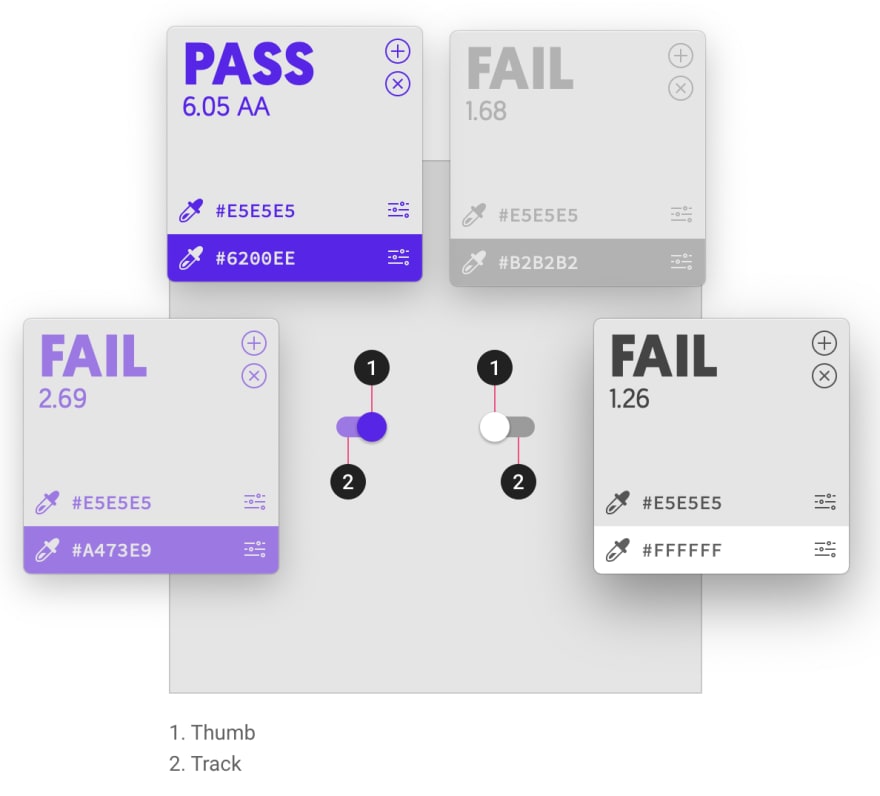
The ratio app used was Contraste. The top bar is the background and the bottom is the foreground.
In our switch implementation, we darkened the thumb box-shadow and the track.
Focus
In addition to contrast, another often missed area is appropriate visual focus states. Focus can be triggered either by a click/tap, or from tabbing through elements. This is one of the easier things to test - just open up your components that are intended to be interactive and get to tabbin'! If you lose your place on the screen, you need to fix the focus of that component.
The "ripple" (pulsing halo) that is a hallmark of Material is used as a focus indicator for many components including switch as well as radios, checkboxes, buttons, and tabs. Ripple is basically never reliably accessible because it applies varying opacity and has an unpredictable background color. Tab through the Material-UI example switches to experience the focus ripple.
For our switches, we removed the ripple and created a custom focus state that applies a consistent box-shadow that mimics native browser focus. The customized box-shadow enables us to apply the visual focus to specifically the thumb.

Interactive Component Visual States
An area to concentrate most of your efforts of making components accessible by default is both contrast and focus, but also the various visual states for interactive components like tabs or menus. There are three main areas that you may need to consider:
- Focused
- Selected
- Selected and focused
In the case of both tabs and menus, an item could be both selected and focused, or one or the other. Just as with buttons or form elements, you don't want to lose track of where your visual focus is so it must be distinct from the selected state.
To make states like these accessible by default, consider exempting them from being adjusted by props or from inherited theme values. Mimicking browser focus colors and using clear but minimal icons (ex. an arrow) may be a solution path to consider. As always, consider the intent of the component and the expected use of any stateful components you create.
Required Props and Attributes
If you are supplying components via something like a React or Angular library package, you have the opportunity to apply sensible defaults and create required props (for styles, see next tip).
Examples of props to require or supply defaults for:
-
alttext for images, default to including it blank -
aria-labelfor icon-only buttons, icon/img avatars, badges -
labelfor form fields
Best Practice Defaults
Whether you're supplying a CSS/Sass framework or a Javascript library, set up your default styles to be the best practice for the most frequent scenarios. For example, while Material defaults to a "text" variant for buttons, our implementation defaults to the "contained" button variant. This is because of several reasons relating to best practices and also user expectations.

Recommended reading: Links vs. Buttons in Modern Web Applications
Self-Defensive Theming
This is an area I'm particularly passionate about. Material stands behind an overarching theme system where at a minimum you select the following colors: primary, secondary, error, background (aka the background-color on <body>), surface (the default background-color on most all Paper-based components), and an ink (text) color.
Besides the consistency provided across components from such a tight palette, there are fewer variables to test for contrast.
Both in Javascript and Sass, you can create (or borrow) functions that test a foreground and background and determine whether it has enough contrast. Coupled with a function that provides an appropriate contrasting color given a color input, you have the basis for self-defensive theming.
Sound like a daunting task? Material-UI has built-in functions to determine contrast, which is automatically applied to palette color inputs. Google's Sass framework for their web components has comparable functions that can be applied where needed. Check out my Codepen which borrows the Google functions to learn how to use, beginning line 81.
To round out the self-defense, apply those functions to any component that expects a theme palette or variable color input as a background-color to provide an appropriately contrasting ink color. You can borrow additional functions from the Material-UI or Google web component resources to also apply stateful contrasts, such as knowing whether a focused button background should lighten or darken, and whether that means the ink color needs to swap for dark or light.
Related: check out my article on using Sass to help create a harmonious, accessible color palette
Developer Mode Warnings
With a Javascript library, you can assess provided and missing props logically and make use of the warning package to display console warnings when accessibility violations are found.
For example, if an Avatar has an icon child or an img but has no aria-label, then we show a warning complete with a link back to our documentation for a reference.
This tactic is useful for multi-purpose components with varied requirements given the different expected use cases.
Thorough, Production-Ready Documentation Demos
Despite required props, sensible defaults, a defensive styling/theming solution, and even console warnings, at the end of it all, you must have thorough documentation with production-ready demos. And a big part of standing by code being production-ready is ensuring it fully passes for accessibility.
A bonus of providing accessible code samples is to promote your documentation as a resource for future adopters who are not yet ready to transition from their existing component solutions but are seeking accessibility best practices for common scenarios.
How have you ensured accessibility upon implementation of your design system components? Please share in the comments!

Top comments (0)