
In this post, we will:
- define browser compatibility
- learn how to leverage data from CanIUse
- define browser prefixes
- learn to automate prefixing with Autoprefixer and gulp
This is the fifteenth post and video in a series on learning web development for beginners. Learn more about the series and see the post schedule >
You may watch the following video or follow along with the expanded transcript that follows.
To begin this lesson, open the starter project you began in episode 1, or review the source files from episode 14.
First, let's learn what browser compatibility means:
Browser compatibility refers to the fact that not all CSS properties are supported, or not supported in the same way, across all browsers.
When we think of desktop compatibility, we often focus on Chrome, Firefox, Safari, and Internet Explorer. There are also mobile-specific browsers such as Opera Mini or proprietary manufacturer browsers such as Amazon Silk. Some browsers are geared toward a specific region, such as the predominately Asian-preferred UC Browser.
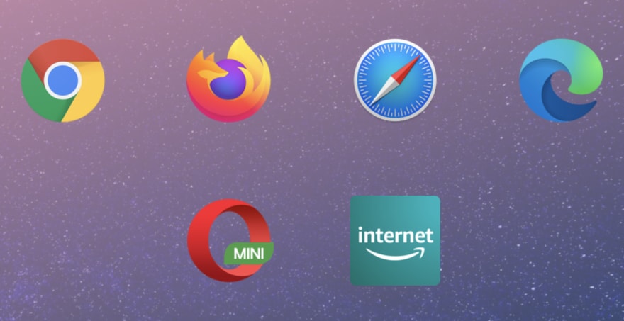
Typically, focusing on Chrome, Firefox, Safari, and Internet Explorer (aka IE) Edge and beyond will get you acceptable coverage for most users unless you are marketing to predominantly non-US or non-English speaking users. I'm personally not familiar with those challenges, so I encourage you to research popular browsers for your target audience.
One tool to help discover both browser compatibility of CSS properties, as well as estimate browser usage of your audience, is called CanIUse.
Visit caniuse.com and we'll search for "grid" which is a display value we used in the Card lessons, and a relatively newer property to CSS.
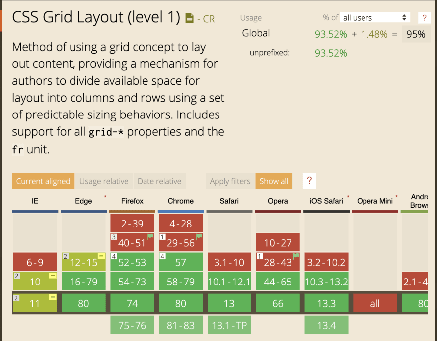
My typical process of using this resource is to first check the usage percentage. As of writing this lesson, that number is estimated at 93.5%, which means you can expect that 93.5% of visitors will be using a browser that has good support for grid.
Then, I look at the top four browsers we mentioned, in particular Internet Explorer. The reason is that up until January 15, 2020, Internet Explorer notoriously lagged in support for more recent additions to CSS, which included grid. As of that date, IE switched to being a Chromium browser, which means it now is very comparable in compatibility to Chrome.
CanIUse helpfully highlights full compatibility in green, incompatibility in red, and partial support in yellow. We can hover over a yellow cell, such as for IE 12-15, and we are given more information about what may be unsupported. In this case, it says it is supported for this set of browser versions but only with the -ms prefix.
Hmm - what's a prefix?
A prefix refers to the way browser makers flag certain in-progress feature additions and is commonly used to onboard new CSS properties.
Once the browser makers determine they've adequately supported the feature, and the CSS property spec is sufficiently complete, they may drop the prefix in later versions in favor of the name and values determined in the CSS spec.
We can use another tool to generate prefixes, called Autoprefixer, available online at autoprefixer.github.io.

We'll update their .example class in the lefthand editor to our .card-row class with just display: grid. You'll see that on the right side, Autoprefixer generated the prefixed version of the value, -ms-grid.
Since we know from CanIUse that the prefix is only needed in older versions of IE, it's important that both the prefixed and un-prefixed display values are included. This provides the best chance of compatibility across most browsers. Due to the CSS cascade, it's also important that the un-prefixed property name is last in order within the rule.
Let's open our project in VSCode.
Today, before we run the project, we're going to add Autoprefixer to our build so that we can automate adding the prefixes rather than coming to the online tool and manually adding them.
In the Terminal, type npm install --save-dev autoprefixer to install Autoprefixer.
After that install completes, we also need to run npm install --save-dev gulp-postcss as a helper to make Autoprefixer available to our build process.
Then, open gulpfile.js and at the top we'll add:
    const postcss = require("gulp-postcss");
    const autoprefixer = require("autoprefixer");
This will load these tools, and then we need to add them into our build process during the style phase, so we'll include them in that function with:
    // .src(paths.styles.src)
    .pipe(postcss([autoprefixer({ grid: true })]))
    // .pipe(gulp.dest(paths.styles.dest))
Order matters, so we include it prior to the file being sent to the dist folder so that the final, distributed file includes the browser prefixes.
Finally, we need to open package.json and add the following browserslist array to the end of the file:
    "browserslist": [
        "last 2 versions",
        "> 0.2%",
        "not dead"
      ]
This means to prefix what's needed to support the last 2 versions of browsers unless they are considered "dead" or are less than 0.2% of market usage. You can view precisely what browsers this includes by checking the browserl.ist service.

For demonstration purposes, we'll change one more thing temporarily in the gulpfile.js file.
In the watch function, let's set baseDir: "./dist/" to serve the compiled files instead of the source files to the browser. That way we can view prefixed styles in the browser.
Next in the Terminal, type the start command npm run start to run the project, and update the browser url to include /card-layout.html.
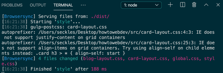
We will need to open card-layout.css and just do a save to trigger the autoprefix process to run. Since we just added the prefixing, it hasn't yet been done to the previously saved file.
Before we look in the browser, we see that we have a couple new messages in Terminal regarding certain properties of grid and their compatibility with IE. On your own, you can follow up with the items noted by checking on CanIUse to determine which version of IE is impacted.
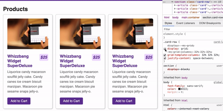
Let's switch to view our styles in the browser. Since we are using Chrome, we have full grid support. But let's inspect and look at our .card-row.

You will now see that Inspector shows the prefixed versions crossed out. That is because those prefixes are both unsupported and unneeded in Chrome. Instead, it's skipped over them and used the supported property of simply display: grid.
If we test toggling off display: grid, Chrome is unable to use grid display at all since it does not recognize the -ms prefix.
We can revert the change we made in gulpfile.js to serve from src again.
Now, you can continue to write your CSS as we've learned, and if Autoprefixer recognizes that a property needs prefixed, it will automatically do it for you!
While we won't take the time to fully explore it in this lesson, there are tools available to review your CSS layouts by simulating many of the desktop and mobile browsers. The most popular one is BrowserStack, and there is a limited free account available. Using this tool you can open your website within various browsers to do a visual check to catch any other issues that can't be resolved by prefixing alone.
Once you have a published website, you can make use of analytics tools to learn what browsers your visitors are actually using. Then, you can use that data to see if there is a worthwhile investment of your time to resolve any issues in those browsers.
Next up in Episode 16: Responsive Design

Oldest comments (0)