
When I made my portfolio site, I put a lot of effort into following the accessibility standards I knew from MDN's Getting Started with the Web guides and other reading I had done. I felt a 100 Lighthouse score was a good indicator of how I was doing. I wanted to test with a screen reader and do some cross browser testing, but that all fell by the wayside when I got a job.
After more reading, following more accessibility experts on Twitter, and feedback from other developers (like the reduced motion CSS in this article), I began to suspect I needed to reassess, but didn't know where to start.
Luckily, I was able to attend Todd Libby's Lunch and Learn. For a full list of the tools Todd uses for his formal audits, you can watch the Lunch and Learn or the livestream where he audits the Virtual Coffee site, or listen to his Virtual Coffee podcast episode.
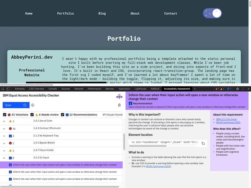
Todd said "No site is 100% accessible, especially as you update it, but we can aim to get close," so let's aim for close. I used 6 of the tools Todd used: WAVE browser extension, Firefox's accessibility dev tools tab, axe DevTools extension, ARC dev toolkit for chrome dev tools, IBM Equal Access Accessibility checker, and Microsoft Accessibility Insights.
If you're just dipping your toe into accessibility, I would say the WAVE extension was the most intuitive and not overwhelming. The IBM Equal Access Ability checker was by far the most thorough and informative, with actual suggestions on how to fix things. The ARC Toolkit came in close second, but the suggestions were less helpful. It links to the WCAG guidelines, which can be quite dense and vague. Firefox's accessibility dev tools tab gave me one warning - clickable elements must be focusable and should have interactive semantics, aka test with a keyboard.

Auditing with Automatic Tools
The Findings
Landing Page
- the blank form I have to put in my index page to use Netlify's serverless contact form and spam bot is missing form labels
- no navigation landmark (
<nav>or otherwise) - missing
focusable='false'for the SVG in my button - warning to test Windows high contrast mode works
Main Page
- dark mode toggle - empty form label, form element with a visible label and hidden input, the 'for' attribute is not the 'id' of a valid
<input>element, and the<label>element does not have descriptive text that identifies the expected input - many PDF accessibility issues!
- verify that the file download mechanism does not cause a keyboard trap
- alt-text - 1 was not descriptive enough, 2 were redundant, and 1 was too long
- SVGs - the Github and Chrome SVG images/links I use all have the same id, SVGFocusable attribute is not set on them, and in my skills section, ARC Toolkit recommends adding
aria-labelledbyand ids - verify there is keyboard focusable content that allows you to scroll horizontally (referring to my blog preview component)
- missing methods to bypass blocks of content
- make sure "below" still makes sense without visual context
- My
<aside>elements do not have labels with accessible names! - 8 warnings to inform the user when an input action will open a new window or change the context
Blog Page
- 85 empty link warnings - the HTML pulled using the DEV API generates empty links in the headings.
- 7 skipped heading level warnings - this was an issue I knew about and I honestly thought this would be significantly worse.
- long alt-text warnings
-
<br>,<em>and<strong>warnings

I got quite a few false positives for color contrast - often "I can't calculate this, so you should check it," because color math is hard. There are also several warnings that I investigated and dismissed. For example, <noscript> cannot be used to present content, and the <noscript> added to my site by create-react-app only contains perfectly accessible "You need to enable JavaScript to run this app." There are some optimistic ones like WAVE's warnings about links to youtube videos - I too wish I could guarantee all the videos I link to have captions.
ARC Toolkit was unhappy that the alt-text for my preview images for my portfolio projects and blog cover images include "gif," "screenshot," and "image." This is something I almost never do because it is redundant, and in these instances, I wanted to highlight that they are images, so I'll be keeping it.
Manual Testing is Key
Todd stressed the importance of manually testing a site using keyboard and a screen reader tool (e.g. Safari voiceover for Mac, NVDA for Windows, or Orca for Linux).
Based on the automatic tooling testing, I began manual testing focused on a few things:
- Does a keyboard or screen reader hit the blank form?
- How much of a problem is my dark mode toggle?
- Does my blog preview component allow you to scroll horizontally?
- Verifying it is clear you need to click the landing page button and easy to do so.
- Are the PDF downloads, SVGs, and links making traps?
- Do I need to add methods of bypassing blocks of content?
I started my manual testing with Microsoft Accessibility Insights' FastPass tab stops feature, which was cool. It immediately confirmed that my blog preview does not allow you to scroll horizontally using the keyboard and my dark mode toggle is not focusable.

Next, I moved on to the Microsoft Accessibility Insights' Intelligent Guided Test, which included many tests, some automatic, but mainly instructions for conducting manual tests. My findings:
- The number of links I have that open new windows without warning is a problem.
- The download file link does not create a keyboard trap.
- I need to add Landmark roles for content not covered by semantic HTML.
- I need to add accessible descriptions to my Github and Chrome links.
- I am pleased to find my skills section SVGs do have accessible names.
- My full blog text fails the reflow test around 350% zoom.
- In horizontal mobile, my blog page switches to horizontal scroll!?
Finally, it's time to try using Safari voiceover.
- Neither keyboard or screen reader hit the blank form
- It is clear you need to click the landing page button and easy to do so.
- A screen reader gets trapped in my blog preview component.
- It's not obvious to a screen reader that the blog heading links are clickable.
- I don't think I need to add skip links for my main page, as the nav has buttons to load single components the content isn't that dense.
What's Next?
My dark mode toggle needs serious help - I need to make it focusable, and add descriptive text. Furthermore, I'll need to test whether adding for and id attributes and <label> content adds accessibility and/or takes away functionality.
I need to make the blog preview component's content focusable so a keyboard user can use it and scroll horizontally. Also, I need to make it obvious to a screen reader that clicking the preview heading opens up a single blog. I'll be researching providing methods of bypassing blocks of content for my full blog page and preventing my blog preview from becoming a horizontal trap.
I'll be updating all my SVGs with focusable attributes, aria-labelledby attributes, and unique ids. I need to add accessible labels to the Github, and Chrome links in my portfolio section and my <aside> elements and add landmark roles where necessary.
All of my links that open new windows or download files need to warn users that they do that. For those file downloads, I need to develop accessible PDFs either by adding an HTML resume or formatting and tagging the existing download links appropriately.
I'll be removing the words "click below" from my Old Wall Site blurb because it doesn't even make sense unless you're on mobile.
My headshot and Old Wall Site screenshots need more descriptive alt-text.
I would like to stop my full blog page from scrolling horizontally if you turn your phone. I also need to get the full blog page to 400% zoom without causing reflow issues. The IBM tool suggested replacing long alt-text with an aria-describedby attribute or a D-link. I also saw warnings about <br> tags not being used for paragraph formatting, using more list elements, and <q> or <quoteblock> tags for quotes. All of this, the skipped blog heading levels, and the empty links in blog headings will require a deep dive into how I format my blogs when I write them, what HTML the DEV API returns, and my styling of it on my site. I already had a feeling I would have to do this and just learned DEV added the ability to add captions to images, so that should help.
While auditing, I also noticed the button that opens my full blog page needs to be wrapped in an <h1>, and my <ul> styling on my full blog page needs help.
Conclusion
I am actually quite pleased with the results of this audit. I have only two problematic components, and I was very much focused on visual presentation when I built them. Accessible SVGs are very hard, and I got these warnings after I made them more accessible while writing this blog. Most of the other problems were news to me, and honestly the alt-text issues show how much I've improved with the practice I've been doing. The blog HTML and CSS issues are not a surprise to me - I've tossed that page together on a short deadline twice now.
I am very proud I did not have any color contrast, color as meaning, or high contrast mode errors as color is something I focus on with everything I build. I also did a great job of ensuring tab focus is visible and creating parsable, semantic HTML. Finally, thanks to my focus on responsive design, zoom up to 400% doesn't cause reflow issues except on my full blog page.
Using a screen reader for a few minutes was quite eye opening. At some point, I'll also take Todd's recommendation to try and go a whole day without using a mouse, but that's another blog post.
Read Part 2 - Quick Fixes
It's a collection of short stories about quick fixes - some amuse-bouches, if you will.
Read Part 3 - An Accessible Dark Mode Toggle in React
I make my dark mode toggle accessible, refactor it, and re-test my site.
Read Part 4 - Blog Preview Component
In which I find out what a keyboard trap really is.
Read Part 5 - Blog Page Accessibility Deep Dive
In which I find a security vulnerability, write a surprising number of regexes, and this series becomes a thesis.

Top comments (6)
Excellent deep dive!
Phenomenal article, Abbey! Thanks for coming to the Lunch & Learn and the mention. 🙂
Thanks for getting me unblocked on something I've been wanting to do for a while!
Yes, very good article.
May I make one comment? I like Executive Summary's or abstracts. I feel that an abstract would have pointed me in the right direction from the start. Focus my attention on the main point then provide the evidence along the way. For example, what steps yielded that biggest bang for the buck? What 1 or 2 things are the first you would address.
I am very simple-minded, I like things spelled out. ;)
Hey Matt,
I'm sorry this isn't written in the style you prefer, but that isn't what I was going for with this blog. You can find other blogs I've done that for -
dev.to/abbeyperini/sourcing-images...
dev.to/abbeyperini/a-walkthrough-o...
The main point is the story of the journey of auditing my site, because I know other people feel this way (I've already gotten a comment to that effect on Hashnode). This is a walkthrough series for a complex process. There were no biggest bang for the buck steps - you have to use multiple automatic tools and manual testing together. There were no 1 or 2 things I'd like to address. There are whole sections with clear headings about my findings and what I will address. I've already started building 3 more blogs off of the what I will address section.
Even so, I feel the very beginning addresses the main point, gives links if you want a more in depth explanation of accessibility auditing from Todd, and sets the tone for the rest of the article/series. I even included a brief mention of the automatic tools that stuck out to me. For a blog that condenses 4-5 hrs of testing into less than 2,000 words and was written, edited, formatted with graphics, and cross-posted to other sites in about 24 hrs, I am pleased with what it is.
Nice!
Really need to do this for my site as well!
So cool to see these tools one can use :D