
This post contributed to the AG Grid blog by Cameron Pavey
When building complex web applications, you will often find yourself needing something more advanced than a simple table. This is where data grids come into play. In this context, a data grid is essentially an interactive table. This interactivity may involve filters, sorting, editing, pagination, and other interactions. There are a lot of libraries out there that attempt to deliver data grids that satisfy a wide assortment of use cases, and this comparison will look at two such libraries.
The first library under consideration is AG Grid React. This is a fully featured data grid, ready to go right out of the box.
The other library is React Table. Unlike AG Grid React, React Table is not a table component; instead, it describes itself as “a table utility” or “a collection of hooks for building powerful tables and datagrid experiences.” This means that React Table does not include any UI but provides you with the pieces you need to implement data grid logic into your UI components.
This article compares these two libraries in various ways, typically by demonstrating how comparable features would look when implemented with each library and comparing the effort required in each case. All of the code samples in this article can be found in the public GitHub repo, along with Storybook stories of each example if you wish to see them in action. You should also note that the examples in this article draw heavily from the official examples in the documentation of each respective library. They may not be the most efficient way to achieve a certain outcome, but they generally represent the best practices endorsed by each library as a result.
Creating a Basic Grid
As a frame of reference for the rest of this comparison, it is good to see how these two libraries differ in a simple use case. The simplest grid that you can make with each library is described by the “getting started” section in the documentation of each respective library. The following code snippets are sourced from said documentation, which can be found here for AG Grid and here for React Table.
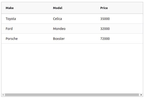
The basic usage of AG Grid is as follows:
import * as React from 'react';

import { AgGridReact } from 'ag-grid-react';

import 'ag-grid-community/dist/styles/ag-grid.css';
import 'ag-grid-community/dist/styles/ag-theme-alpine.css';

export const AgGrid = () => {

    const [rowData] = React.useState([
        { make: "Toyota", model: "Celica", price: 35000 },
        { make: "Ford", model: "Mondeo", price: 32000 },
        { make: "Porsche", model: "Boxster", price: 72000 }
    ]);

    const [columnDefs] = React.useState([
        { field: 'make' },
        { field: 'model' },
        { field: 'price' }
    ])

    return <div className="ag-theme-alpine" style={{ height: 400, width: 600 }}>
        <AgGridReact
            rowData={rowData}
            columnDefs={columnDefs}>
        </AgGridReact>
    </div>
}
This will result in a grid that looks like so:
Meanwhile, the basic usage of React Table is somewhat more verbose:
import * as React from 'react';

import { useTable } from 'react-table';

export const ReactTable = () => {
    const data = React.useMemo<Record<string, string>[]>(
        () => [
            { col1: 'Hello', col2: 'World' },
            { col1: 'react-table', col2: 'rocks' },
            { col1: 'whatever', col2: 'you want' },
        ], []
    )

    const columns = React.useMemo(
        () => [
            { Header: 'Column 1', accessor: 'col1' },
            { Header: 'Column 2', accessor: 'col2' },
        ], []
    )

    const tableInstance = useTable({ columns, data })

    const { getTableProps, getTableBodyProps, headerGroups, rows, prepareRow, } = tableInstance

    return (
        <table {...getTableProps()}>
            <thead>
                {headerGroups.map(headerGroup => (
                    <tr {...headerGroup.getHeaderGroupProps()}>
                        {headerGroup.headers.map(column => (
                            <th {...column.getHeaderProps()}>
                                {column.render('Header')}
                            </th>
                        ))}
                    </tr>
                ))}
            </thead>
            <tbody {...getTableBodyProps()}>
                {
                    rows.map(row => {
                        prepareRow(row)
                        return (
                            <tr {...row.getRowProps()}>
                                {row.cells.map(cell => {
                                    return (<td {...cell.getCellProps()}>
                                        {cell.render('Cell')}
                                    </td>
                                    )
                                })}
                            </tr>
                        )
                    })}
            </tbody>
        </table>
    )
}
The resulting grid is also somewhat lackluster and without styling:

Just from this comparison, one of the main differences is immediately obvious. AG Grid takes a more declarative approach, where the output is largely controlled, with the ability to specify options as props. On the other hand, React Table does not come with any UI out of the box. Instead, you must establish how you want the table to appear manually while using the provided hooks to inject the necessary data.
Working with Columns
Data grids can be tricky to implement due to the vast assortment of use cases they may need to fulfill. For example, a grid can be little more than a table in its simplest form. However, businesses often require the ability to interact with the grid dynamically. This may take the form of operations like column sorting, filtering, rearranging, pinning, and resizing. The following examples illustrate what this interaction may look like with each of the libraries in question. First, consider this AG Grid example:
import * as React from 'react';

import { AgGridReact } from 'ag-grid-react';
import { ColDef } from 'ag-grid-community';

import 'ag-grid-community/dist/styles/ag-grid.css';
import 'ag-grid-community/dist/styles/ag-theme-alpine.css';

export const AgGrid = () => {

    const [rowData] = React.useState([
        { make: "Toyota", model: "Celica", price: 35000 },
        { make: "Ford", model: "Mondeo", price: 32000 },
        { make: "Porsche", model: "Boxster", price: 72000 }
    ]);

    const [columnDefs] = React.useState([
        { field: 'make', pinned: true }, // Only this row is pinned, meaning it cannot be re-ordered
        { field: 'model' }, // Non-pinned rows can be re-ordered by default
        { field: 'price' }
    ])

    // These properties apply to all of the above columns
    const [defaultColDef] = React.useState<ColDef>({
        sortable: true, // Allows the columns to be sorted
        filter: true, // Allows the columns to be filtered
        resizable: true, // Allows the columns to be resized
    })

    return <div className="ag-theme-alpine" style={{ height: 400, width: 600 }}>
        <AgGridReact
            rowData={rowData}
            columnDefs={columnDefs}
            defaultColDef={defaultColDef}
        />
    </div>
}
This example implements all of the functionality mentioned above using column definitions, or columnDefs. This prop allows you to stipulate what functionality you want to enable for each column. The defaultColDef prop allows you to specify defaults that apply to all columns unless overridden by a more specific definition.

Next, consider this example for implementing similar functionality with React Grid:
import * as React from 'react';
import { useSortBy, useTable, useFilters } from 'react-table';
import { matchSorter } from 'match-sorter'

// Define a default UI for filtering
function DefaultColumnFilter({
    column: { filterValue, preFilteredRows, setFilter },
}) {
    const count = preFilteredRows.length

    return (
        <input
            value={filterValue || ''}
            onChange={e => {
                setFilter(e.target.value || undefined) // Set undefined to remove the filter entirely
            }}
            placeholder={`Search ${count} records...`}
        />
    )
}

function fuzzyTextFilterFn(rows, id, filterValue) {
    return matchSorter(rows, filterValue, { keys: [row => row.values[id]] })
}

// Let the table remove the filter if the string is empty
fuzzyTextFilterFn.autoRemove = val => !val

export const ReactTable = () => {

    const filterTypes = React.useMemo(
        () => ({
            // Add a new fuzzyTextFilterFn filter type.
            fuzzyText: fuzzyTextFilterFn,
            // Or, override the default text filter to use
            // "startWith"
            text: (rows, id, filterValue) => {
                return rows.filter(row => {
                    const rowValue = row.values[id]
                    return rowValue !== undefined
                        ? String(rowValue)
                            .toLowerCase()
                            .startsWith(String(filterValue).toLowerCase())
                        : true
                })
            },
        }),
        []
    )

    const data = React.useMemo<Record<string, string>[]>(
        () => [
            { col1: 'hello', col2: 'world' },
            { col1: 'react-table', col2: 'rocks' },
            { col1: 'whatever', col2: 'you want' },
        ], []
    )

    const columns = React.useMemo(
        () => [
            { Header: 'Column 1', accessor: 'col1', filter: 'fuzzytext' },
            { Header: 'Column 2', accessor: 'col2', filter: 'fuzzytext' },
        ], []
    )

    const defaultColumn = React.useMemo(
        () => ({
            // Let's set up our default Filter UI
            Filter: DefaultColumnFilter,
        }),
        []
    )

    const tableInstance = useTable({ columns, data, defaultColumn, filterTypes }, useFilters, useSortBy)

    const { getTableProps, getTableBodyProps, headerGroups, rows, prepareRow } = tableInstance

    return (
        <table {...getTableProps()}>
            <thead>
                {headerGroups.map(headerGroup => (
                    <tr {...headerGroup.getHeaderGroupProps()}>
                        {headerGroup.headers.map(column => (
                            // For sorting, you need to add this function call below
                            <th {...column.getHeaderProps(column.getSortByToggleProps())}>
                                <div>

                                    {column.render('Header')}
                                    {/* Add a sort direction indicator */}
                                    <span>
                                        {column.isSorted
                                            ? column.isSortedDesc
                                                ? ' 🔽'
                                                : ' 🔼'
                                            : ''}
                                    </span>
                                </div>
                                {/* Render the columns filter UI */}
                                <div>{column.canFilter ? column.render('Filter') : null}</div>
                            </th>
                        ))}
                    </tr>
                ))}

            </thead>
            <tbody {...getTableBodyProps()}>
                {
                    rows.map(row => {
                        prepareRow(row)
                        return (
                            <tr {...row.getRowProps()}>
                                {row.cells.map(cell => {
                                    return (<td {...cell.getCellProps()}>
                                        {cell.render('Cell')}
                                    </td>
                                    )
                                })}
                            </tr>
                        )
                    })}
            </tbody>
        </table>
    )
}

This lengthy example implements sorting and filtering with React Table. Other features such as resizing and reordering are omitted for brevity, but they similarly require lengthy imperative implementations. If you are interested, the official documentation has an example for resizing and specifying column ordering. Interactive column reorder is not yet natively supported; however, it can be achieved through some manual effort.
The difference in verbosity between the two libraries will be a recurring theme throughout this comparison, as AG Grid tends to ship with most of the desired functionality ready to go. At the same time, React Table instead provides utilities that you can use to build your table components.
Pagination
When dealing with large volumes of data, pagination is an important feature. Both of the libraries in question support pagination. With AG Grid, adding pagination is a matter of specifying at least two props—pagination and paginationPageSize. There are other props you can use for more advanced use cases; you can refer to the documentation for more details. Consider the following example to see how this looks in practice:
import * as React from 'react';

import { AgGridReact } from 'ag-grid-react';

import 'ag-grid-community/dist/styles/ag-grid.css';
import 'ag-grid-community/dist/styles/ag-theme-alpine.css';

// This function will generate lots of data, so that you can see how the table behaves when populated with many rows
function getData() {
    let data = [];
    for (let x = 0; x < 150; x++) {
        data.push(
            {
                make: ["Toyota", "Nissan", "Kia"][Math.floor(Math.random() * 3)],
                model: ["Celica", "KDH", "Sorento"][Math.floor(Math.random() * 3)],
                price: Math.floor(Math.random() * 100000) + 25000,
                type: ["sedan", "van", "jeep"][Math.floor(Math.random() * 3)]
            });
    }
    return data;
};

export const AgGrid = () => {

    const [rowData] = React.useState(getData);

    const [columnDefs] = React.useState([
        { field: 'make' },
        { field: 'model' },
        { field: 'price' }
    ])

    return <div className="ag-theme-alpine" style={{ height: 550, width: 600 }}>
        <AgGridReact
            pagination // This prop enables pagination for the table
            paginationPageSize={10} // This prop specifies how many items to show per page
            rowData={rowData}
            columnDefs={columnDefs}>
        </AgGridReact>
    </div>
}

By comparison, as with the previous examples, facilitating pagination in React Table is somewhat more involved. Consider the following example, inspired by the official pagination example:
import * as React from 'react';
import { usePagination, useTable } from 'react-table';

// This function will generate lots of data, so that you can see how the table behaves when populated with many rows
function getData() {
    let data = [];
    for (let x = 0; x < 150; x++) {
        data.push(
            {
                col1: ["Hello", "react-table", "whatever"][Math.floor(Math.random() * 3)],
                col2: ["World", "rocks", "you want"][Math.floor(Math.random() * 3)],
            }
        );
    }
    return data;
};

export const ReactTable = () => {
    const data = React.useMemo<Record<string, string>[]>(
        getData, []
    )

    const columns = React.useMemo(
        () => [
            { Header: 'Column 1', accessor: 'col1' },
            { Header: 'Column 2', accessor: 'col2' },
        ], []
    )

    const tableInstance = useTable({ columns, data }, usePagination)

    const { getTableProps, getTableBodyProps, headerGroups, page, prepareRow, pageCount, gotoPage, previousPage, nextPage, pageOptions, canPreviousPage, canNextPage, state: { pageIndex, setPageSize } } = tableInstance

    return (
        <>
            <table {...getTableProps()}>
                <thead>
                    {headerGroups.map(headerGroup => (
                        <tr {...headerGroup.getHeaderGroupProps()}>
                            {headerGroup.headers.map(column => (
                                <th {...column.getHeaderProps()}>
                                    {column.render('Header')}
                                </th>
                            ))}
                        </tr>
                    ))}
                </thead>
                <tbody {...getTableBodyProps()}>
                    {page.map((row, i) => {
                        prepareRow(row)
                        return (
                            <tr {...row.getRowProps()}>
                                {row.cells.map(cell => {
                                    return (<td {...cell.getCellProps()}>
                                        {cell.render('Cell')}
                                    </td>
                                    )
                                })}
                            </tr>
                        )
                    })}
                </tbody>
            </table>
            {/*
        Pagination can be built however you'd like.
        This is just a very basic UI implementation:
      */}
            <div className="pagination">
                <button onClick={() => gotoPage(0)} disabled={!canPreviousPage}>
                    {'<<'}
                </button>{' '}
                <button onClick={() => previousPage()} disabled={!canPreviousPage}>
                    {'<'}
                </button>{' '}
                <button onClick={() => nextPage()} disabled={!canNextPage}>
                    {'>'}
                </button>{' '}
                <button onClick={() => gotoPage(pageCount - 1)} disabled={!canNextPage}>
                    {'>>'}
                </button>{' '}
                <span>
                    Page{' '}
                    <strong>
                        {pageIndex + 1} of {pageOptions.length}
                    </strong>{' '}
                </span>
            </div>
        </>
    )
}

Themes and Styling
In most cases, an unstyled table is not going to be adequate. Even with good default styles such as those included with AG Grid, table components will often need to be restyled specifically to match an application’s overall aesthetic. To this end, grid libraries must include the ability to apply custom themes and styling.
AG Grid provides instructions in the documentation that detail the process of customizing the provided themes using SCSS. There is also a section detailing the process of applying more specific style overrides using regular CSS for cases where you cannot achieve the desired design effects through simply modifying the theme parameters.
As a headless library, React Table does not ship with UI included. Instead, you must specify how you want your components to render. This means that you have complete, expressive control over the styling of the grid. Whether you want to use HTML and CSS or components from other UI libraries, the choice is yours. The official documentation includes examples of how to create a basic table using components from @material-ui/core and React-Bootstrap. For the most part, these examples look the same as the basic examples seen above, with the main difference being that the UI is imported from an external library rather than the default HTML elements.
Custom Cell Renderer
Typically, grids will render values as textual representations of the raw data, and there are times you may want to override this rendering behavior without having to alter the underlying data. For example, if your data contains a URL to an image asset, you may want to display the actual image instead of just the URL.
Doing this in AG Grid involves defining an additional component to be used when the cell is rendered. Consider the following example for AG Grid:
import * as React from 'react';

import { AgGridReact } from 'ag-grid-react';

import 'ag-grid-community/dist/styles/ag-grid.css';
import 'ag-grid-community/dist/styles/ag-theme-alpine.css';
import { ColDef } from 'ag-grid-community';

// This component will be used to render the image cells
const CustomImageRenderer = (props) => {
    return <img alt="" src={props.value} />
}

export const AgGrid = () => {

    const [rowData] = React.useState([
        { name: 'John Doe', image: 'https://picsum.photos/40' },
        { name: 'Jane Doe', image: 'https://picsum.photos/40' },
        { name: 'Bob Smith', image: 'https://picsum.photos/40' },
    ]);

    const [columnDefs] = React.useState<ColDef[]>([
        { field: 'name' },
        { field: 'image', cellRenderer: CustomImageRenderer }, // Here, you can specify your custom renderer
    ])

    return <div className="ag-theme-alpine" style={{ height: 400, width: 600 }}>
        <AgGridReact
            rowData={rowData}
            columnDefs={columnDefs}>
        </AgGridReact>
    </div>
}

In this case, the React Table implementation is very similar. Like AG Grid, you can define a custom component to handle rendering for certain cells. This component is then specified in the columns config, like so:
import * as React from 'react';
import { useTable } from 'react-table';

// this component will handle rendering of the images
const ImageCellRenderer = (row) => {
    return <img alt="" src={row.value} />
}

export const ReactTable = () => {
    const data = React.useMemo<Record<string, string>[]>(
        () => [
            { col1: 'Hello', col2: 'World', col3: 'https://picsum.photos/40' },
            { col1: 'react-table', col2: 'rocks', col3: 'https://picsum.photos/40' },
            { col1: 'whatever', col2: 'you want', col3: 'https://picsum.photos/40' },
        ], []
    )

    const columns = React.useMemo(
        () => [
            { Header: 'Column 1', accessor: 'col1' },
            { Header: 'Column 2', accessor: 'col2' },
            { Header: 'Image', accessor: 'col3', Cell: ImageCellRenderer }, // Here, you can specify your custom cell renderer
        ], []
    )

    const tableInstance = useTable({ columns, data })

    const { getTableProps, getTableBodyProps, headerGroups, rows, prepareRow, } = tableInstance

    return (
        <table {...getTableProps()}>
            <thead>
                {headerGroups.map(headerGroup => (
                    <tr {...headerGroup.getHeaderGroupProps()}>
                        {headerGroup.headers.map(column => (
                            <th {...column.getHeaderProps()}>
                                {column.render('Header')}
                            </th>
                        ))}
                    </tr>
                ))}
            </thead>
            <tbody {...getTableBodyProps()}>
                {
                    rows.map(row => {
                        prepareRow(row)
                        return (
                            <tr {...row.getRowProps()}>
                                {row.cells.map(cell => {
                                    return (<td {...cell.getCellProps()}>
                                        {cell.render('Cell')}
                                    </td>
                                    )
                                })}
                            </tr>
                        )
                    })}
            </tbody>
        </table>
    )
}

Custom Cell Editor
Another feature similar to custom renderers is custom cell editors. Custom editors can be useful when you want the user to be able to interact with the grid to update data in an Excel-like fashion. This can be challenging because different data types typically require different editors in order to deliver a good user experience. Of course, you could simply let the user edit everything as plain text, but this is not ideal in the case of values such as dates and times, numbers, and booleans. Consider the following example for AG Grid, where a custom editor is used to restrict the user’s input with a Select component.
import * as React from 'react';

import { AgGridReact } from 'ag-grid-react';

import 'ag-grid-community/dist/styles/ag-grid.css';
import 'ag-grid-community/dist/styles/ag-theme-alpine.css';

const VehicleEditor = React.forwardRef((props, ref) => {
    const [value, setValue] = React.useState(props.value);
    const refInput = React.useRef(null);

    React.useEffect(() => {
        // focus on the input
        refInput?.current?.focus();
    }, []);

    React.useImperativeHandle(ref, () => {
        return {
            // the final value to send to the grid, on completion of editing
            getValue() {
                return value;
            },
            isCancelBeforeStart() {
                return false;
            },
            isCancelAfterEnd() {
                return false;
            }
        };
    });

    return <select name="cars" id="cars" onChange={(e) => setValue(e.target.value)} value={value}>
        <option value="Toyota">Toyota</option>
        <option value="Ford">Ford</option>
        <option value="Porsche">Porsche</option>
        <option value="Audi">Audi</option>
    </select>

});

export const AgGrid = () => {

    const [rowData] = React.useState([
        { make: "Toyota", model: "Celica", price: 35000 },
        { make: "Ford", model: "Mondeo", price: 32000 },
        { make: "Porsche", model: "Boxster", price: 72000 }
    ]);

    const [columnDefs] = React.useState([
        { field: 'make', cellEditor: VehicleEditor, editable: true },
        { field: 'model' },
        { field: 'price' }
    ])

    return <div className="ag-theme-alpine" style={{ height: 400, width: 600 }}>
        <AgGridReact
            rowData={rowData}
            columnDefs={columnDefs}>
        </AgGridReact>
    </div>
}

React Table does not have first-class support for editable cells, but because it is essentially just a collection of utility hooks, there is nothing stopping you from implementing this yourself. React Table’s site has an example where a custom cell editor is specified, similar to the custom-renderer example above. This editor is able to work due to a couple of workarounds and external state hoisting. This works as a solution if you find yourself needing it while using React Table, but it is not as elegant as AG Grid’s first-class support.
Imperative Control
In complex applications, you will often need to integrate the grid more deeply with the rest of your components. This may take the form of other components or logic-performing actions that have an effect on the content or configuration of the grid. To satisfy such use cases, developers frequently require a measure of imperative control over the grid in the form of an API. AG Grid allows you to do this by passing a ref to the component, which will then have access to the internal imperative API.
React Table has a different approach, instead choosing to expose a useControlledState hook, which can be used for fine-grained, manual control over the entire table state.
Column Grouping
Both libraries support column grouping in similar ways. For AG Grid, this takes place in the columnDefs prop by specifying an object with a headerName, as well as children:
const columnDefs = [
    {
        headerName: 'Group Name',
        children: [
            { field: 'name'},
            { field: 'age'},
            { field: 'height'}
        ]
    },
    {
        headerName: 'Second Group Name',
        children: [
            { field: 'food' },
            { field: 'car' },
            { field: 'pet' },
        ]
    }
];

This works largely the same way in React Table, with the groups being specified the same as normal columns but with the addition of their own column key:
const columns = React.useMemo(
    () => [
      {
        Header: 'Group Name',
        columns: [
          { Header: 'Name', accessor: 'name' },
          { Header: 'Age', accessor: 'age' },
          { Header: 'Height', accessor: 'height' },
        ],
      },
      {
        Header: 'Second Group Name',
        columns: [
          { Header: 'Food', accessor: 'food' },
          { Header: 'Car', accessor: 'car' },
          { Header: 'Pet', accessor: 'pet' },
        ],
      },
    ],
    []
  )

Enterprise Features
The last set of features this article will discuss are typically geared toward enterprise users. These features include grouping, pivoting, aggregation, tree data, charts, and server-side data. For the sake of brevity, full code samples won’t be provided for each of these.
Aggregation
Similarly to column grouping, both libraries also support aggregation by passing additional properties into the column definitions. For AG Grid, this is the aggFunc property, and for React Table, it is a pair of properties, namely aggregate and Aggregated.
Tree Data
Both libraries also support expandable subrows for showing tree-like data. In AG Grid, this works by implementing a getDataPath function that is then passed to the grid as a prop. This function is responsible for returning an array of strings that will be used to determine the nesting of data.
React Table’s implementation of this functionality involves simply nesting the data itself, with subrows being stored within a subRows property of their parent row.
Row Grouping
Where Tree Data requires you to specify the paths that will be used to group data into hierarchies, Row Grouping achieves a similar outcome in a more dynamic manner, by instead allowing you to perform “group by” operations on the rows in the grid. In AG Grid, this is done by setting some additional properties. Specifically, you need to set rowGroup: true on any column definitions that you want the data to be grouped by, in addition to setting groupDisplayType={‘groupRows’} on the AgGridReact component.
React Table also implements this behavior. In this case, it comes in the form of two additional hooks, useGroupBy, which is responsible for the actual grouping operations and aggregation of data, and useExpanded, which allows you to show the subrows that would otherwise be hidden by aggregation. As with the other examples thus far, the React Table implementation requires more manual effort in exchange for granular control over how everything will render, while the AG Grid implementation simply requires you to opt-in with some additional properties.
Charts
AG Grid offers an integrated charting solution, allowing you to visualize your data in more advanced ways. This is quite a powerful feature, and leveraging it can be as simple as adding two props to your AgGrid component, specifically enableCharts, and enableRangeSelection. Covering the integrated charts in depth would be difficult to do adequately within this article, but if this is something that your use case would benefit from, you should review the official documentation for more details.
Unfortunately, React Table does not have a charting implementation, as it focuses purely on table utilities. However, there is a similar library from the same author, React Charts, which describes itself as “a React component for rendering many many different variations of X/Y charts including, but not limited to, line, area, bar, column and bubble charts.”
Wrapping Up
In this article, you’ve seen examples of how to implement some commonly desired functionality using both React Table and AG Grid. There are typical themes that emerge when you view these comparisons from a high level. Typically, AG Grid comes with useful functionality out of the box, where all you have to do is opt in by enabling a prop. React Table also provides a lot of utilities, but typically only for the logic aspects of these features, requiring you to stitch pieces together and supply your own UI. This results in more granularity and control but at the cost of elevated effort.
If you have a very specific use case in mind that no off-the-shelf component adequately solves, React Table provides a set of robust building blocks to serve as a starting point. However, if your use case is supported by AG Grid, it might be the best choice as you can take advantage of customization functionality like themes, custom editors, and custom renderers without having to build from the ground up.
If you wish to learn more about AG Grid and whether it is a good fit for you, be sure to refer to the official documentation and the live demo to see it in action.
You can find all of the code samples in this article in the public GitHub repo.

Top comments (0)