An important aspect of developer tools is being able to visualize work and progress in various ways. A well known example is the burndown chart that agile teams use to track their progress through iterations. There are many other standard visualizations, such as throughput charts, which are useful for kanban teams.
To make Aha! Develop extendable and flexible we’ve implement new functionality using our public API and extension SDK. This lets us build the best experience in-app and also support extension developers and customers who wish to query the data themselves.
In this post I’ll detail the new record events API that underlies our reports, and then demonstrate how to use it to create your own report within a custom Aha! Develop extension to track estimation accuracy. The finished code for this extension is available on GitHub.
Charting with recordEvents
To make a chart you need to be able to see the changes that happened over time. Aha! Develop keeps a timeline of events and provides a new GraphQL API query endpoint called recordEvents . You can start exploring this API in your own Aha! account, after you are logged in, using the GraphQL explorer.
When we looked at the kinds of charts useful to development teams it was apparent that being able to group the data was important. A burndown chart, which looks at changes over a single sprint, might be interested in every single event over the course of the sprint. A velocity chart, showing changes over many sprints, needs to group a limited amount of information by sprint. Processing every single event for a whole year of sprint work wouldn’t be optimal.
Therefore, underneath the recordEvents query you’ll find three subqueries that give different views into the data. These are raw, grouped and timeSeries
-
raw: This is for fetching the raw events. It is useful for querying the events on a particular record, or a very limited subset of events. -
grouped: This is for fetching events with a custom grouping. For example, you can elect to group events by iteration by specifyinggroupBy: ITERATION_ID. Groups of events are always provided with acountand the estimation fields are aggregated. The aggregation method can be chosen by an optional argument, defaulting toSUM. -
timeSeries: Group events by a provided time grouping. ThetimeGroupargument can beHOUR,DAY,WEEKorMONTH. As with thegroupedquery, estimation fields are aggregated, and the aggregation cab be chosen by an optional argument.
The top level recordEvents query also has a filters argument. These filters will be applied to the data in whatever form is requested. For example, if you make an extension that shows a chart you might always apply a teamId filter to narrow the results down to the currently selected team.
Filters are optional except in the case that timeSeries data is selected. A time series always requires a filter by time range:
recordEvents( filters: { createdAt: { gt: '2022-01-01', lt: '2022-02-01' } } )
As you’ll find in the GraphQL explorer, there are many event types, and it’s likely that any chart will only need events for one type, or several related types. You can filter by one or more event type using the eventType filter. This takes a single value or an array.
You can filter by the event subject record. For example, to get all of the events for a single feature you might specify filters: { eventSubject: { id: 'FEAT-123', typename: 'Feature' } }
You can also filter using assignedToUserId, epicId, featureId, iterationId, releaseId, requirementId, teamId, teamWorkflowStatusId. These are powerful filters because they do not filter by just the event subject record, but instead by the references to other records. For example, if we specify filters: { featureId: 'FEAT-123' } then we will get events for that feature, and also for any requirements of the feature.
An example of querying for events, filtered by team and only including events for when a record is completed or restarted. A completed record is one where the team status is “done”, and a restarted record is one where the team status changes from a “done” status back to an “in progress” status.
query GetEvents {
  recordEvents(filters: { teamId: "TEAM-123", eventType: [RECORD_COMPLETED, RECORD_RESTARTED] }) {
    grouped(groupBy: ITERATION_ID) {
      groupByValue
      originalEstimate
      eventType
    }
  }
}
Building an Estimation Accuracy chart
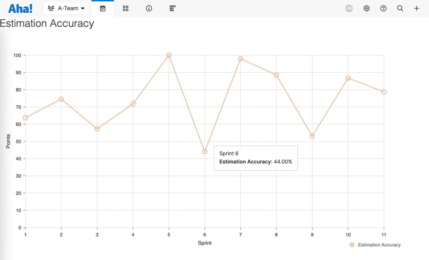
Let’s imagine that we have a team who are finding that some of their estimations on features are way too low in comparison to other features. What they thought was a 2 on their point scale turned out to be a 13 and couldn’t be completed within the current sprint. The team wants to tackle the problem, but they also want to understand how bad the problem is, and see the improvement. They need an Estimation Accuracy chart.
Let’s make an extension using the aha-cli.
> npm install -g aha-cli
The aha-cli provides several commands for creating, building and installing extensions. We’ll use the extension:create command to create a new extension:
> aha-cli extension:create
? Enter a human readable name for your extension: Estimation Accuracy
? Who are you? Your personal or organization GitHub handle is a good identifier: fredwin
? Each extension must have a universally unique identifer that is also a valid NPM package name.
Generally a good identifier is <organization-name>.<extension-name>.
Enter an identifier: fredwin.estimation-accuracy
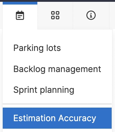
At this stage, the extension:create command will ask if you want to add a contribution. We’ll create a page view extension contribution so that we have a whole page in the team navigation for the new chart:
? Are you ready to add contributions? yes
? Enter a human readable title for your contribution: Estimation Accuracy
? Enter a name for your contribution: estimationAccuracy
? Select a type for your contribution: view
? Enter an entry point for your contribution: src/views/estimationAccuracy.js
? Enter the host for your view: page
? Enter a navigation menu location for your page: Plan
? Add another contribution? no
> cd estimation-accuracy
Let’s add Nivo for charting:
> npm install @nivo/line
And start the extension:
> aha-cli auth:login
> aha-cli extension:watch
There is now menu item for Estimation Accuracy under the Plan menu in Aha! Develop. The page is empty.
Open the file src/views/estimationAccuracy.js. We can start filling in the page to fetch and draw the data. First let’s just make a function to fetch all the available completed iterations:
const getCompletedIterations = async () => {
  return aha.models.Iteration.select("id", "name")
    .order({ startDate: "ASC" })
    .where({ status: [30], projectId: aha.project.id })
    .findInBatches();
};
Now we’ll make a function to fetch the events we’re interested in. What we want to do here is compare the estimate at the start of a sprint to changes made to record estimates during a sprint. So we load the events with the types ITERATION_START and RECORD_ESTIMATE_CHANGED grouped by ITERATION_ID. We only want the events for the sprints in the team we’re currently viewing, so we add a teamId filter as well:
const getEstimationEvents = async () => {
  const query = `
    query GetEstimationEvents($filters: RecordEventFilters!) {
      recordEvents(filters: $filters) {
        grouped(groupBy: ITERATION_ID) {
          groupByValue
          originalEstimate
          eventType
        }
      }
    }
  `;

  const filters = {
    eventType: [
      aha.enums.RecordEventTypeEnum.RECORD_ESTIMATE_CHANGED,
      aha.enums.RecordEventTypeEnum.ITERATION_START,
    ],
    teamId: aha.project.id,
  };

  const data = await aha.graphQuery(query, { variables: { filters } });
  return data.recordEvents.grouped;
};
Now let’s make a chart component that loads that data, shows a spinner while the data is loading, and then displays nothing when finished:
const Chart = () => {
  const [iterations, setIterations] = useState(null);
  const [events, setEvents] = useState(null);

  useEffect(() => {
    getCompletedIterations().then(setIterations);
    getEstimationEvents().then(setEvents);
  }, []);

  if (!iterations || !events) return <aha-spinner />;
  return <div></div>
};

aha.on("estimationAccuracy", () => {
  return (
    <>
      <h2>Estimation Accuracy</h2>
      <Chart />
    </>
  );
});
Easy so far. Now we just need to display the data in a line chart. First we make sure we only look at iterations that have events. This goes into the Chart component function under the spinner line:
  const iterationsWithData = [...new Set(events.map((e) => e.groupByValue))]
    .reduce((acc, id) => {
      const iteration = iterations.find((i) => i.id === id);
      return iteration ? [...acc, iteration] : acc;
    }, [])
    .sort(
      (a, b) =>
        new Date(a.startDate).getTime() - new Date(b.startDate).getTime()
    );
Now we need to provide the line data as expected by Nivo. We’re providing a list of points where each point has the iteration name as the x value and the estimation accuracy % as the y value.
  const data = [
    {
      id: "Estimation Accuracy",
      data: iterationsWithData.map((iteration) => {
        const originalEstimate =
          events.find(
            (event) =>
              event.groupByValue === iteration.id &&
              event.eventType ===
                aha.enums.RecordEventTypeEnum.ITERATION_START.value
          )?.originalEstimate || 0;

        const estimateChangedBy = Math.abs(
          events.find(
            (event) =>
              event.groupByValue === iteration.id &&
              event.eventType ===
                aha.enums.RecordEventTypeEnum.RECORD_ESTIMATE_CHANGED.value
          )?.originalEstimate || 0
        );

        return {
          x: iteration.name,
          y:
            originalEstimate === 0
              ? 100
              : (1.0 - estimateChangedBy / originalEstimate) * 100,
        };
      }),
    },
  ];
And so for each iteration we find the ITERATION_START event. The originalEstimate value for this event is the sum of all the iteration records when the iteration was started. We then find the RECORD_ESTIMATE_CHANGED event. As we’ve grouped by ITERATION_ID this will hold a sum of all of the estimate changes for records that were in the iteration at the time the estimate changed. We use Math.abs because estimations can go up or down, and we’re only interested in the overall magnitude of the difference.
The y value is the % difference between the original iteration estimate and the amount of change in the iteration records. (1.0 - estimateChangedBy / originalEstimate) * 100.
Finally we pass that data into a Nivo line component, and we can find an example in the documentation to copy:
  return (
    <div style={{ width: "100%", height: "500px" }}>
      <ResponsiveLine
        data={data}
        margin={{ top: 50, right: 110, bottom: 50, left: 60 }}
        xScale={{ type: "point" }}
        yScale={{
          type: "linear",
          min: 0,
          max: "auto",
          stacked: false,
          reverse: false,
        }}
        yFormat=" >-.2f"
        axisTop={null}
        axisRight={null}
        axisBottom={{
          tickSize: 5,
          tickPadding: 5,
          tickRotation: 0,
          legend: "Sprint",
          legendOffset: 36,
          legendPosition: "middle",
          format: (name) => name.split(" ")[1],
        }}
        axisLeft={{
          tickSize: 5,
          tickPadding: 5,
          tickRotation: 0,
          legend: "Points",
          legendOffset: -40,
          legendPosition: "middle",
        }}
        pointSize={10}
        pointColor={{ theme: "background" }}
        pointBorderWidth={2}
        pointBorderColor={{ from: "serieColor" }}
        pointLabelYOffset={-12}
        pointLabel={(d) => `${d.y}`}
        useMesh={true}
        legends={[
          {
            anchor: "bottom-right",
            direction: "column",
            justify: false,
            translateX: 0,
            translateY: 50,
            itemsSpacing: 0,
            itemDirection: "left-to-right",
            itemWidth: 80,
            itemHeight: 20,
            itemOpacity: 0.75,
            symbolSize: 12,
            symbolShape: "circle",
            symbolBorderColor: "rgba(0, 0, 0, .5)",
            effects: [
              {
                on: "hover",
                style: {
                  itemBackground: "rgba(0, 0, 0, .03)",
                  itemOpacity: 1,
                },
              },
            ],
          },
        ]}
        enableSlices="x"
        sliceTooltip={({ slice }) => {
          return (
            <div
              style={{
                background: "white",
                padding: "9px 12px",
                border: "1px solid #ccc",
              }}
            >
              <div>{slice.points[0].data.x}</div>
              {slice.points.map((point) => (
                <div
                  key={point.id}
                  style={{
                    padding: "3px 0",
                  }}
                >
                  <strong>{point.serieId}</strong>: {point.data.yFormatted}%
                </div>
              ))}
            </div>
          );
        }}
      />
    </div>
  );
We’re adding a lot of style hacks to get this looking reasonable, which is fine for our quick ad-hoc report.
And there we have it, a simple line chart showing that this team has a highly variable and low estimation accuracy. Now that is visible the team can make and track improvements to how they work.
There are many ways to slice and dice the event data we’ve made available in Aha! Develop. The record event API can be accessed externally or by building extensions.
Sign up for a free trial of Aha! Develop
Aha! Develop is a fully extendable agile development tool. Prioritize the backlog, estimate work, and plan sprints. If you are interested in an integrated product development approach, use Aha! Roadmaps and Aha! Develop together. Sign up for a free 30-day trial or join a live demo to see why more than 5,000 companies trust our software to build lovable products and be happy doing it.

Top comments (0)