Ever dropped out during a signup process or felt frustrated during filling a web form? chances are it's due to bad user expertise during filling the form.
Forms are ubiquitous on the internet, here are form design tips for a better User Experience.
1. Leverage HTML input types
HTML input field offers us a collection of various types to specify the type of data expected. We can take advantage of it to provide a better user experience while delegating simple error handling to client-side browsers.
Input types:
1> type="email" specifies that the type of input must be an email address.
<input type="email" id="email" name="email">
Pros:
- When users enter an invalid id, most modern browsers show an appropriate error message.

- On mobile phones, most of the keyboards show the "@" symbol for easy access in turn improving user experience.
Cons:
Due to its limitations, it will accept john@gibbrishfdsf.com as a valid email id, server-side validation is still required.
2> type="number" specifies that the type of input must be a number.
<input type="number" id="plotNumber" name="plotnumber">
It allows only number input preventing accidental alphabet inputs while preventing a user from making a mistake.
On mobile phones, it opens a numerical keypad giving users the ability to type numbers quickly.
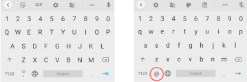
3> type="tel" specifies that the type of input is going to be a telephone number.
<input type="tel" id="phoneNumber" name="phonenumber">
On the desktop, it's similar to normal input, but on mobile phones, it opens a numerical keypad that has the ability to type special characters or alphabets, giving users the ability to type numbers quickly while giving them the liberty to type non-numerical characters.
2. Use autofill.
Give users the ability to autofill forms that are saved in the browser. Users will be able to fill the form quickly by auto-filling common fields like name, email, etc, and focus on more important input tasks.
Google found that by correctly using autofill, users filled forms 30% faster. Read more here:Google Developers
<input type="tel" name="phone" id="phoneNumber" placeholder="+91-45345345435" autocomplete="tel">
3. Dropdowns should be the last resort.
A dropdown is like a swiss army knife for forms, they standardize input, provides predictability, and are flexible, but usability studies show that using a dropdown increases user efforts while filling a form.
Read more about it here : Blog
TLDR :
- Harder to use and takes longer time to complete the form
- Users frequently corrected their choice
- Hides the available options
- Users sometimes miss it
- They slow users down - especially mobile users.
Solution?
For a binary input use a toggle switch.
How to on : w3schools
Another way around is to use list boxes with radio buttons where there are less than 7 options.
Read more here : NN group
4. Use dropdown with search.
When a user has to select their country, the dropdown is probably the best option since it's compact but still, the user has to search through a list of 150+ countries.
A way to provide a good user experience is to allow users to manually enter a search query and dynamically filter the list of available options.
HTML comes with datalist tag which when combined with input tag provides a powerful dropdown + search capability
<form action="/action_page.php" method="get">
  <label for="browser">Choose your country from the list:</label>
  <input list="browsers" name="browser" id="browser">
  <datalist id="browsers">
    <option value="Japan">
    <option value="India">
    <option value="Singapore">
    <option value="Thailand">
    <option value="United States">
  </datalist>
  <input type="submit">
</form>
Read more on : w3school
5. Prevention over correction
Nothing is more frustrating than going through the process of filling a form, clicking captcha image titles that look like "traffic lights" only to find after clicking submit that one of the input was wrongly filled.
Want to experience it?
Go to dribbble.com (a place where designers share their work) and try to signup.

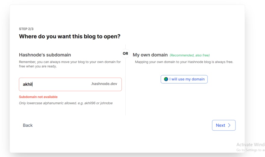
The frustrating part of the signup process is that there's no way for a user to know whether the "username" is available during the signup process. If the username is not available, they show it as an error after we submit it, so we have to again go through the process of guessing a new "username", hope it's available, click on captcha images again and pray.
What they could've done to improve user onboarding is to allow users to signup just with their email and once the is user onboarded, they could let users go through the process of finding a username.
Here's how hashnode does something similar but in a much smoother way.
"To err is human" it's important for us to figure out way's to prevent errors along the way instead of correcting them after the user has gone through a tedious process of filling a form.
If you made it till here, thanks for reading!
This is part 1 of form design guidelines, more design + dev related blogs coming soon.

Top comments (0)