Introduction
When building frontend apps, how many times have you launched your full app just to test a small component — like a Button?
What if you could test, tweak, and share UI components in isolation, without spinning up your entire app?
That’s exactly what Storybook enables.
Let’s understand it using a simple real-world analogy.
🏬 Think of your Web App as a Shopping Mall
Imagine your entire React app is like a giant shopping mall.
Inside, you have:
- Modals (Changing Rooms),
- Buttons (Mannequins),
- Forms (Checkout Counters),
- Navigation Bars (Security Staff), and so on.
Now, let’s say you’re designing a button. Do you really want to:
Boot up the full app,
Log in,
Navigate 3 pages deep...
just to see how one button looks?
👗 Enter Storybook — The Component Dressing Room
Storybook lets you move that single component (like your button) into a clean, isolated environment, where you can:
✅ See it in action
✅ Change its props
✅ Test multiple states (loading, disabled, active)
✅ Share it with your designers or product team — without touching your main app
Step-by-Step Example: Using Storybook in React + TypeScript with a Button Component
Step 1: Install Storybook
In your existing React + TypeScript project, run this:
npx storybook@latest init
This will:
Create a .storybook/ folder with config
Add example stories
Install necessary dependencies
Step 2: Create a Simple Button Component
Create a file:
src/components/Button.tsx
`type ButtonProps = {
label: string;
disabled?: boolean;
};
export const Button = ({ label, disabled = false }: ButtonProps) => {
return {label};
};
`
🔹 This is a simple, reusable button component written in TypeScript.
Step 3: Create the Storybook Story for This Component
Create the story file:
src/components/Button.stories.tsx
`import { Button } from './Button';
export default {
title: 'Components/Button',
component: Button,
};
export const Primary = () => ;
export const Disabled = () => ;
`
Step 4: Run Storybook
In your terminal, run:
npm run storybook
Storybook will launch at:
http://localhost:6006
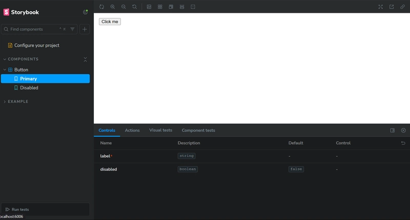
You’ll now see:
- A "Components" section
- Your Button component under it
- "Primary" and "Disabled" states rendered and clickable


Top comments (0)