
React Native comes with many in-built components that you can use to style cross-platform applications. Styling a mobile application is essential. I cannot put enough emphasis on how important it is for a mobile app to have a pleasing design and good use of colors can be provide a better user experience. Without a polished user interface, a potential user will be repelled by the lack of design in the mobile app.
React Native uses plain JavaScript to style. In this tutorial, you are going to explore different ways to style a React Native app by getting some hands-on experience and learning tips along the way.
Introduction
React Native uses JavaScript to style, if you have some experience with the CSS of the web, you know that styling a component is nothing more than writing code by using proper styling syntax. If you do not have any idea what CSS is, stop right here as there would be no advantage for you reading this tutorial. You need to understand a bit of CSS to continue reading the tutorial below. If you understand what backgroundColor: 'blue’ means, then you are good to go.
React Native comes in with many built-in components. Each having its own specific set of styles. These specific styles may or may not be applicable to other components.
For example, Text component supports fontWeight whereas a View component does not. However, some of the styles are similar but not exactly the same. View supports shadowColor while Text supports textShadowColor. Lastly, you have to make note that there are a few platform-specific styles such as shadowPropTypesIOS.
Different Ways to Style a React Native App
There are different ways you can add styles to your React Native component. First one is inline styling. See the example below.
// inline example
import React from 'react';
import { View, Text } from 'react-native';

export default function App() {
  return (
    <View
      style={{
        flex: 1,
        justifyContent: 'center',
        alignItems: 'center',
        backgroundColor: 'blue'
      }}
    >
      <Text style={{ color: 'white', fontSize: 32 }}>Some Text</Text>
    </View>
  );
}
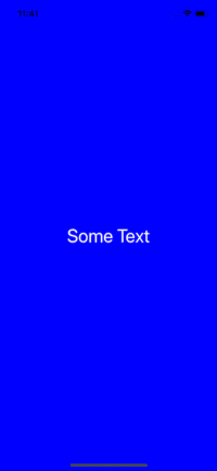
The result of the above code of snippet is following.
In the post Getting Started with React Native in 2019, I've described about StyleSheet object. It is the second way.
Available from React Native API, by importing and using StyleSheet, you create an object and refer to each style individually. This brings the separation of styles from the render method and helps you organize the code. Also, it promotes re-using styles across components.
// StyleSheet Example
import React from 'react';
import { View, Text, StyleSheet } from 'react-native';

export default function App() {
  return (
    <View style={styles.container}>
      <Text style={styles.bigText}>Some Text</Text>
    </View>
  );
}

const styles = StyleSheet.create({
  container: {
    flex: 1,
    justifyContent: 'center',
    alignItems: 'center',
    backgroundColor: 'blue'
  },
  bigText: {
    color: 'white',
    fontSize: 32
  }
});
This snippet of code will have the same effect on rendering on a mobile device. The only thing changed here is being separation of styles inside the component App with StyleSheet object. It takes a JavaScript object as it does above, and returns a new Stylesheet object from it. There are no classes or ids in React Native like in web development.
To create a new style object you use StyleSheet.create() method. Another advantage this way of styling React Native components hold is that when creating a new style object every time, StyleSheet helps to create style objects with an ID which is further used to reference instead of rendering the whole component again.
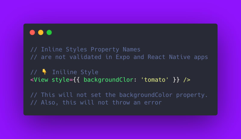
Another difference comes with inline styling is that an inline style property name, if misspelled, does not work and there is no error thrown for the misspelling.
However there is a valid style property check when styles are defined using StyleSheet.create().


Encapsulation of Styles
In React Native, styles are scoped to the component rather than the whole application. You have seen one preferred way of defining styles used commonly by the React Native community.
Another way to define styles is to organize your application code in such a way that it becomes easier to keep track of them when refactoring, or when the application starts to expand. In this second way, you declare all the styles related to a component in a separate file. Then import that styles file inside the component file. Here is an example for you. Create a new file next to the App.js called AppStyles.js.
// AppStyles.js
import { StyleSheet } from 'react-native';

export default StyleSheet.create({
  container: {
    flex: 1,
    justifyContent: 'center',
    alignItems: 'center',
    backgroundColor: 'blue'
  },
  bigText: {
    color: 'white',
    fontSize: 32
  }
});
Next step is to import this file inside App.js.
//App.js
import React from 'react';
import { View, Text } from 'react-native';

import styles from './AppStyles';

export default function App() {
  return (
    <View style={styles.container}>
      <Text style={styles.bigText}>Some Text</Text>
    </View>
  );
}
The demo runs and produces the same result as before. This separation of styles in a file other than the component file has its own advantages. It increases the reusability of other style objects.
Using arrays to pass styles
In inline styling, you must have observed that it is nothing but an object that starts with a style prop and an object is passed with key-value pairs. Similarly, you can use an array that can contain multiple key-value pairs as the value of the style prop.
import React, { Component } from 'react';
import { View, Text, StyleSheet } from 'react-native';

export default function App() {
  return (
    <View style={styles.container}>
      <Text style={[styles.bigText, styles.textYellow]}>Some Text</Text>
    </View>
  );
}

const styles = StyleSheet.create({
  container: {
    flex: 1,
    justifyContent: 'center',
    alignItems: 'center',
    backgroundColor: 'blue'
  },
  bigText: {
    color: 'white',
    fontSize: 32
  },
  textYellow: {
    color: 'yellow'
  }
});
The following is the result for the above snippet.

Do notice that, the last style passed in overrides the previous style when there is a duplicate color property.
Building an App: Dark/Light Themes
In this section, you are going to build a simple app called light/dark mode toggle. It contains a button with some text with a dark background of its own and a light colored background. When the user clicks the button, the background of the app changes to dark mode and the text on the button changes to light mode.
First, let us define styles for it. Open AppStyles.js the external styling file.
import { StyleSheet } from 'react-native';

const Colors = {
  light: 'white',
  dark: 'black'
};

const baseContainer = {
  flex: 1,
  justifyContent: 'center',
  alignItems: 'center'
};

const buttonBorderContainer = {
  justifyContent: 'center',
  alignItems: 'center',
  borderWidth: 3,
  height: 50,
  width: 150
};

const lightStyles = StyleSheet.create({
  container: {
    ...baseContainer,
    backgroundColor: Colors.light
  },
  button: {
    ...buttonBorderContainer,
    backgroundColor: Colors.dark
  }
});

const darkStyles = StyleSheet.create({
  container: {
    ...baseContainer,
    backgroundColor: Colors.dark
  },
  button: {
    ...buttonBorderContainer,
    backgroundColor: Colors.light
  }
});

export default function useTheme(darkTheme) {
  return darkTheme ? darkStyles : lightStyles;
}
A lot is going on here. First, the two different color variables are defined inside a single Colors object. Then, there are two different container objects, one for the background and one for the button.
Both of these container objects then re-used inside the StyleSheet objects, lightStyles and darkStyles. Similarly, to define the background color, we make re-use of the color object such that we do not have to write the value of each color twice.
Lastly, there is a function that gets exported that returns theme based upon a boolean value. Dark Theme’s value darkStyles is returned if its true otherwise light theme is returned.
The file AppStyles.js is a clear representation of structuring styles in a React Native app. This file is then imported inside the App.js that has the following content.
import React, { useState } from 'react';
import { View, Button } from 'react-native';

import useTheme from './AppStyles';

export default function App() {
  const [darkTheme, setDarkTheme] = useState(false);
  const styles = useTheme(darkTheme);

  const toggleTheme = () => {
    setDarkTheme(!darkTheme);
  };

  return (
    <View style={styles.container}>
      <View style={styles.button}>
        <Button title={'Click Me'} onPress={toggleTheme} />
      </View>
    </View>
  );
}
By defining the state, you can declare the default value of the dark theme to be false such as it allows the light theme to be the default. toggleTheme is the method that reverses the boolean value for the dark theme accordingly. Next, inside the render() you are passing the current value of dark theme from the state. This function is then used to apply the correct theme or set of styles based on the boolean value.
You can see this in action below.

- You can find the complete code for the example at this Expo Snack.
- A big thank you to Catalin Miron for proof reading it 🤗

Top comments (0)