
I made a portfolio to improve my chances of getting hired, it's pretty minimal highlighting the things I've done so far.
I would love to get feedback on things that I can improve on, also things that are annoying.
The website is made using nextJs, x-styled and react-spring. Designed using Figma, Hosted on now.sh.

Latest comments (27)
Hi Friend!
This looks nice, but as person who sometimes is participating in process of onboarding people to company where I work, I'd say this would impress me less than your profile at github, bloating with curious projects - some JS plugins, small games etc.
So I dare to advice thinking about this :)
Though such portfolio page may impress your clients if you are going to work as freelancer, doing similar portfolio pages for people and their small enterprises. This may be good of course.
Hi sir, honestly I agree with you on every aspect. I made this portfolio as a way to increase my chances of getting an interview. Though it doesn't reflect my love for solving software problems. I'll make sure to update it and maybe open source some of my old projects even though it's not perfect.
Oh, Friend, no need to call me "sir" please :)
This generally is the same for most developers you met on the web. "Colleague", "Friend", "Pal" or even "Dude" are ok :)
Please don't think I meant offence! It was just a kind of advice from friend developer who started like you, well, 12 years ago. Good luck! :)
No, your advice is really wholesome and I'll keep it in mind, thank you, friend! :)
Pretty Amazing
Hi Amine :) Great work!
A small suggestion would be that you make the navigation to stick even when scrolling to bottom. I think that 'contact' and other important sections of your website should always be visible to the visitor.
Also, I think that you should add a link in the navigation to your skills, I believe that everyone would first like to know your skills and what you can do.
Hope this helps. Cheers :)
Thank you for your suggestion, I made sure the navigation sticks like you said and will see what do about a skills section.
Fixed Thank you for your feedback.
Hey Amine,
That looks pretty good!
Here's my couple of cents:
Also, always when I go back from blog, I see the "loader" (three bars fading and going down). Try to think of something that'll check if the user comes from someplace else and show the loader only then.
Those are my thoughts. All these things are super minor. You did a great job and I am looking forward to seeing your next projects!
Without the logo it the navbar feels empty, so I figured out a little circle would balance it. Yes, I fixed the button font to match the resume and blog link.
I'll make sure to redesign the projects section the way Madza explained and maybe I'll add a footer.
And thank you for noticing the loader bug, I'll make sure to fix it. Thank you, sir!
Hey, maybe you should really have a logo? Like I've said, circle feels very generic.
Looks pretty good to start with! :)
Although, i would recommend some ideas for improvement:
1) Change font family for "resume" and "blog" in top nav to same you use in your pdf resume, make "contact" bold (and maybe try some darker shade for text from the palette you used).
2) I would remove "Hi, There" completely and add just "Hi, " in front of "I'm Amine Elouarti" in the same huge font.
3) Related to all the text below, stick with rounder and smoother fonts like "Quicksand" or "Comfortaa", to preserve the hero-area feel and try to stay in the same palette for text colors.
4) Add a medium size photo of yourself in round frame in "about me" section right above "Passionate about building immersive products" and decrease the font size a bit to fit both.
5) Put "education" panel right under "about me" section and leave it as it is.
6) Change "projects i worked on" title to "projects" and put it under education section and set background color to light green.
7) Also, in projects section remove all the colorful text, and use real screenshots (images) of your projects. Put the name of projects right above each description, using increased font size.
8) Remove the grey horizontal lines between panels. Switching between white and light green would look more clean and professional without them.
9) Increase the font size and weight of panel headings and make them stick out from the background (use some darker green shade on that light green background and a black one on the white background).
10) Consider making a subdomain for blog (blog.elouartinra.now.sh), leaving main page just as hero-area -> about me -> education -> projects -> contact. Link visitors to your blog domain via top nav.
11) Add some CSS media-breaks for smoother hero-area transitions between different display widths. Currently there is just one beak around 735px. Fix the margin of Say Hi button at the bottom on resize.
12) Check your sources in dev tools, resume.pdf.js is not found (404) in initial load (link to resume pdf directly via href) and also fix cookie issues noted in console.
13) Check typos (saw a few) and obviously add some JS for contact and blog navs to add functionality to scroll to their positions/pages and make contact lead to its form (work in progress, i guess).
Again, these are just subjective :)
Best of luck!
Hi Madza, thank you for this awesome response it really means a lot.
Here is some of the stuff I fixed:
TODO
Overall really thank you for your wholesome feedback, I fixed a lot of small things cuz of your comment. Thank you again!
I was bored, so i did mess around in dev tools a bit..
Here's a quick screen capture (put in on 1080p) of basic wire-framing:
drive.google.com/file/d/1SjpCEacS_...
Again, just an idea for inspiration,
Best of luck,
I think it looks amazing. The colours and minimalism are really nice. I especially like the headers where the text colour is that of an image.
Came here to say the same - love the effect of the headers looking like cutouts to an image
I'm glad that both of you guys liked the headers.
As Robin mentioned, it'd be good to slow down the transition on the initial text that shows up because otherwise it's easy to mix.
Typo in the tagline "throught solid" -> "through solid"
In resume "Experiences" -> "Experience"
On the main page, some sort of clear indicator that there is more below and that you need to scroll would be good (even it's it's just a small nicely styled arrow)
I would look for and remove anything that's negative self-reflection in your main page. Telling those stories (like getting low grades in design and then getting motivated by that to deeply study and improve) would be great blog posts/articles, but they are a bit harder to appreciate in a first impression, where I'd expect to see you highlighting your strengths.
Otherwise though, this is very nice! Well done.
Fixed the typos both website and resume, I rewrote the design part and I'll make sure to add a scroll indicator. Thank you for your feedback!
When the page is loaded, this text appears shortly. I recommend to make it a little bit slower to enable the visitor to read it propertly.
And also the second part of the sentence appears twice.
Besides that I like it :)
Thank you sir, I think it's fixed now.
I just checked, yes it's fixed now :)
I really like it! I love the color scheme, and animations.
You just need to remove the '#' from the Blog section's id. The Blog menu link isn't working because of that.
I double on this. If link is not working then it's better for everyone to remove it
I fixed the blog link, it's functional now, Thank you for your feedback.
Hey I just saw that your Resume page has the title "Jamie Chastain"
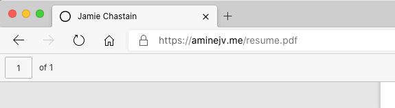
Thank you for catching this, I'll fix it in the weekend