
Spotify Chrome Extension - UI
This is Phase Two of a multi-phase project where we build a Spotify Chrome Extension powered by ReactJS that allows us to control the user's Spotify session
Phase One can be found here.
This tutorial assumes you know how Google Chrome Extensions work. Learn more here.
We're going to start by setting up our developer environment.
We have a boiler-plate React-Chrome Extension up and running;
if you don't know what that is, see above.
We're going to take this basic setup and modify it.
We need to do 3 things:
- organize our file structure
- update the manifest.json
- install some more packages and update the webpack.config
1.
We'll just create 'images' and 'fonts' folders.
Add the assets from Phase One and the font(.woff) file for the project.
We're using the 'Old School Adventures' font. (it'll be in the repo)
2.
Let's update the manifest.json.
We're going to add a background script, 'hasher_and_encoder.js', that we'll use when we build the back-end later.
We'll add some permissions as well as some 'web accessible resources'.
This will allow us to link to our image files from a foreground script later on.
// manifest.json

{
    "name": "Chrome Extension - Spotify Player",
    "description": "Building a Spotify player controller using ReactJS and Chrome Extension.",
    "version": "0.1.0",
    "manifest_version": 2,
    "icons": {
        "16": "./images/obj-16x16.png",
        "32": "./images/obj-32x32.png",
        "48": "./images/obj-48x48.png",
        "128": "./images/obj-128x128.png"
    },
    "background": {
        "scripts": [
            "./background.js",
            "./hasher_and_encoder.js"
        ]
    },
    "options_page": "./options.html",
    "browser_action": {
        "default_popup": "popup.html"
    },
    "permissions": [
        "[http://*/*](http://*/*)",
        "[https://*/*](https://*/*)",
        "tabs",
        "identity",
        "[https://api.spotify.com/*](https://api.spotify.com/*)",
        "storage"
    ],
    "web_accessible_resources": [
        "*.png",
        "*.gif"
    ]
}
3.
To complete the setup, we're going to install some additional packages then we'll make sure webpack knows how to handle our new file structure.
We need to install the 'style-loader', 'css-loader', and 'file-loader'.
npm install --save-dev style-loader css-loader file-loader
In the webpack.config we'll add two more rules:
- css files get handled by the 'style-loader' and 'css-loader'
- woff font files get handled by the 'file-loader'
We need to update our 'CopyWebpackPlugin' also.
Instead of targeting specific image types, we'll just copy the entire images folder; and we'll just add an entry for the 'hasher_and_encoder.js' library as well. (you can view all of the files using the repo at the end of the write-up)
Finally, we need to make a quick change to our inject script.
We'll take out the line that attaches our 'foreground.bundle.js'.
If not, this causes can error later.
Ok, we have our environment setup. Let's start creating the UI.
I'm not going to walk you through every line of CSS in this app; there's a lot.
I will explain the important parts, specifically the design philosophy behind each part of our extension.
- the foreground app
- the options app
- the popup app
…and I refer to them as apps, because they're all written in ReactJS, operate independently from one another, and operate like any ReactJS app.
We simply use the Chrome extension to coordinate communication between these apps.
Let's start with the largest of the three: the 'Foreground' app.
The design philosophy is this:
The app is anchored to the bottom right of our page.
There is one main container for all of the components; this is the 'Foreground' component.
Any page we want to display is considered a 'sub-container'.
For this app we have two pages:
- the cassette player or 'Player' component
- the 'LoadingPage' component
The 'Player' is broken up into three components:
- 'Ticker' — displays the current song being played
- 'PlayerBody' — which shows the different gifs of the player: play, pause, load
- 'PlayerButtons' — html div elements we use to control the player: show/hide; play/pause; next track; previous track
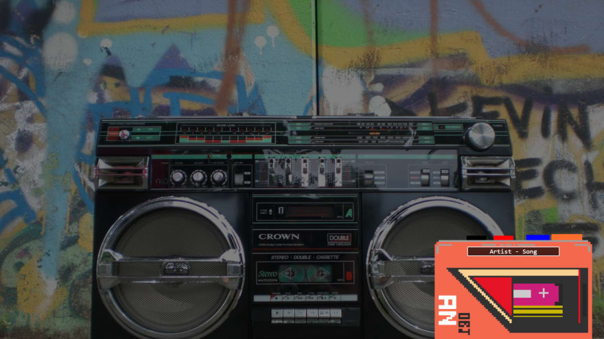
The 'LoadingPage' is one simple component styled as a 'sub-container' like our 'Player'.
It simply shows a gif **with the text 'loading…**'
Let's move on to our 'Options' app.
The design philosophy is this:
The app has the same parent as our cassette 'Player', the 'Foreground' component.
We won't do it now, but eventually we'll copy our entire 'Foreground' component and paste it as the option page's parent.
We do this because we want the options page to have access to the same state as our cassette player.
This will make more sense when we actually do it later on in this series.
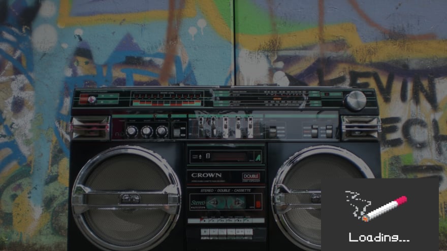
For now, we create a generic 'Options' component and in the actual 'OptionsPage' add a 'Deck' component that houses the image for our cassette player.
Let's finish this out with our 'Popup' app.
The design philosophy is this:
A simple one component app that shows a 'sign in' or 'sign out' button based on the user's status.

So we have the basic scaffolding done for our app.
You can find the source files for this Phase here.
In the next phase we'll start implementing state.
If you want a more in-depth guide, check out my full video tutorial on YouTube, An Object Is A.
Build a Cyberpunk 2077-inspired Spotify Controller - Phase 2

Latest comments (0)