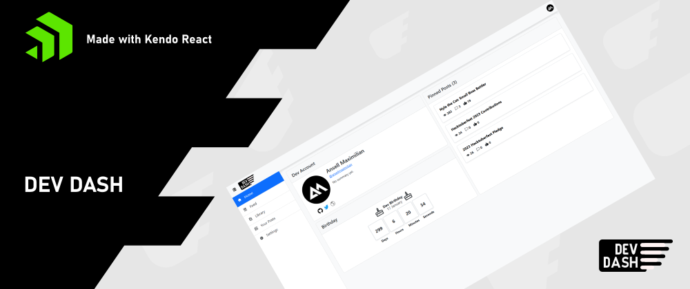
This is a submission for the KendoReact Free Components Challenge.
What I Built
When scrolling through the Kendo React docs, I thought this component list would be perfect for an app that focuses on data. Dev.to just so happens to provide an API for me to fetch its data. And I thought it would be fitting, given where this challenge is happening.
So, I built Dev Dash. It's basically a simple redesign version of Dev.to, but I also attempted to extend it with some unique features not present in the original website, with the help of Kendo React. I was however limited by the API itself.
You would login, submit a Dev.to API key, which you could find here. Then, you'll be able to use Dev Dash's features, which are:
Dashboard
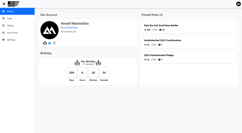
Here, you'll see a some basic data about the currently authenticated Dev user (through the API key), like name, username, profile picture, etc. There's even a countdown to your next birthday celebrating when you joined Dev.to.
Here's where Kendo React will do the heavy lifting. I've arranged the dashboard in what's called a TileLayout. It's super cool! With just a little bit of setup, you can have a layout composed of tiles which you can rearrange and even resize.
I added to this by automatically saving the arrangement of the dashboard every time a change happens. So that when you go back to this later, it will remember your setup and you won't have to rearrange and resize the tiles.
Feed
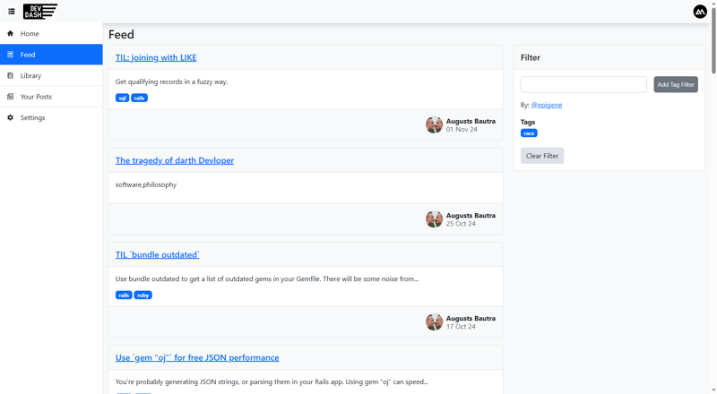
This is just your regular feed, as seen in the original Dev.to site, with a couple easy filtering features, by username or by tags.
The star in my opinion is the Card component. I didn't have to much. I just plopped <Card/> along with its accompanying components such as <CardHeader/> and <CardFooter/>.
Your Posts
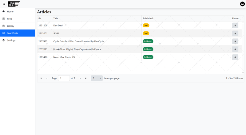
Here you'll see your posts, published or unpublished. I use Data Grid along with a Pager for pagination.
Here you'll view a paginated list of your posts and you'll also be able to pin your favorite uploads, which then will be displayed in your dashboard.
Now, Data Grid is available in the free tier. But there are many premium features you can add to with with a license. I actually used one particular premium feature just for comparison. And that feature is custom cell renderer. I use this to insert a "pin" button into a column for each row.
Library Feature
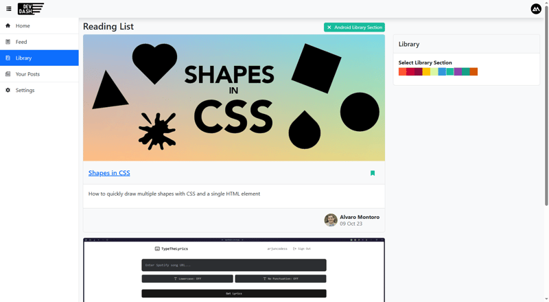
This section is where I extend upon what's already available through Dev.to by allowing users to organize their reading list by "library sections", identified by color and name.
I use the ColorPalette component so the user can choose from a list of colors and create a library section for you to put your reading list items in.
Demo
KendoReact Experience
Overall I really enjoyed recreating and extending Dev.to using Kendo React. I probably worked on this for about a week. And while there are a lot of things that I to implement that I didn't get to deploy, I feel like I did a lot in the timeframe I developed in.
It's definitely thanks to the very complete list of ready free components by Kendo React. I was expecting the free tier to be less extensive to be honest but was very pleasantly surprised.
I would also like to mention how easy it was switch themes. First I used the default, then I opted for Bootstrap. All it took was changing one line.
Here are the list of free components and how I used them (as well as how I feel about them):
Buttons
Of course we have buttons. I used these all over the place. Here's some unique features that I used that I really liked:
- Toggleable buttons
- Easily adding icons into a button by just supplying a prop into the component without worrying of putting classes for flex, etc.
- Separating
themeColor(primary, secondary, etc.) andfillMode(flat, outline, etc.)
Loader
I also used these everywhere. I like it. I used the large version when loading a whole page and the small version to load independent components within a page.
SvgIcon
This was really useful. There's a whole lot of icons available as SVGs. It could be expanded, but 95% of my icon needs I got from this.
TextBox
Kendo React provides a lot of versions of text inputs; however I got all I needed from TextBox.
AppBar
I love the associated AppBarSpacer component. It's really useful for arranging your AppBar without much work.
Drawer
This is really useful for navigation. The setup is easy. And of course: I like that I don't have to do much to achieve a collapsible sidebar!
Avatar
Standard avatar component. I didn't use any of the special properties Kendo React provided, but it was good enough to display the user's profile picture at the end of the AppBar.
Popup
I used this for showing extra info as well as a logout button when a user clicks on their avatar on the app bar.
Again, the it serves its purpose because I don't want to have to deal with anchoring things in elements; and this allowed me to avoid exactly that. That's always a plus.
Card
Standard card component with its associated child components such as CardHeader and CardFooter made it easy to display posts and related info.
TileLayout
This is by far my favorite component that I discovered while developing this application.
Using a tile layout you can separate your display into multiple tiles, and each individual tile can be rearranged and resized. I took it even further by allowing users to save their configuration in the cloud.
I think this makes configurable dashboards really easy.
Autocomplete
Standard auto complete component. No complaints.
Skeleton
Same with the skeleton components. Though I did notice there were a lot of variations, so that's a +.
ColorPalette
There are many available color input components. This is the one I chose. Simple. I like it.
Dialog
Standard dialog. No complaints.
Data Grid
The free version I think is good enough. I used a custom cell renderer, which was a premium function.
Pager
Free pagination tools. Cool!
TabStrip
Tab layout. No complaints.

Top comments (0)