
June 27, 2024: This blog post uses Amplify Gen 1, if you're starting a new Amplify app I recommend trying out Gen 2!
We've been releasing a lot of great new features on AWS Amplify Studio since we launched the developer preview at Re:Invent. I wanted to take this opportunity to show some of these features, and build something a little more feature rich.
1. Create your data model
Head to the Amplify Console and select build a new app.

Once your Studio instance is deployed, click "Launch Studio". Then, once in Studio, click "Data" under "Set up" on the left panel. We'll create two data models: Post and User. Post will have three fields: "content", "postedAt", and "likes". Likes will be an integer, postedAt an AWSDateTime, and content a string. User will have three fields as well: "profilePic" an AWSURL, handle, and name - the last two will remain Strings.
The data will also be related - a Post will have one User - or a 1:1 relationship.

Click "Save and Deploy" once you've added all the fields!
2. Add Starter Data
Once your data model has finished deploying, head to the "Content" tab under "Manage" on the left navigation. Create a few users and Posts using the form. Make sure your Posts have users tied to them!
3. Customize your component in Figma
Head to the AWS Amplify UI Kit. Duplicate the Figma file to your account, and then head to the "My Components" page. You'll see a "SocialB" card which we will modify for our app.
I'll make a few modification:
- Remove the share actions other than the like button
- Remove the
Lorem ipsum - Bold the "Author"
- Remove the "Danny liked this" row
-
Group the
bodyandsharegroups into a group calledCardContent
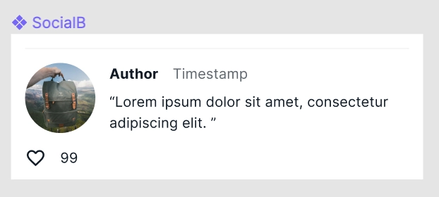
When you're done, your card should look like this:
Then, in Studio, head to the "UI Library" page. Click "Get Started" and paste in the link to your Figma file. Then accept all of your components.
4. Link UI to Data
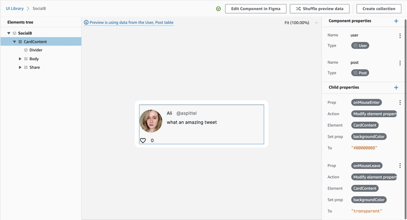
Once your components are loaded into Studio, head to the "SocialB" component. We will tie our component to data. First, click the Lorem Ipsum text. Then, set the label prop to post.content.
Set the Author label to user.name. Set the 99 label to post.likes. Set the src of the image to user.profilePic.
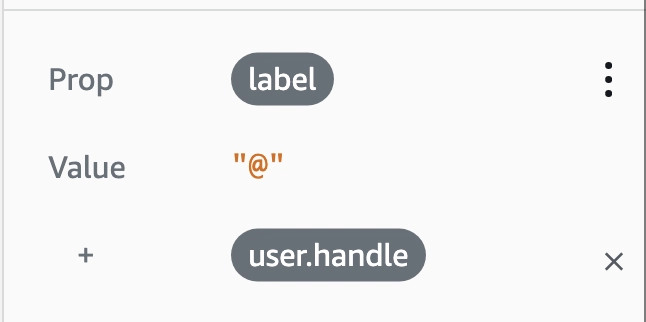
For the Timestamp we'll add in the user's handle. Set the Prop label to "@" then select "concatenate" then choose user.handle.
Let's add a link to the "Author" text. Type in the prop as first, and set it to a. This will make the text into an . Then, let's set the href prop to "/users/" + user.id. This will make it so the author text would link to the user's profile! I won't set up actual routing for this app, but I wanted to display how to set up a link anyways.

5. Add Events in Studio
You can also add actions to elements in Studio - select the CardContent group, we'll make the social media post grey whenever it's hovered.
Select the prop onMouseEnter. Set the action to Modify element property. Set prop backgroundColor to #00000008. Repeat for onMouseLeave but this time set the background color to transparent.
You can also add onClick and other events to create data!
6. Implement Local Code
Now let's move to our local development environment. First, create a React App locally npx create-react-app tweettweet. Then, click "local setup instructions" in Studio and run the generated amplify pull command locally. Install the Amplify libraries: npm i @aws-amplify/ui-react aws-amplify.
Open up your index.js and add the following:
import '@aws-amplify/ui-react/styles.css'
import config from './aws-exports'
import { Amplify } from 'aws-amplify'

import { AmplifyProvider } from '@aws-amplify/ui-react'

Amplify.configure(config)
This will configure Amplify for your app and import the needed CSS for the UI components. Then, in your render add the AmplifyProvider component for styling.
ReactDOM.render(
  <AmplifyProvider>
    <App />
  </AmplifyProvider>,
  document.getElementById('root')
)
Import the fonts in your index.css:
@import url('https://fonts.googleapis.com/css2?family=Inter:slnt,wght@-10..0,100..900&display=swap');
Now, go to your App.js file, where we'll write our logic code! Let's first add a function to query for all of our posts. Import DataStore and your models. We'll also import our SocialB component that was generated by Amplify.
import { DataStore } from 'aws-amplify'

import { Post, User } from './models'

import { useEffect, useState } from 'react'
import { SocialB } from './ui-components'
Also, import the needed React Hooks:
import { useEffect, useState } from 'react'
Let's write a function to query for Posts within our App component.
const [posts, setPosts] = useState([])

const getPosts = async () => {
  const data = await DataStore.query(Post)
  setPosts(data)
}
We'll call this function within our useEffect:
useEffect(() => {
  getPosts()
}, [])
Note: if you don't have related data, you can use Studio to create a data collection and pull data automatically
Now, let's map through the posts and create SocialB instances for each. We'll pass each post to the component, the user as the post.User, and the key being the post's id.
  return (
    <div className='App'>
      {posts.map(post => (
        <SocialB
          post={post}
          key={post.id}
          user={post.User}
        />))}
    </div>
  )
}
Now let's make the like button work! You can pass an override object to the generated components. Pass the Figma name of a subcomponent to pass a prop to that item directly - you can see these by going to the component's generated file and see the key passed as an argument to getOverrideProps.
In this case, I'll send an onClick event to the Share subcomponent. This onClick will modify the post's like count. We'll also need to pass the getPosts function as a prop so that we can trigger that and update the UI.
{posts.map(post => (
  <SocialB
    post={post}
    key={post.id}
    user={post.User}
    overrides={{
      getPosts,
      Share: {
        onClick: async e => {
          e.preventDefault()
          const postToChange = await DataStore.query(Post, post.id)
          await DataStore.save(Post.copyOf(postToChange, updated => {
            updated.likes += 1
          }))
          getPosts()
        }
      }
    }
  }
/>))}
Now your timeline should display all posts, and you should be able to update the like count by clicking the heart!
Conclusion
In this post, we built out a social media timeline with hover actions, onClick events, related data, and linking. I would love to hear your feedback as you build with Amplify, especially since Studio is still in developer preview at the time of this writing!

Top comments (5)
Amazing 👏🏽
Great article!
I'd like to translate this article into Japanese language and post to qiita.com.
Sure, I'm going to mention this article in my post.
Is it okay?
Hey, I'm okay with it as long as you put the canonical url as this post for SEO reasons.
Thanks a lot.