
In the previous article: Catching and handling errors in Angular, we handled errors coming from Http responses, and RxJS operators, by throwing it back to the consumer, to let each consumer handle it differently. Today, we are going to create a component for Toast messages, which could potentially be used for error handling.
The final project can be found on StackBlitz. Find in components/list.partial.ts an example use of the catchError, click on "transactions" in the navigation to see it at work. Also see components/form.partial.ts for another example.
What a toast!
Let's start simple. Really simple: add a component to app.component root, and control a few things about it.
@Component({
    selector: 'gr-toast',
    template: `
      <div class="toast">
        <div class="text">text here</div>
        <button>Dismiss</button>
      </div>
    `,
    changeDetection: ChangeDetectionStrategy.OnPush,
    styleUrls: ['./toast.css'],
})
export class ToastPartialComponent  {
    constructor() {

    }
}
This will be appended to body, manually:
<!--  in app.component.html -->
<gr-toast></gr-toast>

<!--  and in app.module, add a declaration, this will end in Angular 14, hopefully -->
Let's give it minimal style just to be able to work with it:
/* basic css for the toast */
.toast {
  border-radius: 5px;
  max-width: 80vw;
  display: flex;
  flex-wrap: nowrap;
  align-items: center;
  justify-content: space-between;
  background-color: #263238;
  color: #fff;
  position: fixed;
  bottom: 10px;
  left: 10px;
  font-size: 90%;
  z-index: 5100;
}
.text {
  padding: 20px;
  flex-basis: 100%;
  margin-right: 10px;
}

button {
  padding: 20px;
  cursor: pointer;
  font-weight: bold;
  color: inherit;
}
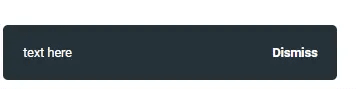
It looks like this in the bottom left corner.
In order to access the visibility of the toast anywhere, it needs to be handled by a service provided in root. The service in its simplest form, has an internal subject, exposed as an observable, that changes its content from 'null' to 'something'.
We can later turn this into a state service we built in RxJS State Management.
The service is as follows:
import { Injectable } from '@angular/core';
import { BehaviorSubject, Observable } from 'rxjs';

// the simple model will become bigger as wel move on
export interface IToast {
    text?: string;
}

@Injectable({ providedIn: 'root' })
export class Toast {
  // internal subject to control the state
  private toast: BehaviorSubject<IToast | null> = new BehaviorSubject(null);
  toast$: Observable<IToast | null> = this.toast.asObservable();

 // show, simply updates the state to something
  Show(text: string) {
    this.toast.next({ text: text });
  }
  // hide, simple updates the state to null
  Hide() {
    this.toast.next(null);
  }
}
Then in the toast template, we watch the toast state:
@Component({
  selector: 'gr-toast',
  // in template watch the toast observable for null values to hide all
  template: `
    <ng-container *ngIf="toastState.toast$ | async as toast">
      <div class="toast">
        <div class="text">{{ toast.text }} </div>
        <!-- on click, hide the toast -->
        <button (click)="toastState.Hide()">Dismiss</span>
      </div>
    </ng-container>
    `,
  changeDetection: ChangeDetectionStrategy.OnPush,
  styleUrls: ['./toast.css'],
})
export class ToastPartialComponent {
  // inject the state
  constructor(public toastState: Toast) {}
}
Showing and hiding in any component is as simple as:
this.toast.Show('hello world');
Does it look too simple? It is. On purpose.
So now, back to our RxJS caught and unhandled error. The end result looked like this:
// in a component that uses the custom operator to unify the error model:
getProjects() {
  this.projects$ = this.projectService.GetProjects().pipe(
    catchError(error => {
      // here we use our toast, we pass the code only
      this.toast.Show(error.code);

      // then continue, nullifying
      return of(null);
    })
  )
}
So we know now that the first argument should be a code, which translates to a message.
Text resources
A code that translates a message? That looks like resources. As I previously stated in SEO service, I steer away from i18n package, and create my own resources file. We are going to build on top of this, but with a slight change. Since the codes come back from the server, we want to have two things:
- An "unknown" generic text for codes that cannot be found
- A fallback message in case we want the fallback to be specific to some cases
// under root/locale/resources.ts, lets add a few codes
export const keys = {
  // an unknown key to fall back to
  Unknown:
    'Oops! We could not perform the required action for some reason. We are looking into it right now.',
  // an empty one just in case
  NoRes: '', // if resource is not found
  // some generic keys of our choice
  Required: 'Required',
  Error: 'An error occurred',
  DONE: 'Done',
  // some specific ones
  UNAUTHORIZED: 'Login or register first.',
  INVALID_VALUE: 'Value entered is not within the range allowed',

  // mapping from server or API
  PROJECT_ADD_FAILED: 'Server did not like this project',
};
The Show method is written with that in mind:
// Toast show method takes code, and fallback
Show(code: string, fallback?: string) {
  // get message from code, keys is found in locale/resources.ts
  let message = keys[code];
  // if it does not exist, fall back message
  if (!message) {
    // if fallback is not provided, return unknown
    message = fallback || keys.Unknown;
  }
  this.toast.next({ text: message });
}
This pattern of finding a key first then falling back, is used anywhere resources are used. It decouples the codes from resources, making it more common to have "unknowns". But, because it decouples them, it is more forgiving during development, when we really have no idea what codes to expect from the server. So, do the following, at your own risk (it is my personal choice):
Resources class
Let's put this pattern in its own class:
import { keys } from '../../locale/resources';

// a simple class that translates resources into actual messages
export class Res {
  public static Get(key: string, fallback?: string): string {
    // get message from key
    if (keys[key]) {
      return keys[key];
    }
    // if not found, fallback, if not provided return NoRes
    return fallback || keys.NoRes;
  }
}
Now we can use it anywhere like this
Res.Get('Invalid_Email');
Or if the code is more unpredictable
Res.Get(serverCode, 'Use this message instead');
And since the second argument is also text, we can choose an existing resource to replace it
Res.Get(serverCode, keys.Unknown);
And that is what we will be using for the toast, in addition to exposing the fallback. Back to our Show method, this should be the most flexible and all rounded way of deciding the message.
Show(code: string, fallback?: string) {
  // use code, then use fallback, then use keys.Unknown
  const message = Res.Get(code, fallback || keys.Unknown);
  this.toast.next({ text: message });
}
Error handling specifics
The toast so far, is a generic tool, we can use directly to display errors in components:
create(project: Partial<IProject>) {
  // we can catch errors in "error" body or as an operator to RxJS pipe
  this.projectService.CreateProject(project).subscribe({
    next: (data) => {
      console.log(data?.id);
    },
    error: (error: IUiError) => {
      // this needs a bit more information, specifically style
      // also error may not have 'code'
      this.toast.Show(error.code);
    }
  });
}

// in a simpler non-subscribing observable
getProjects() {
  this.projects$ = this.projectService.GetProjects().pipe(
    catchError((error:IUiError) => {
      // same as above
      this.toastShow(error.code);
      // then continue, nullifying, remember here to account for "null" values
      // in the component consuming this observable
      return of(null);
    })
  )
}
This will become a pattern, so let's reduce the size and take it away from component:
catchError(e=>this.toast.HandleUiError(e[, fallBack]))
Also, we need to take care of the final gate of error handling, what if the error is not a UiError? What if it's a JavaScript error? In the toast state service, we add this new HandleUiError method, and a final re-throw:
export class Toast {
  // ...

  // show code then return null
  HandleUiError(error: IUiError, fallback?: string): Observable<any> {
    // if error.code exists it is our error
    if (error.code) {
      this.Show(error.code, fallback);
      return of(null);
    } else {
      // else, throw it back to Angular Error Service, this is a JS error
      return throwError(() => error);
    }
  }
}
Are all errors equal?
As we move on and create styling, we'd think that all toasts coming from catchError statements are red failures. But are they all so? From a UI perspective, definitely not. Consider the following use cases
Add member by email
A feature allowing admins to add new users by their email, a good API would have (at least) two points:
- Create new user:
POST users/with a little more than just email - Add member:
POST members/with user ID, or email, which can be preceded by "find user by email".
As developers we would start with adding a member by email. If the email does not exist, it will return an error of 404. The UI only needs to build on top of it, by allowing admin to continue to fill out other fields. The message, if any, in this case; is not an error, but information.The message, if any, in this case; is not an error, but information.
A timed out user
The server may return an error of 401 or 403 which is not terminal. The message in this case is not an error, but informative, with a "re-login" button, or in a more severe case, a redirect.
Let's add style first, and see how we can adapt.
Styling
There will be repetitive patterns to show the red box, the yellow box, the green box, and so on.
this.toast.ShowError
this.toast.ShowWarning
this.toast.ShowSuccess
this.toast.Show (default)
We'll add those repetitive functions in the state service. Since we have extra options, the fallback text will be merged into text option.
// adapt the toast state service to have options as a second argument
// fallback message is now part of options
  Show(code: string, options?: IToast): void {
    // get message from code
    const message = Res.Get(code, options?.text || keys.Unknown);
    // pass options
    this.toast.next({...options, text: message})
  }

// shortcuts for specific styles, replace fallback with options
  ShowError(code: string, options?: IToast) {
    this.Show(code, { extracss: 'error', ...options });
  }
  ShowSuccess(code: string, options?: IToast) {
    this.Show(code, { extracss: 'success', ...options });
  }
  ShowWarning(code: string, options?: IToast) {
    this.Show(code, { extracss: 'warning', ...options });
  }

  // replace fallback here as well
  HandleUiError(error: IUiError, options?: IToast): Observable<any> {
    // if error.code exists it is our error
    if (error.code) {
      this.Show(error.code, options);
      return of(null);
    } else {
      // else, throw it back to Angular Error Service, this is a JS error
      return throwError(() => error);
    }
  }

  // using it is now like this
  // this.toast.Show('SomeCode', {text: 'fallback message'});
In our css file
/* add to toast.css */
.toast.warning {
  background-color: var(--yellow);
  color: #263238;
}
.toast.error {
  background-color: var(--red);
}
.toast.success {
  background-color: var(--green);
}
In our toast component template
<div class="toast {{toast.extracss}}">
But we want "toast" to be adapted, and we want it defaulted as well. To accomplish that, we need a default options variable in state service
// in toast state service
 private defaultOptions: IToast = {
    css: 'toast',
    extracss: '',
    text: '',
  };

  Show(code: string, options?: IToast) {
    // extend default options
    const _options: IToast = { ...this.defaultOptions, ...options };

    const message = Res.Get(code, options?.text || keys.Unknown);
    this.toast.next({ ..._options, text: message });
  }
In our toast component template
<div class="{{ toast.css }} {{toast.extracss}}">
With all these gadgets in, creating a very specific and dynamic warning message looks like this
// extreme case of a warning when an upload file is too large
const size = Config.Upload.MaximumSize;
this.toast.ShowWarning(
  // empty code to fallback
  '',
  // fallback to a dynamically created message
  { text: Res.Get('FILE_LARGE').replace('$0', size)}
);

// where FILE_LARGE is:
// FILE_LARGE: 'The size of the file is larger than the specified limit ($0 KB)'
Http status errors
Back to our consumer component, where error is caught. We have the following possible outcome in an example "get project" function:
getProjects() {
  this.projects$ = this.projectService.GetProjects().pipe(
    catchError(error => {
     // what is the error? is it 404? or 401?
     if (error.status === 400){
      this.toast.ShowError(error.code);
     }
     if (error.status === 404) {
       // ignore code from server
       this.toast.ShowWarning('PROJECT_NOT_FOUND');
     }
     if ([401, 403].includes(error.status)){
       // ignore codes and always show unauthorized
       // and in the future also pass a button to login
       this.toast.Show('UNAUTHORIZED', {button: 'TODO'} );
       // or simply log out
       this.authService.logout();
     }
     // and other error statuses...
     // then continue, nullifying
     return of(null);
    })
  )
}
Note: if we place the toast component in the root app, redirecting to login will not make it disappear, which is exactly what we want, if you redirect to a route that does not have the toast component, there is no point showing it, because it will be removed.
That is one way to take care of the problem. It is a pattern though, we should move that too to our state service. And while at it, we should create buttons interface.
// rewriting HandleUiError
 HandleUiError(error: IUiError, options?: IToast): Observable<any> {
    if (error.code) {
      // do a switch case for specific errors
      switch (error.status) {
        case 500:
          // terrible error, code always unknown
          this.ShowError('Unknown', options);
          break;
        case 400:
          // server error
          this.ShowError(error.code, options);
          break;
        case 401:
        case 403:
          // auth error, just show a unified message, need to add options for button
          this.Show('UNAUTHORIZED', options);
          break;
        case 404:
          // thing does not exist, better let each component decide
          this.ShowWarning(error.code, options);
          break;
        default:
          // other errors
          this.ShowError(error.code, options);
      }
      return of(null);
    } else {
      return throwError(() => error);
    }
  }
Consuming this, is very flexible, here is the end result if I want to be specific about the 404 error:
getProjects() {
  this.projects$ = this.projectService.GetProjects().pipe(
    catchError((error) => {
      // you could override the extracss, or fallback text
      // this.toast.HandleUiError(error, { extracss: 'warning' })
      // but if 404, i want a different code
      if (error.status === 404) {
        error.code = 'PROJECT_NOT_FOUND';
      }
      return this.toast.HandleUiError(error);
    });
}
We can now do any kind of specific combination, here is our previous scenario of adding a member, a user 404 is not an error:
// example of handling 404 differently
assignMember() {
  this.user$ = this.userService.GetUser('email@something.com').pipe(
    catchError((error) => {
      if (error.status !== 404) {
        return this.toast.HandleUiError(error);
      }
      // a 404 means new user needs to be created
      // may be a toast of that? optional
      this.toast.Show('ADDING_NEW_USER');
      // return new user object and continue
      return of({email: 'email@something.com'});
    });
}
You can be more specific to the needs of the project you're working on. So keep an eye on repeating patterns, and take care of them.
Action buttons
Last but not least, we need to expose buttons to allow for buttons other than "dismiss". First, let's add the buttons to the template, and pass the click event:
<!-- in toast template -->
 <div class="{{toast.css}} {{toast.extracss}}">
  <div class="text">{{ toast.text }} </div>
  <div class="buttons" *ngIf="toast.buttons.length">
    <!-- TODO: add buttons collection to model, and click handler prop -->
      <button *ngFor="let button of toast.buttons"
       [class]="button.css"
       (click)="button.click($event)"
      >{{button.text}}</button>
  </div>
</div>
In the toast model, we add the buttons collection, each button is an element with at least text and css, and a click method:
export interface IToast {
  text?: string;
  css?: string; // basic css, defaults to toast
  extracss?: string; // extra styling
  buttons?: IToastButton[]; // action buttons
}

export interface IToastButton {
  text: string;
  css?: string;
  // and a click handler
  click?: (event: MouseEvent) => void;
}
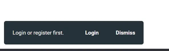
In our consumer component, for example, the Login to continue scenario, let's add a button to login in the toast.
// inside a catchError operator
 return this.toast.HandleUiError(error, {
  buttons: [
    {
      text: 'Login', // better use resources keys
      click: (event) => {
        // route to login then close toast
        this.router.navigateByUrl('/login');
        this.toast.Hide();
      }
    }
  ],
});
We can also create the dismiss button by default. The safest way to optionally add it, is to expose the dismiss button, and treat it like any other button. In the toast state service:
// public dismiss button
dismissButton = {
  css: 'btn-close',
  text: keys.DISMISS,
  click: (event: MouseEvent) => {
    this.Hide();
  },
};

// added to default options
private defaultOptions: IToast = {
  css: 'toast',
  extracss: '',
  text: '',
  // add dismiss by default
  buttons: [this.dismissButton]
};
Back to our consuming component where we want to add the two buttons:
// inside a catchError operator
return this.toast.HandleUiError(error, {
  buttons: [
    {
      text: 'Login',
      click: (event) => {
        // route to login then close toast
        this.router.navigateByUrl('/login');
        this.toast.Hide();
      }
    },
    // add dismiss as well
    this.toast.dismissButton
  ]
});
Sligh addition to the CSS to cater for the new buttons:
/*allow multiple buttons to appear on one line*/
.buttons {
  display: flex;
}
Auto hide
Toasts are supposed to auto hide after a while, but that shall wait till next week. Thank you for reading this far, and let me know if you spotted the spider in the corner.
The final project is found on StackBlitz.

Top comments (0)