Grabbing potential customers’ attention quickly is critical for a landing page. Cool App is a stunning, responsive landing page in the form of a free App Blueprint.
App Blueprints are more than just templates from which to build a specific type of application. We design all of our free App Blueprints to provide one or more key functions that a developer would want to add to their application, regardless of the app’s business use.
Cool App showcases several elements common to modern landing page design. The app can easily be published as a single-page website to act as your main app’s landing page.
As with all of our App Blueprints, the entirety of this blueprint is built without code using Backendless’ UI Builder.
The Cool App Blueprint is a great example of UI Themes in action. Themes utilize CSS Less to produce complex visuals on the page, such as the color gradient used for the app’s primary background.
In this article, we will explore the basics of this app’s functionality (click the link to jump to the appropriate section):
- Implementing UI Themes featuring LESS Mixins
- Add a loading spinner while your app loads
- Using animations on your text
- Creating a slider in UI Builder
- Delivering database-driven content
Additionally, all App Blueprints include thorough instructions to guide you through how to make your own modifications and customizations.
The web app, which functions identically to a website, can be purchased for free when creating a new app in Backendless Console. It features a beautiful, responsive design that will look great on any size screen.
Click here to view the live demo and follow along (opens in a new tab).
Implementing UI Themes featuring LESS Mixins
Cool app takes full advantage of Themes in UI Builder, implementing multiple LESS functions and Mixins to achieve beautiful results. You can learn more about Themes in the video below.
In fact, the primary background “image” for the app is a LESS Mixin function called linear-gradient, You can find this function, and explore other Themes added to the app, under the THEME tab in UI Builder.
You can learn more about this specific function here.
Add a loading spinner while your app loads
Another function added via Themes is the preload spinner. You can view the CSS used to achieve this effect at the Theme Extension called preloader.
The beauty of this extension is that if provides a spinner during app loading without using a spinner component. Instead, the spinner is generated using CSS, giving you the ability to choose from countless spinner animations that have been created by developers across the world.
Using animations on your text
Cool App has two instances where text is animated when it appears on the screen. These can be found in the “Ratings and Reviews” section and “Pricing Plans” section.
In order to achieve this effect, we utilize custom functions, one of which is shown below. This function activates the counter and increments up until the chosen rating (in this case, 4.9) is reached.
Of course, we don’t want this function to activate when the page loads, because then the user wouldn’t see it (as it’s 2/3 of the way down the page). So we have logic on the Page component that triggers on page scroll.
When the user reaches a point between 4000 and 5200 pixels from the top of the page, the custom ratingCounter function is triggered, showing the user the animation.
Creating a slider in UI Builder
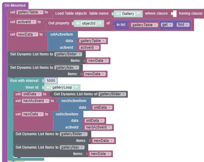
Sliders are a common element on a landing page because they are a great, eye-catching way to show multiple images or items without cluttering the screen. While Backendless includes a slider component, in this Blueprint, we have a built a custom slider.
The slider involves multiple layers of logic to achieve the effect we want. In addition to the On Mounted logic (below), we have logic for the “dots” beneath the slider that show the slider’s progress and allow the user to skip between items.
Delivering database-driven content
Like most of our App Blueprints, a lot of the content in Cool App is delivered from the database. The benefit of this philosophy is that you can easily modify your content from your database rather than updating the app frontend.
This allows you to easily make small changes and updates without having to publish an app update. For apps published on the Apple App Store and Google Play Store, avoiding publishing new app versions is a significant plus.
Several sections of the app utilize Dynamic List Behaviour. Using this functionality, the UI will automatically adjust to display all items as specified in the data table.
Closing
Cool App showcases some of the cool effects that can be implemented within UI Builder. It serves as an vibrant example landing page that can be used for learning, or modified and published for your own website. Most importantly, it provides Backendless users with a template to follow for a variety of key Backendless functions.
Using this template, you can see first-hand how to:
- Implement UI Themes featuring LESS Mixins
- Add a loading spinner while your app loads
- Use animations on your text
- Create a slider in UI Builder
- Deliver database-driven content
Happy Codeless Coding!
This guide first appeared on backendless.com on December 9, 2021


Top comments (0)