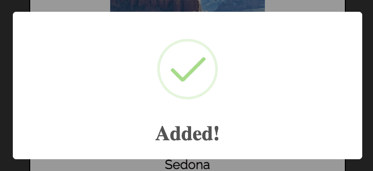
While working on my most recent project, I decided to incorporate a few pop ups for different features. A quick pop up for signing in or adding a new item to a list is a good way to let users know their clicks are working, but the standard alert is not very appealing. Enter SweetAlerts2.
vs
The SweetAlerts2 documentation is very helpful(https://sweetalert2.github.io/) for further details. Here is a quick setup guide. My project is built using React, so these steps are assuming you have the component built where you want to show your alert.
1) install sweetalerts2.
$ npm install sweetalerts2
2) Create a variable using sweetalerts in your function.
const Swal = require('sweetalert2')
3) Call your constant in the function where you want it.
Swal.fire({
          title: 'Added!',
          // text: 'Do you want to continue',
          icon: 'success',
          timer: 1500,
          // confirmButtonText: 'Cool',
          showConfirmButton: false
        }).then(
          function () {},
          // handling the promise rejection
          function (dismiss) {
            if (dismiss === 'timer') {
            }
          }
        )
I did not want any text added to my alert so I commented that out.
I also did not want any click button for users to close out the alert, I wanted it to disappear after a few seconds. To do this, I added in the timer line, shown in milliseconds. And showConfirmationButton needs to be set to: false. I also have the confirmationButtonText commented out since I am not using it.
In addition to the added alert, I also included a "success" alert when the user logged in. The steps are the same as listed above but with some minor adjustments.
1) set your constant:
const Swal = require('sweetalert2')
2) set the Toast constant for the popup:
const Toast = Swal.mixin({
        toast: true,
        position: 'top-end',
        showConfirmButton: false,
        timer: 3000,
        timerProgressBar: true,
        didOpen: (toast) => {
          toast.addEventListener('mouseenter', Swal.stopTimer)
          toast.addEventListener('mouseleave', Swal.resumeTimer)
        }
      })
3) Include it in your function:
Toast.fire({
                icon: 'success',
                title: 'Signed in successfully'
              })
There are 5 different alert icons included in the SweetAlert2 docs: success, error, info, warning, and question. As you can see, I used the success icon for both of my alerts.
I hope this article was helpful in getting started with SweetAlerts2. Please feel free to leave your thoughts or questions below.


Top comments (2)
You can improve code highlight using:
for example.
Or
Or
Official React integration: github.com/sweetalert2/sweetalert2...
The following options can be React elements:
title
html
confirmButtonText
denyButtonText
cancelButtonText
footer
closeButtonHtml
iconHtml
loaderHtml