
So in yesterday's lesson, we were tasked with picking a site that's just out of reach of our abilities.
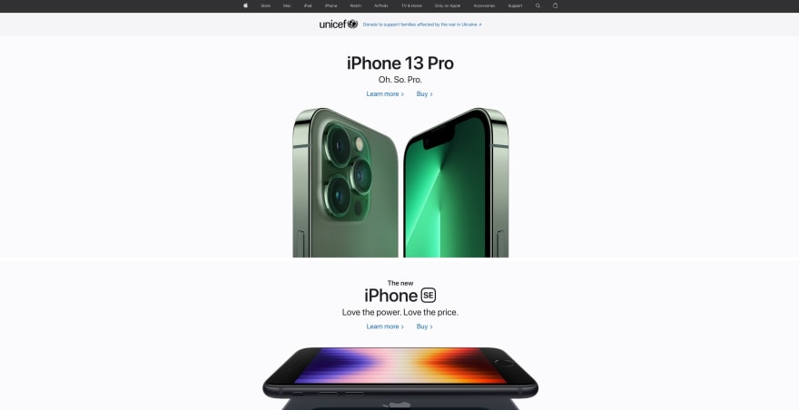
but after staring at the page for more than 30mins, I asked for help, and Derek suggested trying to recreate apple.com
hoo-boy.
where do I even start?
When I finally sat down to tackle this, I stared at the site for a bit. Changed the size of the window, trying to feel the site out. feel out where the different parts of the sites are.
How I am to rebuild this smooth monstrosity.
eventually, I realized its way too much to think about and then just opened my code editor and built out a master layout shell that we had learnt while doing Uncle Bill's site
then I went at it one section at a time.
Header
this guy is the one I spent the most time with.
lotsa typing, all the icons for the images, finding the right apple icon, search icon, ~bag icon~
for whatever reason, Me from that time chose to use Ul/li to build the navigation bar. I think I might have seen that in the source code of apple's site.
but later I just realized using nav would have been much better.
because I had to turn it inline anyway and switch to block only on a smaller viewport.

HTML seems to take so little time at the end of the day. it's always the CSS that I find needs to be constantly worked on. maybe, with experience ill be able to fully visualize what the CSS is doing. currently, I'm able to do it at a very limited capacity.
I think I'm FINALLY intuiting the difference between padding and margin. so, yay for that.
landing
this was relatively simple. I did spend a while here as well, but mostly because I was trying to figure out how the whole section is a link, but also has links within to other places. I managed to figure out that you can in fact put a div inside an a, but that didn't really recreate it the way apple had done it.
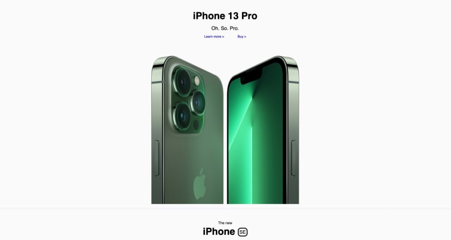
some time was spent looking for images for the site.
making it so that it shrunk when it was smaller.
Apple's image changes when we shrink its site. I think I later realized they might be using @media to just switch the image?
this leads me into the coda section
apple's image here seems to be dynamic, it's the same image, that gets wide, and then when shrunk also has this bottom part that comes in.
I wasn't able to recreate it.
Derek mentioned that it is likely a background image, which I too suspected.
but I wasn't able to get it to work.
eventually, I decided to solve it by using two different images.

first, I thought I could have them be IMG tags and then switch them out with @media...OH.
but that only works with CSS? hmm.
I think what I eventually settled on was convoluted.
I had the wide image as an HTML tag, that has its opacity reduced to 0 when the viewport is shrunk.
and the background of this section (where the IMG tag lives) is the height-focused image.

as I type this I realized I could have used @media to do the same, and it would just switch out the background image.
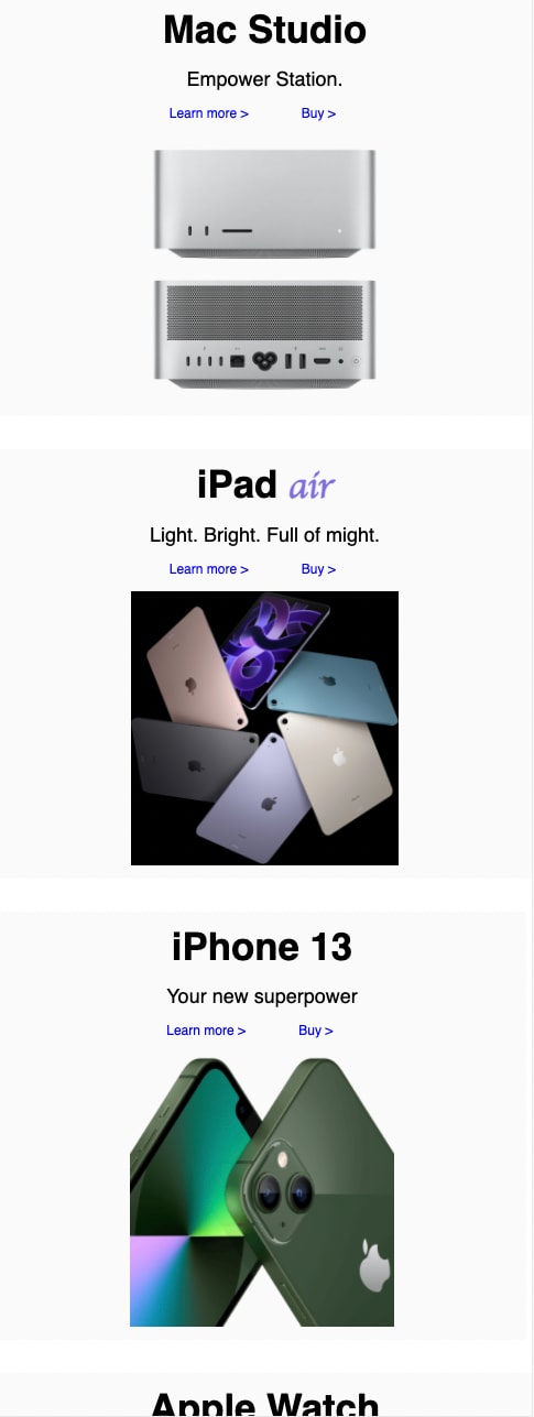
Grid
when I got here I realized these are basically like the landing page sections, but smaller and share space.
so I ended up renaming some class names and named them all cards.
since they all shared the styling and structure within.
I hosted these divs within another list.
John's site too had it in this structure. and Derek had linked a site about early grid stuff.
I tried to look through them but wasn't able to really figure out what to do.
I was also getting really really tired.
so I decided to settle on inline-blocks.
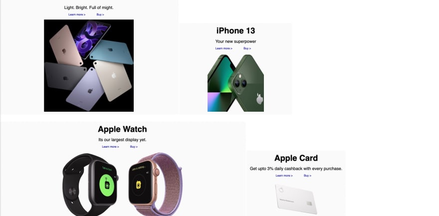
_At least they look fine-ish on phone...
_
footer
I was at the end of my rope.
sleepy and tired. sad about my second road test failure because I didn't look over my shoulder and almost ran into another car (even though this never happens when I'm alone.... I suck at tests). and now trying to recreate apple's site. wanting to do it perfectly and sad that I can't because they are obviously using magic.
so I just copy-pasted the text into
s and styled it appropriately.
did some final touchings and called it a night.

Top comments (3)
There are lots of "cool" things about Apple's site.
But - there are always some strange practices too. 95% of it is the images. 10% typography. The subjects and content strategy don't require much "design."
There are usually a few broken things / or just things that could be written much cleaner - even for a new student. So, it's a fun one. Also - talking about their giant yet sorta accessible link hacks (that tended to mess things up as mouse users!) - was fun.
Also, why did they have the text baked into the Coda poster, and a few other interesting choices.
But - hey, 90% of our applicants list it as one of the 3 sites they like in our Student Screener - even though it doesn't have "dark mode" hahaa. Funny.
Also -- to be fair: The lesson is called "Research and Destroy" - and it's supposed to end in a conversation-starting disaster -- / because students have a very limited set of tools they are allowed to use thus far (which does not include flexbox)
The different image source on that first iPhone spot was also a good reason to talk about the
pictureelement. So, the lesson went just as planned! Good job. ;)