Exploiting plotly’s template attribute to create consistent charts.

Great publications have great charts. The Economist and the New York Times to name but two examples. The reason these stand out to me is consistency. When you look at an Economist chart, you know it’s an Economist chart.
The best thing about consistency is that your charts don’t even have to look that good. In the above example, we’re not seeing anything special. In fact “Education, years” has way too many annotations and is incredibly busy. But the consistency trumps that. It causes that little spurt of happychem in the back of your brain that comes from spotting some order in the world.
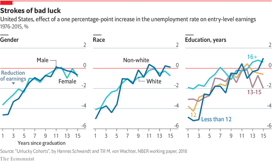
A more brand focused person might suggest that it also helps in establishing a familiarity the same way any good house styling or logo set might. But really, its all about that high.
Junkie to dealer
Plotly is a high-level library built on D3. It exploits all of D3’s fantastic charting powers without suffering from its excruciating learning curve. It’s a great charting platform, but one gripe was the difficulty in creating consistent looking charts.
Styling with plotly is easy enough. The entire plot, data and styling, is contained in a single JSON object. Once you’ve added your data it’s simply a case of setting various attributes until the chart begins to resemble the one that’s in your head. That JSON is then pushed through one of plotly’s libraries and hey presto you’ve got your chart.
The problem is that we have to do this all over again for the next chart. God forbid the next 10. There are of course ways of producing these in batch. Plotly has a python library that makes programmatically producing charts very easy. There isn’t at the moment a way of creating a template within python’s library. So we could try extracting the styling part of the JSON and then reapply it to the next chart. But just writing that out is a faff.
Let’s say that you do manage to create a workflow that lets you reapply your styling. What happens when you realise that your comic sans titles might not be doing you any favours. How do you update all of your live charts to your new theme? Write a script to find all your live charts, download, retheme, reupload, faff, faff, faff.
Plotly’s Template attribute
As of plotly3.4, we have a template attribute we can use to solve all our problems. Documentation is a little thin on the ground at the moment. There are a couple of introductory articles here and here that gives an overview.
Essentially, you recreate the chart JSON within itself. The template can have data, layout, annotations and images as elements. Each element applies conditions in the same way as their main chart JSON counterparts. The difference is that if the template has an element that has already in the main chart, the main chart's definition takes precedence.
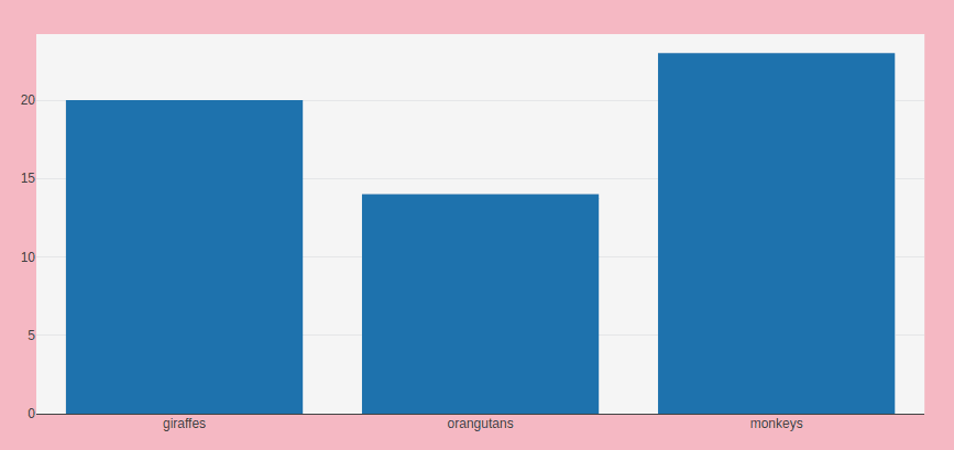
# Unthemed
{
 "data": [
 {
 "x": [
 "giraffes",
 "orangutans",
 "monkeys"
 ],
 "y": [
 20,
 14,
 23
 ],
 "type": "bar"
 }
 ],
 "layout":{
 "template":{
 "layout":{

 }
 }
 }
}

#Themed

{
 "data": [
 {
 "x": [
 "giraffes",
 "orangutans",
 "monkeys"
 ],
 "y": [
 20,
 14,
 23
 ],
 "type": "bar"
 }
 ],
 "layout":{
 "template":{
 "layout":{
 "paper\_bgcolor":"pink"
 }
 }
 }
}

In the above example, we’re able to set the paper background colour in the template only. The resulting charts behave as we’d expect.
Had we set the paper background colour directly in the chart’s layout component then the template's paper background colour would not be rendered pink.
Theming multiple chart types
As with setting templates for the layout of the chart. We can also set default values for parts of the data. In the data section we can assign our template to a type of chart. In the below example we've set up a template for the colour of the bar in a bar chart. The bar element's value is a list of dictionaries defining each individual trace.
template":{
 "data":{
 "bar":[{"marker":{"color":"pink"}}],
 }
 "layout":{
 ...
 }
}
Here we’ve set the first trace of the bar chart where we’ve set the colour of the bar to pink. We can extend this for each trace until we’ve built up an entire colour scheme.
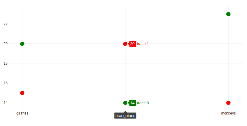
We can even extend this further to include multiple chart types. This means we can have a consistent template that works for all chart types. Even allowing for differences between chart types. Below are two charts created from the same template.
"template":{
 "data":{
 "bar":[{"marker":{"color":"pink"}},{"marker":{"color":"purple"}}],
 "scatter":[{"marker":{"color":"green"}},{"marker":{"color":"red"}}]
 }
 "layout":{
 ...
 }
}
Separating the data from the design
This is all fine and dandy but we’ve not really solved our problem. We’ve made it a little easier to theme a chart but we still have to stitch together a huge JSON in order for plotly to render it.
Except we don’t.
Now that we have our template, we’ve not much use for all the properties that style our chart within the chart itself. So let’s separate the two. We can keep all our chart’s essential data like the x and y values and perhaps some required formatting in the main chart JSON. In a new JSON we put our template object. As the template object isn’t going to change it makes sense to keep the two apart.
The only point we need to combine the two JSONs is when they’re delivered to the end user. As plotly has already gone to the trouble of building a javascript library that allows for separate data and layout to be rendered together on the fly, it would be foolish not to take advantage. We simply pass our data as data and our template as the only element of an empty layoutobject.
The below is part of the javascript that dynamically renders plotly charts on this site. A small php script is called to load chart data from a database. This combined with a templateJSON stored on the site.
var chartJSON = $.ajax(
 {
 url:'/resources/getChart.php?chartID='+chartID,
 dataType:'json',
 type:'GET'
 });
if(window.tmpltJSON == null){
 window.tmpltJSON = $.ajax(
 {
 url:'/resources/plotlyTemplate.json',
 dataType:'json',
 type:'GET'
 });
};

$.when.apply($,[chartJSON,window.tmpltJSON])
 .then(function(){
 var chart = JSON.parse(chartJSON.responseJSON);
 var tmplt = window.tmpltJSON.responseJSON;
 plotDiv = document.getElementById("pie");
 Plotly.newPlot(plotDiv,chart,tmplt,{'responsive':true});
 }
);
Now all my charts are themed when rendered for the end user. If I make to the plotlyTemplate.json they will be immediately used in all charts on the site.
All of which means, we never need to worry about styling a chart again. We have a setup that only produces consistency. Well at least until you make the mistake of opening it on a phone. I mean, how can such a small screen do so much damage.
Originally published at Benjamin Corcoran.

Oldest comments (0)