 |
|---|
| The MySejahtera App (picture courtesy of lowyat.net) |
Update:
MySejahtera has introduced the "MySJ Trace" feature, which solves the very problem of manual check-outs that this article discusses about, written before said feature was introduced.
MySejahtera is a mobile application developed by the Malaysian Government that serves as a response to curb the COVID-19 pandemic through the facilitation of contact tracing, and vaccination arrangements in hopes to achieve the nation's herd immunity.
It has been essential for the everyday lives of Malaysians and the country's residents during such a time. For one to visit an establishment (restaurant, office, etc), one with the app must check-in upon entrance for as long as the personnel approves of the individual's risk level and vaccination status, and check-out upon exit.
The Issue Of The Check-out Feature
 |
|---|
| A family vacation was spoiled over something of MySejahtera they are not aware of. |
However, it is no stranger to criticism. For one, the check-out feature has received a lot of flak for not being friendly enough for users to check themselves out of locations they're no longer present at.
Therefore, some users, myself included, have even "stayed" in malls or convenience stores for weeks! 😱
Fortunately as of the time of writing, there is no penalty that would be imposed for those who fail to check-out in due course.
As comical as the issue may sound, it has led to the dismay of a family whose mother missed her vacation just because she did not check-out for weeks.
This shines a bad light to the app in question. If the family didn't even think about checking for their mother such a thing, this means there is lack of emphasis for checking out of locations.
This feature needs some work, and in this article we will explore about the issue exactly and think aloud what can be done to make the feature friendlier, let alone more useful.
|
|
|---|
| Local comedian Gajen Nad has succinctly described the issue |
Shaking things up

For disclosure, UI/UX is something I am currently learning but not my forte at the moment. What I am about to suggest is based on what I know and what I feel is right. Any open and constructive feedback though is welcome! 😊
With that being said, let's explore the check-out feature and see what we can do differently!
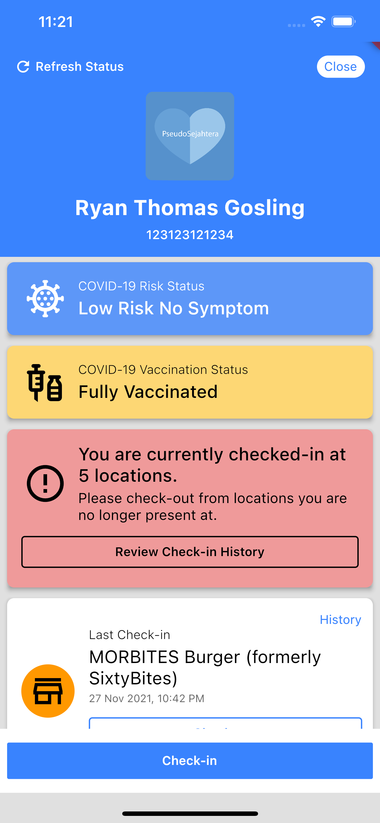
Starting page
Original version
 |
|---|
| The start screen at the current state at the time of writing. |
The starting page seems informative. The user's risk status and vaccination status are displayed at the front.
There is a tile that enables you to check-out your most recent check-in. That is useful, but if it's so important to check out all other check-ins, then we need something here that tells the user how urgent it is to do so.
🆕 Reworked version
 |
|---|
| The start screen, with a check-out reminder. |
Therefore, we can have a reminder at this start screen, reminding user to check-out from locations.
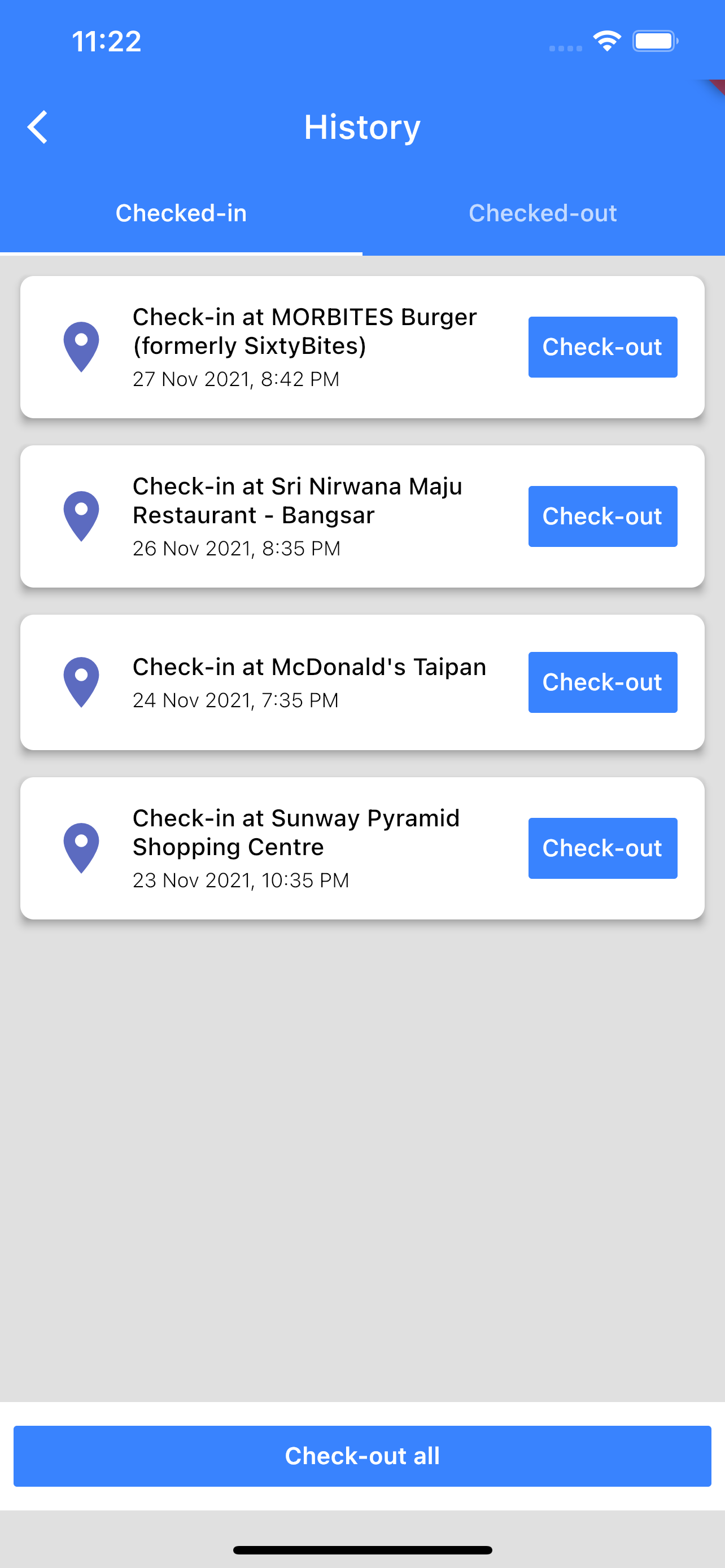
Checking out
Original version
 |
 |
|---|---|
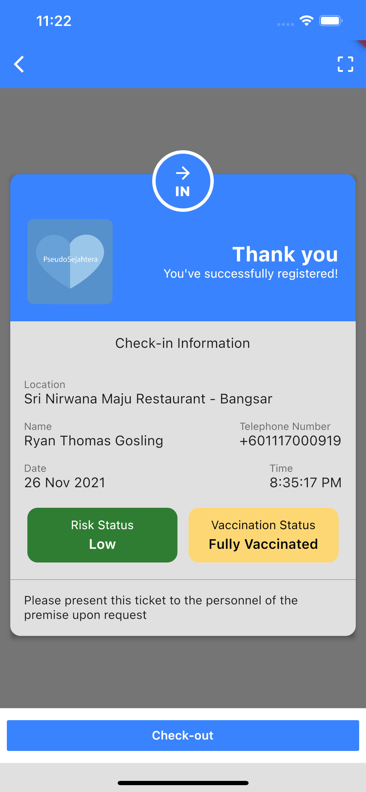
| The fact that there is a reminder at the top on how to assess for outstanding check-ins is concerning. | You have to tap upon one of the tiles in the History page to enter the check-in details page in order to check-out. |
The app currently provides an avenue for users to assess a history of check-ins, and check-out those they are no longer present at.
But the problem is, the UI as it stands makes this whole experience of checking-out an eyeballing exercise. There is lack of proper distinction between locations in terms of its check-in status (checked-in or checked-out) whatsoever, resulting in an inconvenient experience.
Also, the user has to crawl in to the detail page of a location/check-in history and hit the "Check-out" button one by one.
This flow can make use of some refinement.
🆕 Reworked version
 |
|---|
| A reworked history page. |
What can be done differently here is to split the histories in different tabs, for "checked-in" and "checked-out".
Within the "checked-in" tab, users can check-out each of them on the spot, reducing the walkthrough of individual check-out.
We can also introduce a "Check-out all" button in this tab. Upon click, all check-ins will be checked out.
 |
 |
|---|---|
| Checking out from history page. | Checking out all at history page. |
Conclusion

Maybe there is a reason why the check-out feature at the time of writing is hard for users to use. To be fair, I would not want to dismiss the developers as lazy in coming up with this feature for at times, it can be the requirements that can lead up to such an experience.
But I believe there has to be a better way of doing it, and to think aloud and start a conversation can be a start for finding such a way.
Thanks for reading!
You can check out my mock-up of the app in the following repository:

Top comments (0)