
This was one of the ideas I wanted to implement for a while: to visualize the members of all groups I joined on Telegram, and see how many circles I had on the single platform. Thanks to the openness of Telegram’s client API, this was rather easy to achieve.
Get prepared
Here is a list of things you’ll need to build your own graph
- Python 3
-
Pyrogram (
pip3 install pyrogram) -
Networkx (
pip3 install networkx) - Telegram account and Client API ID (not to be confused with Bot API Token)
- Gephi, Graphistry or other graph visualization tools
Gather data
This time I used Pyrogram instead of Telethon, as I started working on this in a REPL instance in Python, and it used to have a synchronous-flavor that served the purpose best. But I was wrong, they have already got rid of the sync flavor in a previous version. So I chose to turn to iPython for REPL because it can automatically run any async function without the bootstrap code.
Anyway, no worry for you, I’ve already consolidated it to a Python script that handles all the async stuff properly. The code is not complicated in any way, just iterate through all the dialogs and try load through the members whenever possible, and then dump the data into two Pickles files. It should be really easy to rewrite this part with other libraries like Telethon if you already have a session file ready.
Remember to replace the API ID and API hash with your own ones. If you have already logged in with Pyrogram, rename the session name with proper one for Pyrogram to pick up the proper session file you have, otherwise you should be prompted to log in for the first time.
from pyrogram import Client
import pickle
import asyncio

api_id = 123 # your API ID here
api_hash = "1234567890abcdef1234567890abcdef" # your API hash here
c = Client("my_pyrogram_session", api_id, api_hash)

async def main():
    await c.start()

    dialogs = [i async for i in c.iter_dialogs()]

    chat_members = {}
    for i in dialogs:
        print("Loading", i.chat.id, i.chat.first_name or i.chat.title)
        try:
            members = [j async for j in i.chat.iter_members()]
            chat_members[i.chat.id] = members
            print(len(members), "member(s) loaded.")
        except Exception as e:
            print(e)

    with open("dialogs.pkl", "wb") as f:
        pickle.dump(dialogs, f)

    with open("members.pkl", "wb") as f:
        pickle.dump(chat_members, f)

asyncio.run(main())
Construct graph
Now, with the full data collected, we can construct a graph for other tools to visualize. In this example, we will use Networkx to construct the graph data and optimise it for visualization.
You may want to get rid of all nodes that connects to yourself for a better visualization. Get your ID on Telegram with any bot that’s capable of doing it, and put it on line 4 of the following code.
import pickle
import networkx as nx

MY_ID = 12345678

# Load data
dialogs = pickle.load(open("dialogs.pkl", "rb"))
members = pickle.load(open("members.pkl", "rb"))

# Build graph
g = nx.Graph()
for k, v in members.items():
    for m in v:
        if m.user.id != MY_ID:
            g.add_edge(k, m.user.id)
Now we have the graph, we can continue to work on it to make the visualization look better. Since my graph had 10k+ of nodes and 20k+ of edges, it would be very difficult to visualize graphs of this scale. I then removed all nodes that only has one edge, that is, all people that shares only 1 common group with me.
g2 = g.copy()
for k, v in nx.degree(g):
    if v == 1:
        g2.remove_node(k)
With this removal, I now have 8k+ nodes and 18k+ edges in the graph, reducing the size by about 20%.
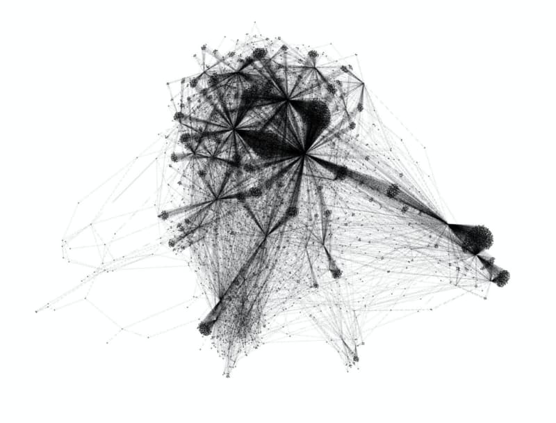
Visualize with Gephi
Gephi is an open-source tool for graph visualization, and works especially well on large graphs like ours. However, getting graphs into the software last updated in 2017 could be tricky.
Through some experimentations, I found out that DOT format works the best importing to Gephi, so let’s get started.
from networkx.drawing.nx_pydot import write_dot
write_dot(g2, 'graph.dot')
Open the graph.dot file in your working directory with Gephi, and you should be able to see the graph shown in the window. Usually, it will automatically generate a layout for you. If you are not satisfied with it, I’d recommend to reset it with Random Layout and build a new layout again with ForceAtlas 2.

When you are satisfied with the graph, you can export it as a PNG, PDF, or SVG files for sharing.
Adding metadata for Gephi
If you think your computer is powerful enough, you can also consider adding labels and other medatada to the graph, so that you can explore it better in Gephi. Here is an example of adding chat names to the graph as labels.
dmap = {i.chat.id: i.chat for i in dialogs}
for i in members.values():
    for j in i:
        if j.user.id not in dmap:
            dmap[j.user.id] = j.user

for i in g2.nodes.keys():
    if i in dmap:
        t = None
        try:
            if dmap[i].is_deleted:
                g2.nodes[i]["label"] = "%DELETED_ACCOUNT%"
                continue
        except:
            pass
        try:
            t = dmap[i].title
            if t:
                g2.nodes[i]["label"] = dmap[i].title
                continue
        except:
            pass
        try:
            if not t:
                if dmap[i].first_name or dmap[i].last_name:
                    t = f"{dmap[i].first_name} {dmap[i].last_name or ''}".strip()
                    g2.nodes[i]["label"] = t
                    continue
        except:
            pass
        if not t:
            print(i, "has no name")
    else:
        print(i, "is not found")
In case there are people with uncommon Unicode character in their names (mainly control characters and combining characters), here is a script to keep only letter characters in the label.
import unicodedata
def normalize_name(s):
    s = unicodedata.normalize("NFKC", s)
    s = list(s)
    for idx, i in enumerate(s):
        cat = unicodedata.category(i)
        if cat[0] in "CMZPS" or cat == "Lm":
            s[idx] = "_"
    return "".join(s)

for i in g2.nodes:
    if "label" in g2.nodes[i]:
        g2.nodes[i]["label"] = normalize_name(g2.nodes[i]["label"])
After that, just re-export the chart in DOT format, and import it with Gephi.
Some interesting analytics
Besides the chart, you can also get some interesting analytics out of the data that you can’t get easily with an official Telegram client, desktop or mobile.
Connected components and their sizes
In an undirected graph, a connected component is an induced subgraph in which any two vertices are connected to each other by paths, and which is connected to no additional vertices in the rest of the graph1 In this context, it shows you how many parts are your network on Telegram separated with only you but no one else in common. This command shows you how large each of part of your network is.
print([len(c) for c in nx.connected_components(g)])
Most connected nodes
Most connected nodes here are either groups with most members, or people that shares most groups in common with you. Here is a simple code script that shows you the top 100 most connected nodes.
dg = g.degree()
sdg = sorted(dict(dg2).items(), key=lambda a: a[1], reverse=True)
print(sdg[:100])
Pairs with most common neighbours
Through pairs with most common neighbours, you can find out which 2 groups or which 2 people are the most similar. For groups, the most similar pair shares the most number of common users. Vice versa, the most similar users share the most number of common groups.
This script prints the top 100 pairs of nodes with common neighbors.
from itertools import combinations

pair_common = []
for i, j in combinations(members.keys(), 2):
    try:
        inb = set(g.neighbors(i))
        jnb = set(g.neighbors(j))
        if len(inb) < 4 or len(jnb) < 4:
            continue
        res = len(inb & jnb)
        pair_common.append(tuple(i, g2.nodes[i]["label"], j, g2.nodes[i]["label"], res))
    except:
        continue

pair_common.sort(key=lambda a: a[4], reverse=True)

print(pair_common[:100])
Other visualization tools
Apart from Gephi, there is another tool that can visualize graphs of large sizes. Sharzy recommended Graphistry as an alternative tool that renders in a web browser and offers colors. Here’s a sample from Sharzy’s Telegram Channel.
Note : To render with Graphistry, you need to upload your graph data to their server, take caution before you use it.
Here is a sample snippet to upload your graph to Graphistry for rendering.
import graphistry
graphistry.store_token_creds_in_memory(False)
graphistry.register(api=3, protocol="https", server="hub.graphistry.com",
                    token="YOUR_TOKEN_GOES_HERE")

graphistry.bind(source='src', destination='dst', node='nodeid', point_title="label").plot(g2)
The post Extract and Visualize Your Telegram Group Network appeared first on 1A23 Blog.

Top comments (0)