
A brief introduction to Gatsby
Gatsby is a static site generator that is built with React.js, Webpack, and GraphQL. It is used for building very fast websites that have relatively static content, for example, blogs, eCommerce websites, and even company websites.
Note: A static site generator is a platform that allows you to get all requests made in static HTML without bothering about server and template (code) interactions every time a user makes a request .

TL:DR
Here is a quick overview of what we will be looking at in this post:
- Creating a theme directory and installing dependencies
- Connecting a site to the custom theme
- Exporting some components to be used by the site
- Overriding some custom theme features from the site by implementing component shadowing

Prerequisites
Before we go any further, this article assumes the following:
- Node.js ≥ v6 is installed on your machine
- NPM is installed on your machine
- Gatsby CLI installed globally
- You have a basic understanding of React.js
Folder setup
The file structure would look something like this after following all the steps below :
- simple-gatsby-theme >>Packages >> scotchy-theme
- Site
The simple-gatsby-theme directory is our project’s folder. The packages directory holds a folder whose name is the theme we are going to create, and in that folder, we have our theme files. Lastly, the site directory contains our Gatsby site which makes use of our theme as we develop it.
Building the Gatsby theme
A theme is different from a starter in the sense that you can build a theme as a library. It then becomes a package that can be updated and can allow you to get things up and running faster by hiding complexity. So by building a theme, we allow users who import that theme to take some inspiration from the theme and set up a user interface faster.
Setting up the project configurations
- First, make a directory for the Gatsby theme on your local device
$ mkdir simple-gatsby-theme
Then run npm init to set up the package.json:

- In the package.json created, we can add a workspace that would allow us to manage the theme’s updates from the user’s end and we also added a “packages/*” that would help us link our Gatsby theme to this end user workspace theme management package:
{
"private": true,
"name": "simple-gatsby-theme",
"version": "1.0.0",
"workspace": [ "site", "packages/*" ]
 }
- Create a new directory, call it packages and inside that directory, we will create the theme directory and create a package.json with the yarn init bash command:

- Next, let’s head over to the site director and run $ yarn workspace simple-site add gatsby. This adds Gatsby as a dependency for our project using the workspaces feature of Yarn.
Note: The command above points to the package.json name “simple-site” in the site directory.
{
 "name": "simple-site",
 "version": "0.0.1",
 "description": "A simple site built for a Gatsby Theme ",
 "main": "gatsby-config.js",
 "license": "MIT",
 "private": true,
 "scripts": { "develop": "gastby develop", "build": "gatsby build" },
 "dependencies": { "gatsby": "^2.1.19", "simple-theme":"*" }
 }
We would have to add the configurations of the theme manually as a dependency for the project so that it can access the theme: "[THEME NAME]" : "*"
Setting up the theme dependencies
The first thing we have to do in our theme directory is to install Gatsby, as a dev dependency by running $ yarn workspace simple-site add gatsby -D, our package.json now looks like this:
{
 "name": "simple-theme",
"version": "0.0.1", "description": "A Simple gatsby theme",
"main": "index.js",
 "license": "MIT",
 "devDependencies": {
 "gatsby": "^2.1.19",
 "react": "^16.8.3",
"react-dom": "^16.8.3"
},
"peerDependencies": {
"gatsby": "^2.1.19",
"react": "^16.8.3",
 "react-dom": "^16.8.3"
 }
}
Here we have a peer dependency and a dev dependency set so that if a user installs the theme, it makes sure that Gatsby is installed. It will warn them if they don’t already have Gatsby installed. We also installed React and react-dom to the theme by running $ yarn workspace simple-theme react react-dom -D.
Building the theme
We’d be using .mdx extension while working with Gatsby because it lets you write JSX embedded inside markdown. That’s a great combination because it allows you to use markdown’s syntax (such as # heading) for the little things and JSX for more advanced components. Plus MDX has no run time, all compilation occurs during the build stage.
This would work fine on a Mac:
$ yarn workspace simple-theme add gatsby-mdx @mdx-js/mdx @mdx-js/tag
For a windows device, run this (I will explain why later in a section below):
$ yarn workspace simple-theme add gatsby-mdx@0.4.2-ci.318
Since Gatsby, by default, will only look at the src/pages/index.mdx directory for the site information, our first move is to create this directory in our theme folder. Also, remember to create an index.js in the theme directory.
Setting up Gatsby-config.js for theme
We will start by creating a gatsby-config.js file in the theme directory and input the following:
module.exports= { plugins : [
{
  resolve : 'gatsby-mdx',
  options:{}
},
 {
  resolve : 'gatsby-plugin-page-creator',
  options:{ path: ${__dirname}/src/pages,
      }
    }
  ]
}
We installed the gastby-content-page-creator plugin so that when the theme is built, it also looks in the src/pages/index.mdx of the theme by reading from our package. That makes sure that when we run the code, it reads from our package because, by default, it looks at the pages in the site directory. So if we want it to load the pages from the theme, we would run the following in bash:
$ yarn workspace simple-theme add gatsby-plugin-page-creator
Setting up gatsby-config.js for site
Here we specify that we are using a theme:
module.exports = {
  __experimentalThemes : [ 'simple-theme' ]
};
Note: A quick hack to check if your site actually has the theme as a dependency would be to run $ yarn workspace info

From the above, we can see that the simple-site has simple-theme as a dependency meaning they are linked and we are good to go.
Then we run the demo to test by running $ yarn workspace simple-site develop we should have this displayed on the screen:

Adding layouts to the simple-theme
We can use gatsby MDX layouts to target the actual layouts we want to be displayed. We’d start by creating a components directory in the src of the site and a layout.js component in which we’d have a simple react component:
import React from 'react'

export default
({children}) => (
  <section style =
{{
   display: 'block',
   maxWidth : '650px',
   margin: '2rem auto'
 }}>
     {children}
   </section>
 );
For the above code to be usable in the simple-theme, we’d have to tell MDX to resolve this layout:
module.exports = {
plugins : [
  {
    resolve : 'gatsby-mdx',
    options:{ defaultLayouts:{
     default: require.resolve('./src/components/layout.js')
         }
       }
     }
   ]
 }
So by default, MDX looks for the layout.js and implements the styles to the entire MDX.
Importing components styling to index.mdx
We can write regular .mdx in the theme directory and import React components for styling these components like so:
First, we create an info.js file and import React and some costume styling:
import React from 'react'
const Info = ({children}) =>{
return(
    <div
      style = {{
                 padding: "1rem",
                 backgroundColor: "blue"
              }} >
              {children}
          </div>
           );
  }
   export default Info
Then we head over to our info.mdx and import the component as we would in regular React:
import Info from "./../components/info"

<Info>
   My name is obinna  welcome to my simple theme
 </Info>
We should have a display with a blue background indicating the part wrapped around the info tag:
export {default as Info} from './src/components/info'
export {default as color} from './src/tokens/color'
Importing components from simple-theme to the site
The whole aim of building the theme is to be able to use its properties in the site. So now, we are going to create some pages in our site and import the layouts of the theme to style in these steps:
Create a
src/pages/info.mdxdirectoryExport the Info component from the simple-theme’s index.js
export {default as Info} from './src/components/info'
- Import into the info.mdx in the site directory
import {Info} from 'simple-theme'
#More Information about me
<Info>
  I like to write a lot of poetry
 </Info>
And there you have it, we are using components from our theme.
Using design tokens in your theme
Let’s say we have some theme custom styling, we want to be identified with our theme by default and we also want to give the user the ability to override these stylings. We can create a token directory in the theme under which we have our default color configuration:
export default {
primary : 'blue'
}
To import the styling to the index.js component, we refactored the component to implement the import:
import React from 'react'
import color from '../tokens/color';
 const Info = ({children}) =>{
   return(
      <div
          style = {{
              padding: "1rem",
              backgroundColor: color.primary
            }} >
        {children}
          </div> );
      }
   export default Info
Component shadowing
This concept allows us to be able to modify parts of the theme to our taste, we can do this by creating a local file (named after the theme in use) to be picked up on render in our site directory. By doing so, any file we put in the folder will take precedence over the theme default.
- create a simple-theme folder in the src of site
- export the color you would prefer in the new folder created
export default {
primary: 'brown'
};
Therefore we now have a page rendering text with the part wrapped around the info text as brown.
We can even override components from the site. First, we would have to create the same identical component folder in our site directory. Let’s name it simple-theme/components/info.js.
Note: To access the custom components to be modified we’d have to export from the index.js of the theme
export {default as Info} from './src/components/info'
export {default as color} from './src/tokens/color'
Our index.js becomes :
import React from 'react'
import {color} from 'simple-theme'
 const Info = ({children}) =>{
  return(
      <div style = {{
                padding: "10rem",
                 background : color.primary,
                 fontSize : '30px'
        }} >
            {children}
        </div> );
 }
 export default Info
Using two themes on the same site
So previously, I mentioned that we can use more than one theme; thus, we will set up a child theme that is also dependent on the simple-theme. I will call mine “bat-theme”, here we initialize yarn by running yarn init and set up the package.json with the required theme dependencies.
{
"name": "bat-theme",
"version": "0.0.1",
"main": "index.js",
"dependencies": {
 "gatsby-plugin-page-creator": "^2.0.9",
 "simple-theme": "*"
 },
 "devDependencies": {
  "gatsby": "^2.1.19",
 "react": "^16.8.3",
 "react-dom": "^16.8.3"
 },
"peerDependencies": {
  "gatsby": "^2.1.19",
  "react": "^16.8.3",
  "react-dom": "^16.8.3"
},
"license": "MIT"
}
We added the simple-theme to be a dependency of the bat-theme because we want it to be connected to the parent theme, so even when the user installs bat-theme they can access the simple-theme features.
Then we can create a gatsby-config.js to import the parent theme into the child the same way we connected to the site and resolve the package.json in the index.js:
module.exports = {
__experimentalThemes:[‘simple-theme’]
};
We can test that the child theme is working by modifying the gatsby-config.js and package.json of the site to use the bat-cave theme which is linked to the simple-theme. To check how this is all interacting we run yarn workspaces info and we should have this displayed:

We can see that the bat-theme is dependent on the simple -theme which the site is dependent on.
Common errors in creating themes
While preparing this article I ran into some errors:
- Typos : Be careful in stating keywords like ‘__experimentalThemes’ “plugins”. I reached out to the Gatsby team and an issue was opened on GitHub to help highlight such errors when typos are made, so I am sure you will be fine
- I also ran into an error where my .mdx file wasn’t showing on the browser and it turns out Gatsby has some errors that are windows OS specific. The problem was that the webpack loader rule wasn’t applying because of windows vs unix file path differences. You can find the fix here
- Find the fix for the windows error here
More Gatsby advancements in the near future
Things we should look forward to from Gatsby theme:
- There is no need to clean the cache all of the time
- Component shadows can be merged with the theme
Conclusion
I really enjoyed explaining how Gatsby themes work. One of the many advantages of themes is that you can install multiple themes at once to your project. You could also build a lot of themes to help improve workflow for other developers.
The most exciting part of building the theme was writing the MDX, it really lives up to the hype. I hope to build some themes with Gatsby and I hope you do too :) If this interests you, may I suggest watching thefull video by Jason and John. Here is a link to the repo for this article. Happy coding!
Plug: LogRocket, a DVR for web apps
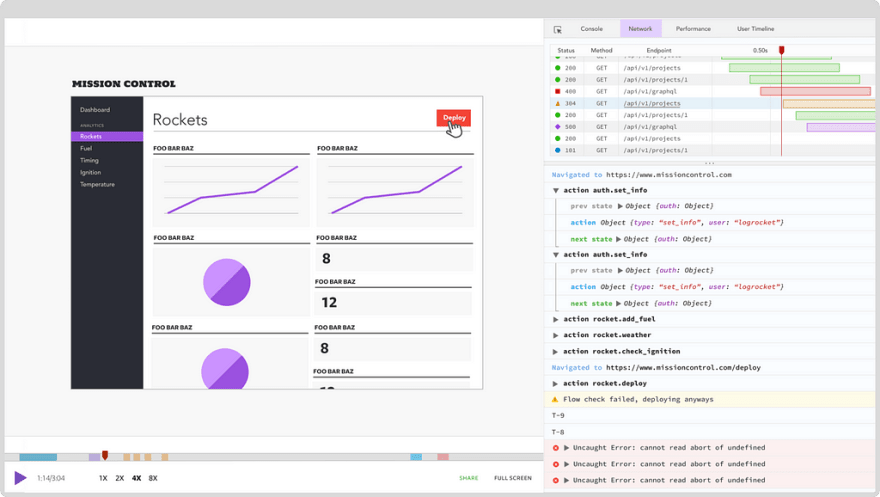
LogRocket is a frontend logging tool that lets you replay problems as if they happened in your own browser. Instead of guessing why errors happen, or asking users for screenshots and log dumps, LogRocket lets you replay the session to quickly understand what went wrong. It works perfectly with any app, regardless of framework, and has plugins to log additional context from Redux, Vuex, and @ngrx/store.
In addition to logging Redux actions and state, LogRocket records console logs, JavaScript errors, stacktraces, network requests/responses with headers + bodies, browser metadata, and custom logs. It also instruments the DOM to record the HTML and CSS on the page, recreating pixel-perfect videos of even the most complex single-page apps.
The post How to build a custom GatsbyJS theme appeared first on LogRocket Blog.

Top comments (0)