
Written by Uzochukwu Eddie Odozi✏️
Toast notifications are modal-like elements that display information to a user, often in the form of buttons or another call to action. The messages displayed tend to be brief and are sometimes removed via user action or set to auto-expire. Most importantly, toast notifications do not interfere with the user’s interaction with your app, whether they are using a desktop or mobile device.
Developers commonly use toast notifications to display, among other things:
- A success message upon a successful form submission or API request
- An error message upon a failed API request
- Chat information
In this tutorial, I’ll demonstrate how to create a custom toast component with React. We’ll use React hooks such as useState and useEffect. After creating the toast component, we’ll add some simple buttons to try out and display the toast on our page.
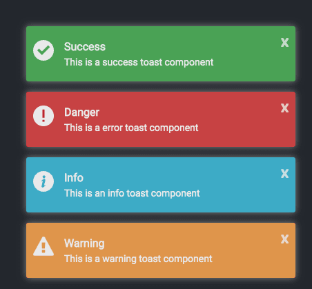
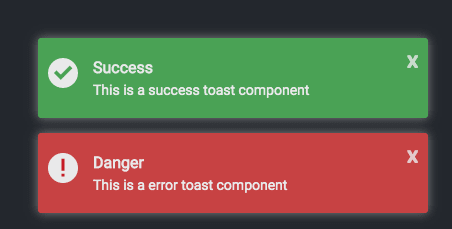
Here’s what the toast notifications will look like after we create and call them:
You can reference the full source code for this tutorial in the GitHub repo.
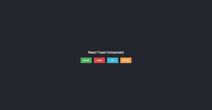
After we create some buttons to trigger the toast notifications, the page should look like this:
Let’s dive in and get started!

Getting started
To demonstrate how to create custom toast components, we must first create a React application. I’ll assume that Node.js is already installed on your computer. Node.js comes with npm, and we’ll use create-react-app with npx to build our React app.
Open a terminal, navigate to the directory where you want to add your project, and type the following.
npx create-react-app react-toast
You can name the project whatever you want. We will not install any other module inside the project; we’ll simply use the modules added by the create-react-app tool.
The default folder structure is as follows.
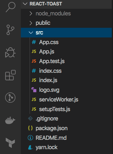
The src folder is where we’ll do most of our work. Inside src, create a new folder called components. We’ll add our toast and button components to this folder.
In React, you can either use class components, which requires you to extend a React.Component and create a render function that returns a React element, or functional components, which are just plain JavaScript functions that accept props and return React elements. We’ll use functional components throughout this tutorial. create-react-app uses functional components by default.
Inside the App.js component, you can remove the content of the header element and change the header to a div with className="app-header". The parent element class should be changed to app. We’ll also change the function to an arrow function (that’s just my personal preference; feel free to use the default function if you’d like).
import React from 'react';

import './App.css';

const App = () => {
    return (
        <div className="app">
            <div className="app-header">

            </div>
        </div>
    );
}
export default App;
Next, add the CSS style into the App.css file. Delete the contents of App.css and add the styles into the file. You can get the CSS styles from GitHub.
Some of the elements with styles in the CSS file have not been added. We’ll add these elements as we progress. The styles consist of some simple CSS properties.
Delete the contents of index.css and add the following.
@import url('https://fonts.googleapis.com/css?family=Roboto&display=swap');
body {
  margin: 0;
  font-family: 'Roboto', 'sans-serif';
}
Creating a toast component
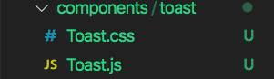
To create a toast component, create a folder called toast inside the components directory and add two files: Toast.js and Toast.css. We are using the .js extension for our JavaScript files as well as CSS — optionally, you can use JSX and SCSS files.
Inside the Toast.js file, create an arrow function called Toast and set the export function as default. Set the parent element to empty tags.
import React from 'react';
const Toast = () => {
    return (
        <>

        </>
    )
}
export default Toast;
The function will always return a React element. The first element to add is the notification container, which will wrap every toast notification element that will be displayed.
<div className="notification-container">
</div>
Later, we’ll add a dynamic property to display the position of the notification container. We’ll add other elements inside the container to display the button, image, title, and message.
<div className="notification toast">
    <button>
        X
    </button>
    <div className="notification-image">
        <img src="" alt="" />
    </div>
    <div>
        <p className="notification-title">Title</p>
        <p className="notification-message">Message</p>
    </div>
</div>
The button will be used to close a particular toast notification. An image icon will display depending on the type of toast. We will essentially end up with four types of toast:
- Success
- Danger
- Info
- Warning
Import the Toast.css file into the component and add the following CSS style for the notification-container to the Toast.css file.
.notification-container {
    font-size: 14px;
    box-sizing: border-box;
    position: fixed;
}
We’ll have four different positions for the toast elements:
- Top-right
- Bottom-right
- Top-left
- Bottom-left
Below are the CSS styles for the position.
.top-right {
    top: 12px;
    right: 12px;
    transition: transform .6s ease-in-out;
    animation: toast-in-right .7s;
}

.bottom-right {
    bottom: 12px;
    right: 12px;
    transition: transform .6s ease-in-out;
    animation: toast-in-right .7s;
}

.top-left {
    top: 12px;
    left: 12px;
    transition: transform .6s ease-in;
    animation: toast-in-left .7s;
}

.bottom-left {
    bottom: 12px;
    left: 12px;
    transition: transform .6s ease-in;
    animation: toast-in-left .7s;
}
The positions will be added dynamically, depending on which position props the user adds to the toast component.
The next CSS styles are for styling the notification class, which contains the remove button, image, title, message, and animations to slide the toast either left or right of the page. Copy the styles from the GitHub repo and add them into the Toast.css file.
To see what the toast component looks like, let’s apply some properties, such as position, to be passed as props inside the toast component.
Props, or properties, are used for passing data from one component to another in React.
The toast component takes in two props: toastList and position. toastList represents an array that will contain objects, and position determines the placement of the notification container on the page. Let’s add a props parameter to the Toast function and then use the ES6 object destructing to get the toastList and position props.
const Toast = (props) => {
    const { toastList, position } = props;

    return (
        <>
            ...
        </>
    )
}
export default Toast;
To use the position prop, add it to the element with a className of notification-container. Remove the class from the notification-container, then add:
className={`notification-container ${position}`}
Next, remove the class from notification div and add the following.
className={`notification toast ${position}`}
Whatever position prop is passed into the toast component, it will be added as a class to those elements (recall that we already set the CSS position properties in the CSS file).
Since toastList is an array, we can loop through it directly in the HTML, but I am not going to do that. Instead, I will use the useState hook to create a new property. useState allows you to create a stateful variable and a function to update it.
First, import the useState and useEffect hooks from React where the useState will be used to create a variable and a function to update the variable. The useEffect hook will be called when there is a rerendering required.
import React, { useState, useEffect } from 'react';
Add this after the props destructuring:
const [list, setList] = useState(toastList);
The default value of the useState list is going to be whatever the default value of the toastList array is.
Add the useEffect method and use the setList to update the list property.
useEffect(() => {
    setList(toastList);
}, [toastList, list]);
The useEffect hook takes a function and an array of dependencies. The setList method is used to update the list array whenever a new object is added to the toastList array, which is passed as a prop. The array consist of dependencies that are watched whenever there is a change to their values. In other words, the useEffect method will always be called when there is an update to the values in the dependencies array.
Let’s loop through the list array inside the HTML. We’ll use the map method to loop through the array.
import React, { useState, useEffect } from 'react';

import './Toast.css';

const Toast = props => {
    const { toastList, position } = props;
    const [list, setList] = useState(toastList);

    useEffect(() => {
        setList(toastList);
    }, [toastList, list]);

    return (
        <>
            <div className={`notification-container ${position}`}>
                {
                    list.map((toast, i) =>
                        <div
                            key={i}
                            className={`notification toast ${position}`}
                        >
                            <button>
                                X
                            </button>
                            <div className="notification-image">
                                <img src={toast.icon} alt="" />
                            </div>
                            <div>
                                <p className="notification-title">{toast.title}</p>
                                <p className="notification-message">
                                    {toast.description}
                                </p>
                            </div>
                        </div>
                    )
                }
            </div>
        </>
    );
}
The structure of the objects that will be added to the toastList array looks like this:
{
    id: 1,
    title: 'Success',
    description: 'This is a success toast component',
    backgroundColor: '#5cb85c',
    icon: ''
}
We’ll add background color of the toast dynamically. To achieve that, we need to add a style property to the notification element. On the element with class notification toast, add a style property that will use the backgroundColor from the list. Add it after the className.
style={{ backgroundColor: toast.backgroundColor }}
Let us now use this component inside the App component. Go into the App component and import the toast component.
import Toast from './components/toast/Toast';
After the div element with class name of app-header, add the toast component.
<Toast />
Now we need to pass the props into the toast component. Go to the GitHub repo and download the SVG files for the toast icons. Create a new directory called assets inside the src folder and add all the SVG files.
Add the imports to the App component.
import checkIcon from './assets/check.svg';
import errorIcon from './assets/error.svg';
import infoIcon from './assets/info.svg';
import warningIcon from './assets/warning.svg';
Each icon will be used for one of the following types of toast notification: success, danger, info, and warning.
To try out the toast component, add this array inside the App component (this is just for testing)
const testList = [
    {
      id: 1,
      title: 'Success',
      description: 'This is a success toast component',
      backgroundColor: '#5cb85c',
      icon: checkIcon
    },
    {
      id: 2,
      title: 'Danger',
      description: 'This is an error toast component',
      backgroundColor: '#d9534f',
      icon: errorIcon
    },
];
Pass this testList as a prop to the toast component and set the position to bottom-right.
<Toast
    toastList={testList}
    position="bottom-right"
/>
Recall that toastList and position are props that we destructured inside the toast component.
Open the project in a terminal and run npm start or yarn start to start the server. The server should run on port 3000. This is the result on the browser:
You can change the position to see the placement of the toasts on the page. If you hover on the toast elements, you’ll see some effects. Add the following objects to the testList array.
{
    id: 3,
    title: 'Info',
    description: 'This is an info toast component',
    backgroundColor: '#5bc0de',
    icon: infoIcon
},
{
    id: 4,
    title: 'Warning',
    description: 'This is a warning toast component',
    backgroundColor: '#f0ad4e',
    icon: warningIcon
}
After adding the other objects to the array, the toast components should look like this:

Let’s add some prop-types to the toast component. React provides type checking features to verify that components receive props of the correct type. PropTypes helps to make sure that components receive the right type of props.
Import prop-types from React. The toast component expects two props toastList and position.
import PropTypes from 'prop-types';
Add the following props check below the toast component arrow function.
Toast.defaultProps = {
    position: 'bottom-right'
}

Toast.propTypes = {
    toastList: PropTypes.array.isRequired,
    position: PropTypes.string
}
The position prop is not a required prop, but you can make it required if you want. If no position is set, the default position prop will be used.
Adding button components
Now that we’ve built a toast component, let’s create a button component and use the buttons to trigger the toast notifications.
Create a new folder called button and add a file called Button.js. Paste the following code inside the file.
import React from 'react';
import PropTypes from 'prop-types';

const Button = props => {
    const { label, className, handleClick } = props;
    return (
        <>
            <button
                className={className}
                onClick={handleClick}
            >
                {label}
            </button>
        </>
    );
}

Button.propTypes = {
    label: PropTypes.string.isRequired,
    className: PropTypes.string.isRequired,
    handleClick: PropTypes.func
}

export default Button;
The props required inside the button components are the label, className, and handleClick which is the onClick method on the button. All we need to do is pass the props into the button component.
Inside the App component, import the Button component and then add a BUTTON_PROPS array just before the App arrow function.
import Button from './components/button/Button';
const BUTTON_PROPS = [
  {
    id: 1,
    type: 'success',
    className: 'success',
    label: 'Success'
  },
  {
    id: 2,
    type: 'danger',
    className: 'danger',
    label: 'Danger'
  },
  {
    id: 3,
    type: 'info',
    className: 'info',
    label: 'Info'
  },
  {
    id: 4,
    type: 'warning',
    className: 'warning',
    label: 'Warning'
  },
];
We’re adding this array is so that we can pass the Button component inside a loop with the different properties.
Inside the div element with class app-header, add the following.
<p>React Toast Component</p>
<div className="toast-buttons">
    {
        BUTTON_PROPS.map(e =>
            <Button
                key={e.id}
                className={e.className}
                label={e.label}
                handleClick={() => showToast(e.type)}
            />
        )
    }
</div>
Instead of creating four different buttons, we used one button inside a loop. The loop displays the number of buttons according to the length of the BUTTON_PROPS.
Create a function called showToast and pass a parameter called type.
const showToast = (type) => {
}
Import the useState hook and then create a new property called list.
const [list, setList] = useState([]);
When any button is clicked, the app displays the corresponding toast, depending on the position selected by the user. If no position is selected, the default position is used.
Inside the showToast method, we’ll use a JavaScript switch statement to pass the corresponding toast object into the toastList array.
Create a new variable.
let toastProperties = null;
We’ll randomly generate the IDs of each toast notification because we’ll use the IDs when the delete functionality is added.
Inside the showToast method, add the following.
const id = Math.floor((Math.random() * 100) + 1);
The IDs will be between 1 and 100. Each case inside the switch statement will correspond with a button.
The cases are success, danger, info and warning.
Add the following switch cases inside the showToast method.
switch(type) {
    case 'success':
        toastProperties = {
            id,
            title: 'Success',
            description: 'This is a success toast component',
            backgroundColor: '#5cb85c',
            icon: checkIcon
        }
        break;
    case 'danger':
        toastProperties = {
            id,
            title: 'Danger',
            description: 'This is an error toast component',
            backgroundColor: '#d9534f',
            icon: errorIcon
        }
        break;
    case 'info':
        toastProperties = {
            id,
            title: 'Info',
            description: 'This is an info toast component',
            backgroundColor: '#5bc0de',
            icon: infoIcon
        }
        break;
    case 'warning':
        toastProperties = {
            id,
            title: 'Warning',
            description: 'This is a warning toast component',
            backgroundColor: '#f0ad4e',
            icon: warningIcon
        }
        break;
    default:
        setList([]);
}
setList([...list, toastProperties]);
The toastProperties object in each case is the same object we had inside the testList. You can delete the testList array. If the success button is clicked, the toastProperties object will be added to the list array.
setList([...list, toastProperties]);
The list array is first destructured using the spread operator and the toastProperties object is added. The setList method is used to update the list array.
Now the toast component inside the App component should look like this:
<Toast
    toastList={list}
    position="bottom-right"
/>

Here, we’re using the bottom-right position to place the toast notifications. Let’s create a select tag where the user can select a position from the dropdown.
Add these divs below toast-buttons div inside the App component.
<div className="select">
    <select
        name="position"
        value={position}
        onChange={selectPosition}
        className="position-select"
    >
        <option>Select Position</option>
        <option value="top-right">Top Right</option>
        <option value="top-left">Top Left</option>
        <option value="bottom-left">Bottom Left</option>
        <option value="bottom-right">Bottom Right</option>
    </select>
</div>
>
The select tag has the name, value, and onChange properties. Whenever an option is selected, the position property will be updated and set to the value property on the select tag. The position will be updated using a useState method inside the selectPosition method of the onChange.
Add a new useState method.
const [position, setPosition] = useState();
As you can see, the useState does not have a default value. That’s because we set a default prop for the position inside the toast component. If you don’t want to set the default props in the toast component, you can just add the default into the useState.
Create a function called selectPosition, which takes in a parameter called event. Inside this method, we’ll pass the event.target.value into the setPosition to update the position based on the option selected by the user. We’ll also pass an empty array into the setList method, which will always clear the list array whenever a new position from the tag is selected.
const selectPosition = (event) => {
    setPosition(event.target.value);
    setList([]);
}
After setting the position prop on the toast component to the useState position variable, the toast component inside the App component should look like this:
<Toast
    toastList={list}
    position={position}
/>
If the user does not select a position before clicking on a button, the default position set on the toast component prop-types will be used.
Top-right:

Top-left:
Bottom-left:
Bottom-right:
Deleting toast notifications
Up to this point, we’ve created a toast component and set notifications to display when buttons are clicked. Now it’s time to add a method to delete a toast from the page as well as from the toastList array.
We’ll use the JavaScript methods findIndex and splice. We’ll also use the unique ID of the toast inside the toastList object array to find the index of the object and the use the splice method to remove the object from the array, thereby clearing the particular toast from the page.
Go into your toast component. On the button, add an onClick with a method called deleteToast, which takes a toast ID as a parameter.
onClick={() => deleteToast(toast.id)}
Create a deleteToast method.
const deleteToast = id => {
    const index = list.findIndex(e => e.id === id);
    list.splice(index, 1);
    setList([...list]);
}
After getting the index of the toast object inside the list array, the index is used inside the splice method, which removes the property at that index from the array. The number 1 lets the splice method know we want to remove only one value.
After removing the toast, use the spread operator to update the list array using the setList method. That’s all you need to do to delete a toast notification.

See the full source code for this tutorial in the GitHub repo.
If you prefer to watch me as I code, you can check out this video tutorial on YouTube.
Conclusion
This tutorial should give you a solid understanding of how to create a simple toast component that is capable of displaying multiple notifications. You should now know how to use the popular React hooks useState and useEffect, display and dismiss a toast notification, and customize the component to your heart’s desire.
Full visibility into production React apps
Debugging React applications can be difficult, especially when users experience issues that are difficult to reproduce. If you’re interested in monitoring and tracking Redux state, automatically surfacing JavaScript errors, and tracking slow network requests and component load time, try LogRocket.
LogRocket is like a DVR for web apps, recording literally everything that happens on your React app. Instead of guessing why problems happen, you can aggregate and report on what state your application was in when an issue occurred. LogRocket also monitors your app's performance, reporting with metrics like client CPU load, client memory usage, and more.
The LogRocket Redux middleware package adds an extra layer of visibility into your user sessions. LogRocket logs all actions and state from your Redux stores.
Modernize how you debug your React apps — start monitoring for free.
The post How to create a custom toast component with React appeared first on LogRocket Blog.

Top comments (0)