
Written by Eslam Hefnawy✏️
Frontend frameworks like React have changed the way we interpret the separation of concerns. According to the vanilla approach, HTML, CSS, and JavaScript were all considered separate concerns. Your application’s markup, styles, and behavior were all separated and maintained in different files.
React, on the other hand, breaks down the application into components that have both rendering logic and UI logic. These independent, reusable pieces are coded in isolation but assembled later into compositions of components, templates, and pages.
React components and their smaller building blocks, called elements, take care of everything that you might expect from a part of your UI, including event handling, state changes, and displaying data. They do this by mixing JS with HTML into JSX, a syntax extension of JavaScript.
This mixture of markup and behavior is widely adopted now in the frontend world, and React is one of the most popular frameworks. But when it comes to styling, opinions are split: while some prefer styled-components, others can’t let go of Sass/SCSS.
In this guide, we’ll explore both options and evaluate the advantages and disadvantages of moving from SCSS to styled-components in your React application.
For a visual representation, we’ll create an author box in React and style it in both ways. You can find the code here:
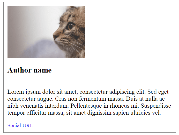
Our finished product will look like this:

Let’s dive in!

Prerequisites
In this tutorial, we’ll use React to create components. While you don’t have to be familiar with styled-components or Sass, you should ideally have some hands-on experience with JavaScript and CSS.
Creating an author box in React with no styling
Let’s walk through how to build an author box with no styling in React.
Step 1: Install React and dependencies
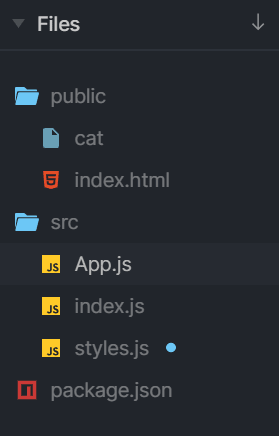
We’re just using a sandbox for the purpose of this tutorial, but if you’re creating a real application, you’ll need to install React, ReactDOM, styled-components, and Sass. Your project folder should include the following files.
Now let’s start populating the index.js file. First, import React and styled-components, respectively, into the styles.scss file.
import React from "react";
import ReactDOM from "react-dom";
import styled from "styled-components";
import "./styles.scss";
I’ve commented out both libraries for now so that we can focus first on the markup of the component. Your index.js you should look like this:
import React from "react";
import ReactDOM from "react-dom";
// import styled from "styled-components";
// import "./styles.scss";

import App from "./App";

ReactDOM.render(<App />, document.getElementById("root"));
Your index.html file should include the following code.
<html>

<head>
  <title>React Exercise</title>
  <meta charset="UTF-8" />
</head>

<body>
  <div id="app"></div>

  <script src="../src/index.js"></script>
</body>

</html>
However, if you’re using the fiddle above, the index.html document will look slightly different, so be aware of this when playing with the code.
Now we’re ready to create the <AuthorBox> component. Remember that in React, all components start with a capital.
Step 2: Build the elements of the author box with JSX
Our component will consist of the following elements.
- An author name (
<H3>) - An author bio: (
<p>) - A social URL (
<a href>) - An author avatar (
<img>) - A wrapper to hold all these (
<div>)
In the App.jsfile, add the following code.
import React from "react";
// import "./styles.scss";
const AuthorBox = () => (
<div>
<img src="" alt="" />
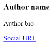
<h3>Author name</h3>
<p>Author bio</p>
<a href="#socialURL">Social URL</a>
</div>
);
export default function App() {
return <AuthorBox />;
}
We’re importing React from react so that we can use JSX syntax. We’re defining the AuthorBox component as a simple ES6 arrow function, which takes no parameter for now and outputs plain HTML markup. In the end, we’re exporting this component as the default export for the App.js file.
You should see this rendered:
Before we move on to styling, let’s add an image. For the image to be displayed in the sandbox, we must first add it to the public folder.

Your code should now look like this:
import React from "react";
// import "./styles.scss";

const AuthorBox = () => (
 <div>
   <img src="cat" alt="" width="200" />
   <h3>Author name</h3>
   <p>Author bio</p>
   <a href="#socialURL">Social URL</a>
 </div>
);

export default function App() {
 return <AuthorBox />;
}
And it should render this:

Now we can start styling. We’ll add SCSS styles, then refactor the code to styled-components.
Step 3: Style the author box with SCSS
First, add the styles to the styles.scss file.
$size-s: 14px;
$size-m: 16px;
$size-l: 20px;
$size-xl: 24px;

.wrapper {
  display: flex;
  flex-flow: column nowrap;
  justify-content: flex-start;
  align-items: flex-start;
  align-content: center;
  padding: 10px;

  &-border {
    border: solid 1px grey;
  }
}

.author {
  &-name {
    font-size: $size-l;
  }

  &-bio {
    font-size: $size-s;
  }

  &-socialUrl {
    text-decoration: none;
    font-size: $size-m;
  }

}
The next step is to add these styles to the elements. Go ahead and update the AuthorBox component. I’ve added some lorem ipsum text to the author bio for demonstration purposes.
import React from "react";
import "./styles.scss";

const AuthorBox = () => (
 <div className="wrapper wrapper-border">
   <img src="cat" alt="" width="200" />
   <h3 className="author-name">Author name</h3>
   <p className="author-bio">Lorem ipsum dolor sit amet, consectetur adipiscing elit. Sed eget consectetur augue. Cras non fermentum massa. Duis at nulla ac nibh venenatis interdum. Pellentesque in rhoncus mi. Suspendisse tempor efficitur massa, sit amet dignissim sapien ultricies vel.
</p>
   <a className="author-socialUrl" href="#socialURL">
     Social URL
   </a>
 </div>
);

export default function App() {
 return <AuthorBox />;
}
Your component should now render like this:
What if we want to assign different color schemes to the author boxes? Let’s say we want a pink box and a blue box with adjusted font colors. We’ll need to create additional classes.
.background {
 &-pink {
   background-color: pink;

   h3,a {
       color: palevioletred;
   }
 }
  &-blue {
   background-color: skyblue;

   h3,a {
     color: blue;
   }
 }
Let’s duplicate the author box in the app output so that we can see both styles in parallel. To do this, adjust the default export code in the App.js file.
export default function App() {
 return (
   <>
     <AuthorBox />
     <AuthorBox />
   </>in
 );
}
Notice that now the AuthorBox components are wrapped in an empty tag, which is a React Fragment.
To add the background colors, we’ll need to pass the AuthorBox component a background property. We’ll condition the background to be pink when the AuthorBox has the isPink property and to be blue otherwise.
const background = `${isPink? "backgroundPink" : "backgroundBlue"}`;
We updated the AuthorBox at the bottom so that one of the components is pink.
import React from "react";
import "./styles.scss";
// import classNames from "classnames";

const AuthorBox = ({ isPink }) => {

 const background = `${isPink? "backgroundPink" : "backgroundBlue"}`;

 return (
   <div
     className={`wrapper wrapperBorder ${background}`}
   >
     <img src="cat" alt="" width="200" />
     <h3 className="authorName">Author name</h3>
     <p className="authorBio">
       Lorem ipsum dolor sit amet, consectetur adipiscing elit. Sed eget consectetur augue. Cras non fermentum massa. Duis at nulla ac nibh venenatis interdum. Pellentesque in rhoncus mi. Suspendisse tempor efficitur massa, sit amet dignissim sapien ultricies vel.
     </p>
     <a className="authorSocialUrl" href="#socialURL">
       Social URL
     </a>
   </div>
 );
}

export default function App() {
 return (
   <>
     <AuthorBox isPink />
     <AuthorBox />
   </>
 )
}
If we want to add one more class to the wrapper for a top margin, for example, the code becomes quite crowded.
<div className={`wrapper wrapperBorder ${background} wrapper-margin`}>
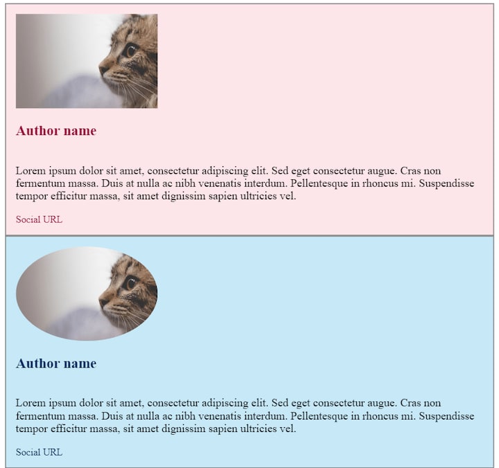
Finally, let’s make the author image round. We need to add another class since we want it to be an option, not mandatory. Create a class called avatar and add it to the <img> tag.
.avatar{
   border-radius: 50%;
 }
We want this class to apply only to one of the containers — let’s say, the blue one. We need to condition this.
const AuthorBox = ({ isPink }) => {

 const background = `${isPink? "backgroundPink" : "backgroundBlue"}`;
 const avatar = `${isPink? " " : "avatar"}`;

 return (
   <div
     className={`wrapper wrapperBorder ${background}`}
   >
     <img className={`${avatar}`} src="cat" alt="" width="200" />
     <h3 className="authorName">Author name</h3>
     <p className="authorBio">
       Lorem ipsum dolor sit amet, consectetur adipiscing elit. Sed eget consectetur augue. Cras non fermentum massa. Duis at nulla ac nibh venenatis interdum. Pellentesque in rhoncus mi. Suspendisse tempor efficitur massa, sit amet dignissim sapien ultricies vel.
     </p>
     <a className="authorSocialUrl" href="#socialURL">
       Social URL
     </a>
   </div>
 );
}
Below are our final components.

While this is definitely achievable for such small projects, as the code base grows, it becomes increasingly troublesome to maintain the styles. Let’s see what the same components would look like with styled-components.
Step 4: Style the author box with styled-components
I’ve copied the code from the index.js and app.js files, but this time our styles will stay inside a style.js file.
How can we refactor from SCSS to styled-components? First, we’ll adjust the styles, and our code should look like this:
import styled from "styled-components";

const sizeS = '14px';
const sizeM = '16px';
const sizeL = '20px';

export const Wrapper = styled.div`
 display: flex;
 flex-flow: column nowrap;
 justify-content: flex-start;
 align-items: flex-start;
 align-content: center;
 padding: ${sizeS};
 border: solid 1px grey;
 background-color: ${props => (props.isPink ? "rgb(252, 230, 234)" : "rgb(199, 233, 247)")};
`

export const Avatar = styled.img`
 border-radius: ${props => (props.isRound ? `50%` : ` `)};
`

export const Name = styled.h3`
 font-size: ${sizeL};
 color: ${props => (props.isPink ? "rgb(150, 13, 58)" : "rgb(4, 46, 94)")};
`

export const Bio = styled.p`
 font-size: ${sizeM};
`

export const SocialURL = styled.a`
 text-decoration: none;
 font-size: ${sizeS};
 color: ${props => (props.isPink ? "rgb(150, 13, 58)" : "rgb(4, 46, 94)")};
`
This is 34 lines of code, compared to 54 in the SCSS version.
Next, adjust the App.js file.
import React from "react";
import { Wrapper, Avatar, Name, Bio, SocialURL } from "./styles";

const AuthorBox = ({ isPink, isRound }) => {
 return (
   <Wrapper isPink={isPink}>
     <Avatar isRound={isRound} src="cat" alt="" width="200" />
     <Name isPink={isPink}>Author name</Name>
     <Bio>
       Lorem ipsum dolor sit amet, consectetur adipiscing elit. Sed eget consectetur augue. Cras non fermentum massa. Duis at nulla ac nibh venenatis interdum. Pellentesque in rhoncus mi. Suspendisse tempor efficitur massa, sit amet dignissim sapien ultricies vel.
     </Bio>
     <SocialURL isPink={isPink} href="#socialURL">
       Social URL
     </SocialURL>
   </Wrapper>
 );
};

export default function App() {
 return (
   <>
     <AuthorBox isPink isRound/>
     <AuthorBox />
   </>
 );
}
Now we have 29 lines of code instead of the 36 lines from the SCSS version.
The components should render like this:
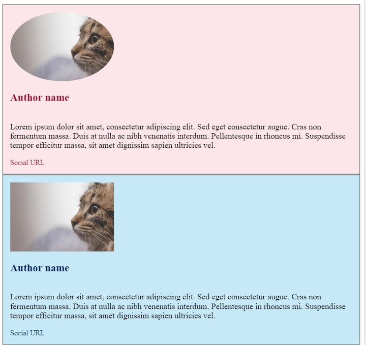
The styled-components can be even cleaner if you use switch functions, but with this setup, you can see how easy it is to mix and match the components and properties. If you want the avatar to be round in the blue version, just pass the isRound property to the second component.
export default function App() {
 return (
   <>
     <AuthorBox isPink />
     <AuthorBox isRound />
   </>
 );
}
SCSS vs. styled-components
styled-components enable you to fully separate UI from the function and state of components. But are they really better than Sass/SCSS? Let’s compare the advantages and drawbacks of both libraries.
Overwriting styles and naming conventions
Since styled-components don’t come with any globally scoped selectors, you don’t need to worry about conflicts and styles overwriting each other. Although Sass comes with nice upgrades such as nesting and variables, it’s more likely to lead to overwriting styles.
styled-components offer simplicity in naming. With Sass/SCSS — whether combined with BEM or not — there’s a lot of going back and forth to find the correct classes. You can imagine what a challenge it would be to determine what overwrites what in a large project.
Also, in the case of Sass stylesheets, the code quickly becomes crowded when you start adding classes, especially if you want the additional styling to be optional for the user.
Customization and reuse
styled-components are easier to reuse than those styled with Sass. If you want to share a component between two higher-order components or even between two apps, you can be sure that the logic and styling will remain consistent.
They’re also easy to customize by simply passing additional props. The ability to condition properties such as sizes and colors to props makes the styles more dynamic and easier to handle in big projects.
Performance and caching
styled-components are rendered only if the component is on screen, while Sass is processed anyway in most cases, although this can be controlled.
This is a point for styled-components, but the drawback in this case is that once the styles are parsed, all the code is added into the index.html file and there’s no way to separate the CSS from the rest.
Another disadvantage of styled-components is that the class names are generated dynamically, which can cause issues with caching between builds or renders. With Sass, this issue doesn’t exist.
Debugging
The method of scoping styled-components is superior in terms of reusability and customization, but because the components are more generic, it can be harder to debug them.
Moreover, due to all the conditioning and logic mixed with styles, they’re also harder to read. With Sass/SCSS, the output is plain CSS and debugging is easier.
Learning curve and legacy code
The learning curve for styled-components is steeper than that of Sass/SCSS, and not all developers like to mix their CSS with JS. But with styled-components, you can still use plain CSS. You don’t have the flexibility to do things both ways with Sass.
Finally, Sass is more likely to be found in legacy projects. Integrating both libraries into a single application can be confusing. Although styled-components offer myriad advantages, some developers prefer the stability and more universal character of Sass over the novelty of styled-components.
Is your frontend hogging your users' CPU?
As web frontends get increasingly complex, resource-greedy features demand more and more from the browser. If you’re interested in monitoring and tracking client-side CPU usage, memory usage, and more for all of your users in production, try LogRocket.

LogRocket is like a DVR for web apps, recording everything that happens in your web app or site. Instead of guessing why problems happen, you can aggregate and report on key frontend performance metrics, replay user sessions along with application state, log network requests, and automatically surface all errors.
Modernize how you debug web apps — Start monitoring for free.
The post Moving from SCSS to styled-components: Advantages and caveats appeared first on LogRocket Blog.

Top comments (1)
It is helpful content and the example is very descriptive.Thank you. I