
Using CSS to create a zigzag pattern was a lot harder to do than bubbles but there are a couple of ways you can approach this problem and there's a bit of fun you can have too.
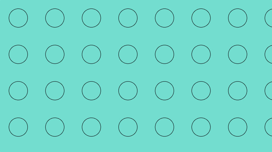
Starting with the basics, a repeatable bubble pattern can be created using a circular gradient and letting it repeat:

background-image: radial-gradient(transparent 25px, black 25px, black 26px, transparent 26px);
background-size: 100px 100px;
It doesn't get much simpler than that, set the size of the pattern and create the appropriate circle using a radial-gradient that goes from transparent to the colour you want for the border.
The nice thing about this solution, it will take on the background colour for the element you've applied it to. Here's the same pattern on top of a teal background:

background-colour: teal;
The other way to achieve this is to replace transparent with the colour of your choice. So here's the same pattern but with turquoise to fill. It's actually on top of the same teal background, you just can't see it.
background-color: teal;
background-image: radial-gradient(turquoise 25px, black 25px, black 26px, turquoise 26px);
Now, for a bit of fun. Using the multiple radial-gradients, background-positions and background-sizes you can build up something a bit more complicated:
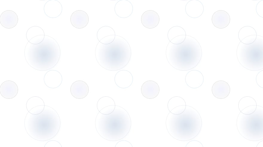
By no means is this a realistic representation of what bubbles look like, but it just shows that you have a bit of freedom to create repeating patterns without having to load in additional assets.
{
    background-image: radial-gradient(rgba(0,0,255,0.05), rgba(0,0,0,0.025) 25px, rgba(0,0,0,0.2) 26px, transparent 26px),
    radial-gradient(transparent 25px, rgba(176,196,222,0.4) 25px, rgba(176,196,222,0.4) 26px, transparent 26px),
    radial-gradient(transparent 50px, rgba(176,196,222,0.25) 50px, rgba(176,196,222,0.25) 51px, transparent 51px),
    radial-gradient(rgba(176,196,222,0.5), rgba(176,196,222,0) 50px),
    radial-gradient(transparent 25px, rgba(135,206,250,0.35) 25px, rgba(135,206,250,0.35) 26px, transparent 26px);
    background-size: 200px 200px;
    background-position: -75px -45px, 0 0, 20px 50px, 25px 55px, 50px 125px;
}
For this example, you need to specify multiple radial-gradients while also adding a specific background-position for each corresponding gradient. You could also add a specific background-size if you wanted to have a parts of the pattern that might not repeat as often.

Top comments (0)