Introduction
This post will layout a short tutorial on how to build an Add to Cart button for an ecommerce store using Web Components. Though this example uses the Fake Store API, the concept can really be applied to any ecommerce platform.
It will review:
- The product page and the requirements
- The anatomy of a web component
- The business logic
- The final product
You can skip to the end to see the whole example on CodePen.
But first, a little context…
Context
A client wanted an ajax Add to Cart button for some upsell products on their Shopify store. JQuery would have worked just fine, but I wanted to try something different.
I'd been looking for a reason to use Web Components. I wanted something more complex than a basic counter example but not something too complex.
An Add to Cart button provides the perfect amount of complexity.
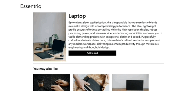
Page Overview
The ecommerce store looks like this:

There's a main product with an add to cart button, and then 3 upsell products below.
For this article, the key is that the main add to cart button is not an ajax button; it's a regular form submit as is common on ecommerce sites. When the user submits the form, they are directed to the cart page. Though, that doesn't really happen on a CodePen.
The requirements for the Add to Cart button are simple:
- the user should click on the button firing a
fetchrequest - the button should indicate that it is processing the request
- if the product was added or if there was an error, the button should indicate that.
The upsell buttons are our web components. Notice that they have the same styling as the main button. That's because they're using the same global CSS. Web Components have their own styling so slots need to be used to ensure they inherit styling.
Anatomy of a Web Component
Web Components are custom elements, so we add them to the page like regular HTML:
<add-to-cart>
  <button slot="button" type="submit" class="btn--atc">
    Add to cart
  </button>
  <input slot="input" type="hidden" name="quantity" value="1">
</add-to-cart>
Take note of how the button and input are being added.
The Web Component structure looks like this:
class AddToCartButton extends HTMLElement {
// props
productId;
button;
// constructor
constructor() {
super();
this.attachShadow({ mode: "open" });
// where styles and HTML go
this.shadowRoot.innerHTML = ``;
}
// lifecycle
connectedCallback() {}
}
// register it
customElements.define("add-to-cart", AddToCartButton);
```
Like any class, there's a constructor, and props and methods can be defined, but it also includes [lifecycle hooks](https://developer.mozilla.org/en-US/docs/Web/API/Web_components/Using_custom_elements#using_a_custom_element:~:text=Custom%20element%20lifecycle%20callbacks%20include%3A). This one only uses `connectedCallback` which is called when the component is mounted.
### The Constructor
In the constructor, we can set some state and define the HTML of the shadow root.
```js
constructor() {
super();
this.attachShadow({ mode: "open" });
this.shadowRoot.innerHTML = `
<style>
:host{
display: flex;
flex-direction: column;
width: 100%;
}
</style>
<slot name="button"></slot>
<slot name="input"></slot>
`;
}
```
The constructor isn't the place to check for attributes or really query anything about the component. According to the [docs](https://developer.mozilla.org/en-US/docs/Web/API/Web_components/Using_custom_elements#implementing_a_custom_element):
> In the class constructor, you can set up initial state and default values, register event listeners and perhaps create a shadow root. At this point, you should not inspect the element's attributes or children, or add new attributes or children. See Requirements for custom element constructors and reactions for the complete set of requirements.
The most important thing to note in this constructor is the `this.shadowRoot.innerHTML`.
The style tag defines styles that apply inside component, and only inside component. The `:host` selector selects the actual component. The only style defined is that it's a flex column.
For this component, the button styles need to inherit from the global css, so styling a button within the component wouldn't work.
In order to allow the button to be styled from the outside the component, a `slot` is used.
This component has two slots:
```html
<slot name="button"></slot>
<slot name="input"></slot>
```
This allows children to be passed in to the component:
```html
<add-to-cart>
<button slot="button" type="submit" class="btn--atc">
Add to cart
</button>
<input slot="input" type="hidden" name="product-id" value="1">
</add-to-cart>
```
This is especially helpful in an ecommerce setting where (1) there is already a set of styles and (2) a templating language like Liquid is used to render out the elements using product data:
```liquid
<input slot="input" type="hidden" name="product-id" value="{{ product.id }}">
```
### The connectedCallback
Once the component is mounted, the `connectedCallback` hook is called.
It's here where the slots can be queried.
```js
connectedCallback() {
const buttonSlot = this.shadowRoot.querySelector(`slot[name="button"]`);
buttonSlot.addEventListener("click", (e) => this.addToCart());
this.button = buttonSlot
.assignedElements()
.find((el) => el.tagName === "BUTTON");
const inputSlot = this.shadowRoot.querySelector(
`slot[name="input"]`
);
const input = inputSlot
.assignedElements()
.find((el) => el.tagName === "INPUT");
// coerce string to number
this.productId = +(input.value);
}
```
#### Getting the Elements
The `querySelector` can be used to query within the `shadowRoot` to the slots. Then `assignedElements()` returns all the elements that have the matching `slot` name.
So for the button, the attribute of `slot="button"` makes the button an assigned element of `slot[name="button"]`. Filtering according to tag type isn't necessary, but just ensures an actual button is returned.
#### Setting the Properties
The `this.button` and `this.productId` are properties of the component, defined above the constructor.
```js
class AddToCartButton extends HTMLElement {
/** @type {number} */
productId;
/** @type {HTMLButtonElement} */
button;
constructor() {}
connectedCallback() {}
}
```
#### Adding an EventListener
The last part of the callback is adding an event listener:
```js
buttonSlot.addEventListener("click", (e) => this.addToCart());
```
This is where the actual logic of the add to cart button will happen.
## The Business Logic
There are two parts to the business logic — the request to the api and updating the UI
```js
/**
* Set the state of the button
*
* @param {('fetching' | 'success' | 'error')} state
*/
setButtonState(state) {
const button = this.button;
const fetching = "fetching";
const success = "success";
const error = "error";
switch (state) {
case "fetching":
button.textContent = "Adding...";
button.disabled = true;
button.classList.add(fetching);
button.classList.remove(success, error);
break;
case "success":
button.textContent = "Added!";
button.disabled = true;
button.classList.add(success);
button.classList.remove(fetching, error);
break;
case "error":
button.textContent = "Retry";
button.disabled = false;
button.classList.add(error);
button.classList.remove(fetching, success);
break;
default:
break;
}
}
async addToCart() {
this.setButtonState("fetching");
try {
const response = await fetch("https://fakestoreapi.com/carts/7", {
method: "PUT",
body: JSON.stringify({
userId: 3,
date: 2019 - 12 - 10,
products: [
{
productId: this.productId,
quantity: 1
}
]
})
});
// obviously, this is only for testing
if(this.getAttribute('error')) {
throw new Error("A test error");
}
const json = await response.json();
console.log(json);
this.setButtonState("success");
} catch(error){
console.error(error);
this.setButtonState("error");
}
}
```
*Note the `error` attribute. That isn't needed, but helpful for testing.*
The `addToCart()` method is straightforward:
- Set the button to `"fetching"`.
- Make the request.
- If it's successful, set the button to `"success"`
- If there's an error, set the button to `"error"`
The `setButtonState()` updates the button's text and applies classes for styling.
In a typical Web Component, the classes would be defined in a style tag, but because slots were used, the styling from the global css can be applied to the elements assigned to the slot.
This has some pros and cons.
- Pro: can define the CSS of the component with the rest of your CSS
- Con: the class names are hardcoded to the component, but have to correlation to anything inside the component (i.e. what does a `"success"` class mean in the component? nothing).
Attributes could be used to pass in class names:
```html
<add-to-cart
btn-fetching-class="fetching"
btn-success-class="success"
btn-error-class="error"
>
```
This would allow any name class names to be used, but for a one-off component, it may be a bit much.
Now to see it all in action.
## The Final Product
Here is the final product
Also see it on CodePen

Top comments (2)
You can set attributes on the Web Component:
<add-to-cart state="fetching" ...>And then use the :host() style inside the Web Component with CSS:
:host([state="fetching"]) button { ... }FYI My GPT gets you a starter in seconds; just ask for a
<add-to-cart>Yes, that would work as well, and would be a good way to indicate the state too.
For the original client, I needed to use styles already defined in their global css file, so creating those styles in the component wouldn't have been needed.