Web animations introduced attractive and exciting UI, but creating robust animations in software has been a hassle. There are many difficulties while scaling the application, so developers have created several reusable libraries overtime to handle these difficulties.
This article will be focusing on one of those libraries—KendoReact and its React Animation component. In KendoReact, the TransitionGroup component helps users animate elements that appear, enter or exit the viewport.
The KendoReact library includes the KendoReact Animation component in its robust suite of more than 100 customizable and fully accessible React UI components. It is distributed through npm under the kendo-react-animation package.
Prerequisites
To follow along with this tutorial, you will need to have:
- A basic knowledge of ReactJS
- Node.js installed
- A code editor
Installation and Setup
Firstly, we need to use the following command to create a project, move into the project directory and start the project. Enter the command below in your terminal:
npx create-react-app kendo-ui-animations --use-npm
cd kendo-ui-animations
npm start
Next, install the KendoReact library needed for the project with the following command.
npm install --save @progress/kendo-react-animation
Note: KendoReact is a commercial UI component library, and as a part of this you will need to provide a license key when you use the components in your React projects. You can snag a license key through a free trial or by owning a commercial license. For more information, you can head over to the KendoReact Licensing page.
Configuring the React Animation Component
The ReactTransitionGroup performs CSS transitions and animations when a React component enters or exits the DOM. All components wrapped by the animation will be animated with every child element enclosed in the AnimationChild component. The AnimationChild component implements the required special life-cycle hooks, and each child component is wrapped in an additional div element.
The TransitionGroup component automatically detects the enter and exit state of the children. This means that you only need to add or remove a child to animate a child.
The following example below shows how to animate the element content added to the Slide Animation with an entering effect. When content is removed, the element gains a unique animation effect.
For the aesthetic of our UI, let's create a style.css file in the src directory and paste the following code into the file.
.content {
    width: 100px;
    padding: 10px;
    color: #787878;
    background-color: #fcf7f8;
    font-size: 13px;
    font-family: Helvetica, Arial, sans-serif;
    letter-spacing: 1px;
    text-align: center;
    border: 1px solid rgba(0,0,0,.05);
}
The CSS code above is used to style the content we will create shortly.
In your project directory, you will see the App.js file in the src directory; replace the file's content with the code below.
import {useState} from "react";
import { Slide } from "@progress/kendo-react-animation";
import "./styles.css";
const App = () => {
const [show, setShow] = useState(true);
const onClick = () => {
setShow((state)=>{
!state
});
};
const children = show ? <div className="content">CONTENT</div> : null;
return (
<div>
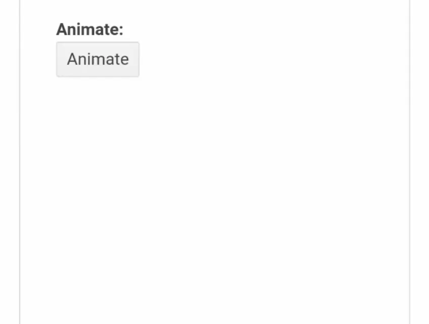
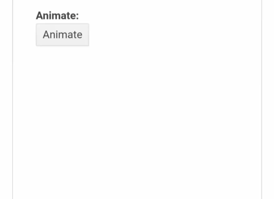
<dl>
<dt>Animate:</dt>
<dd>
<button className="k-button" onClick={onClick}>
Animate
</button>
</dd>
</dl>
<Slide>{children}</Slide>
</div>
);
};
We imported Slide from KendoReact and state from React in the code above. We then called state in App.js and set its initial value to be true (meaning the element content will be visible on initial rendering). We created the variable children and assigned a value to it based on the present state of the show value using the ternary operator.
So whenever we click on the button tag, the onClick function is called and it changes the state of show. But here we are passing a callback into setShow because the next state value is dependent on the previous state value of show.
Types of Animation
The contents in the Animation component are animated using various animation effects. The Animation package contains the following types of animations:
- Fade
- Expand
- Push
- Reveal
- Slide
- Zoom
To use these different animations, go back into your App.js file and replace every part of your code that contains Slide to whichever animation you want to use; below is an example using Fade.
import {useState} from "react";
import { Fade } from "@progress/kendo-react-animation";
import "./styles.css";

const App = () => {
    const [show, setShow] = useState(true);

    const onClick = () => {
    setShow((state)=>{
    !state
    });
    };

    const children = show ? <div className="content">CONTENT</div> : null;
    return (
    <div>
    <dl>
    <dt>Animate:</dt>
    <dd>
        <button className="k-button" onClick={onClick}>
        Animate
        </button>
    </dd>
    </dl>

    <Fade>{children}</Fade>
    </div>
    );
};
Disabled Animations
You can also disable or enable (hide or show) the effect of the animations. The control over the disabled animation state results in its disappearance or an instant element display.
The Expand, Push, Reveal, Slide and Zoom animations apply the hiding or showing effect by default. To disable these effects, set the exit or the enter property, respectively, to false.
Now adjust or replace the code in the App.js file to fit the code below.
import {useState} from "react";
import { Slide } from "@progress/kendo-react-animation";
import "./styles.css";
const App = () => {
const [show, setShow] = useState(false);
const [enter, setEnter] = useState(true);
const [exit, setExit] = useState(true);
const onClick = () => {
setShow(!show);
};
const onChange = (e) => {
if (e.target.name === "enter") {
setEnter(e.target.checked);
} else {
setExit(e.target.checked);
}
};
const children = show ? <div className="content">CONTENT</div> : null;
return (
<div>
<dl>
<dt>
<dl>
<input
type="checkbox"
id="enter"
className="k-checkbox"
name="enter"
checked={enter}
onChange={onChange}
/>
<label htmlFor="enter" className="k-checkbox-label">
Enter:
</label>
<br />
<input
type="checkbox"
id="exit"
className="k-checkbox"
name="exit"
checked={exit}
onChange={onChange}
/>
<label htmlFor="exit" className="k-checkbox-label">
Exit:
</label>
</dl>
</dt>
<dt>Animate:</dt>
<dd>
<button className="k-button" onClick={onClick}>
Animate
</button>
</dd>
</dl>
<Slide enter={enter} exit={exit}>
{children}
</Slide>
</div>
);
};
The props enter and exit are passed into the animation component (Slide) to enable the entering and exiting animation in the code above; this is because the value of enter and exit are set to true initially.
We also added an onChange function; the function is called by checking or unchecking the input tag, which allowed the enabling or disabling of the entering or exiting animation.

Stacked Animations
All animation is an extension of the Animation component. However, animations like the Push and Zoom are further extended by using the stackChildren options, which enable you to stack animations.
Exiting and Entering Child Elements
To stack exiting and entering child elements within the same block container, set the stackChildren property to true. When it comes to replacing an existing child element with a new one, the stack effect is most suitable.
Now adjust or replace the code in the App.js file to fit the code below.
import {useState}from "react";
import { Zoom } from "@progress/kendo-react-animation";
import "./styles.css";

const App = () => {
    const [index, setIndex] = useState(1);

    const onClick = () => {
    setIndex(index + 1);
    };

    return (
    <div>
    <dl>
    <dt>Zoom:</dt>
    <dd>
        <button className="k-button" onClick={onClick}>
        Animate
        </button>
    </dd>
    </dl>

    <Zoom stackChildren={true}>
    <div className="content" key={index}>
        {index}
    </div>
    </Zoom>
    </div>
    );
};
In the codes above, we imported our animation components as usual. But, this time we passed nested JSX, which is in contrast to the previous animation where we passed only a single JSX. In order for this to work, we had to pass the stackChildren props with the value true.
Life-Cycle Hooks
When a child element is declared, you are either removing or adding a child. All animations call specific hooks during the entering or exiting of the element.
Adding Child Elements
Each time you add a component to an entering animation, the animations call the following hooks:
onEnter—Called before the animation starts.
onEntering—Called after the animation has started.
onEntered—Called when the animation completes.
Removing Child Elements
The animations call the following hook below each time you remove a component from an existing animation:
onExit—Called before the animation starts.
onExiting—Called after the animation started.
onExited—Called when the animation completes.
Duration
All animation types allow you to take control of the duration of the exiting and entering animation effects.
When configuring the duration, make sure to define the transitionExitDuration or transitionEnterDuration property. The duration is represented by the passed value of the animation in milliseconds.
For example, adjust or replace the code in the App.js file to fit the code below.
import {useState} from "react";
import { Slide } from "@progress/kendo-react-animation";
import "./styles.css";

const App = () => {
    const [show, setShow] = useState(false);

    const onClick = () => {
    setShow(!show);
    };

    const children = show ? <div className="content">CONTENT</div> : null;
    return (
    <div>
    <dl>
    <dt>Animate:</dt>
    <dd>
        <button className="k-button" onClick={onClick}>
        Animate
        </button>
    </dd>
    </dl>

    <Slide transitionEnterDuration={800} transitionExitDuration={1000}>
    {children}
    </Slide>
    </div>
    );
};
In the code above, we made an adjustment to import the Slide from KendoReact Animation. Also we passed the transitionEnterDuration and transitionExitDuration props to specify the animation duration for entering and exiting.
Direction
Except for the Fade Animation, the Animations provide a set of predefined directions, which allow us to control their exiting and entering effects.
Note: A configurable direction feature isn't available for the Fade Animation because it represents a transition in the element's opacity.
The entering and exiting animations can be defined by using the direction property of each Animation type listed below:
- ExpandDirection
- PushDirection
- RevealDirection
- SlideDirection
- ZoomDirection
Expand
The following predefined directions are supported by the Expand Animation:
- Vertical (Default): The content is expanded from center to top and bottom, and vice versa.
- Horizontal: The content is expanded from center to left and right, and vice versa.
Now adjust or replace the code in the App.js file with the code below.
import { useState } from "react"
import { Expand } from "@progress/kendo-react-animation";
import "./styles.css";
const App = () => {
const [show, setShow] = useState(false);
const [direction, setDirection] = useState("vertical");
const onClick = () => {
setShow(!show);
};
const onChange = (e) => {
setDirection(e.target.value);
};
const children = show ? <div className="content">Content</div> : null;
return (
<div className="row">
<div className="col-md-6">
<dl>
<dt>Expand: {direction}</dt>
<dd>
<button className="k-button" onClick={onClick}>
Animate
</button>
</dd>
</dl>
<Expand direction={direction}>{children}</Expand>
</div>
<div className="col-md-6">
<dl>
<dt>Direction:</dt>
<dd>
<div className="example-config">
<input
id="ver"
className="k-radio"
type="radio"
name="direction"
value="vertical"
defaultChecked={direction === "vertical"}
onClick={onChange}
/>
<label htmlFor="ver" className="k-radio-label">
Vertical
</label>
<br />
<input
id="hor"
className="k-radio"
type="radio"
name="direction"
value="horizontal"
defaultChecked={direction === "horizontal"}
onClick={onChange}
/>
<label htmlFor="hor" className="k-radio-label">
Horizontal
</label>
</div>
</dd>
</dl>
</div>
</div>
);
};
In the code above, we called the setDirection function; the value of setDirection determines the value of the prop Direction passed into the Expand component imported from KendoReact animations. The GIF below shows the result.

Push
The following predefined directions are supported by the Push Animation:
Right (Default)—The content is pushed from left to right.
Up—The content is pushed from bottom to top.
Down—The content is pushed from top to bottom.
Left—The content is moved from right to left.
Now adjust or replace the code in the App.js file to fit the code below.
import { useState } from "react"
import { Push } from "@progress/kendo-react-animation";
import "./styles.css";
const App = () => {
const [direction, setDirection] = useState("right");
const [index, setIndex] = useState(1);
const onClick = () => {
setIndex(index + 1);
};
const onChange = (e) => {
setDirection(e.target.value);
};
return (
<div className="row">
<div className="col-md-6">
<dl>
<dt>Push: {direction}</dt>
<dd>
<button className="k-button" onClick={onClick}>
Animate
</button>
</dd>
</dl>
<Push direction={direction} stackChildren={true}>
<div className="content" key={index}>
{index}
</div>
</Push>
</div>
<div className="col-md-6">
<dl>
<dt>Direction:</dt>
<dd>
<div className="example-config">
<input
id="up"
className="k-radio"
type="radio"
name="direction"
value="up"
defaultChecked={direction === "up"}
onClick={onChange}
/>
<label htmlFor="up" className="k-radio-label">
Up
</label>
<br />
<input
id="down"
className="k-radio"
type="radio"
name="direction"
value="down"
defaultChecked={direction === "down"}
onClick={onChange}
/>
<label htmlFor="down" className="k-radio-label">
Down
</label>
<br />
<input
id="left"
className="k-radio"
type="radio"
name="direction"
value="left"
defaultChecked={direction === "left"}
onClick={onChange}
/>
<label htmlFor="left" className="k-radio-label">
Left
</label>
<br />
<input
id="right"
className="k-radio"
type="radio"
name="direction"
value="right"
defaultChecked={direction === "right"}
onClick={onChange}
/>
<label htmlFor="right" className="k-radio-label">
Right
</label>
</div>
</dd>
</dl>
</div>
</div>
);
};
In the code above, we followed the same syntax as Expand, but the process is done with the Push component this time. Also, we included the stackChildren. The GIF below shows the result.

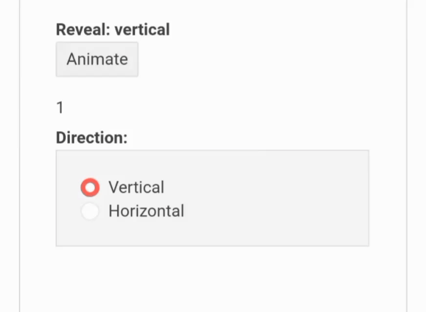
Reveal
The following predefined directions are supported by the Reveal Animation:
Vertical (Default)—The content of the height is revealed.
Horizontal—The content of the width is displayed.
Now adjust or replace the code in the App.js file to fit the code below.
import { useState } from "react"
import { Reveal } from "@progress/kendo-react-animation";
import "./styles.css";
const App = () => {
const [direction, setDirection] = useState("vertical");
const [index, setIndex] = useState(1);
const onClick = () => {
setIndex(index + 1);
};
const onChange = (e) => {
setDirection(e.target.value);
};
return (
<div className="row">
<div className="col-md-6">
<dl>
<dt>Reveal: {direction}</dt>
<dd>
<button className="k-button" onClick={onClick}>
Animate
</button>
</dd>
</dl>
<Reveal direction={direction}>{index}</Reveal>
</div>
<div className="col-md-6">
<dl>
<dt>Direction:</dt>
<dd>
<div className="example-config">
<input
id="ver"
className="k-radio"
type="radio"
name="direction"
value="vertical"
defaultChecked={direction === "vertical"}
onClick={onChange}
/>
<label htmlFor="ver" className="k-radio-label">
Vertical
</label>
<br />
<input
id="hor"
className="k-radio"
type="radio"
name="direction"
value="horizontal"
defaultChecked={direction === "horizontal"}
onClick={onChange}
/>
<label htmlFor="hor" className="k-radio-label">
Horizontal
</label>
</div>
</dd>
</dl>
</div>
</div>
);
};
Once again, in the code above, we followed the same syntax as Expand, but this time the process is done with the Reveal Animation.
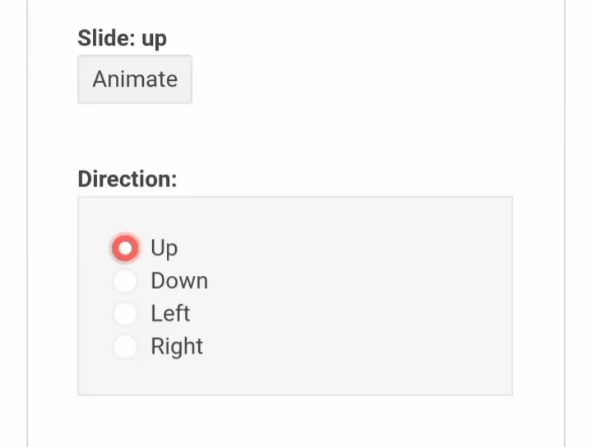
Slide
The following predefined directions are supported by Slide Animation:
Down (Default)—The content is slid from top to bottom, and vice versa.
Up—The content is slid from bottom to top, and vice versa.
Left—The content is slid from right to left, and vice versa.
Right—The content is slid from left to right, and vice versa.
Now adjust or replace the code in the App.js file with the code below.
import { useState } from "react"
import { Slide } from "@progress/kendo-react-animation";
import "./styles.css";
const App = () => {
const [show, setShow] = useState(false);
const [direction, setDirection] = React.useState("down");
const onClick = () => {
setShow(!show);
};
const onChange = (e) => {
setDirection(e.target.value);
};
const children = show ? <div className="content">CONTENT</div> : null;
return (
<div className="row">
<div className="col-md-6">
<dl>
<dt>Slide: {direction}</dt>
<dd>
<button className="k-button" onClick={onClick}>
Animate
</button>
</dd>
</dl>
<Slide direction={direction}>{children}</Slide>
</div>
<div className="col-md-6">
<dl>
<dt>Direction:</dt>
<dd>
<div className="example-config">
<input
id="up"
className="k-radio"
type="radio"
name="direction"
value="up"
defaultChecked={direction === "up"}
onClick={onChange}
/>
<label htmlFor="up" className="k-radio-label">
Up
</label>
<br />
<input
id="down"
className="k-radio"
type="radio"
name="direction"
value="down"
defaultChecked={direction === "down"}
onClick={onChange}
/>
<label htmlFor="down" className="k-radio-label">
Down
</label>
<br />
<input
id="left"
className="k-radio"
type="radio"
name="direction"
value="left"
defaultChecked={direction === "left"}
onClick={onChange}
/>
<label htmlFor="left" className="k-radio-label">
Left
</label>
<br />
<input
id="right"
className="k-radio"
type="radio"
name="direction"
value="right"
defaultChecked={direction === "right"}
onClick={onChange}
/>
<label htmlFor="right" className="k-radio-label">
Right
</label>
</div>
</dd>
</dl>
</div>
</div>
);
};
Here we followed the same syntax as Expand, but the process is done with the Slide Animation this time.
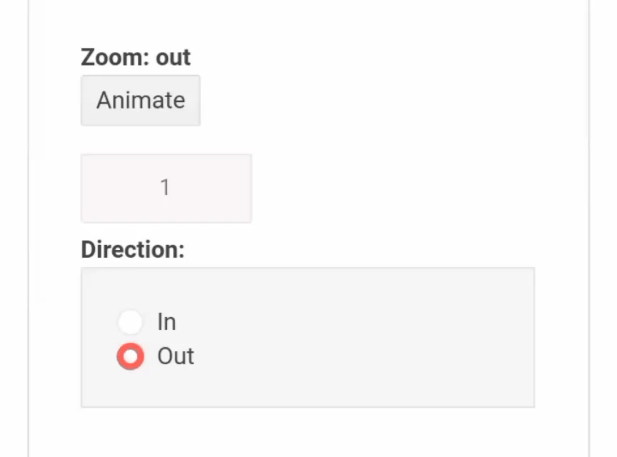
Zoom
The following predefined directions are supported by Zoom Animation:
Out (Default)—The content is zoomed from the outside to the inside.
In—The content is zoomed from the inside to the outside.
Now adjust or replace the code in the App.js file with the code below.
import { useState } from "react"
import { Zoom } from "@progress/kendo-react-animation";
import "./styles.css";
const App = () => {
const [direction, setDirection] = useState("out");
const [index, setIndex] = useState(1);
const onClick = () => {
setIndex(index + 1);
};
const onChange = (e) => {
setDirection(e.target.value);
};
return (
<div className="row">
<div className="col-md-6">
<dl>
<dt>Zoom: {direction}</dt>
<dd>
<button className="k-button" onClick={onClick}>
Animate
</button>
</dd>
</dl>
<Zoom direction={direction} stackChildren={true}>
<div className="content" key={index}>
{index}
</div>
</Zoom>
</div>
<div className="col-md-6">
<dl>
<dt>Direction:</dt>
<dd>
<div className="example-config">
<input
id="in"
className="k-radio"
type="radio"
name="direction"
value="in"
defaultChecked={direction === "in"}
onClick={onChange}
/>
<label htmlFor="in" className="k-radio-label">
In
</label>
<br />
<input
id="out"
className="k-radio"
type="radio"
name="direction"
value="out"
defaultChecked={direction === "out"}
onClick={onChange}
/>
<label htmlFor="out" className="k-radio-label">
Out
</label>
</div>
</dd>
</dl>
</div>
</div>
);
};
Here, we followed the same syntax as Expand, but the process is done with the Zoom Animation, and we added stackChildren.
Exiting Child Components
Although the child component is exiting, it is still rendered because it is part of the React Virtual DOM but is no longer available in the DOM.
An exiting child element can apply reactive updates because it passes a childFactory function. The function controls the exiting and entering child components based on the provided props.
Now adjust or replace the code in the App.js file with the code below.
import { useState } from "react"
import { Slide } from "@progress/kendo-react-animation";
import "./styles.css";

const App = () => {
    const [show, setShow] = useState(false);

    const onClick = () => {
    setShow(!show);
    };

    const children = show ? <div className="content">CONTENT</div> : null;

    const childFactory = (child) => {
    if (!child.props.in) {
    return React.cloneElement(child, {
    ...child.props,
    children: <div className="content">JUST CHANGED!</div>,
    });
    }

    return child;
    };

    return (
    <div className="example">
    <div>
    <dl>
        <dt>Slide:</dt>
        <dd>
        <button className="k-button" onClick={onClick}>
        Animate
        </button>
        </dd>
    </dl>

    <Slide childFactory={childFactory} transitionExitDuration={1500}>
        {children}
    </Slide>
    </div>
    </div>
    );
};
In the code above, the childFactory functions, which is passed in as props to the component Slide, is used by KendoReact to mutate the existing element to the new children element <div className="content">JUST CHANGED!</div> created using React.cloneElement.
The GIF below shows the result.

Animation Customization
Customization of the animation's behavior is done by configuring the Animation component.
You can use the transitionName property to update the Animation effect. The property defines the class name that is added to the exit or enter elements.
Entering Animations
Add the following code to your styles.css file.
.custom-animation-enter {
    transform: scale(0);
    transition: transform 500ms ease-in-out;
}
.custom-animation-enter-active {
    transform: scale(1);
}
In the code above, the CSS classes are used in configuring the entering animation. Next, adjust or replace the code in your App.js file to fit the code below.
import { useState } from "react"
import { Animation } from "@progress/kendo-react-animation";
import "./styles.css";

const App = () => {
    const [show, setShow] = useState(true);

    const onClick = () => {
    setShow(!show);
    };

    const children = show ? <div className="content">CONTENT</div> : null;
    return (
    <div>
    <dl>
    <dt>Animate:</dt>
    <dd>
        <button className="k-button" onClick={onClick}>
        Animate
        </button>
    </dd>
    </dl>

    <Animation
    transitionName="custom-animation"
    transitionEnterDuration={300}
    exit={false}
    >
    {children}
    </Animation>
    </div>
    );
};
Here, we passed the transitionName as props with a value, which is the name (custom-animation) in our style.css file, and set the exit prop to false. The GIF below shows the result.
Exiting Animations
Once again, the CSS classes are used in configuring the exiting animation by using the following syntax:
Add the following code to your style.css file.
    .custom-animation-exit {
      transform: scale()1;
      transition: transform 500ms ease-in-out;
    }
    .custom-animation-exit-active {
      transform: scale(0);
    }
Next, adjust or replace the code in your App.js file to fit the code below.
import { useState } from "react"
import { Animation } from "@progress/kendo-react-animation";
import "./styles.css";
const App = () => {
const [show, setShow] = useState(true);
const onClick = () => {
setShow(!show);
};
const children = show ? <div className="content">CONTENT</div> : null;
return (
<div>
<dl>
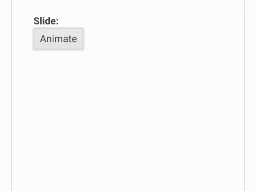
<dt>Slide:</dt>
<dd>
<button className="k-button" onClick={onClick}>
Animate
</button>
</dd>
</dl>
<Animation
transitionName="custom-animation"
transitionExitDuration={300}
enter={false}
>
{children}
</Animation>
</div>
);
};
Here what we did was to pass the transitionName as props with a value, which is the name (custom-animation) in our style.css file, and also set the enter prop to false.

Appearance of the React Animation Component
The Animations enable you to set custom CSS classes both to all wrapper Animation elements and all their child elements or to use their default styling options.
By default, the child component renders a k-child-animation-container CSS class, and the parent component renders a k-animation-container CSS class. You can use these CSS classes to style the components without specifying separate CSS classes.
Add the following code to your style.css file.
.k-animation-container {
    background-color: lightgray;
    }
    .k-animation-container > .k-child-animation-container {
    color: lightgray;
    background-color: #ff6757;
    }
    .example {
    display: flex;
    }
Now, adjust or replace your App.js file with the code below.
import { useState } from "react"
import { Slide } from "@progress/kendo-react-animation";
import "./styles.css";

const App = () => {
    const [show, setShow] = useState(false);

    const onClick = () => {
    setShow(!show);
    };

    const children = show ? <div className="content">CONTENT</div> : null;
    return (
    <div className="example">
    <div>
    <dl>
        <dt>Slide:</dt>
        <dd>
        <button className="k-button" onClick={onClick}>
        Animate
        </button>
        </dd>
    </dl>

    <Slide>{children}</Slide>
    </div>
    </div>
    );
};
In the code above, we set the className to k-button, which enabled us to access KendoReact predefined styles to alter our application's appearance. The GIF below shows the result.
Conclusion
KendoReact has delivered an easy-to-use, scalable animation library that has helped developers quickly add animation to their projects. I hope you found this post helpful.

Top comments (0)