
Quick Plug before we get started: If you like what you read, feel free to read more over at my blog site, or read this article in my blog site, thanks!
Colour psychology is a powerful tool for developers and designers alike. Understanding the fundamentals of color psychology is essential for creating effective designs and having a better user experience.
In this article, we'll learn how to use color psychology effectively, and how each colour can impact your design and when you should use each colour. If you find this useful, share it to someone who might be able to use this and bookmark this article so you can go through it again when you're creating a new design!
Table Of Contents
- Introduction
- What Is Color Psychology
- red
- orange
- yellow
- green
- blue
- purple
- brown
- black
- white
- conclusion
Introduction
Take a look at these three successful brand logos:

What do they all have in common? They are all red, and they are all in the fast-food industry.
But why did they choose red?
What about these two:

What do they all have in common? They are black logos for luxurious brands. But why did they choose black?
Color psychology is why.
Have you ever seen a meditation app logo with warm, red colors? Or a website educating people about
planting trees with purple colors?
What Is Color Psychology
colour psychology is the study of how different color hues cause different human behaviors.
People's emotions can be influenced by the various characteristics of a color. In design,
this is an important subject, as we can use this to our advantage to make more engaging designs,
which is what we'll learn in this article.
Red
Red shows anger, excitement, energy, war, danger, strength, power, passion, courage, determination,
attention, and love. It's the colour of fire and it stimulates hunger, it's used to create urgency,
draw attention, caution, and encouragement.
This is why most fast food logos are red. And also why this is a good option if you're making another fast-food greasy restaurant as red will stimulate hunger and draw attention.
Examples
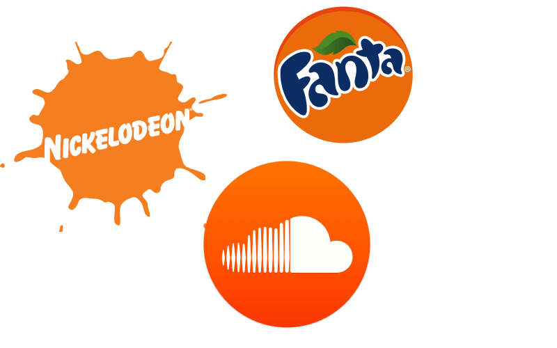
orange
Orange is a combination of red and yellow. It shows joy, sunshine, and tropics. It represents enthusiasm,
fascination, happiness, creativity, determination, attraction, success, and encouragement. It shows
communication, and fun, draws attention, and expresses freedom.
If you're creating creative agency branding, orange would be a perfect color. It shows great communication,
success, and creativity.
Examples
yellow
Yellow is used to stimulate awareness, energize, affect mood, and draw attention. It's the colour of sunshine
and it's associated with joy, happiness, intellect, and energy. It's associated with food. Bright yellow is
used to get attention.
Yellow is a colour that demonstrates positivity and happiness, which is why yellow would work in a home decor brand,
for a warm and welcoming experience.
Examples

green
Green is commonly referred to as the colour of nature. It stands for growth, health, wealth, freshness,
and relaxation. Dark green is commonly associated with money.
Green is directly related to nature, which you can use it to promote 'Green products', an environmental
organization, or anything that is closely related to nature and ecological awareness. But remember that
a dull, dark green can also represent money, making it suitable for a finance app.
Example

blue
The colour of the sky and the sea is blue. Blue stands for trust, loyalty, wisdom, confidence, intelligence, and truth. It evokes calmness and it's commonly associated as the colour of tranquility. It
can be found in various cleaning products, air, and sky (e.g.: airlines), water, and sea.
RELATED: ⭐️ Five Underrated CSS Properties You NEED to Try Out!
If you're building a financial app or a bank branding, blue is a very good idea to use. Blue shows trust,
reliability, security, and confidence. Blue is widely used in the finance industry for this reason.
Examples

purple
Purple is a colour very rarely found in nature. It is commonly preferred by pre-adolescent children. It's
a combination of blue (stability), and red (energy). It is commonly referred to as the colour of
royalty. It is related to power, nobility, luxury, and ambition, and it expresses wealth and
extravagance. It's associated with wisdom, dignity, independence, creativity, mystery, and magic.
Purple represents luxury and royalty making it a good option for luxury brands. But it could also
be used for video games; purple is a color that pre-adolescents really like. What's another thing
pre-adolescents also like? Games! Purple also symbolizes magic and mystery making it perfect for
a magic video game.
Examples

brown
Brown can give a feeling of warmth, security, and earthiness. People associate neutral and natural
with brown. It's commonly used to evoke feelings related to the natural world, as well as
connoting organic wholesome feelings in general. It also provokes feelings related to comfort,
high quality, strength, and honesty.
If you're creating branding for an organic food company (or anything organic/agricultural-related
really), brown would work great; it would create a feeling of comfort, high quality, and obviously,
a sense of nature, earthiness, and warmth.
Examples

black
Black shows strongness, and boldness. It can also represent that someone or something is mysterious and rebellious. It's a timeless, classic, and elegant colour.
Knowing this, black would be a great color to use for a luxurious fashion brand. Black shows sophistication, and elegance, perfect for a logo for a fashion brand.
Examples
white
White is associated with innocence and purity. It's a simple, and clean colour and can symbolize perfection. It is used to show luxury, open-mindedness, purity, cleanness, and perfection.
Meditation and mental health apps would benefit from using white as it conveys a sense of mental clarity and open-mindedness. White would help users feel in a peaceful full state of mind giving its purity, and perfection.
Examples

conclusion
If you're a designer or a front-end developer, understanding the principles of color psychology is essential as it can significantly enhance your user's experience and greatly increase analytics; However, if not used effectively, it can diminish everything as well. I hope you learned how colours can have a meaningful impact on your users as well as some ways each colour can be used. Thanks for reading, if you found this article useful, I would suggest bookmark it in your browser (or devto) so you can make sure to use these practices when working on a new design, and share it to someone who might find it useful too!

Top comments (0)