If the first thing that comes to your mind when you think of product management is Gantt charts and analyses that seem like they need an MBA then you think product management is hard.
As developers, we know how to build. Give us a side project we can work alone on and consider it done.
But when you get a bigger team with a more mature product it gets complicated.
You might have to start thinking about things like epics, velocity, capacity management, etc., and then we have to consider the tools to manage that complexity.
We think we need to use diagrams that have the word "matrix" in them that some consultants from McKinsey invented.
Have you ever wondered if it had to be that hard?
Do you need to have an MBA from Harvard or Stanford to run a product management process?
I don't think so.
Shape Up by Ryan Singer gives us a bit of a glimpse of what a simpler product management process could look like.
It's all about the process Basecamp has used for the last 15 years to develop products.
What this post is about showing you 5 product management tools and techniques you can steal and use right away.
These are tools that Basecamp came up with to work within their product development system, but I've found them to be helpful in the pseudo-scrum-kanban-agile systems that a lot of us work in.
Here are the tools:
Design Tools
- Breadboarding
- Fat Marker Sketches
Product Management Tools
- The Pitch
- Scope Map
- Hill Chart
Design Tools
There's a Goldilocks zone for design specifications.
I used to think I always needed a pixel perfect design fresh from Photoshop.
Here's the problem: you can have a design that's too high fidelity.
With software development, it's not a question of whether you can build a design. You can build anything, but do you want to spend the time it's going to take to build that design you're so hyped about?
Sometimes you do, but if the early design is set in stone without considering the implementation you could run into trouble.
There's another extreme, too. Instead of a design, you get a ticket or user story that describes the solution with a paragraph of text.
There's more freedom with that, but sometimes too much freedom can crush you.
All of a sudden you're not sure the boundaries of the solution, and you have to figure out what the design will be at the same time as you're figuring out the functionality.
In both situations, there could be edge cases that cause the project to explode.
Two tools that help here:
- Breadboarding
- Fat Marker Sketches
Tool #1: Breadboarding

Source: Shape Up
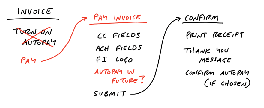
Think of breadboarding like a textual map of the UI. It's like a statechart for product management.
It's called breadboarding.
Why? Because it's inspired by the breadboards of circuit design which allow you to prototype and test circuits without having to worry about the final design.
It's a tool that allows us to think through our UI solution.
It consists of these elements:
Places
Affordances
Connection lines
Places are where users can navigate to like pages, dialogs, menus, etc.
Affordances is a fancy word for something a user can do (think a button or form field), or shows a user what can be done (think UX copy or an icon).
Connection lines show what happens when a user interacts with an affordance.
Source: Shape Up
The big win from this is how it allows us to think through the user's path without having to get too concrete too early.
We don't get hung up on early design ideas because all we have is text, but it's concrete enough to allow us to see what won't work.
Tool #2: Fat Marker Sketches
Source: Shape Up
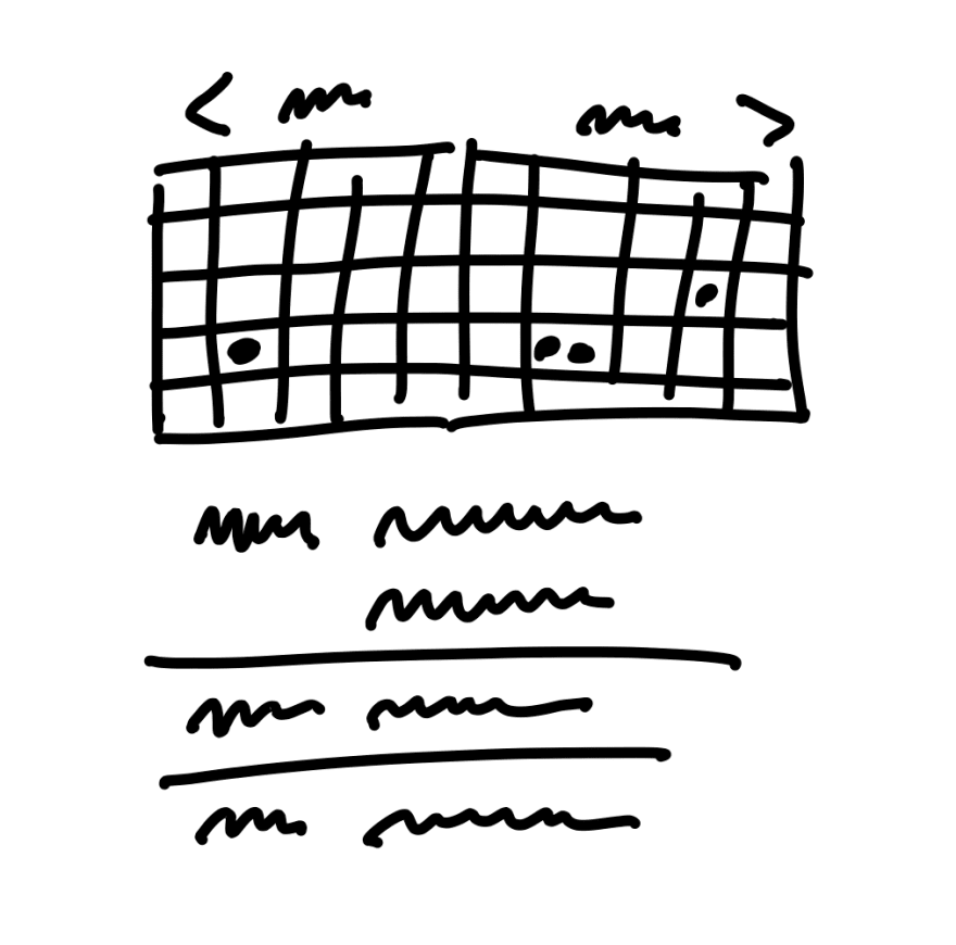
There are times when text alone isn't enough, and you need to sketch out an idea
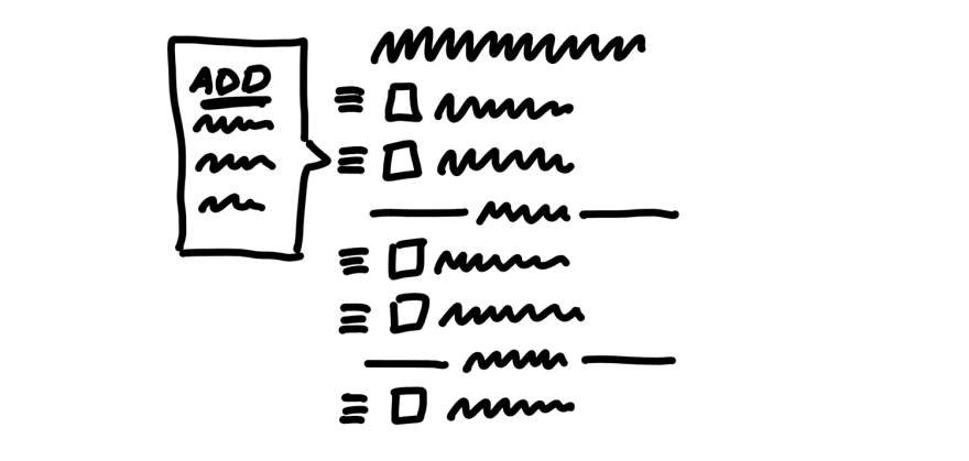
A drag and drop interface of some sort comes to mind. They can be complicated enough that breadboarding alone wouldn't be sufficient.
At the same time, you might not need to jump into detailed mockups.
That is where fat marker sketches come in.
It's almost laughable to call this a technique, but I can testify to its value.
A fat marker sketch is a low-fidelity wireframe done with a tool (like a king size Sharpie) that limits the amount of detail we can show.
It's not going to be confused with a mock-up, and because of that, it's not going to tie anyone's hands further down the line. It gives room for interpretation so that the designer and the developer can make the best possible choices as they work on the design and implementation.
The lack of detail is a feature, not a bug.
Source: Shape Up
Product Management Tools
This next class of tools is what I consider to be core product management tools.
They help you get a handle on where the project is:
What even are we working on?
What are the independent parts?
How close are we to completion?
Important questions for any project.
Three tools help us with that:
- Pitches
- Scope maps
- Hill Charts
Tool #3: Pitches
I don't know about you, but I've worked on a bunch of disconnected and disembodied user stories and tickets over the years that I've had zero clues on how they relate to the overall vision of the project.
How does "as a user, I can edit my profile picture" connect to what we were doing again?
The worst part about not knowing how things connect is it often leads to bad outcomes during integration phases of later user stories/tickets.
You might not have thought about how one piece interacts with a later part of the project because you never knew you would need to think about it. When it comes time to build that later piece you have to rework a lot of what you already had done.
Not good.
But what can be done?
Enter the pitch.
All the pitch is, is a write up of a proposal for a new feature or an improvement.
It's obvious, right? But I've worked on plenty of projects or features that didn't have anything like it associated with them.
At least not anything that I saw.
Think of it like pitching any idea:
A company
A movie
A book
The pitch has to persuade and explain. In the case of products, we want to persuade why what we're proposing matters and how it will work.
It has five ingredients:
- Problem
- Appetite
- Solution
- Rabbit holes
- No-gos
Problem
What problem will your solution solve?
Is there an issue customers are facing? Common complaint?
This is what will motivate people to want to work on the feature. They buy into the problem you present as being worth solving.
Appetite
How much time are you willing to spend on solving your problem?
I love this concept of appetite. If you only want to spend two weeks solving a problem that will constrain what you do as compared to two months.
The appetite will serve to frame your solution. Some problems are worth spending months on, but if you look at what your appetite is for a project you might find it's less than you might think.
I've estimated a lot of projects over the years, and what is seldom known is how much time the business is willing to spend. In other words, seldom is it asked what the appetite is.
So many ideas never get worked on because the estimate ends up being huge when if the appetite was known from the beginning the proposed solution could have been scaled down.
One way Basecamp constrains their appetites for even massive projects is keeping the work to 6 week cycles. They seek to find the 6 week version of the solution to fit the problem.
Solution
Once you know the problem you're trying to solve, and how much time you're willing to spend to solve it you can work on finding the solution.
This is the proposal on how to solve the problem within the allotted appetite.
What are the elements that need to be there?
What are the nice-to-haves?
Should be clear and include visual aids to understand what needs to be done.
Rabbit holes
As you're thinking through the solution keep an eye out for possible distractions. These can be nice-to-haves that you can see having the potential of being a major time sink.
Make those explicit and optional. If we have a specific appetite for the project we should be willing to give up parts of our solution that are not central to solving the problem.
No-gos
These are things we explicitly aren't going to do. Doesn't mean we won't do them ever, but we don't want our time eaten up by them right now.
Shape Up gives the example of a team forgoing making a particular form field WYSIWYG. That would be a nice improvement, but it's not central to the solution and can be done later if needed.
Write and present
Once you have all your ingredients gathered you write it up and present.
At Basecamp they use Basecamp to present, but you could use email or even a GitHub issue to layout your proposal.
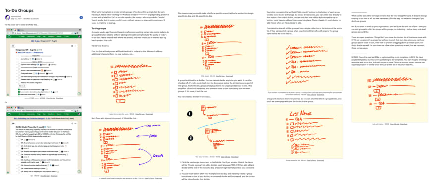
Having it written is important. It gives people the option to read, digest slowly, and give measured feedback.
Source: Shape Up
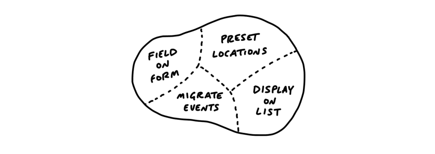
Tool #4: Scope Maps
Source: Shape Up
The work in a lot of projects isn't divided up well.
Sometimes they're divided up by who will be doing the work. That can be fine, but if, for instance, the front end work is too disconnected from the backend work it can create communication problems.
It can also mean that the individual members of the team don't have a good sense of the overall scope of what they're working on because they're focused on a small subset of a slice of the problem.
Or we divide up the project and then try to move all the separate parts forward at the same time without ever completing something until at the end.
This hurts the context we can build when we focus on completing the independent pieces one at a time.
This is where the scope map is helpful.
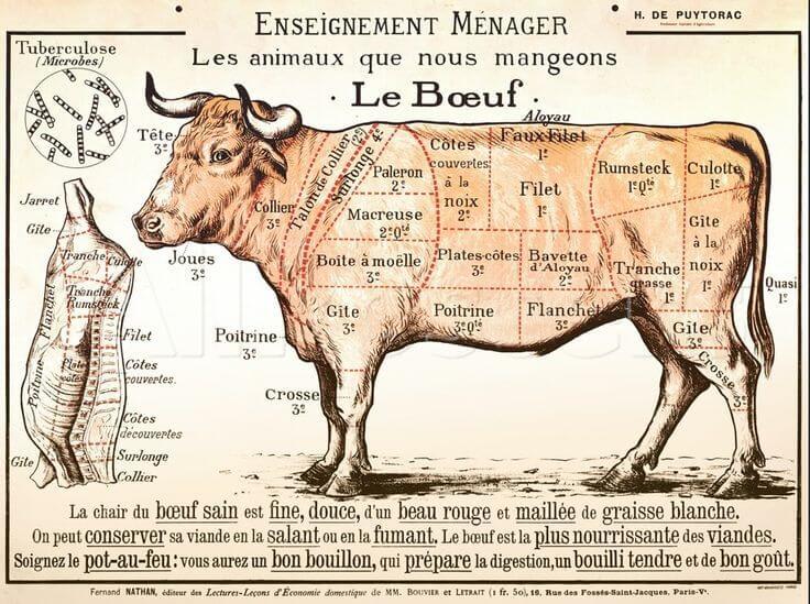
You can think of the scope map like the product manager's version of a butcher map.
A butcher's map of an animal shows where different cuts of meat come from.
In the case of the scope map, we want to show what the individual pieces of the project are.
In other words, what are the smaller individual scopes in this project that can be completed independently of one another?
As you do discovery and start working on a project you start to see the individual pieces that need to be done. You might organize this into some sort of todo list, user stories, or something else.
At first, you'll just have one big list, but the goal of the scope map is not to leave it that way.
Instead, you want to start grouping those items that make up the orthogonal pieces so they can be done separately.
And then you start working on them one slice at a time.
It's important to know that you might not have the scopes fully mapped out at the start of the project. There will be things you discover later on that reveal further scopes to you.
That's okay. It's all part of the process.
The goal with the scope map is to have a map of what needs to be done so you don't get lost along the way.
Tool #5: Hill Charts
Source: Ryan Singer
It can be hard to know how close a project is to "done," especially, if you're not doing the work yourself.
The developers might have a fingertip feel of how close they are to being complete, but even they can be wildly off if they have tunnel vision on whatever it is they're working on.
You might not be able to tell if a particular ticket or user story is 10% or 90% done.
Even if you have a todo list associated with the task there could be items that take as much time to complete as the rest of the list combined. If you just went by the percentage of items complete you could be WAY off.
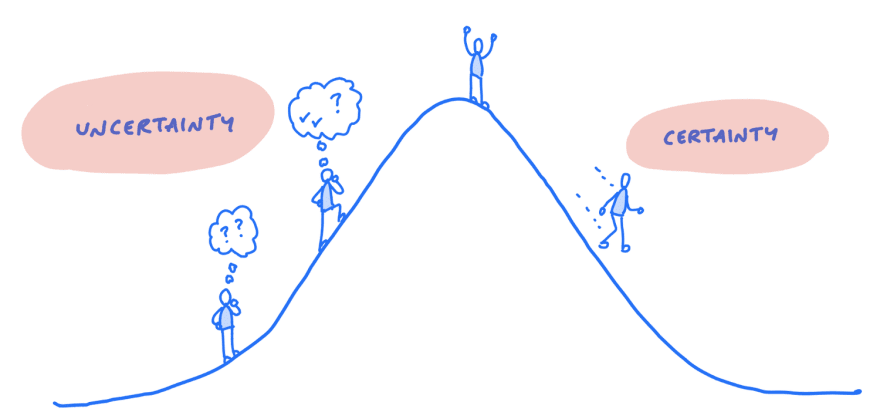
Basecamp's solution to this uncertainty is the hill chart.
Hill charts start with the assumption that there are two main phases of work for a project:
- Uphill
- Downhill
Uphill
The uphill part of a project is when you're struggling to get it to the top. You can't see the other side so you're not quite sure how close you are to completion.
There's a lot of unknowns left to discover.
In the uphill phase, you could be knocked back down the slope. Maybe you discover the data you'll need for a particular task isn't where you thought it was, and so you have to go out and get that data when you weren't planning to.
Downhill
Once you crest the top of the hill things become easier. You can see what's left to be done laid out before you, and you know the path to get it done.
Momentum can take over as you knock off one task after another.
The power of the hill chart
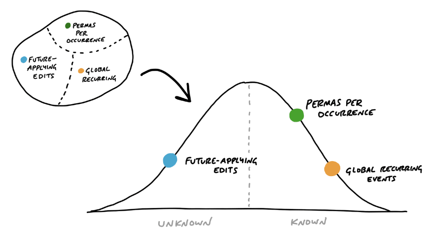
The power of the hill chart is it allows you to visualize the progress of a project. You can see where the uncertainty is. What needs extra effort to be pushed up the hill.
Maybe you'll devote more resources to it, or simply be able to see what's going on.
From day to day people can update where things are at. One item was near the top of the hill yesterday, but new issues or problems have arisen and it's rolled halfway back down the hill today.
That's valuable data for any team.
Source: Shape Up
Hill charts are guesses
It's important to know: this is a guesstimate , and it's always subject to the fallibility of people.
We're not making a quantitative judgment. In some sense, it's kind of like a thermometer. How does the team feel the project is going?
How do you create a hill chart?
The main tool I know of is in Basecamp. Now, I don't use Basecamp, but there's no reason you couldn't use a whiteboard.
Conclusion
There's way more in Shape Up than these tools.
It's a look behind the curtain of what product management can look like outside of Agile/Kanban/Scrum.
Your team might not be ready to adopt all the practices in it (mine isn't!), but there's no reason you can't steal these 5 simple tools and make life a little easier for your product management process.



Top comments (0)