Having spent the last 6 years fielding the question, "When are we ever going to use this in real life?" I'm excited to approach boxplots with a different audience in mind.
The Basics:
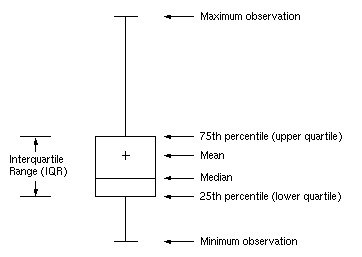
The boxplot is a standardized method used to display the distribution of data based on a 5 number summary: minimum, quartile 1 median, quartile 2, and maximum.
IQR: interquartile range, calculated as Q3 - Q1
Minimum: Q1 - 1.5 * IQR
Quartile 1: 25th percentile
Median: 50th percentile center value of the data's full range
Quartile 3: 75th percentile
Maximum: Q3 + 1.5 * IQR
Beyond the summary lines, boxplots allow you to view outliers, symmetry, tightness of grouping, and any skews your data may have. Boxplots are best used when you want more information than just the central measures of tendency as they make dispersion and variability visible.
Group Comparisons:
Boxplots work their magic when you are comparing many groups of data sets. The visible 5 summary statistics make similarities and differences between groups evident. For example, the following plot was created while exploring trends in movie data. The release dates of movies ranging from 2006 - 2018 were grouped by release week and plotted against %ROI. The aim was to determine if there were weeks that were favorable to others in terms of profitability.

Here the visual effect was enhanced by utilizing a colormap. Based on the percentile of data above or below the break-even point, the boxplots are shaded in a gradient or red or blue. The visual allows for quick insight, directing further exploration.
Extensions:
Despite the depth of information, it could be useful to have a more direct means of comparison between plots. Focusing on a subset of the release week data I wanted to implement notched boxplots and a swarm overlay.
Notched Boxplots:
The notched boxplot displays a confidence interval around the median, generally a 95% confidence interval. If the notches in the boxplots being compared do not overlap then there is evidence that the medians are significantly different. I chose a few weeks where I expected some medians to be significantly different and some not to be.

The notches help to display that the medians for the weeks of May 17th and May 31st are significantly different than those for the weeks of April 19th and April 26th.
Swarm Overlay Boxplots:
One downside to boxplots is being unable to see all observations that are underlying the distribution of the plot. A swarm plot overlay not only allows us to see all observations but ensures data points are a minimum distance away from one another to over overlapping. The swarm overlay gives a better representation of the distribution of values.

To get the full effect of the swarm overlay, be sure to change the transparency level of your box plots or your points will be hidden behind the box itself.


Top comments (0)