
Live Demo / Download
--
A vertical timeline is an intelligent way to display a flow of information that branches out from top to bottom and involves some form of content connection (e.g., temporal, semantic, etc.).
From a purely technical standpoint, a vertical timeline doesn’t differ much from the more common horizontal timeline, and the substantial difference lies in how the information is displayed: a horizontal timeline is more suitable for “temporal” content (e.g., a calendar), while a vertical timeline is ideal for related information.
In this tutorial we will show you how to create three distinct versions of vertical timelines using Tailwind CSS. Specifically:
If you want to take a look at how we previously implemented a vertical timeline in one of our Tailwind CSS templates, we suggest checking out this SaaS website template called Open Pro.
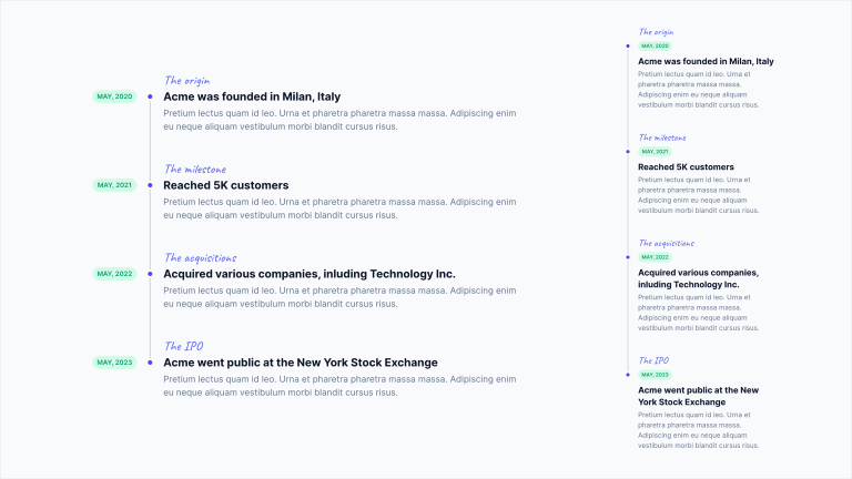
Example #1: The Milestone Timeline
In this example, we will create a vertical timeline to display the milestones of a project using Tailwind CSS. A milestone chart is a diagram that shows a series of important events or stages in a project, represented by a vertical line that crosses the chart at the date they occur.
Let’s begin by creating a simple HTML document where we can include the code for our timeline:
<!DOCTYPE html>
<html lang="en">

<head>
    <meta charset="utf-8">
    <title>Vertical Timelines</title>
    <meta name="viewport" content="width=device-width,initial-scale=1">
    <link rel="preconnect" href="https://fonts.googleapis.com">
    <link rel="preconnect" href="https://fonts.gstatic.com" crossorigin>
    <link href="https://fonts.googleapis.com/css2?family=Inter:wght@400;600;700&Caveat:wght@500&display=swap" rel="stylesheet">
    <script src="https://cdn.tailwindcss.com"></script>
    <script>
        tailwind.config = {
            theme: {
                extend: {
                    fontFamily: {
                        inter: ['Inter', 'sans-serif'],
                        caveat: ['Caveat', 'cursive'],
                    },
                },
            },
        };
    </script>
</head>

<body class="relative font-inter antialiased">

    <main class="relative min-h-screen flex flex-col justify-center bg-slate-50 overflow-hidden">
        <div class="w-full max-w-6xl mx-auto px-4 md:px-6 py-24">
            <div class="flex flex-col justify-center divide-y divide-slate-200 [&>*]:py-16">

                <div class="w-full max-w-3xl mx-auto">

                    <!-- Vertical Timeline #1 -->

                </div>

            </div>
        </div>
    </main>
</body>

</html>
Now, let’s move on to designing our timeline. During this phase, it is crucial to have in mind how the timeline should appear on both mobile and desktop screens.
On desktop screens, where there is more space available, the date, circle marker, and title are aligned horizontally. However, on mobile devices, we need to adjust the layout to ensure a better user experience. In this case, the title is positioned below the date and the circle marker.
To create the vertical line, we will utilize the ::before pseudo-element within each timeline element. This approach gives us control over the height of the line and allows us to choose whether or not to display the vertical line on the last element of the timeline.
With these key design points in mind, we can proceed to the next step: constructing the timeline structure. The structure will be organized as follows:
Timeline element (should have left, top, and bottom padding)
Purple label
Circle marker (
::before) ~ Date ~ Title ~ Vertical line (::after)Content
Let’s write the HTML code using Tailwind CSS utility classes. Since each timeline element has a vertical padding of 24px (defined by the py-6 class), we will apply a negative vertical margin of -24px to the container element (using the -my-6 class) to offset the padding:
<!-- Container -->
<div class="-my-6">

    <!-- Timeline Item -->
    <div class="relative pl-8 sm:pl-32 py-6 group">
        <!-- Purple label -->
        <!-- Vertical line (::before) ~ Date ~ Title ~ Circle marker (::after) -->
        <!-- Content -->
    </div>

</div>
Now, we can proceed with coding the timeline element:
<!-- Container -->
<div class="-my-6">

    <!-- Timeline Item -->
    <div class="relative pl-8 sm:pl-32 py-6 group">
        <!-- Purple label -->
        <div class="font-caveat font-medium text-2xl text-indigo-500 mb-1 sm:mb-0">The origin</div>
        <!-- Vertical line (::before) ~ Date ~ Title ~ Circle marker (::after) -->
        <div class="flex flex-col sm:flex-row items-start mb-1 group-last:before:hidden before:absolute before:left-2 sm:before:left-0 before:h-full before:px-px before:bg-slate-300 sm:before:ml-[6.5rem] before:self-start before:-translate-x-1/2 before:translate-y-3 after:absolute after:left-2 sm:after:left-0 after:w-2 after:h-2 after:bg-indigo-600 after:border-4 after:box-content after:border-slate-50 after:rounded-full sm:after:ml-[6.5rem] after:-translate-x-1/2 after:translate-y-1.5">
            <time class="sm:absolute left-0 translate-y-0.5 inline-flex items-center justify-center text-xs font-semibold uppercase w-20 h-6 mb-3 sm:mb-0 text-emerald-600 bg-emerald-100 rounded-full">May, 2020</time>
            <div class="text-xl font-bold text-slate-900">Acme was founded in Milan, Italy</div>
        </div>
        <!-- Content -->
        <div class="text-slate-500">Pretium lectus quam id leo. Urna et pharetra pharetra massa massa. Adipiscing enim eu neque aliquam vestibulum morbi blandit cursus risus.</div>
    </div>

</div>
While the purple label and content require no futher explanations, it is worth delving deeper into the central part. Let’s examine in detail the most significant classes we’ve used:
- The classes
flexandflex-colmake the content inside the div arrange in columns. Addingsm:flex-rowensures that on larger screens, the date and title are positioned on the same row. - The
<time>element is absolutely positioned on the left when the window width is greater than 640px, thanks to thesm:prefix (sm:absolute). It is also moved 0.5rem down to align it vertically with the circle marker and the title (sm:translate-y-0.5). Additionally, we’ve set a fixed width of 80 pixels (w-20) for this element to ensure proper alignment of the content on the right. Keep in mind that if you decide to change the width, you may need to adjust other related measurements in this example. - The vertical line is created using the pseudo-element
::before(with thebefore:prefix). It is absolutely positioned in relation to the timeline element (before:absolute). The line extends vertically to cover the entire height of the timeline (before:h-full), and it starts from the circle marker, visually connecting the timeline elements. Furthermore, we hide the segment of the last element by applying thegroup-last:before:hiddenclass. - The circle marker is created using the pseudo-element
::after(using theafter:prefix). It is absolutely positioned on the left side of the timeline element. To achieve the desired positioning, we fine-tune its placement using themarginandtransformproperties. The dimensions of the circle marker are set to 8×8 pixels (after:w-2 after:h-2), and it features a 4px border (after:border-4) that matches the page background (after:border-slate-50).
As long as we have only one element in the timeline, we won’t see any vertical line. Let’s add the more items to see the connected circle markers along the line. Here’s the complete code:
<div class="-my-6">

    <!-- Item #1 -->
    <div class="relative pl-8 sm:pl-32 py-6 group">
        <!-- Purple label -->
        <div class="font-caveat font-medium text-2xl text-indigo-500 mb-1 sm:mb-0">The origin</div>
        <!-- Vertical line (::before) ~ Date ~ Title ~ Circle marker (::after) -->
        <div class="flex flex-col sm:flex-row items-start mb-1 group-last:before:hidden before:absolute before:left-2 sm:before:left-0 before:h-full before:px-px before:bg-slate-300 sm:before:ml-[6.5rem] before:self-start before:-translate-x-1/2 before:translate-y-3 after:absolute after:left-2 sm:after:left-0 after:w-2 after:h-2 after:bg-indigo-600 after:border-4 after:box-content after:border-slate-50 after:rounded-full sm:after:ml-[6.5rem] after:-translate-x-1/2 after:translate-y-1.5">
            <time class="sm:absolute left-0 translate-y-0.5 inline-flex items-center justify-center text-xs font-semibold uppercase w-20 h-6 mb-3 sm:mb-0 text-emerald-600 bg-emerald-100 rounded-full">May, 2020</time>
            <div class="text-xl font-bold text-slate-900">Acme was founded in Milan, Italy</div>
        </div>
        <!-- Content -->
        <div class="text-slate-500">Pretium lectus quam id leo. Urna et pharetra pharetra massa massa. Adipiscing enim eu neque aliquam vestibulum morbi blandit cursus risus.</div>
    </div>

    <!-- Item #2 -->
    <div class="relative pl-8 sm:pl-32 py-6 group">
        <!-- Purple label -->
        <div class="font-caveat font-medium text-2xl text-indigo-500 mb-1 sm:mb-0">The milestone</div>
        <!-- Vertical line (::before) ~ Date ~ Title ~ Circle marker (::after) -->
        <div class="flex flex-col sm:flex-row items-start mb-1 group-last:before:hidden before:absolute before:left-2 sm:before:left-0 before:h-full before:px-px before:bg-slate-300 sm:before:ml-[6.5rem] before:self-start before:-translate-x-1/2 before:translate-y-3 after:absolute after:left-2 sm:after:left-0 after:w-2 after:h-2 after:bg-indigo-600 after:border-4 after:box-content after:border-slate-50 after:rounded-full sm:after:ml-[6.5rem] after:-translate-x-1/2 after:translate-y-1.5">
            <time class="sm:absolute left-0 translate-y-0.5 inline-flex items-center justify-center text-xs font-semibold uppercase w-20 h-6 mb-3 sm:mb-0 text-emerald-600 bg-emerald-100 rounded-full">May, 2021</time>
            <div class="text-xl font-bold text-slate-900">Reached 5K customers</div>
        </div>
        <!-- Content -->
        <div class="text-slate-500">Pretium lectus quam id leo. Urna et pharetra pharetra massa massa. Adipiscing enim eu neque aliquam vestibulum morbi blandit cursus risus.</div>
    </div>

    <!-- Item #3 -->
    <div class="relative pl-8 sm:pl-32 py-6 group">
        <!-- Purple label -->
        <div class="font-caveat font-medium text-2xl text-indigo-500 mb-1 sm:mb-0">The acquisitions</div>
        <!-- Vertical line (::before) ~ Date ~ Title ~ Circle marker (::after) -->
        <div class="flex flex-col sm:flex-row items-start mb-1 group-last:before:hidden before:absolute before:left-2 sm:before:left-0 before:h-full before:px-px before:bg-slate-300 sm:before:ml-[6.5rem] before:self-start before:-translate-x-1/2 before:translate-y-3 after:absolute after:left-2 sm:after:left-0 after:w-2 after:h-2 after:bg-indigo-600 after:border-4 after:box-content after:border-slate-50 after:rounded-full sm:after:ml-[6.5rem] after:-translate-x-1/2 after:translate-y-1.5">
            <time class="sm:absolute left-0 translate-y-0.5 inline-flex items-center justify-center text-xs font-semibold uppercase w-20 h-6 mb-3 sm:mb-0 text-emerald-600 bg-emerald-100 rounded-full">May, 2022</time>
            <div class="text-xl font-bold text-slate-900">Acquired various companies, inluding Technology Inc.</div>
        </div>
        <!-- Content -->
        <div class="text-slate-500">Pretium lectus quam id leo. Urna et pharetra pharetra massa massa. Adipiscing enim eu neque aliquam vestibulum morbi blandit cursus risus.</div>
    </div>

    <!-- Item #4 -->
    <div class="relative pl-8 sm:pl-32 py-6 group">
        <!-- Purple label -->
        <div class="font-caveat font-medium text-2xl text-indigo-500 mb-1 sm:mb-0">The IPO</div>
        <!-- Vertical line (::before) ~ Date ~ Title ~ Circle marker (::after) -->
        <div class="flex flex-col sm:flex-row items-start mb-1 group-last:before:hidden before:absolute before:left-2 sm:before:left-0 before:h-full before:px-px before:bg-slate-300 sm:before:ml-[6.5rem] before:self-start before:-translate-x-1/2 before:translate-y-3 after:absolute after:left-2 sm:after:left-0 after:w-2 after:h-2 after:bg-indigo-600 after:border-4 after:box-content after:border-slate-50 after:rounded-full sm:after:ml-[6.5rem] after:-translate-x-1/2 after:translate-y-1.5">
            <time class="sm:absolute left-0 translate-y-0.5 inline-flex items-center justify-center text-xs font-semibold uppercase w-20 h-6 mb-3 sm:mb-0 text-emerald-600 bg-emerald-100 rounded-full">May, 2023</time>
            <div class="text-xl font-bold text-slate-900">Acme went public at the New York Stock Exchange</div>
        </div>
        <!-- Content -->
        <div class="text-slate-500">Pretium lectus quam id leo. Urna et pharetra pharetra massa massa. Adipiscing enim eu neque aliquam vestibulum morbi blandit cursus risus.</div>
    </div>

</div>
Example #2: The Progress Timeline
In this second example, we will show you how to create a progress timeline that visually represents the status of a something. For example, an e-commerce order just like the example below.
We will follow a similar approach to the previous example. We will first determine how the timeline should look on both mobile and desktop screens, and then proceed with its implementation accordingly. This pre-planning ensures that the timeline is optimized for different devices and provides a consistent user experience across platforms.
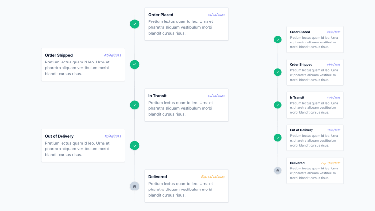
Due to limited horizontal space on mobile screens, we will position all the timeline elements to the right of the vertical line.
Unlike the previous example, we will define the vertical line as a single element that extends across the entire height of the timeline. Instead of dividing it into segments for each timeline element, we will apply the ::before pseudo-element at the container div level of the timeline.
<!-- Container -->
<div class="space-y-8 relative before:absolute before:inset-0 before:ml-5 before:-translate-x-px md:before:mx-auto md:before:translate-x-0 before:h-full before:w-0.5 before:bg-gradient-to-b before:from-transparent before:via-slate-300 before:to-transparent">

    <!-- Timeline Item -->
    <div class="relative flex items-center justify-between md:justify-normal md:odd:flex-row-reverse group is-active">
        <!-- Icon -->
        <!-- Card -->
    </div>

</div>
The vertical line is absolutely positioned within the timeline container. The before:h-full class ensures that the line visually spans the entire timeline. Additionally, we have added a linear gradient that transitions from transparent to the color slate-300.
With the vertical line in place, we can now proceed with defining the individual elements of the timeline, each representing a specific oreder step.
<!-- Container -->
<div class="space-y-8 relative before:absolute before:inset-0 before:ml-5 before:-translate-x-px md:before:mx-auto md:before:translate-x-0 before:h-full before:w-0.5 before:bg-gradient-to-b before:from-transparent before:via-slate-300 before:to-transparent">

    <!-- Timeline Item -->
    <div class="relative flex items-center justify-between md:justify-normal md:odd:flex-row-reverse group is-active">
        <!-- Icon -->
        <div class="flex items-center justify-center w-10 h-10 rounded-full border border-white bg-slate-300 group-[.is-active]:bg-emerald-500 text-slate-500 group-[.is-active]:text-emerald-50 shadow shrink-0 md:order-1 md:group-odd:-translate-x-1/2 md:group-even:translate-x-1/2">
            <svg class="fill-current" xmlns="http://www.w3.org/2000/svg" width="12" height="10">
                <path fill-rule="nonzero" d="M10.422 1.257 4.655 7.025 2.553 4.923A.916.916 0 0 0 1.257 6.22l2.75 2.75a.916.916 0 0 0 1.296 0l6.415-6.416a.916.916 0 0 0-1.296-1.296Z" />
            </svg>
        </div>
        <!-- Card -->
        <div class="w-[calc(100%-4rem)] md:w-[calc(50%-2.5rem)] bg-white p-4 rounded border border-slate-200 shadow">
            <div class="flex items-center justify-between space-x-2 mb-1">
                <div class="font-bold text-slate-900">Order Placed</div>
                <time class="font-caveat font-medium text-indigo-500">08/06/2023</time>
            </div>
            <div class="text-slate-500">Pretium lectus quam id leo. Urna et pharetra aliquam vestibulum morbi blandit cursus risus.</div>
        </div>
    </div>

</div>
We have an icon whose size is 40×40 pixels (w-10 h-10), positioned next to a card varies based on the screen size:
- On mobile screens, the card occupies 100% of the available width, excluding a 4rem margin (
w-[calc(100%-4rem)]) - On desktop screens, the card occupies 50% of the available width, excluding a 2.5rem margin (
md:w-[calc(50%-2.5rem)])
To ensure a consistent layout, we utilize the flexbox model on mobile screens, applying the justify-between class to distribute the child elements with space between them. On desktop screens, we restore the natural order of elements using the md:justify-normal class and reverse the order in which they are displayed using md:odd:flex-row-reverse. These classes create the alternating effect of the timeline elements. Additionally, we apply the classes md:order-1, md:group-odd:-translate-x-1/2, and md:group-even:translate-x-1/2 to correctly reposition the icon.
Finally, we have created an arbitrary group class called is-active that allows us to apply a different style to the completed timeline elements. When the is-active class is applied to a timeline element, the icon appears green; otherwise, it appears gray.
Here’s the complete code for the second example:
<div class="space-y-8 relative before:absolute before:inset-0 before:ml-5 before:-translate-x-px md:before:mx-auto md:before:translate-x-0 before:h-full before:w-0.5 before:bg-gradient-to-b before:from-transparent before:via-slate-300 before:to-transparent">

    <!-- Item #1 -->
    <div class="relative flex items-center justify-between md:justify-normal md:odd:flex-row-reverse group is-active">
        <!-- Icon -->
        <div class="flex items-center justify-center w-10 h-10 rounded-full border border-white bg-slate-300 group-[.is-active]:bg-emerald-500 text-slate-500 group-[.is-active]:text-emerald-50 shadow shrink-0 md:order-1 md:group-odd:-translate-x-1/2 md:group-even:translate-x-1/2">
            <svg class="fill-current" xmlns="http://www.w3.org/2000/svg" width="12" height="10">
                <path fill-rule="nonzero" d="M10.422 1.257 4.655 7.025 2.553 4.923A.916.916 0 0 0 1.257 6.22l2.75 2.75a.916.916 0 0 0 1.296 0l6.415-6.416a.916.916 0 0 0-1.296-1.296Z" />
            </svg>
        </div>
        <!-- Card -->
        <div class="w-[calc(100%-4rem)] md:w-[calc(50%-2.5rem)] bg-white p-4 rounded border border-slate-200 shadow">
            <div class="flex items-center justify-between space-x-2 mb-1">
                <div class="font-bold text-slate-900">Order Placed</div>
                <time class="font-caveat font-medium text-indigo-500">08/06/2023</time>
            </div>
            <div class="text-slate-500">Pretium lectus quam id leo. Urna et pharetra aliquam vestibulum morbi blandit cursus risus.</div>
        </div>
    </div>

    <!-- Item #2 -->
    <div class="relative flex items-center justify-between md:justify-normal md:odd:flex-row-reverse group is-active">
        <!-- Icon -->
        <div class="flex items-center justify-center w-10 h-10 rounded-full border border-white bg-slate-300 group-[.is-active]:bg-emerald-500 text-slate-500 group-[.is-active]:text-emerald-50 shadow shrink-0 md:order-1 md:group-odd:-translate-x-1/2 md:group-even:translate-x-1/2">
            <svg class="fill-current" xmlns="http://www.w3.org/2000/svg" width="12" height="10">
                <path fill-rule="nonzero" d="M10.422 1.257 4.655 7.025 2.553 4.923A.916.916 0 0 0 1.257 6.22l2.75 2.75a.916.916 0 0 0 1.296 0l6.415-6.416a.916.916 0 0 0-1.296-1.296Z" />
            </svg>
        </div>
        <!-- Card -->
        <div class="w-[calc(100%-4rem)] md:w-[calc(50%-2.5rem)] bg-white p-4 rounded border border-slate-200 shadow">
            <div class="flex items-center justify-between space-x-2 mb-1">
                <div class="font-bold text-slate-900">Order Shipped</div>
                <time class="font-caveat font-medium text-indigo-500">09/06/2023</time>
            </div>
            <div class="text-slate-500">Pretium lectus quam id leo. Urna et pharetra aliquam vestibulum morbi blandit cursus risus.</div>
        </div>
    </div>

    <!-- Item #3 -->
    <div class="relative flex items-center justify-between md:justify-normal md:odd:flex-row-reverse group is-active">
        <!-- Icon -->
        <div class="flex items-center justify-center w-10 h-10 rounded-full border border-white bg-slate-300 group-[.is-active]:bg-emerald-500 text-slate-500 group-[.is-active]:text-emerald-50 shadow shrink-0 md:order-1 md:group-odd:-translate-x-1/2 md:group-even:translate-x-1/2">
            <svg class="fill-current" xmlns="http://www.w3.org/2000/svg" width="12" height="10">
                <path fill-rule="nonzero" d="M10.422 1.257 4.655 7.025 2.553 4.923A.916.916 0 0 0 1.257 6.22l2.75 2.75a.916.916 0 0 0 1.296 0l6.415-6.416a.916.916 0 0 0-1.296-1.296Z" />
            </svg>
        </div>
        <!-- Card -->
        <div class="w-[calc(100%-4rem)] md:w-[calc(50%-2.5rem)] bg-white p-4 rounded border border-slate-200 shadow">
            <div class="flex items-center justify-between space-x-2 mb-1">
                <div class="font-bold text-slate-900">In Transit</div>
                <time class="font-caveat font-medium text-indigo-500">10/06/2023</time>
            </div>
            <div class="text-slate-500">Pretium lectus quam id leo. Urna et pharetra aliquam vestibulum morbi blandit cursus risus.</div>
        </div>
    </div>

    <!-- Item #4 -->
    <div class="relative flex items-center justify-between md:justify-normal md:odd:flex-row-reverse group is-active">
        <!-- Icon -->
        <div class="flex items-center justify-center w-10 h-10 rounded-full border border-white bg-slate-300 group-[.is-active]:bg-emerald-500 text-slate-500 group-[.is-active]:text-emerald-50 shadow shrink-0 md:order-1 md:group-odd:-translate-x-1/2 md:group-even:translate-x-1/2">
            <svg class="fill-current" xmlns="http://www.w3.org/2000/svg" width="12" height="10">
                <path fill-rule="nonzero" d="M10.422 1.257 4.655 7.025 2.553 4.923A.916.916 0 0 0 1.257 6.22l2.75 2.75a.916.916 0 0 0 1.296 0l6.415-6.416a.916.916 0 0 0-1.296-1.296Z" />
            </svg>
        </div>
        <!-- Card -->
        <div class="w-[calc(100%-4rem)] md:w-[calc(50%-2.5rem)] bg-white p-4 rounded border border-slate-200 shadow">
            <div class="flex items-center justify-between space-x-2 mb-1">
                <div class="font-bold text-slate-900">Out of Delivery</div>
                <time class="font-caveat font-medium text-indigo-500">12/06/2023</time>
            </div>
            <div class="text-slate-500">Pretium lectus quam id leo. Urna et pharetra aliquam vestibulum morbi blandit cursus risus.</div>
        </div>
    </div>

    <!-- Item #5 -->
    <div class="relative flex items-center justify-between md:justify-normal md:odd:flex-row-reverse group">
        <!-- Icon -->
        <div class="flex items-center justify-center w-10 h-10 rounded-full border border-white bg-slate-300 group-[.is-active]:bg-emerald-500 text-slate-500 group-[.is-active]:text-emerald-50 shadow shrink-0 md:order-1 md:group-odd:-translate-x-1/2 md:group-even:translate-x-1/2">
            <svg class="fill-current" xmlns="http://www.w3.org/2000/svg" width="12" height="12">
                <path d="M12 10v2H7V8.496a.5.5 0 0 0-.5-.5h-1a.5.5 0 0 0-.5.5V12H0V4.496a.5.5 0 0 1 .206-.4l5.5-4a.5.5 0 0 1 .588 0l5.5 4a.5.5 0 0 1 .206.4V10Z" />
            </svg>
        </div>
        <!-- Card -->
        <div class="w-[calc(100%-4rem)] md:w-[calc(50%-2.5rem)] bg-white p-4 rounded border border-slate-200 shadow">
            <div class="flex items-center justify-between space-x-2 mb-1">
                <div class="font-bold text-slate-900">Delivered</div>
                <time class="font-caveat font-medium text-amber-500">Exp. 12/08/2023</time>
            </div>
            <div class="text-slate-500">Pretium lectus quam id leo. Urna et pharetra aliquam vestibulum morbi blandit cursus risus.</div>
        </div>
    </div>

</div>
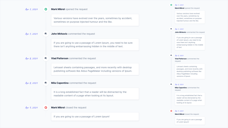
Example #3: The Discussion Timeline
Now we want to show you how to create a timeline of comments that can be applied to many different types of apps. This timeline is structurally similar to the first example and visually similar to the second one. So, we will draw inspiration from the first example to ensure optimal display on both mobile and desktop screens, and from the second example to create the vertical line with icons.
To begin, let’s focus on the container element:
<!-- Container -->
<div class="space-y-8 relative before:absolute before:inset-0 before:ml-5 before:-translate-x-px md:before:ml-[8.75rem] md:before:translate-x-0 before:h-full before:w-0.5 before:bg-gradient-to-b before:from-transparent before:via-slate-300 before:to-transparent">

    <!-- Timeline item -->
    <div class="relative">
        <!-- Date / Icon / Title -->
        <div>
            <div>
                <!-- Icon -->
                <!-- Date -->
            </div>
            <!-- Title -->
        </div>
        <!-- Card -->
    </div>

</div>
As you can see, we have reused a significant portion of the code from the previous example to create the vertical line using the ::before pseudo-element.
However, the structure of each timeline item is slightly more complex, but the underlying approach remains similar to example #1. We arrange the date, icon, and title on the same line, followed by the content of the comment below. On mobile screens, we display the icon with the date, and the title on a new line.
Let’s examine how the code for a single timeline item is made:
<!-- Container -->
<div class="space-y-8 relative before:absolute before:inset-0 before:ml-5 before:-translate-x-px md:before:ml-[8.75rem] md:before:translate-x-0 before:h-full before:w-0.5 before:bg-gradient-to-b before:from-transparent before:via-slate-300 before:to-transparent">

    <!-- Timeline item -->
    <div class="relative">
        <div class="md:flex items-center md:space-x-4 mb-3">
            <div class="flex items-center space-x-4 md:space-x-2 md:space-x-reverse">
                <!-- Icon -->
                <div class="flex items-center justify-center w-10 h-10 rounded-full bg-white shadow md:order-1">
                    <svg class="fill-emerald-500" xmlns="http://www.w3.org/2000/svg" width="16" height="16">
                        <path d="M8 0a8 8 0 1 0 8 8 8.009 8.009 0 0 0-8-8Zm0 12a4 4 0 1 1 0-8 4 4 0 0 1 0 8Z" />
                    </svg>
                </div>
                <!-- Date -->
                <time class="font-caveat font-medium text-xl text-indigo-500 md:w-28">Apr 7, 2024</time>
            </div>
            <!-- Title -->
            <div class="text-slate-500 ml-14"><span class="text-slate-900 font-bold">Mark Mikrol</span> opened the request</div>
        </div>
        <!-- Card -->
        <div class="bg-white p-4 rounded border border-slate-200 text-slate-500 shadow ml-14 md:ml-44">Various versions have evolved over the years, sometimes by accident, sometimes on purpose injected humour and the like.</div>
    </div>

</div>
L’unica novità degna di nota in questo layout riguarda il card element, a cui abbiamo applicato un margine sinistro di 176px (md:ml-44) per assicurarci che sia perfettamente allineata al title su desktop screens.
Ed ecco la timeline completa:
<div class="space-y-8 relative before:absolute before:inset-0 before:ml-5 before:-translate-x-px md:before:ml-[8.75rem] md:before:translate-x-0 before:h-full before:w-0.5 before:bg-gradient-to-b before:from-transparent before:via-slate-300 before:to-transparent">

    <!-- Item #1 -->
    <div class="relative">
        <div class="md:flex items-center md:space-x-4 mb-3">
            <div class="flex items-center space-x-4 md:space-x-2 md:space-x-reverse">
                <!-- Icon -->
                <div class="flex items-center justify-center w-10 h-10 rounded-full bg-white shadow md:order-1">
                    <svg class="fill-emerald-500" xmlns="http://www.w3.org/2000/svg" width="16" height="16">
                        <path d="M8 0a8 8 0 1 0 8 8 8.009 8.009 0 0 0-8-8Zm0 12a4 4 0 1 1 0-8 4 4 0 0 1 0 8Z" />
                    </svg>
                </div>
                <!-- Date -->
                <time class="font-caveat font-medium text-xl text-indigo-500 md:w-28">Apr 7, 2024</time>
            </div>
            <!-- Title -->
            <div class="text-slate-500 ml-14"><span class="text-slate-900 font-bold">Mark Mikrol</span> opened the request</div>
        </div>
        <!-- Card -->
        <div class="bg-white p-4 rounded border border-slate-200 text-slate-500 shadow ml-14 md:ml-44">Various versions have evolved over the years, sometimes by accident, sometimes on purpose injected humour and the like.</div>
    </div>

    <!-- Item #2 -->
    <div class="relative">
        <div class="md:flex items-center md:space-x-4 mb-3">
            <div class="flex items-center space-x-4 md:space-x-2 md:space-x-reverse">
                <!-- Icon -->
                <div class="flex items-center justify-center w-10 h-10 rounded-full bg-white shadow md:order-1">
                    <svg xmlns="http://www.w3.org/2000/svg" width="16" height="16">
                        <path class="fill-slate-300" d="M14.853 6.861C14.124 10.348 10.66 13 6.5 13c-.102 0-.201-.016-.302-.019C7.233 13.618 8.557 14 10 14c.51 0 1.003-.053 1.476-.143L14.2 15.9a.499.499 0 0 0 .8-.4v-3.515c.631-.712 1-1.566 1-2.485 0-.987-.429-1.897-1.147-2.639Z" />
                        <path class="fill-slate-500" d="M6.5 0C2.91 0 0 2.462 0 5.5c0 1.075.37 2.074 1 2.922V11.5a.5.5 0 0 0 .8.4l1.915-1.436c.845.34 1.787.536 2.785.536 3.59 0 6.5-2.462 6.5-5.5S10.09 0 6.5 0Z" />
                    </svg>
                </div>
                <!-- Date -->
                <time class="font-caveat font-medium text-xl text-indigo-500 md:w-28">Apr 7, 2024</time>
            </div>
            <!-- Title -->
            <div class="text-slate-500 ml-14"><span class="text-slate-900 font-bold">John Mirkovic</span> commented the request</div>
        </div>
        <!-- Card -->
        <div class="bg-white p-4 rounded border border-slate-200 text-slate-500 shadow ml-14 md:ml-44">If you are going to use a passage of Lorem Ipsum, you need to be sure there isn't anything embarrassing hidden in the middle of text.</div>
    </div>

    <!-- Item #3 -->
    <div class="relative">
        <div class="md:flex items-center md:space-x-4 mb-3">
            <div class="flex items-center space-x-4 md:space-x-2 md:space-x-reverse">
                <!-- Icon -->
                <div class="flex items-center justify-center w-10 h-10 rounded-full bg-white shadow md:order-1">
                    <svg xmlns="http://www.w3.org/2000/svg" width="16" height="16">
                        <path class="fill-slate-300" d="M14.853 6.861C14.124 10.348 10.66 13 6.5 13c-.102 0-.201-.016-.302-.019C7.233 13.618 8.557 14 10 14c.51 0 1.003-.053 1.476-.143L14.2 15.9a.499.499 0 0 0 .8-.4v-3.515c.631-.712 1-1.566 1-2.485 0-.987-.429-1.897-1.147-2.639Z" />
                        <path class="fill-slate-500" d="M6.5 0C2.91 0 0 2.462 0 5.5c0 1.075.37 2.074 1 2.922V11.5a.5.5 0 0 0 .8.4l1.915-1.436c.845.34 1.787.536 2.785.536 3.59 0 6.5-2.462 6.5-5.5S10.09 0 6.5 0Z" />
                    </svg>
                </div>
                <!-- Date -->
                <time class="font-caveat font-medium text-xl text-indigo-500 md:w-28">Apr 8, 2024</time>
            </div>
            <!-- Title -->
            <div class="text-slate-500 ml-14"><span class="text-slate-900 font-bold">Vlad Patterson</span> commented the request</div>
        </div>
        <!-- Card -->
        <div class="bg-white p-4 rounded border border-slate-200 text-slate-500 shadow ml-14 md:ml-44">Letraset sheets containing passages, and more recently with desktop publishing software like Aldus PageMaker including versions of Ipsum.</div>
    </div>

    <!-- Item #4 -->
    <div class="relative">
        <div class="md:flex items-center md:space-x-4 mb-3">
            <div class="flex items-center space-x-4 md:space-x-2 md:space-x-reverse">
                <!-- Icon -->
                <div class="flex items-center justify-center w-10 h-10 rounded-full bg-white shadow md:order-1">
                    <svg xmlns="http://www.w3.org/2000/svg" width="16" height="16">
                        <path class="fill-slate-300" d="M14.853 6.861C14.124 10.348 10.66 13 6.5 13c-.102 0-.201-.016-.302-.019C7.233 13.618 8.557 14 10 14c.51 0 1.003-.053 1.476-.143L14.2 15.9a.499.499 0 0 0 .8-.4v-3.515c.631-.712 1-1.566 1-2.485 0-.987-.429-1.897-1.147-2.639Z" />
                        <path class="fill-slate-500" d="M6.5 0C2.91 0 0 2.462 0 5.5c0 1.075.37 2.074 1 2.922V11.5a.5.5 0 0 0 .8.4l1.915-1.436c.845.34 1.787.536 2.785.536 3.59 0 6.5-2.462 6.5-5.5S10.09 0 6.5 0Z" />
                    </svg>
                </div>
                <!-- Date -->
                <time class="font-caveat font-medium text-xl text-indigo-500 md:w-28">Apr 8, 2024</time>
            </div>
            <!-- Title -->
            <div class="text-slate-500 ml-14"><span class="text-slate-900 font-bold">Mila Capentino</span> commented the request</div>
        </div>
        <!-- Card -->
        <div class="bg-white p-4 rounded border border-slate-200 text-slate-500 shadow ml-14 md:ml-44">It is a long established fact that a reader will be distracted by the readable content of a page when looking at its layout.</div>
    </div>

    <!-- Item #5 -->
    <div class="relative">
        <div class="md:flex items-center md:space-x-4 mb-3">
            <div class="flex items-center space-x-4 md:space-x-2 md:space-x-reverse">
                <!-- Icon -->
                <div class="flex items-center justify-center w-10 h-10 rounded-full bg-white shadow md:order-1">
                    <svg class="fill-red-500" xmlns="http://www.w3.org/2000/svg" width="16" height="16">
                        <path d="M8 0a8 8 0 1 0 8 8 8.009 8.009 0 0 0-8-8Zm0 12a4 4 0 1 1 0-8 4 4 0 0 1 0 8Z" />
                    </svg>
                </div>
                <!-- Date -->
                <time class="font-caveat font-medium text-xl text-indigo-500 md:w-28">Apr 9, 2024</time>
            </div>
            <!-- Title -->
            <div class="text-slate-500 ml-14"><span class="text-slate-900 font-bold">Mark Mikrol</span> closed the request</div>
        </div>
        <!-- Card -->
        <div class="bg-white p-4 rounded border border-slate-200 text-slate-500 shadow ml-14 md:ml-44">If you are going to use a passage of Lorem Ipsum!</div>
    </div>

</div>
Final Thoughts
If you have followed this tutorial from start to finish, you have likely realized that creating a vertical timeline with Tailwind CSS is not a challenging task, although it may require some time and effort. We understand the importance of time in our work, so we have provided pre-built Next.js and Vue components that you can easily incorporate into your projects.
We also encourage you to explore other tutorials in this series and browse through our collection of Tailwind CSS templates. We are confident that you will discover a wealth of valuable resources for your upcoming projects!

Top comments (0)