HTML
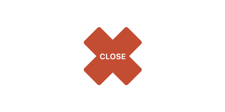
For HTML, we need a container with two div elements and a span element with text "CLOSE".
<div class="container">
    <div></div>
    <div></div>
    <span>CLOSE</span>
</div>
CSS
For CSS, first we'll style the container. We'll set width and height to 80x30 pixels.
We'll set position to relative because of div child elements, which will be positioned absolute, these two elements will create X sign.
And, we'll position the text in center using flexbox and set cursor to pointer.
.container {
    width: 80px;
    height: 30px;
    position: relative;
    display: flex;
    align-items: center;
    justify-content: center;
    cursor: pointer;
}
Now we'll style those two div elements inside of container.
As mentioned before, we'll set position to absolute, with top, bottom, left and right properties set to 0, which means that these two elements will be the same width and height as it's parent, and at the same position.
We'll set background color to light grey, a little border radius and transition.
.container div {
    position: absolute;
    background-color: rgb(186, 186, 186);
    top: 0;
    bottom: 0;
    left: 0;
    right: 0;
    transition: .3s;
    border-radius: 3px;
}
As for the text element, we'll set z-index to 1, so that this element appears on top of these two div elements that we just styled above.
We'll set font size to 10 pixels, a little transition and font weight to 600.
span {
    z-index: 1;
    font-size: 10px;
    transition: .3s;
    font-weight: 600;
}
On hover, we'll set text color to white and add a little transition.
.container:hover span {
    color: #fff;
    transition: .3s;
}
For div elements, on hover, we'll set background color to red and add a little transition.
.container:hover div {
    background-color: rgb(211, 66, 37);
    transition: .3s;
}
Also, we'll rotate div elements, so that they form an X sign.
To achieve this, we'll rotate one element for 45 degrees, and the other for -45 degrees.
.container:hover div:first-child {
    transform: rotate(45deg);
}
.container:hover div:nth-child(2) {
    transform: rotate(-45deg);
}
And that's it it. Simple, huh?
You can find video tutorial with full code here.
Thant you for reading. ❤️

Top comments (0)