HTML
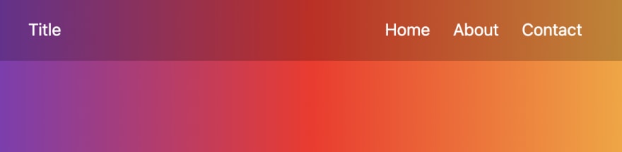
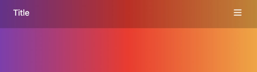
In HTML we have title and menu.Inside menu item, we have desktop and mobile element.
Desktop will be displayed when screen is grater than 500px and mobile will be displayed when screen is less than 500px.
Inside mobile class, we'll add an hamburger svg icon.
Inside desktop class, we'll add a few menu items.
<div class="nav">
    <div>Title</div>
    <div class="menu">
        <div class="mobile">
            <svg xmlns="http://www.w3.org/2000/svg" width="20" height="20" fill="none" viewBox="0 0 24 24" stroke="currentColor" stroke-width="2">
                <path stroke-linecap="round" stroke-linejoin="round" d="M4 6h16M4 12h16M4 18h16" />
            </svg>
        </div>
        <div class="desktop">
            <span>Home</span>
            <span>About</span>
            <span>Contact</span>
        </div>
    </div>
</div>
CSS
First we'll align title on the left, and menu on the right, using flexbox.
Then we'll set paddings, height and colors.
.nav {
    display: flex;
    justify-content: space-between;
    align-items: center;
    padding: 0 30px;
    height: 60px;
    color: #fff;
    background-color: rgba(0, 0, 0, .2);
}
Now we'll add styling to all span elements inside desktop class. This means that we are styling all menu items.
We'll just set some paddings, cursor to pointer, add a little transition and set transparent border of 1 pixel.
The reason we're adding the transparent border is because on hover, it will become white, and if we haven't added the transparent border now, it would increase in size, which we don't want.
.desktop span {
    padding: 5px 10px;
    cursor: pointer;
    transition: .3s;
    border: 1px solid transparent;
}
Now we're setting the styling on hover for menu items.
We'll set top and bottom border color, and add transition, so the color changes smoothly.
.desktop span:hover {
    border-bottom-color: #fff;
    border-top-color: #fff;
    transition: .3s;
}
Let's now set desktop class to invisible. We'll overwrite this later in media queries.
.desktop {
    display: none;
}
Now let's set pointer to cursor for hamburger svg inside mobile class.
.mobile svg {
    cursor: pointer;
}
And also set the mobile element invisible. Same as desktop.
.mobile {
    display: none;
}
Now, using media queries, we're detecting when screen is less than 50 pixels and overwriting the display property from none to block.
@media  only screen and (max-width: 500px) {
    .mobile {
        display: block;
    }
}
And when screen is greater than 501 pixel, we'll overwrite desktop's display property, so it becomes visible.
@media  only screen and (min-width: 501px) {
    .desktop {
         display: flex;
    }
}
And that is it. You can now add menu items to mobile class on svg click.
You can find full code with video tutorial here.
Thank you for reading. ❤️

Top comments (0)