Card Component with Tailwind CSS
Hi everyone! In this post we'll learn how we can create a card with Tailwind CSS.
You can refer to this to setup tailwind css and code with me(I'm not so good in making videos)
Before starting to code we should have an idea about what we have to create and how it will look when completed. So, basically a card have an Image, title, some description and a button.
So, first of all structure our Card
<!DOCTYPE html>
<html lang="en">
<head>
    <meta charset="UTF-8">
    <meta http-equiv="X-UA-Compatible" content="IE=edge">
    <meta name="viewport" content="width=device-width, initial-scale=1.0">
    <title>Tailwind Card Tutorial</title>
    <link rel="stylesheet" href="./style.css">
</head>
<body>
    <!-- <h1>Tailwind Css Card Tutorial </h1> -->
    <div>
        <div>
            <img src="https://images.unsplash.com/photo-1658827866369-25c66ae3dc30?ixlib=rb-1.2.1&ixid=MnwxMjA3fDB8MHxwaG90by1wYWdlfHx8fGVufDB8fHx8&auto=format&fit=crop&w=870&q=80" alt="image">

            <h2>Tailwind Card Comoponent</h2>
            <p>
                Lorem ipsum dolor, sit amet consectetur adipisicing elit. Libero dolore quod placeat sit? Omnis nobis perferendis doloremque facilis, modi animi tempora inventore!
            </p>
            <button>Read More</button>
        </div>
    </div>
</body>
</html>
We have completed the HTML part of the Card component.
**You can skip this part if you know how to setup the tailwind css for your project
Now we have to setup Tailwind CSS for our project. So, open the terminal in VS Code and run the following commands (You can find all the commands on the official Tailwind Website).
Terminal
npm init -y
npm install -D tailwindcss postcss autoprefixer vite
npx tailwindcss init
tailwindcss.config.js
/** @type {import('tailwindcss').Config} */
module.exports = {
  content: ["*"],
  theme: {
    extend: {},
  },
  plugins: [],
}
style.css
@tailwind base;
@tailwind components;
@tailwind utilities;

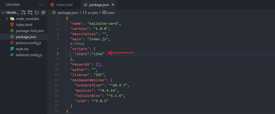
Add the above script to package.json
Install the Tailwind CSS IntelliSense extension for better and faster experience
The Complete code for this project
<div class="conatainer bg-slate-400 w-screen h-screen flex justify-center items-center">
        <div class="max-w-sm h-auto bg-white rounded-xl shadow-2xl">
            <img src="https://images.unsplash.com/photo-1658827866369-25c66ae3dc30?ixlib=rb-1.2.1&ixid=MnwxMjA3fDB8MHxwaG90by1wYWdlfHx8fGVufDB8fHx8&auto=format&fit=crop&w=870&q=80" class="w-full rounded-t-xl" alt="image">

            <h2 class="font-bold text-lg my-2 mx-4 hover:cursor-default">Tailwind Card Comoponent</h2>
            <p class="font-medium text-sm my-4 mx-4 hover:cursor-default">
                Lorem ipsum dolor, sit amet consectetur adipisicing elit. Libero dolore quod placeat sit? Omnis nobis perferendis doloremque facilis, modi animi tempora inventore!
            </p>
            <button class="bg-blue-600 text-white font-bold px-4 py-1 mx-4 rounded-md my-2 hover:bg-blue-700 hover:scale-105 duration-300 mb-8">Read More</button>
        </div>
    </div>
Hope you loved it.😊


Top comments (0)