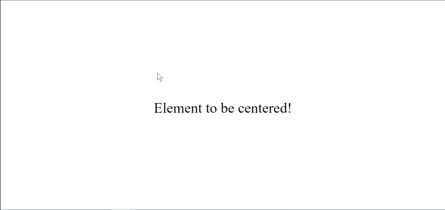
Sometimes, you may want to have your elements centered vertically and horizontally on the webpage (hence bidirectional). In this guide, we’ll look at two simple CSS techniques you can use to do this. These CSS techniques are the position and flexbox.
Prerequisites
To understand the content of this guide, you need to have:
- A code editor (I’m using Visual Studio Code)
- Basic knowledge of HTML and CSS (especially position and flexbox)
- A web browser (I’m using Google Chrome)
Using the Position Technique
We can place our child elements anywhere within the parent element using the position property (and the transform property) for bidirectional centering. When the parent element has the position: relative, the direct child becomes limited to its dimensions, i.e. its width and height. Let’s have a look at how it’s done:
HTML Markup:
<div class="container">
  <div class="element">Element to be centered!</div>
</div>
CSS Stylesheet:
.container {
  position: relative;
  height: 100vh;
}

.element {
  position: absolute;
  top: 50%;
  left: 50%;
  transform: translate(-50%, -50%);
}
The position: absolute; property applied to the .element {} enables the .element to be placeable anywhere within the .container.
The top: 50% and left: 50% moves the .element to the absolute center vertically and horizontally and the transform: translate(-50%, -50%) corrects them to be in the perfect center.
The height: 100vh; controls the parent element's height i.e. the .container that we will center the child element in.
Using the Flexbox Technique
Using CSS Flexbox for bidirectional centering, you can control the placement of elements within other elements. When the display: flex property is applied to the parent element, the direct children becomes flex items, and so you can add alignment properties to control those children (flex items). Let’s take a look at how this works:
HTML Markup:
<div class="container">
  <div class="element">Element to be centered!</div>
</div>
CSS Stylesheet:
.container {
  display: flex;
  align-items: center;
  justify-content: center;
  height: 100vh;
}
The align-items: center; property applied to the .container vertically centers the child element while the justify-content: center; makes it horizontally centered. On certain occasions, the align-items: center; may seem ineffective. This could be because your parent element does not have a height property. In this guide, we’ll include a height: 100vh; within the .container {} for the align-items: center; to be effective.
Maintainability, flexibility and ease of use are some of the key advantages of this technique over the position technique.
Conclusion
Bidirectional centering is an essential part of frontend development, and as we have learnt in this article, they’re effortless to handle if you understand how they work. The two standard techniques to implement bidirectional centering in CSS are the position and flexbox properties covered in this article.
Suppose you have any questions or comments concerning this article. In that case, you can drop them in the comments section, and if you have other frontend related topics, do not hesitate to reach out to me via Twitter or LinkedIn.


Top comments (0)