One of the things that stood out to me from WWDC this year was the ability to have native half sheets. This has been a request from the designers at every job I have ever had and until now we have always had to roll our own. So I thought I would play around with the code from this video and see how they work in practice. This code is all written in Xcode 13, beta 1 on macOS 11.3 (Big Sur) and run on iOS 15 simulators.
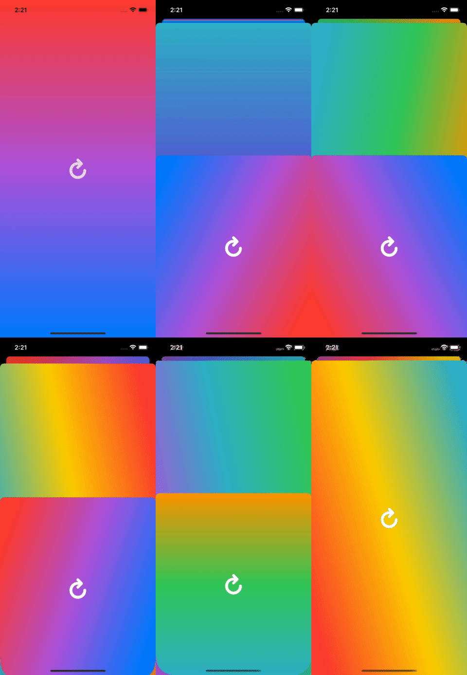
And please excuse the quality of the gifs. Gradients don't play super well with a limited palette, but it was the easiest way I could find to have some simple examples of what the movement of these sheets looks like.
Finding The Sheet Presentation Controller
The first thing I noticed is that the sample code doesn't actually compile (at least not on the version of Xcode I'm running). UIViewController doesn't have a property called sheetPresentationController. It is accessible through the presentationController property, assuming the modalPresentationStyle is set to pageSheet or formSheet, but you have to cast it as a UISheetPresentationController to access the new properties. I added this shim for now to get the sample code to run, but I assume the new sheetPresentationController property will be made available eventually.
extension UIViewController {
 var sheetPresentationController: UISheetPresentationController? {
   presentationController as? UISheetPresentationController
 }
}
With that available, I had a route to start adding some sheets:
override func viewDidLoad() {
    super.viewDidLoad()

    view.backgroundColor = .systemTeal
    presentSheet()
}

override func viewDidAppear(_ animated: Bool) {
    presentSheet()
}

private func presentSheet() {
    let viewController = UIViewController()
    viewController.view.backgroundColor = .systemOrange

    let sheet = viewController.sheetPresentationController
    sheet?.detents = [.medium(), .large()]

    present(viewController, animated: true)
}
That gives us a bottom sheet like this:
Making It Look Nice
It's pretty cool out of the box. It looks good, you can expand it up to full height and back and dismiss it like you would expect. But I wanted to see how customizable it is, see what it is good for and what it isn't, etc. And I want it to look good in the process, so let's get some gradients in there.
First, I'm using this simple GradientView which is a UIView subclass that has a CAGradientLayer as its layer class and provides direct access to it.
class GradientView: UIView {
    override class var layerClass: AnyClass {
        return CAGradientLayer.self
    }

    var gradientLayer: CAGradientLayer {
        return layer as! CAGradientLayer
    }
}
Then, I set the view of ViewController to be that GradientView
private lazy var contentView: GradientView = .init()

override func loadView() {
    view = contentView
}
And then make some semi-random combinations of colors:
let colorSets: [[UIColor]] = [
    [.systemTeal, .systemGreen, .systemOrange],
    [.systemRed, .systemPurple, .systemBlue],
    [.systemPink, .systemIndigo, .systemTeal],
    [.systemPink, .systemYellow, .systemGreen],
    [.systemGreen, .systemTeal, .systemPurple],
    [.systemYellow, .systemPink, .systemIndigo],
    [.systemRed, .systemYellow, .systemTeal]
]

// in viewDidLoad()
contentView.gradientLayer.colors = colorSets.randomElement()!
                                            .map(\.cgColor)
To add a little more variety, I also added a couple of different start points:
let startPoints: [CGPoint] = [
    CGPoint(x: 0.5, y: 0),
    CGPoint(x: 0, y: 0.3),
    CGPoint(x: 0.5, y: 1),
    CGPoint(x: 0, y: 0.8),
    CGPoint(x: 1, y: 0.3),
    CGPoint(x: 1, y: 0.8),
]

extension CGPoint {
    func opposite() -> CGPoint {
        let x = 1 - self.x
        let y = 1 - self.y
        return CGPoint(x: x, y: y)
    }
}

// in viewDidLoad()
let start = startPoints.randomElement()!
contentView.gradientLayer.startPoint = start
contentView.gradientLayer.endPoint = start.opposite()
FInally, to add new sheets, I added a button instead of doing it automatically in viewDidAppear. This allows it to be recursive, so you can just keep adding new iterations onto the stack. This is using the new UIButtonConfiguration, which I won't go into detail on here, but maybe in a future article. Needless to say, it is also pretty nice.
private let addButton = UIButton(configuration: .plain())

// in viewDidLoad()
let arrowConfig = UIImage.SymbolConfiguration(pointSize: 36,
                                              weight: .black)
let arrow = UIImage(systemName: "arrow.clockwise",
                    withConfiguration: arrowConfig)
addButton.configuration?.image = arrow
addButton.tintColor = .white
let addAction = UIAction { _ in self.presentSheet() }
addButton.addAction(addAction, for: .primaryActionTriggered)

view.addSubview(addButton)
addButton.centerAnchors == view.centerAnchors

// in presentSheet()
sheetPresentationController?.animateChanges {
    sheetPresentationController?.selectedDetentIdentifier = .large
}

let viewController = ViewController()
That leads to something that looks like this.
Customizing Things
Now that's looking a lot more fun! And it gives us a pretty solid foundation to mess with some of the interface talked about in the WWDC session. The first thing I tried as messing with the preferredCornerRadius, which I found is not yet a property on UISheetPresentationController. But there is a private version called __preferredCornerRadius, which, again, I'm assuming will be fixed before the release of the GM. To mess around with this, I added a slider, that will let us set it in the app.
static var preferredCornerRadius: CGFloat = 24
private let cornerRadiusSlider = UISlider()

// in viewDidLoad()
cornerRadiusSlider.maximumValue = 60
cornerRadiusSlider.minimumValue = 0
cornerRadiusSlider.maximumTrackTintColor = .white.withAlphaComponent(0.3)
cornerRadiusSlider.minimumTrackTintColor = .white
cornerRadiusSlider.value = Float(Self.preferredCornerRadius)

let updateRadiusAction = UIAction { _ in self.updateRadius() }
cornerRadiusSlider.addAction(updateRadiusAction, for: .primaryActionTriggered)

view.addSubview(cornerRadiusSlider)
cornerRadiusSlider.horizontalAnchors == view.readableContentGuide.horizontalAnchors + 20
cornerRadiusSlider.topAnchor == addButton.bottomAnchor + 20

// in presentSheet()
sheet?.__preferredCornerRadius = Self.preferredCornerRadius

private func updateRadius() {
    let radius = CGFloat(cornerRadiusSlider.value)
    sheetPresentationController?.__preferredCornerRadius = radius
    Self.preferredCornerRadius = radius
}
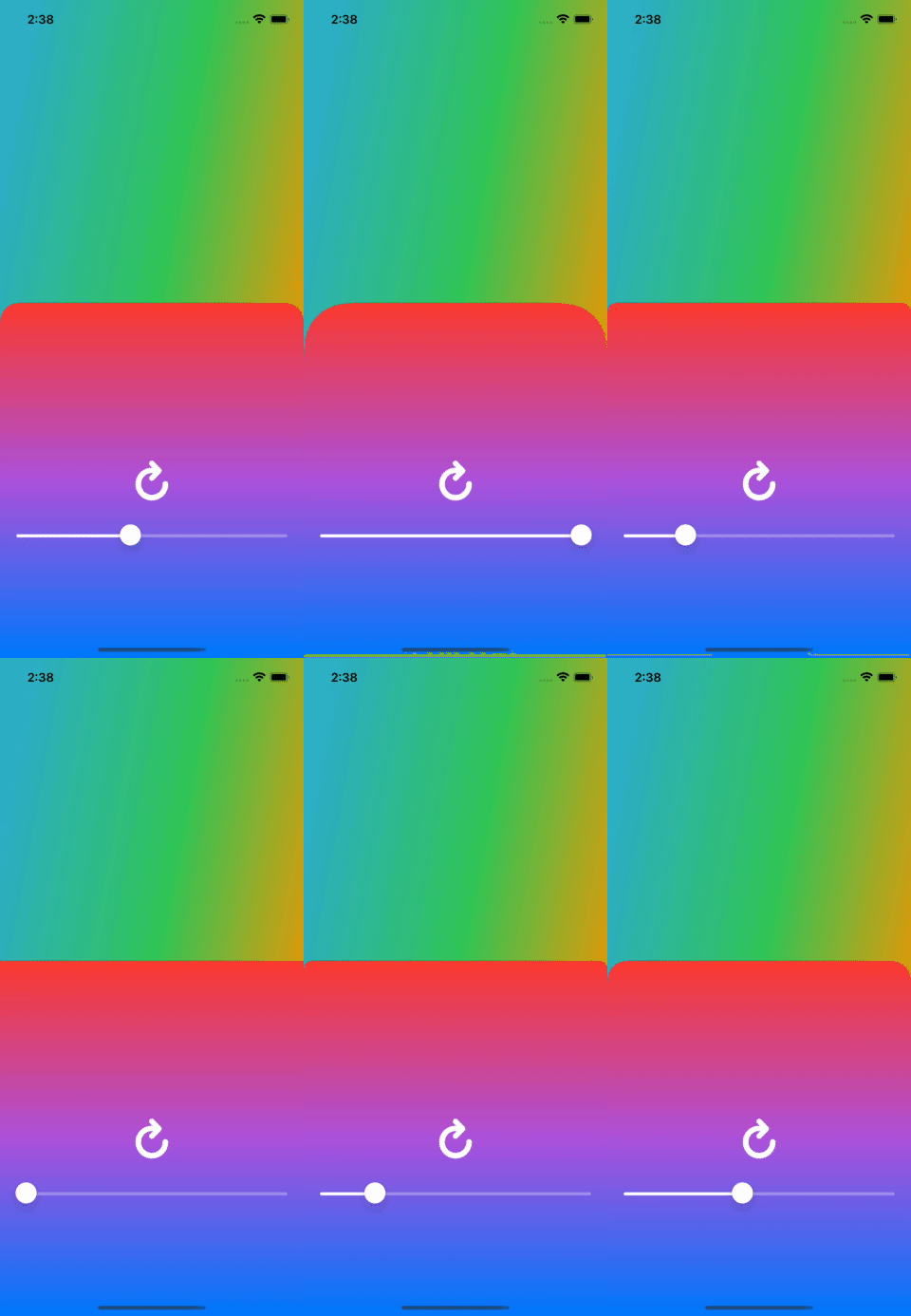
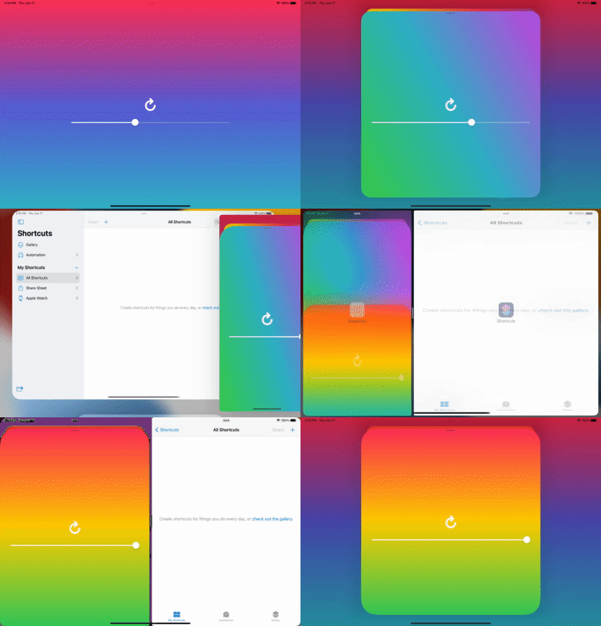
This works pretty much as you would expect. As you move the slider, the corner radius updates.
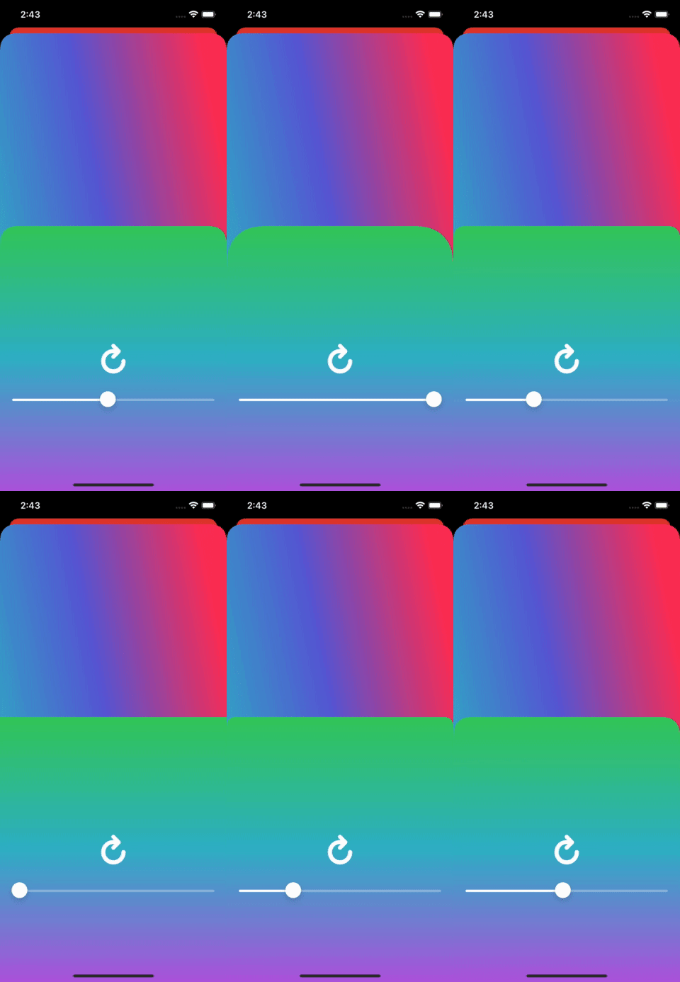
Interestingly, setting the preferred corner radius on the sheet presenter doesn't affect the view behind if it is at half-height, but it does at full height.
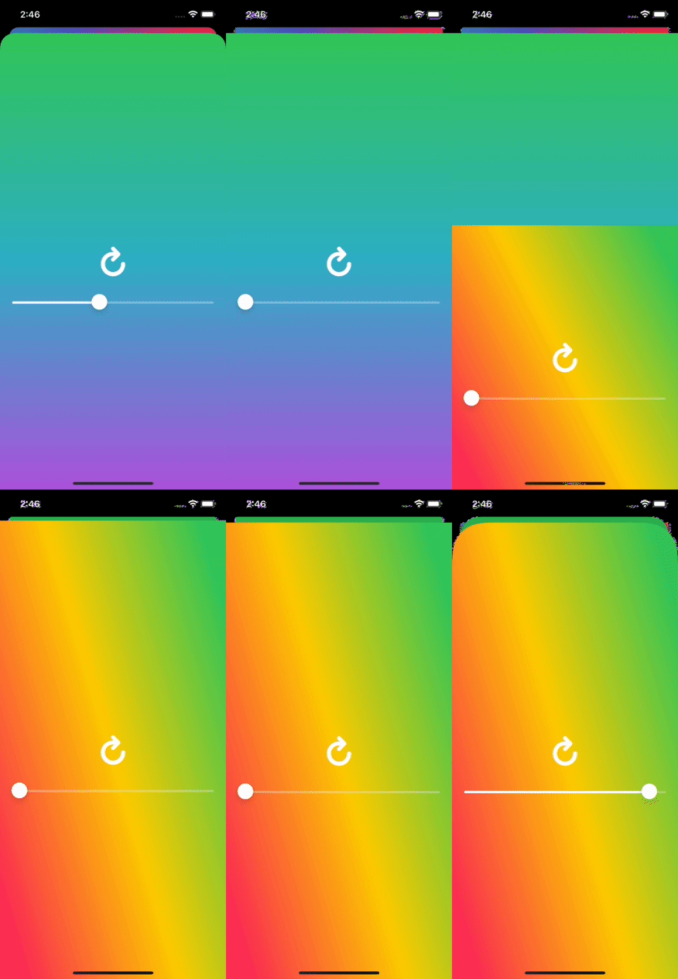
Even more interesting, it only affects the view immediately behind it, even at full height.
Most of these things shouldn't really affect much in practice, because how often are you presenting sheet on top of sheet on top of sheet, or allowing the user to change the corner radius of a view at will? But it is good to know where it might fall down.
prefersGrabberVisible, prefersEdgeAttachedInCompactHeight, and smallestUndimmedDetentIdentifier are all accessible and work expected. I added these methods to expose them in the app, and hooked them up to respective buttons.
private func updateGrabber() {
    showsGrabberButton.isSelected.toggle()
    sheetPresentationController?.animateChanges {
        sheetPresentationController?.prefersGrabberVisible = showsGrabberButton.isSelected
    }
}

private func updateEdgeAttached() {
    edgeAttachedButton.isSelected.toggle()
    sheetPresentationController?.animateChanges {
        sheetPresentationController?.prefersEdgeAttachedInCompactHeight = edgeAttachedButton.isSelected
    }
}

private func updateDimming(_ detent: Detent) {
    sheetPresentationController?.animateChanges {
        sheetPresentationController?.smallestUndimmedDetentIdentifier = detent.identifier
    }
}
And it all works well on iPad too, although you have to access the sheet controller through popoverPresentationController?.adaptiveSheetPresentationController if your view is presented in a popover.
One thing that is really cool is that, if you set the sheet to not dim the view behind it, you can still interact with the view controller behind it. That doesn't mean much in this toy app, but the WWDC video had a good example of showing an image picker on the bottom (in the front view controller) and displaying the image picked on the top (in the back view controller).
Wrap Up
All in all, I think it looks pretty slick and (mostly) works like you would expect it to out of the box. If they get the last few pieces of the interface cleaned up before the GM release, I'll definitely be using it my apps when the design calls for it. Download my toy app and play around with this stuff for yourself in this repo.
If this has been helpful buy me a coffee!






Top comments (0)