The Coronavirus Forecasting Dashboard — Modeling Deaths and Cases around the World
The coronavirus forecasting dashboard shows historical and predicted values for deaths and cases for all countries and US states from the ongoing coronavirus pandemic. In this post, I will present details of the model used and how the dashboard was created. If you are interested in a full tutorial of how this dashboard was built, check out my course Build an Interactive Data Analytics Dashboard with Python.

Dashboard Features
Before delving into the details of the model and technologies used to launch the dashboard, let’s cover some of the dashboard features.
Data Table
The data table on the left side of the dashboard contains totals for deaths and cases for each country of the world by default. You can switch the view to show totals for the last week and previous day via the tabs. Countries can also be aggregated by region of the world.
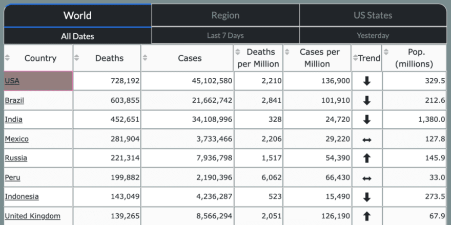
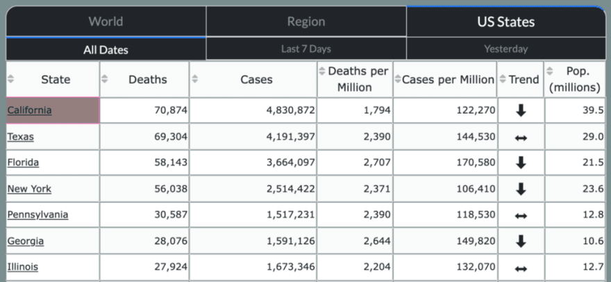
Totals for each US state have their own view.
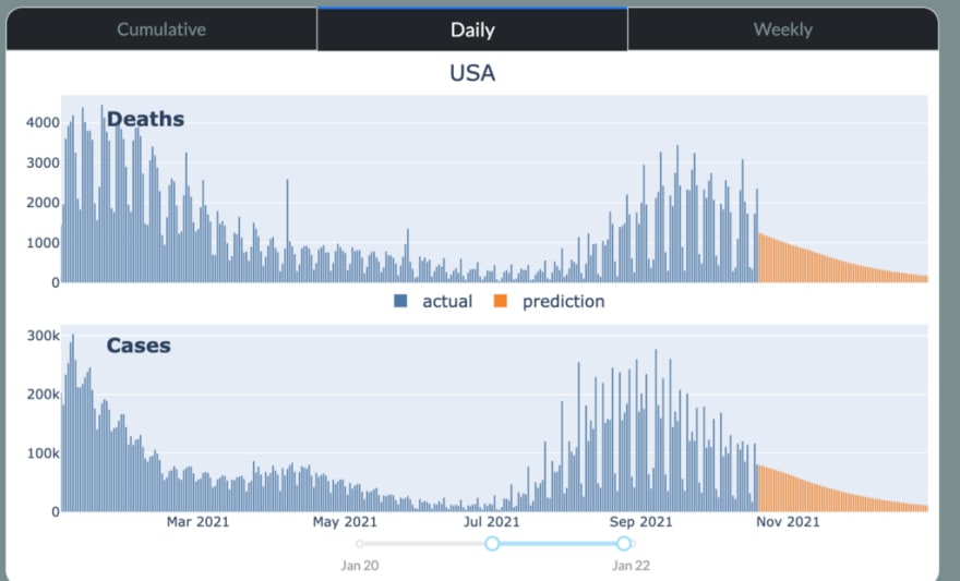
Historical and predicted values
Each area in the table can be selected, which will have the effect of showing its historical and predicted values for deaths and cases appear in the graph to the right. Views for cumulative, daily, and weekly are available via the tabs above the graph. A slider below controls the date range.
Choropleth Maps
Choropleth maps (areas colored by specific values) are shown below the graphs as a visual representation of the data table. Hovering over a country reveals its data. The coloring can change by selecting one of the values above the map.

The map changes to show the USA when the US States tab is selected.

Model Performance
The model performance page shows how well the model performed over a chosen date range.

Constructing the Model
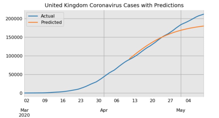
One goal of this dashboard was to build a model to predict the number of future cases and deaths. As with any data task, there are a wide variety of approaches for choosing and building a model. There are also many variables to consider. To keep things simple, I chose to only use historical cases as the single input into the model. Historical cases are known, easy to retrieve from a single source, and provide good predictive power for future cases. Let’s take a look at cumulative case count the UK from March 2020 to the end of October 2020.

The UK shows a typical pattern of cases — a first wave of cases beginning in March and ending in July with another wave starting in September. The majority of countries have now seen multiple waves that behave similarly. There appears to be exponential growth during the beginning of a wave, then steady growth, and then ending in exponential decline. The waves form shapes that are well-modeled by a class of functions called “S-Curves”, with the generalized logistic function proving to be a good choice with flexibility to model a single wave. Take a look at its form below:

Where L represents the upper bound for cases, x0 controls the horizontal shift, s the vertical shift (useful when modeling new waves), k controls the growth rate (steepness of the curve), and v controls the amount of asymmetry difference between the exponential growth and decline phases (most coronavirus waves have long tails towards their upper bound like the UK does above).
Here, we use this model to make predictions for the UK after allowing the model to view data through April 10.
One formulation of the generalized logistic function is the Gompertz curve, also popular for modeling coronavirus waves. Each area of the world and US state has its model updated on a daily basis using this generalized logistic function. The results are displayed in the dashboard.
Dashboard Construction
The dashboard was constructed using the Dash Python library, an open-source project from the Plotly company. Dash provides the data tables, widgets, and interactivity necessary to create nearly any dashboard you wish. The data visualizations themselves are created by the Plotly library.
The Layout and Interactivity
Dash applications are composed of two parts, the layout and the interactivity. In the layout, you define each component of the dashboard, such as the data tables, tabs, links, graphs, maps, etc… You can use custom HTML and CSS to place more components, and style and arrange them.
After setting the layout, callback functions can be defined to add interactivity. A callback function is triggered by specific events in your dashboard such as clicking a radio button or selecting an item in a dropdown menu. In this dashboard, one callback is triggered by the clicking of a country or state name in the data table on the left. Doing so, changes the data displayed in the graphs on the right to that area. The radio buttons above the maps also trigger a callback to change the coloring of each are by the specific metric selected.
Dash Bootstrap Components
The third party library Dash Bootstrap Components has several more components styled using the popular Bootstrap JavaScript/CSS library and was used to make the radio buttons.
Visit the Dashboard
If you haven’t already done so, visit the dashboard, explore its features and let me know what you think of it.

Top comments (0)