
The answer is Display P3.
iykyk. For the rest of us, read on.
Nature has an infinite number of colors (it’s just different wavelengths of light, so there are as many colors as there are real numbers). So when we represent colors on our lil finite computers, we have to fit infinity in some smaller box.
The box we use is called a “color space”. And a specific coordinate in that box represents a particular color.Since we’re fitting an infinite number of colors in a smaller box, there is no way to represent all colors.
This is fine. We were happy in the days of 16 bit VGA displays where we could see individual pixels on the bulky computer monitor; the human imagination is great in filling in the missing details, it even enjoys the process.
The problem comes though when someone builds a bigger box, and our neighbour gets one. So you could be fine with your VGA display, until you see the same data presented on a shiny 4K display.
The same sort of a thing happened with color spaces.
sRGB is a standard-ish box (“color space”) that is used on the web and elsewhere. It’s fine, and it works everywhere (mostly), so everyone was satisfied.
But then Apple, ever the petulant child, went ahead and built a bigger box — Display P3.
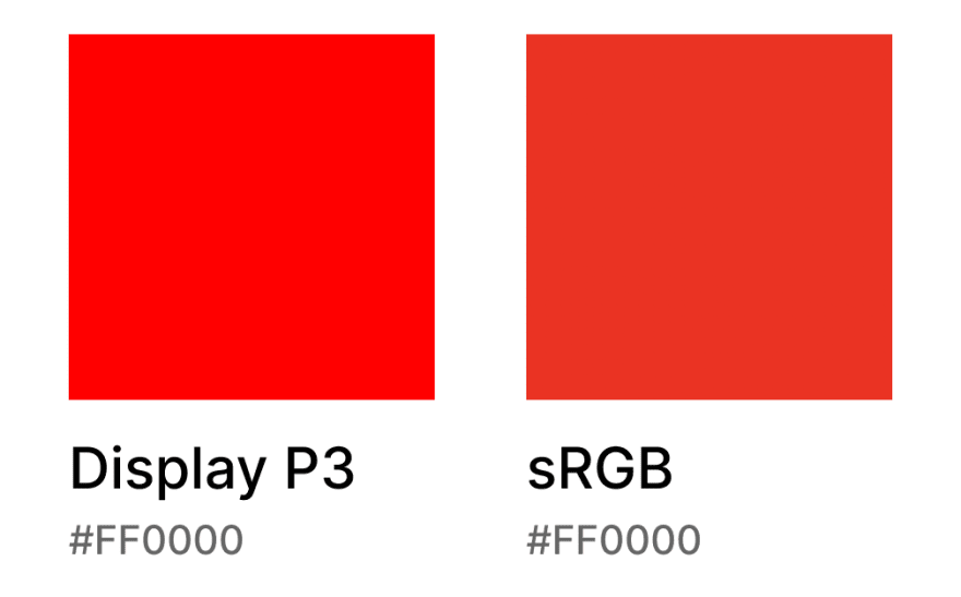
Display P3 is capable of representing more colors than SRGB. And even the ones that sRGB can represent, Display P3 maps to more “vibrant” versions. Here is the standard red #FF0000 — on the left in P3, the right in sRGB.
Of course, one needs a display that also has the hardware support to be able to see the difference. But thanks to Apple, a significant percentage of the world’s population has access to such displays: the retina screens on iPhones support Display P3.
With the backstory out of the way (for those of you who already understand these things, I hope you stayed so far!), let’s get to the specifics.
Meet our friend, Bob. Bob is a designer for a fancy startup (guess which one 😉), and in between sipping his Chai Lattes and Instagram Reels, he designs things in Figma. Of course, he uses his fancy MacBook, with the latest retina display, where he ponders over the mesmerising designs he makes in Figma’s macOS app.
Finally one day, after he’s done being mesmerised, he pings his developer teammate, Meena, to pick up the design. Feeling fidgety, he also exports one of the screens as a PNG (at 3x, no less!) to show to the rest of his team while the code changes are done.
When he sees the exported image, he’s shocked.
His vibrant, lush greens are looking dull, washed-out and uninspiring. And because his colors have lost their vitality, the entire design feels just off — the contrasts between the text and colors is reduced, the shadows stop popping out, etc; you get the idea.
As he sulkingly wonders what the issue is over another chai latte, Meena pings him and says that the updates he’d requested are now in on the TestFlight build. “That was fast!”, he replies. This generally cheers him up.
He installs the build, but only to see the same horror on his device! Just like the exported image, the colors are dull and washed-out.
Bob, on the verge of tears by now, his mesmering edifice reduced to ordinariness, comes to us for consolation, and advice.
What is happening with Bob is a story in two parts.
Part 1.
The Figma macOS app by default uses an “Unmanaged” color space. This is Figma speak for saying that it’ll use the system’s color space. In case of Bob, since he’s using a MacBook, this system color space is Display P3.
When Bob exports the image though, Figma exports it in sRGB. Since the Display P3 box is bigger than the sRGB box, the vibrant P3 color that he’d been seeing on his screen gets clipped to the nearest sRGB color, which is not an exact equivalent. In general, as we saw above with the red, even the same color feels dullers in sRGB (vis-à-vis P3); the colors which don’t have an exact equivalent would feel duller still.
Part 2.
Flutter does not support Display P3. So even though Meena used the correct color value/hex code from Figma, when the color is rendered on screen, it is rendered by Flutter in the sRGB space.
So the same issue that happened with the exported image happens with the app running in Flutter too — the P3 color gets mapped to a duller sRGB one.
How can we help Bob though?
There are no easy answers.
One approach would be for Bob to switch his Figma macOS app to use the sRGB color space (one can argue that is perhaps a safer default for Figma to have chosen. But then what would life be without this shock and confusion being a rite of passage for designers).
Then he can design in the sRGB color space and will not have any surprises later when his work gets exported to images, or implemented in Flutter. Plus, this way he’ll always “be with the people”: the colors he sees are the colors half their users (without Display P3 devices) will eventually see.
But while this approach is saner, it does leave off the possibility of a much more vibrant world that he could’ve created for the other half of their users: the ones with Display P3 devices. This set of people is less than 50% right now, but this number is the one which is growing, as more and more devices (including Androids) gain support. Of course, this involves engineering challenges (e.g. Flutter doesn’t support Display P3 yet).
So this story stands incomplete, still.
Know of a way to help Bob? Let us know on Twitter, Discord or Reddit.
References:

Top comments (0)