
You can call it Adansive or Resaptive..
Responsive and Adaptive design are two design methodologies with the goal of making a product accessible on any device or screen size, providing the best experience to all users. Both of them try to make the most of the available screen space and the user interaction mode. Before talking about the A+R model we need to break down both methodologies approaches
While responsive design makes use of CSS and/or JS to adapt layouts and contents based on predefined breakpoints, the adaptive approach provides pre-structured templates that will be served based on the user agent and the device type. The main difference between them is the DOM structure, when approaching with a responsive mindset we have the same HTML code for all situations (unless you use JS to remove some DOM nodes), while in adaptive we have a different code structure and potentially different experiences.
Both design mindsets are valid, just ask yourself how many components and complexities you have in your project and if one experience can fit all of your users. Developing web applications the responsive design is frequently used, such as building specific experiences through an adaptive development, like Twitter and Facebook mobile do.
Responsive Design Techniques
While building a responsive experience we have three approaches to handle our layouts and content:
Reflow: We can change the layout structure to better fit the viewport area. Most of time this results in content being stacked (that's not always good).

Resize: Some of the UI components are fluid like most of html elements. They fill the available space and reflow if necessary.
Show/Hide: Some UI parts are hidden from the viewport (but they still exist) or showed up to fill the space.

Restructuring: With this approach we can develop and deliver different layouts to provide the best experience for a specific environment like a touch-only mobile device, or hybrid-touch devices.
Introducing the A+R model
Both approaches have pro and cons, but what do we get if we want to use both of them? The A+R model combines both the responsive and adaptive approaches based on a single major breakpoint.
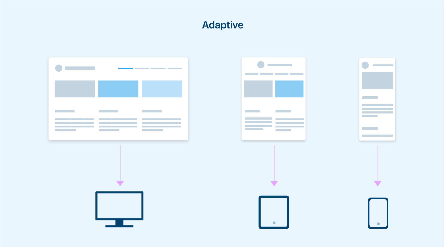
A stands for Adaptive
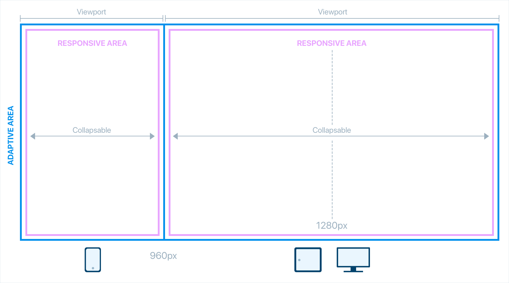
As mentioned above, the adaptive approach allows us to differentiate the user experience, contents and even functionalities based on the user device. Considering a 960px as major adaptive breakpoint (defined based on global stats), we have something similar:
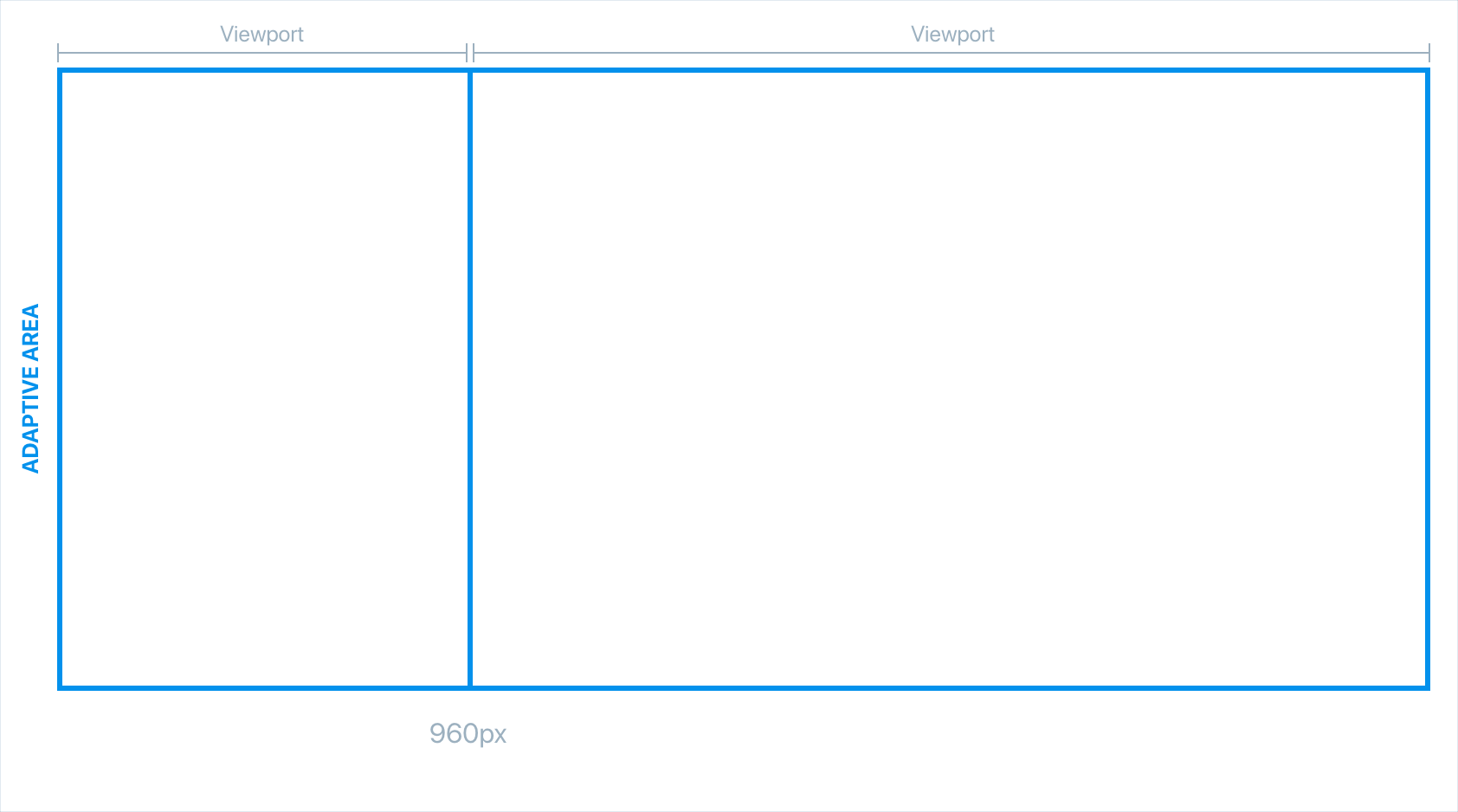
The viewport area on the left represent all the screens under a 960px with a specific layout/content
The viewport area on the right represent all the screens with a 960px or greater with another layout.
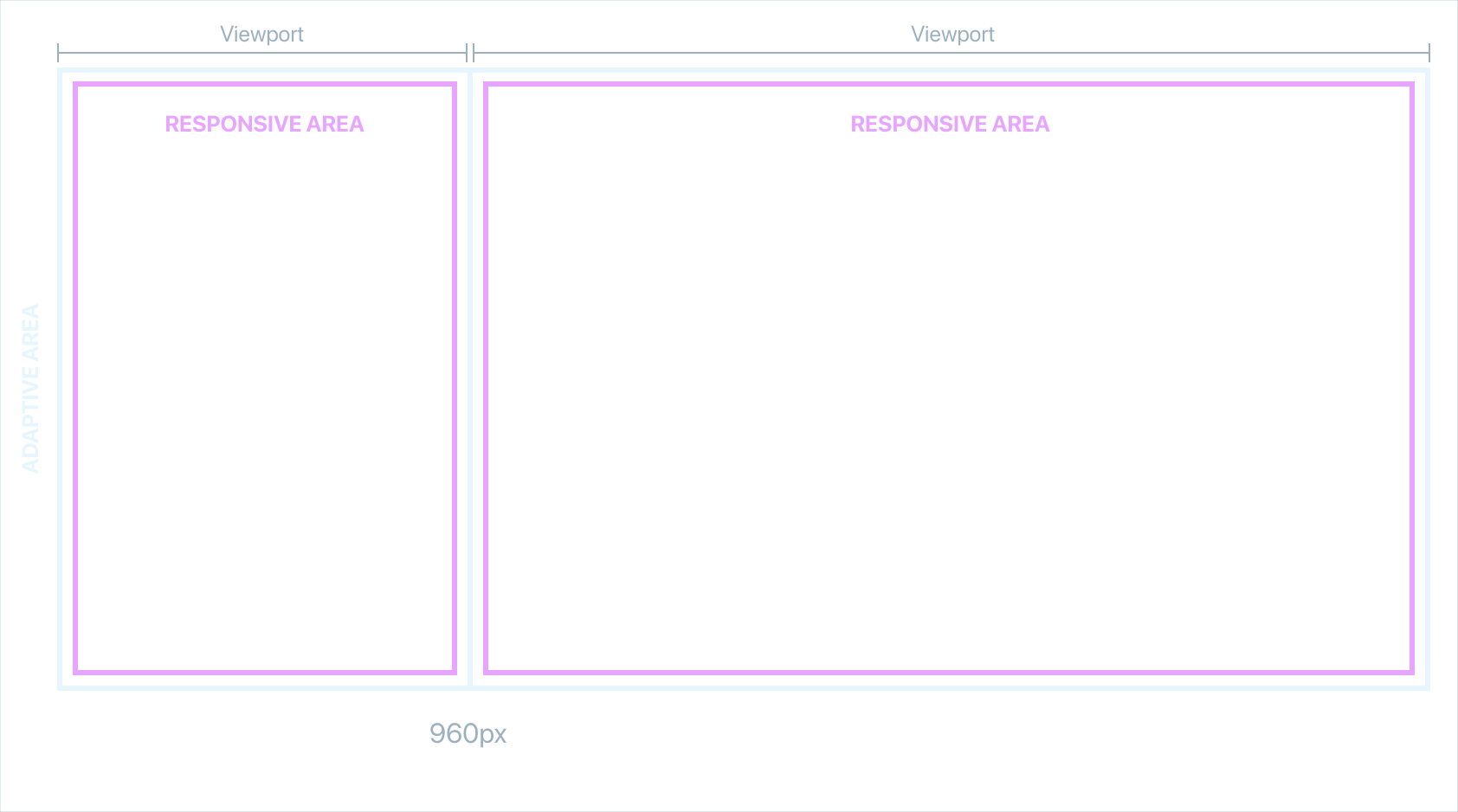
R stands for Responsive
The major breakpoint we have defined create two exprience contexts that may be different from each other, in which we can apply the responsive techniques. Inside each experience we can define minor breakpoints to adapt the layout based on the available space. For example, users which use a tablet will may see a touch-optimised experience (adaptive), but we can still adapt the layout based on the device orientation (responsive).
Adaptive + Responsive
Combining Adaptive and Responsive approaches we get the A + R model. With the adaptive technique we will work on experiences and functionalities, making two different contexts. Withe the responsive one we handle the UI components and layouts which stand inside the contexts.
When to choose the A + R model
This design approach require designers to really understand the experiences they want to provide in order to define what model to follow. This model fit well for large applications that must be accessible from small mobile devices with less functionalities or with a completely different structure. As you can see you will get a lot of flexibility, but also complexity because you may have to handle different codebases and environments (not mandatory).
With the A+R model mindset, designers and developers (but also product owners) can be focused to improve all the experiences the product can offers, instead to provide a "good" experience only on one environment.
Originally published at equinsuocha.io. All the images are made by me and the Contactlab UX team.

Top comments (2)
Mattia, can you list any relatively large websites using this approach? It seems to me it combines the cons of adaptive and responsive approaches without retaining any pros, but maybe if I could see it working I'd believe :)
Twitter, Facebook and Github. They are both adaptive to serve different experiences, but both experiences are also responsive.
Contactlab.com for example use this approach in its data-heavy applications. The main core experience is on desktops but some apps are accessible even on mobile as a "light" version. So instead to just use mq to hide functionalities or ui elements they provide two experiences, both optimised without compromising each other.