A short tutorial on how to use FlowLayout in Jetpack Compose
At Exyte, we strive to contribute to the open source engineering community by sharing our knowledge and expertise. We regularly write tutorials and release libraries to help other developers improve their skills and create better software. We expand our knowledge base with up-to-date trends and technologies in software development, such as SwiftUI and Jetpack Compose.
Our latest tutorial is on Android FlowLayout, where we demonstrate how to create a flexible layout for displaying views in a flow-like manner.
If you’ve been keeping up with the latest updates in Jetpack Compose, you might have heard about the new FlowRow and FlowColumn composables recently added to Jetpack Compose 1.4.1. Of course, it has already been published in the Accompanist for a while (a group of libraries designed to supplement Jetpack Compose with features often required by developers but not yet available). But now they are available in the base framework and it would be cool to see what they can be used for.
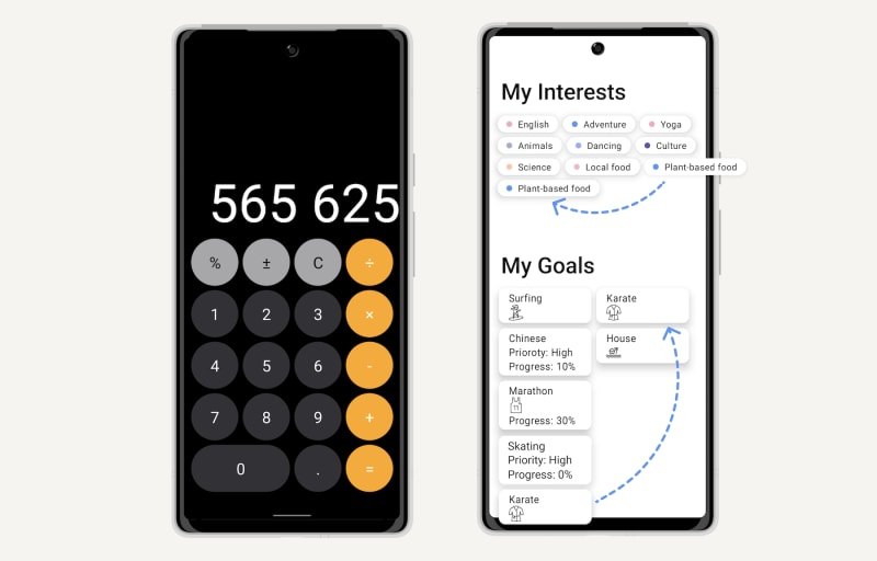
The most important idea in this layout is that we can lay out items in a container when the size of the items or the container is unknown or dynamic. For example, here we have chips (tags) which we place in random order. “Plant-based food” chip does not fit and carries over to the next line.

FlowRow {
    chipsInRow.forEach {
        Chip(text = it.text, pointColor = it.pointColor)
    }
}
For a FlowColumn, it could look like this:
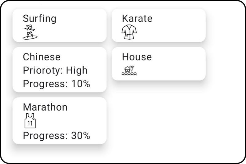
FlowColumn {
    cardsInColumn.forEach { cardData ->
        Card(cardData)
    }
}
Let's take a look at the API:
horizontalArrangement helps to arrange the elements horizontally in a certain order.
verticalAlignment helps align elements if they are of different heights (although this should not be a common case).
maxItemsInEachRow indicates the maximum number of elements we can place in a row. This is very convenient to use in combination with weight modifiers.
fun FlowRow(
    modifier: Modifier = Modifier,
    horizontalArrangement: Arrangement.Horizontal = Arrangement.Start,
    verticalAlignment: Alignment.Vertical = Alignment.Top,
    maxItemsInEachRow: Int = Int.MAX_VALUE,
    content: @Composable RowScope.() -> Unit
)
For the FlowColumn the parameters work the same way, except rotated vertically.
verticalAlignment offers 3 different options that are self-evident:

horizontalArrangement, on the other hand, has more options with some non-obvious ones:

The distinction between SpaceEvenly and SpaceAround might not be obvious. The main difference is that SpaceEvenly, as the name implies, provides a spacing that is even, including the leading and trailing margins. SpaceAround works the same way, but the margins will take half as much space as the distance between the inner elements. Alternatively, you can use an absolute value to keep the interface constant when selecting the RTL (Right to Left) layout: Arrangement.Absolute
If you want to add distance between elements you can use this construction:
Arrangement.spacedBy(5.dp, Alignment.CenterHorizontally)

maxItemsInEachRow can be used together with weight modifiers to make something like this:

All buttons have the weight set to 1 except the zero button, which has the weight set to 2.
FlowRow(maxItemsInEachRow = 4) {
    buttons.forEach {
        FlowButton(
            modifier = Modifier
                .aspectRatio(1 * it.weight)
                .clip(CircleShape)
                .background(it.color)
                .weight(it.weight),
            text = it.text,
            textColor = it.textColor,
        )
    }
}
As you can see, for straight-forward examples the FlowRow and FlowColumn composables are very easy to use - they are a powerful and flexible layout tool for dynamic or unknown sizes. This makes them especially useful for dynamic and responsive interfaces that adapt to different screen sizes and orientations. We expect the examples above to cover most developers’ needs, but we still want to create a more complex example using these new layouts and animating transitions that could happen during adding, removing or repositioning elements. So keep an eye out for the next article on Flow Layout! Meanwhile you can check out our other articles on android development: Dribbble replicating or Androidview&Jetpack Compose tutorial.

Top comments (0)