DEV Community

Cover image for Create a Material Outlined Text Field with Xamarin.Forms
Fabricio Bertani
Fabricio Bertani

Posted on

Create a Material Outlined Text Field with Xamarin.Forms

Sometime ago, the Xamarin team officially release Material Visual, a feature to change the UI controls of your application in order to follow the Material Design Rules & Guidelines proposed by Google. 
This is an amazing feature, as you can check on the official docs and other several posts about using it. They are built natively on each platform and have a great performance, but…(there is always a but), they just add the standard material UI elements, leaving aside other elements, like the outlined text field.
Material outlined text field sample on the Material docs.

For that reason, today we are going to create a material outlined textfield entirely on Xamarin.Forms!!!

As I said before, the Material Visual feature built by Xamarin is completely native, for that reason it has better performance. We are going to have to sacrifice a bit of performance (nearly unnoticeable to the untrained eye) in order to write this control, almost, without having to deal with native code on each platform.
Before starting, let's make a list of what our control should have:

  • Rounded borders
  • Borders should change color
  • Placeholder animation
  • Character counter
  • Leading and trailing icons
  • Interactive icons for password
  • Helper and error texts
  • Error icon

In order to see what we're dealing with, we just build our app with a regular entry and a material one.
Regular and material entries on Android, iOS and UWP

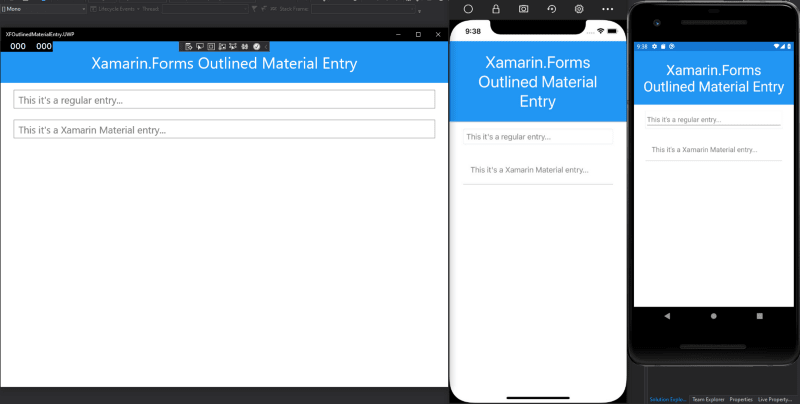
Let's focus on the regular entry:

  • In UWP it has a frame that we need to get rid of.
  • In iOS also has a frame that needs to be removed.
  • In Android, we need to remove that annoying underline.

So let's create some effects for it:

// Base effect placed on the Xamarin.Forms project
namespace XFOutlinedMaterialEntry.Effects
{
public class RemoveEntryBordersEffect : RoutingEffect
{
public RemoveEntryBordersEffect()
: base("XFOutlinedMaterialEntry.RemoveEntryBordersEffect")
{
}
}
}
// iOS implementation
namespace XFOutlinedMaterialEntry.iOS.Effects
{
public class RemoveEntryBordersEffect : PlatformEffect
{
protected override void OnAttached()
{
var textField = this.Control as UITextField;
if (textField is null)
throw new NotImplementedException();
textField.BorderStyle = UITextBorderStyle.None;
textField.BackgroundColor = Color.Transparent.ToUIColor();
}
protected override void OnDetached()
{
}
}
}
// UWP implementation
namespace XFOutlinedMaterialEntry.UWP.Effects
{
public class RemoveEntryBordersEffect : PlatformEffect
{
protected override void OnAttached()
{
var textBox = this.Control as TextBox;
if (textBox is null)
throw new NotSupportedException();
textBox.BorderThickness = new Windows.UI.Xaml.Thickness(0);
textBox.BorderBrush = Color.White.ToBrush();
}
protected override void OnDetached()
{
}
}
}
// Base effect placed on the Xamarin.Forms project
namespace XFOutlinedMaterialEntry.Effects
{
public class RemoveEntryUnderline : RoutingEffect
{
public RemoveEntryUnderline()
: base("XFOutlinedMaterialEntry.RemoveEntryUnderline")
{
}
}
}
// Android implementation
namespace XFOutlinedMaterialEntry.Droid.Effects
{
public class RemoveEntryUnderline : PlatformEffect
{
protected override void OnAttached()
{
var editText = this.Control as EditText;
if (editText is null)
throw new NotImplementedException();
editText.SetBackgroundColor(Color.Transparent);
}
protected override void OnDetached()
{
}
}
}

Great! Now we need to make from our outlined text field a reusable solution, so we should create a component of it.
We will use:

  • A Grid that contains all, because of it overlay property will help us with the placeholder animation.
  • A Frame to wrap around the entry with rounded borders and border color.
  • The other labels for helper, counter and error texts.
  • Images for the icons

Let's create our reusable component!

<?xml version="1.0" encoding="UTF-8"?>
<Grid
xmlns="http://xamarin.com/schemas/2014/forms"
xmlns:x="http://schemas.microsoft.com/winfx/2009/xaml"
xmlns:effects="clr-namespace:XFOutlinedMaterialEntry.Effects"
x:Class="XFOutlinedMaterialEntry.Components.OutlinedMaterialEntry"
Margin="0"
Padding="0, 5, 0, 10"
RowDefinitions="Auto, Auto"
ColumnDefinitions="*, Auto">
<!-- To activate animation when entry is clicked -->
<Grid.GestureRecognizers>
<TapGestureRecognizer Tapped="OutlinedMaterialEntryTapped" />
</Grid.GestureRecognizers>
<Frame
Grid.Row="0"
Grid.Column="0"
Grid.ColumnSpan="2"
x:Name="containerFrame"
BackgroundColor="White"
BorderColor="Gray"
CornerRadius="10"
HasShadow="False"
Padding="{OnPlatform Android='1.5', iOS='1.5', UWP='5'}">
<StackLayout
Orientation="Horizontal">
<!-- Leading icon -->
<Image
x:Name="leadingIcon"
HorizontalOptions="Start"
Margin="18, 0, 0, 0"
HeightRequest="24"
IsVisible="False">
<Image.Triggers>
<Trigger
TargetType="Image"
Property="IsVisible"
Value="True">
<Setter
Property="WidthRequest"
Value="24" />
</Trigger>
<Trigger
TargetType="Image"
Property="IsVisible"
Value="False">
<Setter
Property="WidthRequest"
Value="0" />
</Trigger>
</Image.Triggers>
</Image>
<!-- The Entry -->
<Entry
x:Name="customEntry"
HorizontalOptions="FillAndExpand"
Margin="{OnPlatform Android='18, 0, 18, 0', iOS='18, 10, 0, 10'}"
BackgroundColor="White"
FontSize="Medium"
TextColor="Black"
Focused="CustomEntryFocused"
Unfocused="CustomEntryUnfocused">
<Entry.Effects>
<effects:RemoveEntryBordersEffect />
<effects:RemoveEntryUnderline />
</Entry.Effects>
</Entry>
<!-- Trailing icon -->
<Image
x:Name="trailingIcon"
HorizontalOptions="End"
Margin="0, 0, 18, 0"
HeightRequest="24"
WidthRequest="24" />
<!-- Eye icon for password -->
<Image
x:Name="passwordIcon"
HorizontalOptions="End"
Margin="0, 0, 18, 0"
HeightRequest="24"
WidthRequest="24"
IsVisible="False">
<Image.GestureRecognizers>
<TapGestureRecognizer Tapped="PasswordEyeTapped" />
</Image.GestureRecognizers>
<Image.Triggers>
<DataTrigger
TargetType="Image"
Binding="{Binding Source={x:Reference customEntry}, Path=IsPassword}"
Value="True">
<Setter
Property="Source"
Value="ic_eye_open.png" />
</DataTrigger>
<DataTrigger
TargetType="Image"
Binding="{Binding Source={x:Reference customEntry}, Path=IsPassword}"
Value="False">
<Setter
Property="Source"
Value="ic_eye_close.png" />
</DataTrigger>
</Image.Triggers>
</Image>
</StackLayout>
</Frame>
<!-- Placeholder -->
<StackLayout
x:Name="placeholderContainer"
HorizontalOptions="FillAndExpand"
VerticalOptions="Start"
BackgroundColor="White"
Padding="5, 0">
<StackLayout.Triggers>
<DataTrigger
TargetType="StackLayout"
Binding="{Binding Source={x:Reference leadingIcon}, Path=IsVisible}"
Value="True">
<Setter
Property="Margin"
Value="45, 10, 36, 0" />
</DataTrigger>
<DataTrigger
TargetType="StackLayout"
Binding="{Binding Source={x:Reference leadingIcon}, Path=IsVisible}"
Value="False">
<Setter
Property="Margin"
Value="15, 10, 40, 0" />
</DataTrigger>
</StackLayout.Triggers>
<Label
x:Name="placeholderText"
VerticalOptions="CenterAndExpand"
VerticalTextAlignment="Center"
FontSize="Medium"
TextColor="Gray" />
</StackLayout>
<!-- Helper text -->
<Label
x:Name="helperText"
Grid.Row="1"
Grid.Column="0"
Margin="18, 0, 0, 0"
FontSize="Small"
TextColor="Gray"
LineBreakMode="WordWrap"
IsVisible="false" />
<!-- Char counter -->
<Label
x:Name="charCounterText"
Grid.Row="1"
Grid.Column="1"
Margin="0, 0, 18, 0"
HorizontalTextAlignment="End"
FontSize="Small"
TextColor="Gray"
IsVisible="false" />
<!-- Error text -->
<Label
x:Name="errorText"
Grid.Row="1"
Grid.Column="0"
Margin="18, 0, 0, 0"
FontSize="Small"
TextColor="Red"
LineBreakMode="WordWrap"
IsVisible="false" />
</Grid>

And now on the code behind let's define the bindable properties, event handlers, animations and methods.

using System;
using System.Threading.Tasks;
using System.Windows.Input;
using Xamarin.Essentials;
using Xamarin.Forms;
namespace XFOutlinedMaterialEntry.Components
{
public partial class OutlinedMaterialEntry : Grid
{
private ImageSource tempIcon;
// BindableProperties
public static readonly BindableProperty TextProperty = BindableProperty.Create(
nameof(Text),
typeof(string),
typeof(OutlinedMaterialEntry),
default(string),
BindingMode.TwoWay,
null,
(bindable, oldValue, newValue) =>
{
var view = (OutlinedMaterialEntry)bindable;
view.customEntry.Text = (string)newValue;
}
);
public static readonly BindableProperty PlaceholderTextProperty = BindableProperty.Create(
nameof(PlaceholderText),
typeof(string),
typeof(OutlinedMaterialEntry),
default(string),
BindingMode.OneWay,
null,
(bindable, oldValue, newValue) =>
{
var view = (OutlinedMaterialEntry)bindable;
view.placeholderText.Text = (string)newValue;
}
);
public static readonly BindableProperty HelperTextProperty = BindableProperty.Create(
nameof(HelperText),
typeof(string),
typeof(OutlinedMaterialEntry),
default(string),
BindingMode.OneWay,
null,
(bindable, oldValue, newValue) =>
{
var view = (OutlinedMaterialEntry)bindable;
view.helperText.Text = (string)newValue;
if (view.errorText.IsVisible)
view.helperText.IsVisible = false;
else
view.helperText.IsVisible = !string.IsNullOrEmpty(view.helperText.Text);
}
);
public static readonly BindableProperty ErrorTextProperty = BindableProperty.Create(
nameof(ErrorText),
typeof(string),
typeof(OutlinedMaterialEntry),
default(string),
BindingMode.OneWay,
null,
(bindable, oldValue, newValue) =>
{
var view = (OutlinedMaterialEntry)bindable;
view.errorText.Text = (string)newValue;
}
);
public static readonly BindableProperty LeadingIconProperty = BindableProperty.Create(
nameof(LeadingIcon),
typeof(ImageSource),
typeof(OutlinedMaterialEntry),
default(ImageSource),
BindingMode.OneWay,
null,
(bindable, oldValue, newValue) =>
{
var view = (OutlinedMaterialEntry)bindable;
view.leadingIcon.Source = (ImageSource)newValue;
view.leadingIcon.IsVisible = !view.leadingIcon.Source.IsEmpty;
}
);
public static readonly BindableProperty TrailingIconProperty = BindableProperty.Create(
nameof(TrailingIcon),
typeof(ImageSource),
typeof(OutlinedMaterialEntry),
default(ImageSource),
BindingMode.OneWay,
null,
(bindable, oldValue, newValue) =>
{
var view = (OutlinedMaterialEntry)bindable;
view.trailingIcon.Source = (ImageSource)newValue;
view.trailingIcon.IsVisible = view.trailingIcon.Source != null;
}
);
public static readonly BindableProperty HasErrorProperty = BindableProperty.Create(
nameof(HasError),
typeof(bool),
typeof(OutlinedMaterialEntry),
default(bool),
BindingMode.OneWay,
null,
(bindable, oldValue, newValue) =>
{
var view = (OutlinedMaterialEntry)bindable;
view.errorText.IsVisible = (bool)newValue;
view.containerFrame.BorderColor = view.errorText.IsVisible ? Color.Red : Color.Black;
view.helperText.IsVisible = !view.errorText.IsVisible;
view.placeholderText.TextColor = view.errorText.IsVisible ? Color.Red : Color.Gray;
view.PlaceholderText = view.errorText.IsVisible ? $"{view.PlaceholderText}*" : view.PlaceholderText;
if (view.TrailingIcon != null && !view.TrailingIcon.IsEmpty)
view.tempIcon = view.TrailingIcon;
view.TrailingIcon = view.errorText.IsVisible
? ImageSource.FromFile("ic_error.png")
: view.tempIcon;
view.trailingIcon.IsVisible = view.errorText.IsVisible;
}
);
public static readonly BindableProperty IsPasswordProperty = BindableProperty.Create(
nameof(IsPassword),
typeof(bool),
typeof(OutlinedMaterialEntry),
default(bool),
BindingMode.OneWay,
null,
(bindable, oldValue, newValue) =>
{
var view = (OutlinedMaterialEntry)bindable;
view.customEntry.IsPassword = (bool)newValue;
view.passwordIcon.IsVisible = (bool)newValue;
}
);
public static readonly BindableProperty MaxLengthProperty = BindableProperty.Create(
nameof(MaxLength),
typeof(int),
typeof(OutlinedMaterialEntry),
default(int),
BindingMode.OneWay,
null,
(bindable, oldValue, newValue) =>
{
var view = (OutlinedMaterialEntry)bindable;
view.customEntry.MaxLength = (int)newValue;
view.charCounterText.IsVisible = view.customEntry.MaxLength > 0;
view.charCounterText.Text = $"0 / {view.MaxLength}";
}
);
public static readonly BindableProperty BorderColorProperty = BindableProperty.Create(
nameof(BorderColor),
typeof(Color),
typeof(OutlinedMaterialEntry),
Color.Blue,
BindingMode.OneWay
);
public static readonly BindableProperty ReturnCommandProperty = BindableProperty.Create(
nameof(ReturnCommand),
typeof(ICommand),
typeof(OutlinedMaterialEntry),
default(ICommand),
BindingMode.OneWay,
null,
(bindable, oldValue, newValue) =>
{
var view = (OutlinedMaterialEntry)bindable;
view.customEntry.ReturnCommand = (ICommand)newValue;
}
);
public OutlinedMaterialEntry()
{
InitializeComponent();
this.customEntry.Text = this.Text;
this.customEntry.TextChanged += this.OnCustomEntryTextChanged;
this.customEntry.Completed += this.OnCustomEntryCompleted;
}
// Event Handlers
public event EventHandler<EventArgs> EntryCompleted;
public event EventHandler<TextChangedEventArgs> TextChanged;
// Properties
public string Text
{
get => (string)GetValue(TextProperty);
set => SetValue(TextProperty, value);
}
public string PlaceholderText
{
get => (string)GetValue(PlaceholderTextProperty);
set => SetValue(PlaceholderTextProperty, value);
}
public string HelperText
{
get => (string)GetValue(HelperTextProperty);
set => SetValue(HelperTextProperty, value);
}
public string ErrorText
{
get => (string)GetValue(ErrorTextProperty);
set => SetValue(ErrorTextProperty, value);
}
public ImageSource LeadingIcon
{
get => (ImageSource)GetValue(LeadingIconProperty);
set => SetValue(LeadingIconProperty, value);
}
public ImageSource TrailingIcon
{
get => (ImageSource)GetValue(TrailingIconProperty);
set => SetValue(TrailingIconProperty, value);
}
public bool HasError
{
get => (bool)GetValue(HasErrorProperty);
set => SetValue(HasErrorProperty, value);
}
public bool IsPassword
{
get => (bool)GetValue(IsPasswordProperty);
set => SetValue(IsPasswordProperty, value);
}
public int MaxLength
{
get => (int)GetValue(MaxLengthProperty);
set => SetValue(MaxLengthProperty, value);
}
public Color BorderColor
{
get => (Color)GetValue(BorderColorProperty);
set => SetValue(BorderColorProperty, value);
}
public Keyboard Keyboard
{
set => this.customEntry.Keyboard = value;
}
public ReturnType ReturnType
{
set => this.customEntry.ReturnType = value;
}
public ICommand ReturnCommand
{
get => (ICommand)GetValue(ReturnCommandProperty);
set => SetValue(ReturnCommandProperty, value);
}
// Here we check if there is any text on the entry,
// if not, we set the border and placeholder text color
// and activate the animation to move the placeholder up
private async Task ControlFocused()
{
if (string.IsNullOrEmpty(this.customEntry.Text) || this.customEntry.Text.Length > 0)
{
this.customEntry.Focus();
this.containerFrame.BorderColor = this.HasError ? Color.Red : this.BorderColor;
this.placeholderText.TextColor = this.HasError ? Color.Red : this.BorderColor;
int y = DeviceInfo.Platform == DevicePlatform.UWP ? -25 : -20;
await this.placeholderContainer.TranslateTo(0, y, 100, Easing.Linear);
this.placeholderContainer.HorizontalOptions = LayoutOptions.Start;
this.placeholderText.FontSize = Device.GetNamedSize(NamedSize.Small, typeof(Label));
}
else
await this.ControlUnfocused();
}
// Here we change the border and placeholder text color
// back to normal and check if there is any text on the entry,
// if not we launch the animation to place the placeholder
// back over the entry
private async Task ControlUnfocused()
{
this.containerFrame.BorderColor = this.HasError ? Color.Red : Color.Black;
this.placeholderText.TextColor = this.HasError ? Color.Red : Color.Gray;
this.customEntry.Unfocus();
if (string.IsNullOrEmpty(this.customEntry.Text) || this.customEntry.MaxLength <= 0)
{
await this.placeholderContainer.TranslateTo(0, 0, 100, Easing.Linear);
this.placeholderContainer.HorizontalOptions = LayoutOptions.FillAndExpand;
this.placeholderText.FontSize = Device.GetNamedSize(NamedSize.Medium, typeof(Label));
}
}
private void CustomEntryFocused(object sender, FocusEventArgs e)
{
if (e.IsFocused)
MainThread.BeginInvokeOnMainThread(async () => await this.ControlFocused());
}
private void CustomEntryUnfocused(object sender, FocusEventArgs e)
{
if (!e.IsFocused)
MainThread.BeginInvokeOnMainThread(async () => await this.ControlUnfocused());
}
private void OutlinedMaterialEntryTapped(object sender, EventArgs e)
{
MainThread.BeginInvokeOnMainThread(async () => await this.ControlFocused());
}
// Here we change the password type of the entry
// in order to change the eye icon
private void PasswordEyeTapped(object sender, EventArgs e)
{
this.customEntry.IsPassword = !this.customEntry.IsPassword;
}
// Here we set the text by every new char
// and update the charCounter label
private void OnCustomEntryTextChanged(object sender, TextChangedEventArgs e)
{
this.Text = e.NewTextValue;
if (this.charCounterText.IsVisible)
this.charCounterText.Text = $"{this.customEntry.Text.Length} / {this.MaxLength}";
this.TextChanged?.Invoke(this, e);
}
private void OnCustomEntryCompleted(object sender, EventArgs e)
{
this.EntryCompleted?.Invoke(this, EventArgs.Empty);
}
}
}

Let's test it

Just add the new component into a Xamarin.Forms page to see the results:

<?xml version="1.0" encoding="utf-8" ?>
<ContentPage
xmlns="http://xamarin.com/schemas/2014/forms"
xmlns:x="http://schemas.microsoft.com/winfx/2009/xaml"
xmlns:components="clr-namespace:XFOutlinedMaterialEntry.Components"
xmlns:ios="clr-namespace:Xamarin.Forms.PlatformConfiguration.iOSSpecific;assembly=Xamarin.Forms.Core"
x:Class="XFOutlinedMaterialEntry.MainPage"
ios:Page.UseSafeArea="True">
<ScrollView
BackgroundColor="White">
<StackLayout
Orientation="Vertical"
Padding="30"
Spacing="15">
<!-- Regular Entry -->
<Entry
Visual="Default"
BackgroundColor="White"
Placeholder="This it's a regular entry"
PlaceholderColor="Gray"
FontSize="Medium"
TextColor="Black" />
<!-- Xamarin Material Entry -->
<Entry
Visual="Material"
BackgroundColor="White"
Placeholder="This it's a Xamarin Material Entry"
PlaceholderColor="Gray"
FontSize="Medium"
TextColor="Black" />
<!-- Our custom outlined Material Entry -->
<components:OutlinedMaterialEntry
PlaceholderText="Outlined Material Entry"
Keyboard="Text"
ReturnType="Next" />
<!-- Our Material Entry with Helper Text -->
<components:OutlinedMaterialEntry
PlaceholderText="With Helper"
Keyboard="Email"
ReturnType="Next"
HelperText="Helper message" />
<!-- Our Material Entry with Character Cunter -->
<components:OutlinedMaterialEntry
PlaceholderText="With char counter"
Keyboard="Chat"
ReturnType="Next"
MaxLength="20" />
<!-- Our Material Entry with a Leading Icon -->
<components:OutlinedMaterialEntry
PlaceholderText="With leading icon"
Keyboard="Email"
ReturnType="Next"
LeadingIcon="ic_user.png" />
<!-- Our Material Entry password type -->
<components:OutlinedMaterialEntry
PlaceholderText="With password"
Keyboard="Default"
ReturnType="Next"
IsPassword="True" />
<!-- Our Material Entry with Error display -->
<components:OutlinedMaterialEntry
PlaceholderText="With error"
Keyboard="Email"
ReturnType="Next"
HasError="True"
ErrorText="Error message" />
</StackLayout>
</ScrollView>
</ContentPage>
view raw MainPage.xaml hosted with ❤ by GitHub

Now let's see it running in all the 3 different supported platforms!

Our Material Outlined Entry running on Android, iOS and UWP!

That's all for today folks

Hope this help you to create new cool components and explore the power of Xamarin.Forms controls.

Also, you can see a complete sample repository for this post on GitHub.

Thanks for reading and keep coding! 😁


Edit: It also could works on macOS, but needs some changes and adjustments, check the sample repo.

Kinda running on macOS, need fixes and adjustments

Image of Datadog

The Essential Toolkit for Front-end Developers

Take a user-centric approach to front-end monitoring that evolves alongside increasingly complex frameworks and single-page applications.

Get The Kit

Top comments (0)

Qodo Takeover

Introducing Qodo Gen 1.0: Transform Your Workflow with Agentic AI

Rather than just generating snippets, our agents understand your entire project context, can make decisions, use tools, and carry out tasks autonomously.

Read full post

👋 Kindness is contagious

Please leave a ❤️ or a friendly comment on this post if you found it helpful!

Okay