DEV Community

Cover image for Cool transition animations with Shapes in Xamarin.Forms
Fabricio Bertani
Fabricio Bertani

Posted on

Cool transition animations with Shapes in Xamarin.Forms

The official release of Xamarin.Forms 4.7, included for the first time the Shapes control, under the experimental flag. Fast-forward to the present, in the actual version (v5.0.0.2012), things change a lot, Shapes left behind the experimental flag, and now it’s pretty stable on all supported platforms (Android, iOS, UWP, WPF and macOS).

Shapes it’s a really powerful control that allow us to easily draw any shape on screen, like circles, lines, rectangles, polygons and even take values from some svg image file and paste it by using the paths.
We could use this control to create graphics, good-looking backgrounds, innovative UI controls, etc., as can be seen on this great article by David Ortinau.

UI samples created with Shapes

Another really powerful tool provided by Xamarin.Forms are Animations, that help us to bring life to our application by using default controls or create our own custom animations.


Animating shapes!

In order to make our application outstand the others, we should create something really impressive, and putting shapes with animations together seems like a good start. Also, let’s add navigation between pages into the mix.

Let’s face it, Xamarin.Forms built-in transition animation it’s boring and the SharedTransitions plugin created by Giampaolo Gabba it’s really neat, but it just contains common transitions widely used nowadays in most applications.
We are going to create some awesome transition animations using shapes!

Before starting, some considerations for this post:

  • Despite Shapes being available for UWP, WPF and macOS, we will stick to Android and iOS only.
  • We are going to centralize most of the navigations on the MainPage.
  • We will remove the original toolbar and replace it with a fake one, in order to present the animations on full screen.
  • These are just samples, not actual production code.

Let’s get started!

For all our pages we will use a Grid control to wrap the entire page content, in order to take advantage of the overlap property.
Also, we will set x:Name to the toolbar and content to make them disappear during the transition.

Here we are going to create our first shape, in this case, we want a big red arrow pointing to the right.
Let’s use a Path control. While checking the markup syntax we can see that Data field basically needs: M to determine the start of the Path, next to the starting X,Y points, then with L we define the line and the several X,Y points that it travels and finally Z to signal the end of the path.
We make it invisible and hide it on the left side of the screen.

<ContentPage
xmlns="http://xamarin.com/schemas/2014/forms"
xmlns:x="http://schemas.microsoft.com/winfx/2009/xaml"
xmlns:ios="clr-namespace:Xamarin.Forms.PlatformConfiguration.iOSSpecific;assembly=Xamarin.Forms.Core"
x:Class="ShapeTransitions.Views.MainPage"
ios:Page.UseSafeArea="True"
Visual="Material"
BackgroundColor="White"
NavigationPage.HasNavigationBar="False">
<Grid
RowDefinitions="Auto, *"
Padding="0"
Margin="0"
RowSpacing="0">
<StackLayout
x:Name="toolbar"
Grid.Row="0"
HeightRequest="60"
BackgroundColor="#2296F3"
Padding="15, 0">
<Label
VerticalOptions="FillAndExpand"
VerticalTextAlignment="Center"
FontSize="20"
FontAttributes="Bold"
TextColor="White"
Text="Main Page" />
</StackLayout>
<StackLayout
x:Name="content"
Grid.Row="1"
HorizontalOptions="CenterAndExpand"
VerticalOptions="CenterAndExpand"
Spacing="15">
<Label
HorizontalTextAlignment="Center"
FontSize="Medium"
TextColor="Black"
Text="Left to right arrow like transition animation" />
<Button
HorizontalOptions="FillAndExpand"
Margin="40, 0"
BackgroundColor="DeepSkyBlue"
Text="Navigate To Page 1"
Clicked="NavigateToPage1_Clicked" />
</StackLayout>
<Path
x:Name="leftArrowtransitionAnimation"
Grid.Row="0"
Grid.RowSpan="2"
Data="M 0, 165 L 405,330 0, 495Z"
Stroke="Red"
Fill="Red"
TranslationX="-500"
IsVisible="False" />
</Grid>
</ContentPage>
view raw MainPage.xaml hosted with ❤ by GitHub

In the button click handler of our code behind, we just call an async method on the main thread that will run our custom animation.
In the animation, we will turn the shape’s visibility on and make it move from left to right, while we fade off our toolbar and content. This whole animation will last 350 milliseconds.
As our animation is committed synchronously, we need to add a delay a bit longer than the animation and then finally run the navigation to the next page.

public partial class MainPage : ContentPage
{
public MainPage()
{
InitializeComponent();
}
private void NavigateToPage1_Clicked(object sender, EventArgs e)
{
MainThread.InvokeOnMainThreadAsync(async () => await ExecuteLeftArrowAnimationAndNavigationToPage1());
}
private async Task ExecuteLeftArrowAnimationAndNavigationToPage1()
{
new Animation
{
{ 0, 0.1, new Animation(v => leftArrowtransitionAnimation.IsVisible = true) },
{ 0.5, 0.8, new Animation(v => toolbar.FadeTo(0)) },
{ 0.5, 0.8, new Animation(v => content.FadeTo(0)) },
{ 0, 1, new Animation(v => leftArrowtransitionAnimation.TranslateTo(1000, 0)) },
{ 0.99, 1, new Animation(v => leftArrowtransitionAnimation.IsVisible = false) }
}.Commit(this, "leftArrowTransitionAnimation", 60, 350, Easing.Linear);
await Task.Delay(750);
await Navigation.PushAsync(new LeftArrowAnimationPage(), false);
}
}

Let’s check the result:

Left to right arrow shape transition animation

Our ArrowNavigationPage will be almost the same as the MainPage, but the arrow will be pointing in the opposite direction.

<?xml version="1.0" encoding="utf-8" ?>
<ContentPage
xmlns="http://xamarin.com/schemas/2014/forms"
xmlns:x="http://schemas.microsoft.com/winfx/2009/xaml"
xmlns:ios="clr-namespace:Xamarin.Forms.PlatformConfiguration.iOSSpecific;assembly=Xamarin.Forms.Core"
x:Class="ShapeTransitions.Views.LeftArrowAnimationPage"
ios:Page.UseSafeArea="True"
Visual="Material"
BackgroundColor="White"
NavigationPage.HasNavigationBar="False">
<Grid
RowDefinitions="Auto, *"
Padding="0"
Margin="0"
RowSpacing="0">
<StackLayout
x:Name="toolbar"
Grid.Row="0"
HeightRequest="60"
BackgroundColor="#2296F3"
Padding="15, 0">
<Label
VerticalOptions="FillAndExpand"
VerticalTextAlignment="Center"
FontSize="20"
FontAttributes="Bold"
TextColor="White"
Text="Arrow Animation Page" />
</StackLayout>
<StackLayout
x:Name="content"
Grid.Row="1"
HorizontalOptions="CenterAndExpand"
VerticalOptions="CenterAndExpand"
Spacing="15">
<Label
HorizontalTextAlignment="Center"
FontSize="Medium"
TextColor="Black"
Text="Return with a right to left arrow like transition animation" />
<Button
HorizontalOptions="FillAndExpand"
Margin="40, 0"
BackgroundColor="DeepSkyBlue"
Text="Return with animation"
Clicked="ReturnButton_Clicked" />
</StackLayout>
<Path
x:Name="rightArrowtransitionAnimation"
Grid.Row="0"
Grid.RowSpan="2"
Data="M 5,330 L 420,165 420,495Z"
Stroke="Red"
Fill="Red"
TranslationX="500" />
</Grid>
</ContentPage>

And code behind will be almost the same, but also add an override for the Android back button.

public partial class LeftArrowAnimationPage : ContentPage
{
public LeftArrowAnimationPage()
{
InitializeComponent();
}
private void ReturnButton_Clicked(object sender, EventArgs e)
{
MainThread.InvokeOnMainThreadAsync(async () => await ExecuteAnimationAndNavigation());
}
private async Task ExecuteAnimationAndNavigation()
{
new Animation
{
{ 0, 0.1, new Animation(v => rightArrowtransitionAnimation.IsVisible = true) },
{ 0.5, 0.8, new Animation(v => toolbar.FadeTo(0)) },
{ 0.5, 0.8, new Animation(v => content.FadeTo(0)) },
{ 0, 1, new Animation(v => rightArrowtransitionAnimation.TranslateTo(-500, 0)) },
{ 0.99, 1, new Animation(v => rightArrowtransitionAnimation.IsVisible = false) }
}.Commit(this, "returnArrowAnimation", 60, 350, Easing.Linear);
await Task.Delay(750);
Navigation.InsertPageBefore(new MainPage(), this);
await Navigation.PopAsync(false);
}
protected override bool OnBackButtonPressed()
{
base.OnBackButtonPressed();
MainThread.InvokeOnMainThreadAsync(async () => await ExecuteAnimationAndNavigation());
return true;
}
}

And this will be the result of the forward and backward navigation.

Animation of transition from left to right and backwards


For our second page navigation transition, let’s create some overlapping shapes.

<Grid
x:Name="upArrowTransitionAnimation"
Grid.Row="0"
Grid.RowSpan="2"
TranslationY="700"
IsVisible="False">
<Path
Data="M 206,0 L 412,600 0,600Z"
Stroke="Blue"
Fill="Blue" />
<Path
Data="M 206,400 L 309,630 103,630Z"
Stroke="Black"
Fill="LightGray"/>
<Path
Data="M 206,425 L 283.25,650 128.75,650Z"
Stroke="Black"
Fill="White" />
</Grid>

And let’s make it move from bottom to top

private async Task ExecuteUpArrowAnimationAndNavigationToPage2()
{
new Animation
{
{ 0, 0.1, new Animation(v => upArrowTransitionAnimation.IsVisible = true) },
{ 0, 1, new Animation(v => upArrowTransitionAnimation.TranslateTo(0, -700)) },
{ 0.5, 0.8, new Animation(v => toolbar.FadeTo(0)) },
{ 0.5, 0.8, new Animation(v => content.FadeTo(0)) },
{ 0.99, 1, new Animation(v => this.upArrowTransitionAnimation.IsVisible = false) }
}.Commit(this, "upArrowTransitionAnimation", 60, 750, Easing.Linear);
await Task.Delay(1150);
await Application.Current.MainPage.Navigation.PushAsync(new UpArrowAndCircleTransitionPage(), false);
}

The result:

Bottom to top arrow shape transition animation

Now, for the return animation, let’s get a little more creative and create two circles using the Ellipse, one at the left top corner of our screen and the other at the right bottom.

<Ellipse
x:Name="circleIn"
Grid.Row="0"
Grid.RowSpan="2"
HorizontalOptions="End"
VerticalOptions="End"
TranslationX="75"
TranslationY="75"
HeightRequest="150"
WidthRequest="150"
Fill="Blue"
Scale="0"
IsVisible="False" />
<Ellipse
x:Name="circleOut"
Grid.Row="0"
Grid.RowSpan="2"
HorizontalOptions="Start"
VerticalOptions="Start"
TranslationX="-75"
TranslationY="-75"
HeightRequest="150"
WidthRequest="150"
Fill="Blue"
Scale="15"
IsVisible="False" />

We will grow a circle from the bottom right to return to its original size at the top left

private async Task ExecuteCirclesAnimationAndNavigateBack()
{
new Animation
{
{ 0, 0.01, new Animation(v => circleIn.IsVisible = true) },
{ 0.01, 0.5, new Animation(v => circleIn.ScaleTo(15)) },
{ 0.5, 0.51, new Animation(v => circleIn.IsVisible = false) },
{ 0.5, 0.51, new Animation(v => circleOut.IsVisible = true) },
{ 0.51, 0.6, new Animation(v => toolbar.FadeTo(0, 150)) },
{ 0.51, 0.6, new Animation(v => content.FadeTo(0, 150)) },
{ 0.51, 1, new Animation(v => circleOut.ScaleTo(0)) },
{ 0.99, 1, new Animation(v => circleOut.IsVisible = false) }
}.Commit(this, "circleAnimation", 60, 1500, Easing.Linear);
await Task.Delay(1600);
Application.Current.MainPage.Navigation.InsertPageBefore(new MainPage(), this);
await Application.Current.MainPage.Navigation.PopAsync(false);
}

The result:

Circle shape transition animation


Continuing with our “creative rush”, let’s create a multi-page transition animation, that’s mean an animation that starts on one screen and finish on the other one.

For that reason, on the Main Page we add some shapes hidden on both sides of the screen.

<Path
x:Name="leftPaneTransitionAnimation"
Grid.Row="0"
Grid.RowSpan="2"
Data="M 0,0 L 412,0 0,660Z"
Fill="Yellow"
TranslationX="-500"
IsVisible="False" />
<Path
x:Name="rightPaneTransitionAnimation"
Grid.Row="0"
Grid.RowSpan="2"
Data="M 0,660 L 412,660 412,0Z"
Fill="Black"
TranslationX="500"
IsVisible="False" />

In the code behind, we will create an animation that closes the pane shapes we made and navigate the next page.

private async Task ExecutePanesAnimationAndNavigationToPage3()
{
new Animation
{
{ 0, 0.1, new Animation(v => leftPaneTransitionAnimation.IsVisible = true) },
{ 0, 0.1, new Animation(v => rightPaneTransitionAnimation.IsVisible = true) },
{ 0, 1, new Animation(v => leftPaneTransitionAnimation.TranslateTo(0, 0)) },
{ 0, 1, new Animation(v => rightPaneTransitionAnimation.TranslateTo(0, 0)) },
}.Commit(this, "panesTransitionAnimation", 60, 1000, Easing.Linear);
await Task.Delay(1200);
await Application.Current.MainPage.Navigation.PushAsync(new PanesAndPadlockPanelAnimationPage(), false);
}

On the next page, we start with the same panes shapes, but they must start closed.

<?xml version="1.0" encoding="utf-8" ?>
<ContentPage
xmlns="http://xamarin.com/schemas/2014/forms"
xmlns:x="http://schemas.microsoft.com/winfx/2009/xaml"
xmlns:ios="clr-namespace:Xamarin.Forms.PlatformConfiguration.iOSSpecific;assembly=Xamarin.Forms.Core"
x:Class="ShapeTransitions.Views.PanesAndPadlockPanelAnimationPage"
ios:Page.UseSafeArea="True"
Visual="Material"
BackgroundColor="White"
NavigationPage.HasNavigationBar="False">
<Grid
RowDefinitions="Auto, *"
Padding="0"
Margin="0"
RowSpacing="0">
<StackLayout
x:Name="toolbar"
Grid.Row="0"
HeightRequest="60"
BackgroundColor="#2296F3"
Padding="15, 0">
<Label
VerticalOptions="FillAndExpand"
VerticalTextAlignment="Center"
FontSize="20"
FontAttributes="Bold"
TextColor="White"
Text="Side Panes and Padlock Animation Page" />
</StackLayout>
<StackLayout
x:Name="content"
Grid.Row="1"
HorizontalOptions="CenterAndExpand"
VerticalOptions="CenterAndExpand"
Spacing="15">
<Label
HorizontalTextAlignment="Center"
FontSize="Medium"
TextColor="Black"
Text="Return using the padlock animation!" />
<Button
HorizontalOptions="FillAndExpand"
Margin="40, 0"
BackgroundColor="DeepSkyBlue"
Text="Return To Main Page"
Clicked="ReturnButton_Clicked" />
</StackLayout>
<Path
x:Name="leftPaneTransitionAnimation"
Grid.Row="0"
Grid.RowSpan="2"
Data="M 0,0 L 412,0 0,660Z"
Fill="Yellow" />
<Path
x:Name="rightPaneTransitionAnimation"
Grid.Row="0"
Grid.RowSpan="2"
Data="M 0,660 L 412,660 412,0Z"
Fill="Black" />
</Grid>
</ContentPage>

In the code behind, we override the OnAppearing method and execute the panes open animation.

public partial class PanesAndPadlockPanelAnimationPage : ContentPage
{
public PanesAndPadlockPanelAnimationPage()
{
InitializeComponent();
}
protected override void OnAppearing()
{
base.OnAppearing();
new Animation
{
{ 0, 0.98, new Animation(v => leftPaneTransitionAnimation.TranslateTo(-500, 0)) },
{ 0, 0.98, new Animation(v => rightPaneTransitionAnimation.TranslateTo(500, 0)) },
{ 0.98, 0.99, new Animation(v => leftPaneTransitionAnimation.IsVisible = false) },
{ 0.98, 0.99, new Animation(v => rightPaneTransitionAnimation.IsVisible = false) },
{ 0.99, 1, new Animation(v => leftPaneTransitionAnimation.TranslateTo(500, -1000)) },
{ 0.99, 1, new Animation(v => rightPaneTransitionAnimation.TranslateTo(-500, 1000)) }
}.Commit(this, "horizontalPanesTransitionAnimation", 60, 1500, Easing.Linear);
}
}

The result:

Left and right pane shapes transition animation

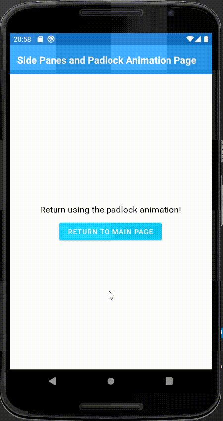
For the return animation, let’s make something more interesting.

Although some shapes are simple to make with paths, others won’t or would require much time to make, so we will use SVG path data for that.
If you are lucky enough, maybe you have a UI designer on your team, you could go and ask them to make great designs that you can use.
If not, you can use some tool like Figma to create and export SVG code:

Create your shape on Figma, then right-click on it, look for the Copy/Paste section and select Copy as SVG.

Figma contextual menu

Paste it on your editor and take the content inside the d tag

svg code from Figma shape

Now let’s add all the shapes to our screen:

<Grid
x:Name="padlockPanels"
Grid.Row="0"
Grid.RowSpan="2"
IsVisible="False">
<Path
x:Name="topPanel"
Data="M 0,0 L 412,0 412,330 0,330Z"
Stroke="Black"
Fill="Gray"
TranslationY="-500" />
<Path
x:Name="bottomPanel"
Data="M 0,330 L 412,330 412,660 0,660Z"
Stroke="Black"
Fill="DarkGray"
TranslationY="500" />
<Path
x:Name="topPadlock"
HorizontalOptions="Center"
VerticalOptions="Center"
Margin="0, -75, 0, 0"
Data="M77.5 0C34.6979 0 0 34.6979 0 77.5H155C155 34.6979 120.302 0 77.5 0Z"
Stroke="Black"
Fill="DarkGray"
TranslationY="-500" />
<Path
x:Name="bottomPadlock"
HorizontalOptions="Center"
VerticalOptions="Center"
Margin="0, 80, 0, 0"
Data="M77.5 78C120.302 78 155 43.3021 155 0.5H0C0 43.3021 34.6979 78 77.5 78Z"
Stroke="Black"
Fill="Gray"
TranslationY="500" />
<StackLayout
x:Name="fullCircle"
Spacing="0"
HorizontalOptions="Center"
VerticalOptions="Center"
IsVisible="False">
<Path
Data="M77.5 0C34.6979 0 0 34.6979 0 77.5H155C155 34.6979 120.302 0 77.5 0Z"
Stroke="Black"
Fill="DarkGray" />
<Path
Data="M77.5 78C120.302 78 155 43.3021 155 0.5H0C0 43.3021 34.6979 78 77.5 78Z"
Stroke="Black"
Fill="Gray" />
</StackLayout>
</Grid>

Remember that we need to add the same on the Main Page, but also need to say that we only want to fire that animation when return from a specific page, so we simply add a flag:

public partial class MainPage : ContentPage
{
private bool _withAnimation;
public MainPage(bool withAnimation = false)
{
InitializeComponent();
_withAnimation = withAnimation;
}
protected override void OnAppearing()
{
base.OnAppearing();
if (_withAnimation)
{
padlockPanels.IsVisible = true;
new Animation
{
{ 0, 0.25, new Animation(v => fullCircle.RotateTo(0)) },
{ 0.35, 0.37, new Animation(v => fullCircle.IsVisible = false) },
{ 0.35, 0.36, new Animation(v => topPadlock.IsVisible = true) },
{ 0.35, 0.36, new Animation(v => bottomPadlock.IsVisible = true) },
{ 0.5, 1, new Animation(v => topPanel.TranslateTo(0, -500)) },
{ 0.5, 1, new Animation(v => topPadlock.TranslateTo(0, -500)) },
{ 0.5, 1, new Animation(v => bottomPanel.TranslateTo(0, 500)) },
{ 0.5, 1, new Animation(v => bottomPadlock.TranslateTo(0, 500)) },
{ 0.99, 1, new Animation(v => padlockPanels.IsVisible = false) }
}.Commit(this, "padlockPanelsTransitionAnimation", 60, 1500, Easing.Linear);
}
}
}

Now we can add the rest of the code PadlockTransitionAnimationShapes code behind for the return animation.

private async Task ExecutePadlockPanelsAnimationAndNavigateBack()
{
new Animation
{
{ 0, 0.1, new Animation(v => padlockPanels.IsVisible = true) },
{ 0.1, 0.5, new Animation(v => topPanel.TranslateTo(0, 0)) },
{ 0.1, 0.5, new Animation(v => topPadlock.TranslateTo(0, 0)) },
{ 0.1, 0.5, new Animation(v => bottomPanel.TranslateTo(0, 0)) },
{ 0.1, 0.5, new Animation(v => bottomPadlock.TranslateTo(0, 0)) },
{ 0.8, 0.85, new Animation(v => topPadlock.IsVisible = false) },
{ 0.8, 0.85, new Animation(v => bottomPadlock.IsVisible = false) },
{ 0.80, 0.81, new Animation(v => fullCircle.IsVisible = true) },
{ 0.9, 1, new Animation(v => fullCircle.RotateTo(90)) }
}.Commit(this, "padlockPanelsTransitionAnimation", 60, 1500, Easing.Linear);
await Task.Delay(2000);
// Here we pass true bool as parameter to MainPage
// in order to execute the rest of the animation
Application.Current.MainPage.Navigation.InsertPageBefore(new MainPage(true), this);
await Application.Current.MainPage.Navigation.PopAsync(false);
}

The result:

Padlock shape transition animation


For our last example, let’s stress the engine with lots of shapes and animations running on the screen. For that reason, we will make a wild pokemon appear as transition animation!

For this example we add the pokemon as a png image, but you can look at some svg pokemon image to take the path 😉.

These will be our shapes on the MainPage

<Grid
x:Name="pokemonTransitionAnimation"
Grid.Row="0"
Grid.RowSpan="2"
BackgroundColor="#460302"
IsVisible="False"
TranslationX="-500">
<Line
x:Name="line1"
X1="0"
Y1="10"
X2="188"
Y2="10"
Stroke="#B24D4D" />
<Line
x:Name="line2"
X1="0"
Y1="30"
X2="233"
Y2="30"
Stroke="#B55151" />
<Line
x:Name="line3"
X1="0"
Y1="55"
X2="247"
Y2="55"
Stroke="#FE8181" />
<Line
x:Name="line4"
X1="0"
Y1="56"
X2="247"
Y2="56"
Stroke="#FE8181" />
<Line
x:Name="line5"
X1="0"
Y1="57"
X2="247"
Y2="57"
Stroke="#FE8181" />
<Line
x:Name="line6"
X1="0"
Y1="68"
X2="188"
Y2="68"
Stroke="#B24D4D" />
<Line
x:Name="line7"
X1="0"
Y1="119"
X2="233"
Y2="119"
Stroke="#B55151" />
<Line
x:Name="line8"
X1="0"
Y1="142"
X2="263"
Y2="142"
Stroke="#B24D4D" />
<Line
x:Name="line9"
X1="0"
Y1="178"
X2="153"
Y2="178"
Stroke="#B55151" />
<Line
x:Name="line10"
X1="0"
Y1="203"
X2="268"
Y2="203"
Stroke="#B55151" />
<Line
x:Name="line11"
X1="0"
Y1="266"
X2="107"
Y2="266"
Stroke="#FE8181" />
<Line
x:Name="line12"
X1="0"
Y1="267"
X2="107"
Y2="267"
Stroke="#FE8181" />
<Line
x:Name="line13"
X1="0"
Y1="268"
X2="107"
Y2="268"
Stroke="#FE8181" />
<Line
x:Name="line14"
X1="0"
Y1="312"
X2="153"
Y2="312"
Stroke="#B55151" />
<Line
x:Name="line15"
X1="0"
Y1="339"
X2="233"
Y2="339"
Stroke="#B24D4D" />
<Line
x:Name="line16"
X1="0"
Y1="359"
X2="183"
Y2="359"
Stroke="#B24D4D" />
<Line
x:Name="line17"
X1="0"
Y1="382"
X2="313"
Y2="382"
Stroke="#B55151" />
<Line
x:Name="line18"
X1="0"
Y1="432"
X2="219"
Y2="432"
Stroke="#FE8181" />
<Line
x:Name="line19"
X1="0"
Y1="433"
X2="219"
Y2="433"
Stroke="#FE8181" />
<Line
x:Name="line20"
X1="0"
Y1="434"
X2="219"
Y2="434"
Stroke="#FE8181" />
<Line
x:Name="line21"
X1="0"
Y1="464"
X2="183"
Y2="464"
Stroke="#B24D4D" />
<Line
x:Name="line22"
X1="0"
Y1="492"
X2="243"
Y2="492"
Stroke="#B55151" />
<Line
x:Name="line23"
X1="0"
Y1="534"
X2="153"
Y2="534"
Stroke="#B24D4D" />
<Line
x:Name="line24"
X1="0"
Y1="557"
X2="253"
Y2="557"
Stroke="#B24D4D" />
<Line
x:Name="line25"
X1="0"
Y1="600"
X2="219"
Y2="600"
Stroke="#FE8181" />
<Line
x:Name="line26"
X1="0"
Y1="601"
X2="219"
Y2="601"
Stroke="#FE8181" />
<Line
x:Name="line27"
X1="0"
Y1="602"
X2="219"
Y2="602"
Stroke="#FE8181" />
<Line
x:Name="line28"
X1="0"
Y1="620"
X2="153"
Y2="620"
Stroke="#B55151" />
<Line
x:Name="line29"
X1="0"
Y1="643"
X2="253"
Y2="643"
Stroke="#B24D4D" />
<Image
x:Name="charizard"
Margin="30, 0"
Source="pokemon.png"
Aspect="AspectFit"
IsVisible="False"
TranslationX="-500" />
</Grid>

And the code behind’s animation:

private async Task ExecutePokemonAnimationAndNavigationToPage4()
{
// Animation appearing
new Animation
{
{ 0, 0.1, new Animation(v => pokemonTransitionAnimation.IsVisible = true) },
{ 0.1, 1, new Animation(v => pokemonTransitionAnimation.TranslateTo(0, 0)) }
}.Commit(this, "openingAnimation", 60, 150, Easing.Linear);
// Lines animations
new Animation
{
{ 0, 1, new Animation(v => line1.TranslationX = v, 0, 500) }
}.Commit(this, "line1", rate: 60, length: 300, easing: Easing.Linear, finished: (v, c) => line1.TranslationX = 0, repeat: () => true);
new Animation
{
{ 0, 1, new Animation(v => line2.TranslationX = v, 0, 500) }
}.Commit(this, "line2", rate: 60, length: 700, easing: Easing.Linear, finished: (v, c) => line2.TranslationX = 0, repeat: () => true);
new Animation
{
{ 0, 1, new Animation(v => line3.TranslationX = v, 0, 500) },
{ 0, 1, new Animation(v => line4.TranslationX = v, 0, 500) },
{ 0, 1, new Animation(v => line5.TranslationX = v, 0, 500) },
}.Commit(this, "bigLine1", rate: 60, length: 900, easing: Easing.Linear, finished: (v, c) =>
{
line3.TranslationX = 0;
line4.TranslationX = 0;
line5.TranslationX = 0;
},
repeat: () => true);
new Animation
{
{ 0, 1, new Animation(v => line6.TranslationX = v, 0, 500) }
}.Commit(this, "line6", rate: 60, length: 200, easing: Easing.Linear, finished: (v, c) => line6.TranslationX = 0, repeat: () => true);
new Animation
{
{ 0, 1, new Animation(v => line7.TranslationX = v, 0, 500) }
}.Commit(this, "line7", rate: 60, length: 500, easing: Easing.Linear, finished: (v, c) => line7.TranslationX = 0, repeat: () => true);
new Animation
{
{ 0, 1, new Animation(v => line8.TranslationX = v, 0, 500) }
}.Commit(this, "line8", rate: 60, length: 650, easing: Easing.Linear, finished: (v, c) => line8.TranslationX = 0, repeat: () => true);
new Animation
{
{ 0, 1, new Animation(v => line9.TranslationX = v, 0, 500) }
}.Commit(this, "line9", rate: 60, length: 824, easing: Easing.Linear, finished: (v, c) => line9.TranslationX = 0, repeat: () => true);
new Animation
{
{ 0, 1, new Animation(v => line10.TranslationX = v, 0, 500) }
}.Commit(this, "line10", rate: 60, length: 621, easing: Easing.Linear, finished: (v, c) => line10.TranslationX = 0, repeat: () => true);
new Animation
{
{ 0, 1, new Animation(v => line11.TranslationX = v, 0, 500) },
{ 0, 1, new Animation(v => line12.TranslationX = v, 0, 500) },
{ 0, 1, new Animation(v => line13.TranslationX = v, 0, 500) },
}.Commit(this, "bigLine2", rate: 60, length: 210, easing: Easing.Linear, finished: (v, c) =>
{
line11.TranslationX = 0;
line12.TranslationX = 0;
line13.TranslationX = 0;
},
repeat: () => true);
new Animation
{
{ 0, 1, new Animation(v => line14.TranslationX = v, 0, 500) }
}.Commit(this, "line14", rate: 60, length: 521, easing: Easing.Linear, finished: (v, c) => line14.TranslationX = 0, repeat: () => true);
new Animation
{
{ 0, 1, new Animation(v => line15.TranslationX = v, 0, 500) }
}.Commit(this, "line15", rate: 60, length: 436, easing: Easing.Linear, finished: (v, c) => line15.TranslationX = 0, repeat: () => true);
new Animation
{
{ 0, 1, new Animation(v => line16.TranslationX = v, 0, 500) }
}.Commit(this, "line16", rate: 60, length: 324, easing: Easing.Linear, finished: (v, c) => line16.TranslationX = 0, repeat: () => true);
new Animation
{
{ 0, 1, new Animation(v => line17.TranslationX = v, 0, 500) }
}.Commit(this, "line17", rate: 60, length: 221, easing: Easing.Linear, finished: (v, c) => line17.TranslationX = 0, repeat: () => true);
new Animation
{
{ 0, 1, new Animation(v => line18.TranslationX = v, 0, 500) },
{ 0, 1, new Animation(v => line19.TranslationX = v, 0, 500) },
{ 0, 1, new Animation(v => line20.TranslationX = v, 0, 500) },
}.Commit(this, "bigLine3", rate: 60, length: 550, easing: Easing.Linear, finished: (v, c) =>
{
line18.TranslationX = 0;
line19.TranslationX = 0;
line20.TranslationX = 0;
},
repeat: () => true);
new Animation
{
{ 0, 1, new Animation(v => line21.TranslationX = v, 0, 500) }
}.Commit(this, "line21", rate: 60, length: 661, easing: Easing.Linear, finished: (v, c) => line21.TranslationX = 0, repeat: () => true);
new Animation
{
{ 0, 1, new Animation(v => line22.TranslationX = v, 0, 500) }
}.Commit(this, "line22", rate: 60, length: 580, easing: Easing.Linear, finished: (v, c) => line22.TranslationX = 0, repeat: () => true);
new Animation
{
{ 0, 1, new Animation(v => line23.TranslationX = v, 0, 500) }
}.Commit(this, "line23", rate: 60, length: 721, easing: Easing.Linear, finished: (v, c) => line23.TranslationX = 0, repeat: () => true);
new Animation
{
{ 0, 1, new Animation(v => line24.TranslationX = v, 0, 500) }
}.Commit(this, "line24", rate: 60, length: 521, easing: Easing.Linear, finished: (v, c) => line24.TranslationX = 0, repeat: () => true);
new Animation
{
{ 0, 1, new Animation(v => line25.TranslationX = v, 0, 500) },
{ 0, 1, new Animation(v => line26.TranslationX = v, 0, 500) },
{ 0, 1, new Animation(v => line27.TranslationX = v, 0, 500) },
}.Commit(this, "bigLine4", rate: 60, length: 419, easing: Easing.Linear, finished: (v, c) =>
{
line25.TranslationX = 0;
line26.TranslationX = 0;
line27.TranslationX = 0;
},
repeat: () => true);
new Animation
{
{ 0, 1, new Animation(v => line28.TranslationX = v, 0, 500) }
}.Commit(this, "line28", rate: 60, length: 650, easing: Easing.Linear, finished: (v, c) => line28.TranslationX = 0, repeat: () => true);
new Animation
{
{ 0, 1, new Animation(v => line29.TranslationX = v, 0, 500) }
}.Commit(this, "line29", rate: 60, length: 852, easing: Easing.Linear, finished: (v, c) => line29.TranslationX = 0, repeat: () => true);
// Pokemon animation
new Animation
{
{ 0, 0.1, new Animation(v => charizard.IsVisible = true) },
{ 0.3, 0.7, new Animation(v => charizard.TranslateTo(0, 0)) },
{ 0.5, 0.6, new Animation(v => toolbar.FadeTo(0)) },
{ 0.5, 0.6, new Animation(v => content.FadeTo(0)) },
{ 0.7, 0.8, new Animation(v => charizard.TranslateTo(-50, 0)) },
{ 0.8, 1, new Animation(v => charizard.TranslateTo(500, 0)) },
{ 0.81, 1, new Animation(v => pokemonTransitionAnimation.TranslateTo(500, 0)) }
}.Commit(this, "pokemonAnimation", 60, 7500, Easing.Linear);
await Task.Delay(7000);
await Application.Current.MainPage.Navigation.PushAsync(new PokemonAnimationPage(), false);
}

Result:

Pokemon shapes transition animation


That’s all folks!

As I said before, these are just samples of how we can exploit our creativity and push the boundaries of Xamarin.Forms.

If this post helps you to create amazing transition animations or you want to showcase the things you’ve done, please leave a sample repo in the comments and will be added to this post later.

Also, you can see a complete sample repository for this post on GitHub. 👇


Thanks for reading and keep coding! 😁

AWS GenAI LIVE image

Real challenges. Real solutions. Real talk.

From technical discussions to philosophical debates, AWS and AWS Partners examine the impact and evolution of gen AI.

Learn more

Top comments (0)

AWS GenAI LIVE image

Real challenges. Real solutions. Real talk.

From technical discussions to philosophical debates, AWS and AWS Partners examine the impact and evolution of gen AI.

Learn more

👋 Kindness is contagious

Please leave a ❤️ or a friendly comment on this post if you found it helpful!

Okay