
Author: Lewis King
Date: April 16, 2020
Originally posted on the Fauna blog.
In my blog last post in the “Data Discovery” series, I discussed how high-level trends can be captured from public data. In this post, I’ll discuss how to use your own company data to take your product to the next level.
Knowing which users are most engaged with your web product is essential. This knowledge helps you understand which users to reach out to for product feedback, and ultimately how to direct the product roadmap. Distinct from the amount they pay or how vocal they are on your community Slack, usage points to true engagement. Furthermore, examining usage can bring unexpected insights into the planning process for your application as you consider growth and breadth of features for the beginning of this new decade.
Pivot tables are quite possibly the easiest and most effective way to analyze complex data sets. Essentially, they take a table of time series data and “tabularize” the data so that it can be represented in a chart more easily. If this is a bit confusing, bear with me, and keep reading. 😀
We’ll be using this dataset in Google Sheets for the tutorial. Please make a copy of it to follow along.
Preparing Your Data
Note that this tutorial assumes that basic usage data is being tracked on your app in some flavor of relational datastore. If you don’t have that yet, that’s no problem--you can pull an example dataset from Google Sheets here.
As an aside, at Fauna, we pull data from FaunaDB into Amazon Athena via Spark for analytics purposes.
SQL
Note: Don’t know or need SQL? No problem, just skip to the “Spreadsheet cleanup” section.
Although some analytics platforms automatically export data into a spreadsheet for you, you might need to start with the output from a SQL statement that queries your app usage data.
Here’s an example query that would return the total number of operations and revenue for each user by date:
select
    u.customer_name customer_name,
    p.date date,
    sum(p.ops) ops,
    sum(p.payment) revenue
from
    users u
join
    payments p
on
    u.id = p.user_id
group by
    1, 2
This query pulls the customer name from a “users” table, and the date and number of operations (e.g. click events), and revenue information from the “payments” table. These may all be joined together using user_id, which is common to both tables (and simply called “id” in the "users" table).
Some other helpful hints about this query:
- “u” and “p” are used as aliases to make referencing the table names easier in the query,
- group by 1, 2 tells the query to group by the first two items in the select statement, namely customer_name and date ,
- u.customer_name customer_name is shorthand for renaming the column from "u.customer_name" to "customer_name"
Spreadsheet cleanup
The resulting dataset looks like this (note that this is made up sample data):
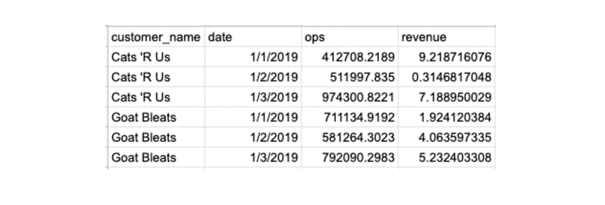
They say that 90% of data science is cleaning data. Well, here’s that part 😅
As you can see, the output is a bit messy. The ops and revenue numbers aren’t rounded. Also, the column titles look like a programmer made them. Shame on us!
This cleanup is possible to do in SQL, but faster to do in Google Sheets. The following best practices will make your data much easier to read and work with:
- Capitalize the column headers and replace underscores with spaces,
- Bold the first row, make the background black, and make the text white.
- Round the Operations numbers to the nearest integer:
- Highlight the Operations numbers (click on cell C2 and click command+shift+down arrow on a Mac), click More formats (the “123” button in the editor ribbon), click Number, click the “.0” button twice.
- Round the Revenue numbers to the nearest cent:
- Highlight the Revenue numbers (click on cell D2 and click command+shift+down arrow on a Mac), click “$” button in the editor ribbon.
- Select the entire table with command+A and create a Filter to make the data sortable :
- In the menu bar, select Data -> “Create a filter”.
- Freeze the first row In the menu bar, select View -> Freeze -> 1 row.
Formatting options menu:

The resulting dataset will be easier to read:

We’re also going to add one “helper column” to the dataset so that we’ll be able to view trends by month more easily. To do this, insert a column to the right of the customer name, call it Month, and paste the formula =month(C2) in cell B2. You can double click the bottom right corner of the cell, then drag down to apply the formula to the rest of the column. Your data should look like this now:

Creating your pivot table#
You might be saying to yourself: “Finally! The part about the pivot table! Thank goodness.” At least, that’s what I said while writing this since I blathered on for 3 pages about data prep 😜
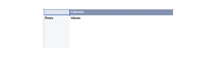
Now that the data is clean, select all of it with control+A, and in the menu bar select Data -> “Pivot table”. Click the Create button when the prompt pops up. You are going to want to use the default setting to open the pivot table (PT) in a new sheet so that your raw data does not get muddied.
Once you click Create, you’ll have a sparkly new pivot table tab:
Hmm, perhaps a bit too sparkly. This bad boy needs some data. Let’s start by looking at total customer revenue. To do this, add Customer Name as a row and Revenue as a value. Here’s the resulting pivot table:
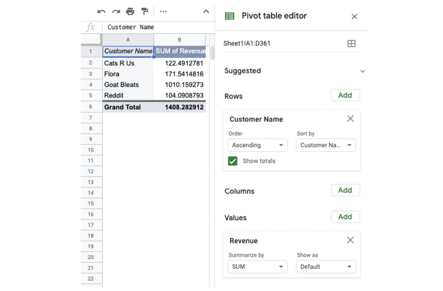
Nice! So glad Goat Bleats Inc. is getting so much value out of our product:

A happy customer.
That said, we are really interested in seeing how revenue and operations trend over time. To get this data, add Customer Name as a column instead of a row, and add Date as a column. Select all of this data and in the menu click Insert -> Chart. The resulting chart:
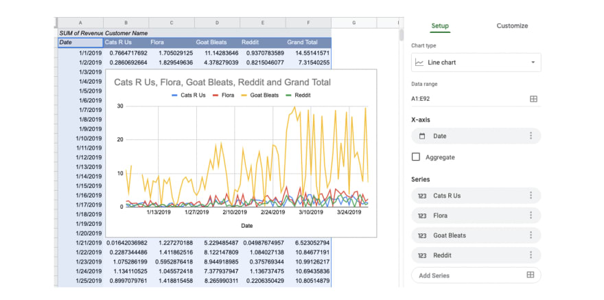
Wow, it’s clear that Goat Bleats is slaying the competition and that their revenue is increasing over time. That said, this is a noisy as heck chart. Wouldn’t it be great if we could simply see this data rolled up by month?
Thankfully, there’s a helper column for that!
Switch out Date for Month in the Rows section. Then, copy cells A2:E5 (the summarized data without Grand Totals) into a new tab. We do that so that we can have a static version of the dataset for charting.
Charting the magic
Charting is a critical part of the data analysis process. This transforms data that we nerds use and makes it look pretty for the executives that need to use this data to make business decisions. Clean up this pasted data using the cleanup techniques described above, select the data, and in the menu click Insert -> Chart. In the Chart editor that pops up, change the Chart type to a Stacked area chart, and name the chart “Revenue per customer by month”:
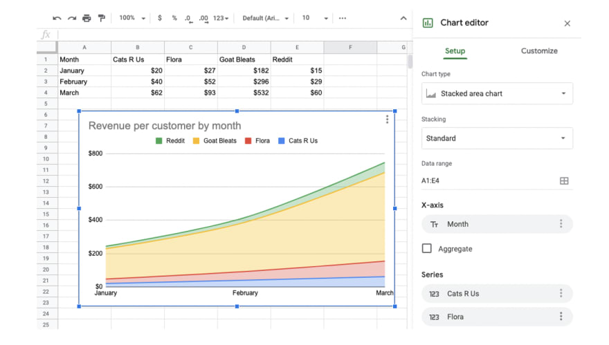
And voila! We have a beautiful chart showing our growth over time:

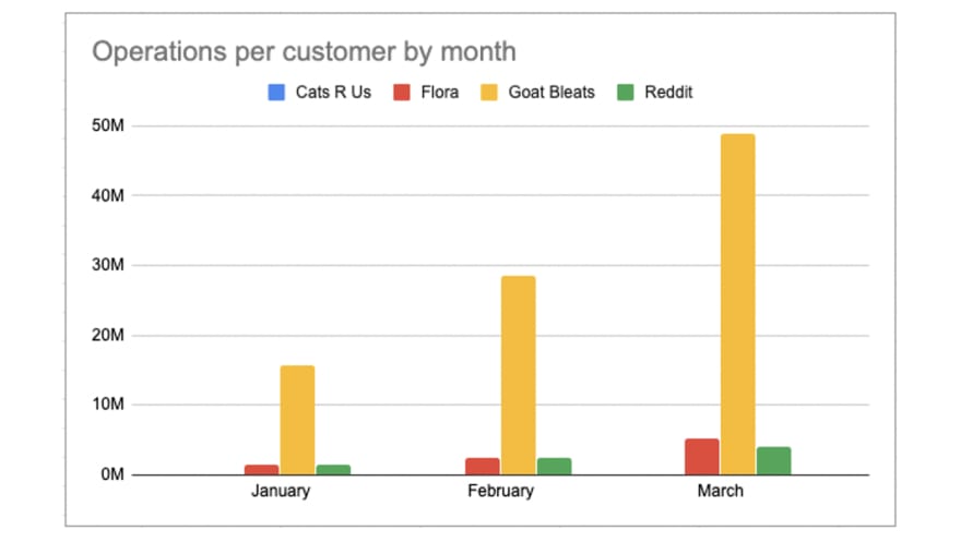
Using the exact same process for Operations, we get the following chart (using a Column chart type):
Conclusion
Pivot tables are my favorite way to learn about how users actually use a web product. They are also powerful and can help you look like a wizard at work.

Your boss after seeing the pivot table.
What’s your favorite way to examine user data, and what metrics do you like most? Please let me know on Twitter or in our Community Slack.

Top comments (0)