Problem description
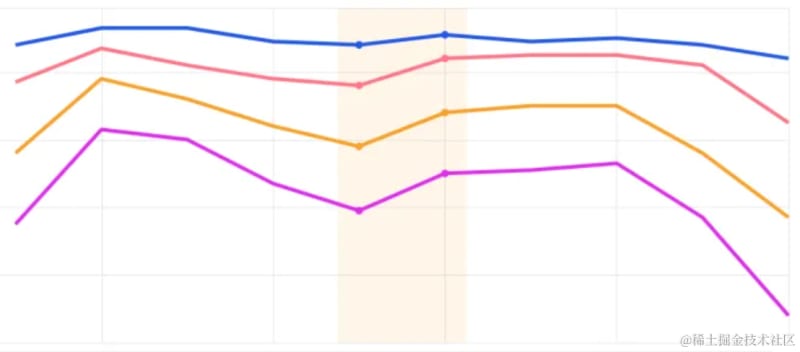
Similar to the effect shown in the figure below, I hope to draw a color block within the specified x-axis range in the chart. How should I configure it in VChart?
Solution
You can achieve this through the markAreacomponent, using the markArea.coordinatesproperty to declare the range of data to be annotated.
-
Coordinates: Support configuring data values, VChart will automatically map the data to canvas coordinates for range drawing.
  markArea: [
    {
      coordinates: [
        {
          Date: 'Jan-20',
          Price: 0.18
        },
        {
          Date: 'Mar-23',
          Price: 0.18
        },
        {
          Date: 'Mar-23',
          Price: 0.12
        },
        {
          Date: 'Jan-20',
          Price: 0.12
        }
      ],
      label: {
        text: 'Electricite prices have surged since 2020',
        position: 'insideTop'
      }
    }
  ],
Code example
https://visactor.io/vchart/demo/marker/mark-area-basic
Results show

Related Documents
- github:https://github.com/VisActor/VChart
- MarkArea demo: https://visactor.io/vchart/demo/marker/mark-area-basic
- MarkArea tutorial: https://visactor.io/vchart/guide/tutorial_docs/Chart_Concepts/marker

Top comments (0)