So I’ve been meaning to write this for almost a year and just never got around to it. Since I’m trying to solidify what I have learned, I plan to write more about my journey and experiences.
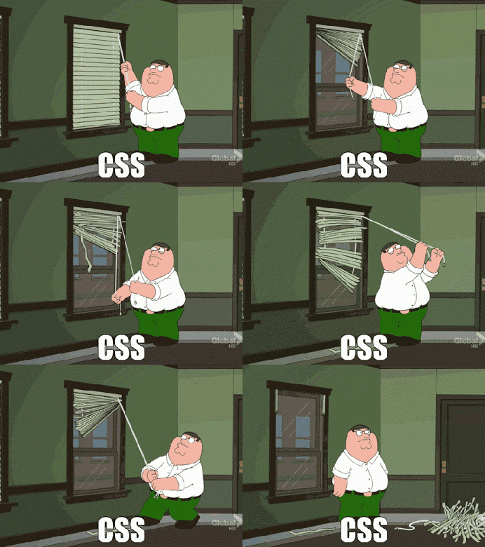
When I first started learning HTML and CSS, I would sometimes have trouble positioning an element where I wanted it to be. I mean, no matter what I did it just wouldn’t set in the right spot or would not move at all. That frustration always reminds me of that CSS gif you see with Peter Griffin pulling the two strings for blinds and have to do it 50 times before it would rise evenly. The CSS struggle is real.
After what seemed like hours trying to figure out why the HTML element wouldn’t move. I would finally figure out which element’s properties, such as margin, padding, width, height, and etc., were preventing the element from moving. In some cases, it would be an element that is at the bottom of the page affecting an element at the top of the page or vice versa. The latter was the most frustrating situation because it would be something you wouldn’t expect to cause an issue.
I met up with a friend every couple of weeks at Starbucks to discuss what project we were working on, eCourse we were doing for front-end development or job interviews we had. Then one day on a sunny afternoon, the heavens parted during a coffee break at Starbucks with Jake. He had found a nice little trick on Quora, I think, for CSS that made finding issues so much easier.
I don’t remember who wrote the article or even if that person is the one who came up with the trick. The trick uses the background property to apply different colors to each HTML element’s margin and padding. Having a visual representation of each element's properties helped me get a better understanding of what was happening with my CSS. The syntax below is what I usually paste at the bottom of my CSS from the get-go and comment out the syntax until I need it.
*{ background-color: rgba(255,0,0,0.3);}
* * { background-color: rgba(0,255,0,0.3);}
* * * { background-color: rgba(35,0,55,0.3);}
* * * * { background-color: rgba(255,0,0,0.3);}
* * * * * { background-color: rgba(0,33,255,0.3);}
When I posted this on Medium in Sept. 2018 I think Firefox had just released a CSS grid feature similar to it, but as of now(April 2022) most browsers have some version of this built into the dev tools. I still find it handy from time to time when I preview something real quick in VS Code.
If you're not a fan of the colors I use, you can change them by changing the RGB values in the CSS.
My coding education started sometime ago and I had to step away for a bit because of personal reasons. I’m just now continuing my journey in 2022 and decided to edit and post this tip here to help others who are just now starting their coding journey as well. I hope this helps you on your Front-End Dev journey, don’t forget to like and share.


Top comments (0)