

Most GitHub profile READMEs I see fall into two groups: an empty "Hi there 👋" left over from the default template, or a wall of badges, GIFs, and five stats widgets stacked on top of each other. Neither tells a visitor much.
I've rewritten mine a few times. Below are five templates I'd actually use, depending on what kind of developer you are, plus a few rules that keep them from rotting.
First: the 30-second setup
If you haven't made one yet:
- Create a new public repository with exactly the same name as your GitHub username (e.g.
octocat/octocat). - Add a
README.mdto it. - Whatever is in that file shows up at the top of your profile.
That's it. Everything below is just Markdown (plus a bit of HTML that GitHub allows).
Template 1: The minimal one
Good if you don't want to maintain anything. Three lines of who you are, three links, done.
# Hi, I'm Sam

Backend developer. I mostly work on Go services and Postgres.
Currently: building internal tooling at a logistics startup.

- Blog: https://example.dev
- X: https://x.com/yourhandle
- Email: you@example.dev
Honestly, this beats most "fancy" profiles. A recruiter or another dev can read it in five seconds.
Template 2: The open source maintainer
If people land on your profile because of a project, send them back to it. Pin the repos too, but a short list with one-line descriptions does more than pins alone.
# Sam Doe

I maintain a few small libraries for working with CSV and time series data.

## Projects

| Project | What it does |
|---|---|
| [fastcsv](https://github.com/you/fastcsv) | Streaming CSV parser, zero deps |
| [tsbucket](https://github.com/you/tsbucket) | Downsample time series in the browser |

## Contributing

Issues and PRs welcome. Start with anything labelled `good first issue`.
Tables render fine on GitHub and stay readable on mobile as long as you keep them to two or three columns.
Template 3: The job seeker
Here the goal is to answer "what can this person do, and can I see proof?" quickly.
# Sam Doe — Full-stack developer

React, TypeScript, Node.js, PostgreSQL. 4 years shipping SaaS products.

**Open to:** remote full-stack roles

## Things I've built
- **Invoicer** — multi-tenant billing app (Next.js, Stripe). [Live](https://example.dev) · [Code](https://github.com/you/invoicer)
- **Queue-lite** — Postgres-backed job queue. [Code](https://github.com/you/queue-lite)

## Contact
you@example.dev · [LinkedIn](https://linkedin.com/in/you)
Put "open to" near the top. People skim.
Template 4: The writer
If you blog, your profile can act as an index. You can update the list by hand, or automate it with a GitHub Action that pulls your RSS feed (there are several on the Marketplace; search "blog post workflow").
# Sam Doe

Fullstack developer. Writing about system design.

## Recent posts
<!-- BLOG-POST-LIST:START -->
- [Designing idempotent webhooks](https://example.dev/idempotent-webhooks)
- [Why I stopped using ORMs for reporting queries](https://example.dev/orm-reporting)
<!-- BLOG-POST-LIST:END -->
The HTML comments are markers that RSS actions typically use to know where to write. They're invisible on the rendered page.
Template 5: The stats-and-visuals one
This is the template most people actually want: a short intro plus some visual summary of your GitHub activity: stats, top languages, streak, contribution graph.
The usual way to do this is to stack several embeds from different services:



It works, but each one has its own theme parameters, and they never quite line up visually. When one of the services is down or rate limited, you get a broken image in the middle of your profile.
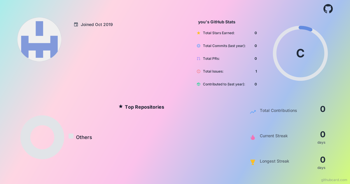
The alternative I've been using is to put all of that into one image. Full disclosure: I work on GitHubCard, which does exactly this. You drag widgets (profile stats, streak, contribution heatmap, top languages, top repos, star history, and so on) onto a canvas, theme them once, and embed a single SVG:
# Hi, I'm Sam 👋
Full-stack developer building useful products.
## Featured projects
- ...
Replace you with your username. With no custom design it renders a default card; if you design and save one in the editor (that part needs a GitHub sign-in), you copy the link it gives you instead. Data refreshes from GitHub but is cached, so changes can take up to an hour to show. For a repo, the same idea works with githubcard.com/owner/repo.
Whatever tool you use, the point is the same: one visual, not six.
Rules I use to keep a profile README useful
1. Keep the top 10 lines for the important stuff. On a laptop screen, that's roughly what people see before scrolling. Name, what you do, what you're working on, how to reach you.
2. Don't list every technology you've touched. A row of 30 logo badges says "I've opened a lot of tutorials". Five you'd be comfortable being interviewed on is more convincing.
3. Avoid anything that goes stale. "Currently learning Rust" from 2022 is worse than nothing. If you include a "currently" line, either update it or automate it.
4. Check it on mobile. Open your profile on your phone. Wide tables, side-by-side images with align="left", and huge GIFs often fall apart there.
5. Watch the number of external images. Every embed is another request to another service. Fewer embeds means a faster profile and fewer broken-image icons.
6. Use alt text.  instead of . It helps screen readers, and it's what shows when an image fails to load.
A combined starter you can copy
If you just want something to paste and edit:
# Hi, I'm <Name> 👋
<One line: what you do.> <One line: what you're working on now.>

## Featured projects
- **[project-one](https://github.com/<username>/project-one)** — what it does, in one line
- **[project-two](https://github.com/<username>/project-two)** — what it does, in one line
## Writing
- [Your best post](https://example.dev/post)
## Contact
<email> · [X](https://x.com/<handle>)
Swap the image line for whatever stats setup you prefer, or delete it. The rest is the part that actually tells people who you are.
If you have a profile README you're proud of, drop the link in the comments. I'm always looking for layouts to steal.


Top comments (0)