
Product Managers and other relevant stakeholders typically monitor and measure the progress of their projects using some form of project management software. This could include the different stages of the project lifecycle, track team performance, and assess the quality of the product.
SpreadJS is a JavaScript spreadsheet component that is ideal for embedding this type of functionality in your project management applications. It allows you to offer maximum flexibility of project task analysis and agile process charts with the ease of use and familiarity of Excel.
This blog will introduce you to how you can embed this functionality directly into your own applications.
Bug Tracking Chart
Bug Tracking Charts are used to monitor the number of bugs recorded and fixed during your iterations, showing in this way trends in bug confirmations, bug fixes, and bugs recorded in the backlog.
Below is shown an example of how you can create a chart of this kind on SpreadJS. Everything starts with the data source. Here is a table containing information for bugs reported and fixed during each sprint, the sprint duration, and the start and end dates.
![]()
To create a Bug Tracking Chart follow the instructions:
- Make some adjustments to the source table. take only the End Date of the sprints and calculate the accumulated number of bugs during each sprint.

- Select on the adjusted table the Series of the chart, Bug Reported, Bugs Fixed, and Bugs in Backlog.
- Add a chart by clicking the Add Chart in the Insert tab.
- Select Combo Chart Type.

If you above issue when selecting your data and see that the series is not created as it should, SpreadJS offers a way of fixing it.
- Right Click on the inserted chart and go to Select Data.

- Add the needed series by clicking the Add button and select the name and range of the series. You can also Edit and Remove the series.
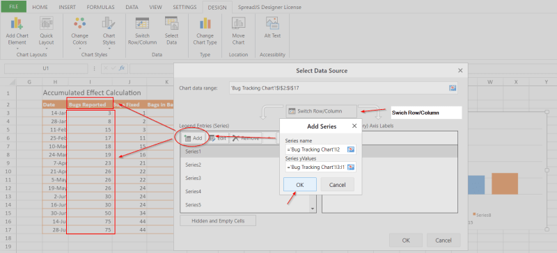
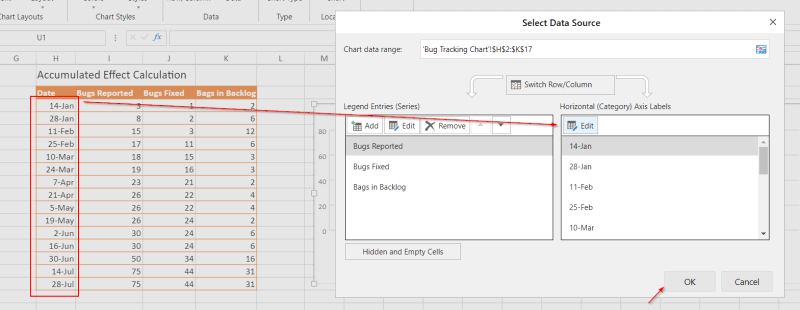
- To modify the Axis Labels, click Edit on the right panel and select the needed range of labels.
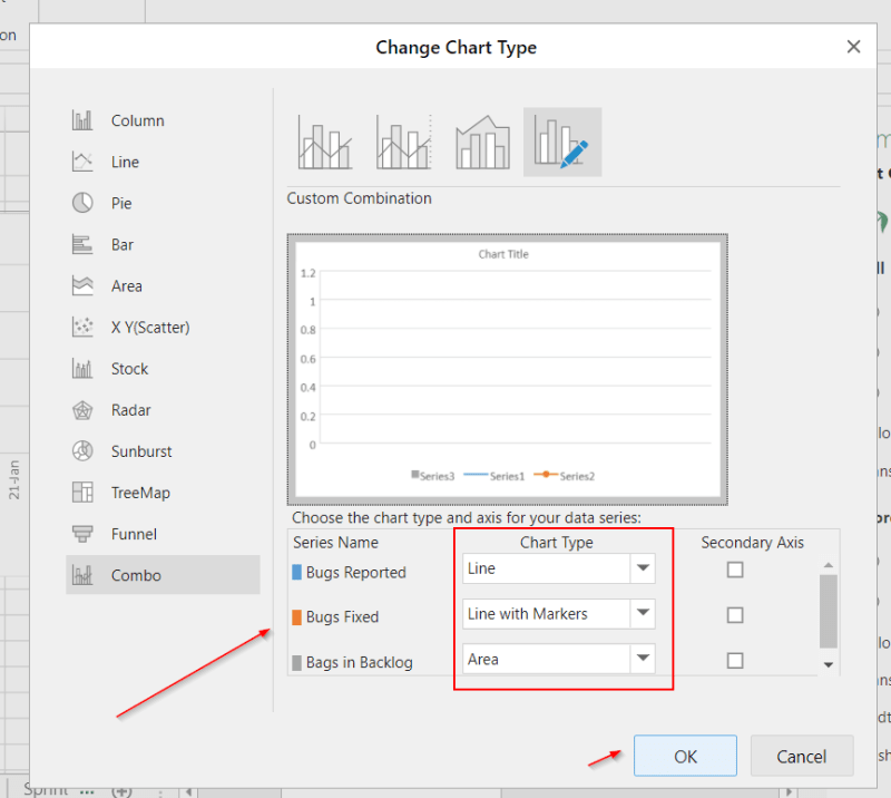
- If your chart looks like below, change the chart type by right-clicking and selecting the function Change Chart Type.

- Select Combo and then assign the type that you want to the chart series.
In our example is better to have Line With Markers for Bugs Fixed and Reported, and Area for bugs in Backlog.
- After having clicked OK, the only thing left to do is to format your chart by assigning different colors to the series so the data presentation is more absorbable.
Use the Format Chart Area method to do that.

In the Format Chart panel, you can change:
- the color of the line, bar, column, area, etc.
- the dash type for the line.
- the markers for Lines with Markers.
By making some adjustments you can manage to enhance the appearance of your chart and present your data in a more professional way.
The end result:

Analysis of the Bug Tracking Chart
- The vertical axis represents the number of bugs.
- The horizontal axis represents the end date of certain Sprints.
- The BLUE line shows the number of bugs ADDED to the backlog. As bugs get reported this line goes up every time.
- The ORANGE line shows the number of bugs fixed. It can never surpass the BLUE line as you cant have more bugs fixed than reported.
- The GREEN area shows the bugs in the backlog.
When you have a big difference between the blue and the orange line, it is a sign that there might be some issues as the bugs reported keep mounting when you can't keep up with fixing the old ones. When that difference rises the green area rises as well.
Cumulative Flow Chart
The cumulative flow diagram highlights workflow bottlenecks, by charting the progress of stories through each stage of the sprint. The colored bands each represent one stage in the development workflow.
The table below shows the number of Tasks in different statuses.

To add a Cumulative Flow Chart (CFC) do as follow:
- Select the series
- Click Add Chart
- Select Area as Chart Type, and Stacked Area
- Click OK

- After having followed the previous steps, we can change the colors of the series so the chart looks better.

Analysis of the CFC
- The vertical axis represents the number of tasks.
- The horizontal axis represents the days.
The graph can visualize bottlenecks in the process – a disproportionately large number of tasks in a certain status indicates a problem, so when we have a widening of any of these colored bands over time will indicate a bottleneck in the phase that follows it.
In the provided example, So, when you have a big difference between the blue and the orange line, it is a sign that there might be delays as the bugs reported keep mounting when you can't keep up with fixing the old ones.
Burn Down Chart
This chart is a graphical representation of the total effort against the amount of work for each iteration. It is mostly used to measure how quickly the team is working to resolve tasks or story points. Below there are the instructions for creating a Burn Down Chart.
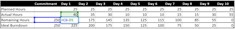
- Prepare your Data Set
- Select the series.
- Add a new chart in Insert Tab.
- Select Combo Chart, and as Chart Type select Clustered Column for Planned Hours and Actual Hours series, and Line for Remaining Hours series.
- Click OK

- Change the horizontal axis labels.
You can do that by right-clicking on the chart, selecting Select Data, and Edit the series by selecting the first row of the dataset table as the range.
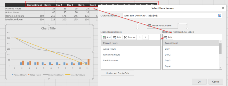
- Customize the chart by right-clicking Format Data Series. Change the bar colors, line colors, markers, and dash types.

Understanding the Burndown Chart
- The vertical axis represents the estimation statistic that you have configured for your board. Could be hours, effort, tasks, or story points.
- The horizontal axis represents time.
- When the Remaining Hours line is below the Ideal Burndown, the team is ahead of schedule. When those two lines meet, the team is on schedule and when the Remaining Hours line is above, the team is behind schedule.
By looking at the chart the management can track the total work remaining in the sprint or the possibility of achieving the sprint goal, and respond to trends accordingly.
Burn-UP Chart
A Burn-UP chart is used to track progress towards the completion of a project. This chart is a visual representation of a sprint's completed work compared with its total scope.
You can create a Burn-UP chart in SpreadJS by following these steps:
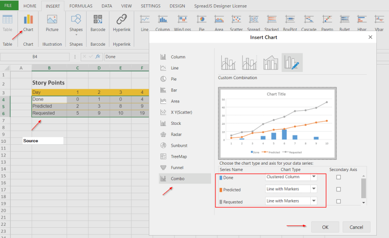
- Prepare your dataset. In this example the Burn-UP Chart

- Select the series.
- Add a new chart in Insert Tab.
- Select Combo Chart, and as Chart Type select Clustered Column for Done series, and Line with Markers for Predicted and Requested series.
- Click OK.
- Format the chart, using Format Chart Area.
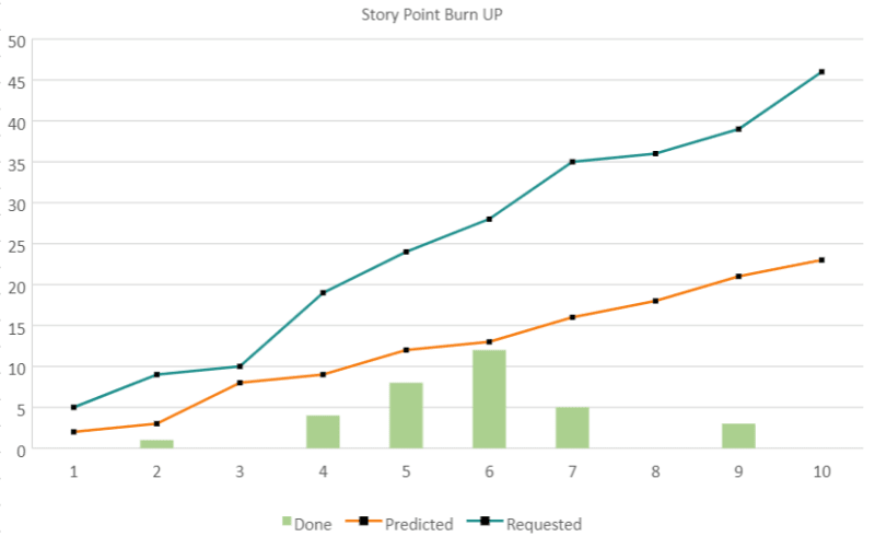
Understanding the Burn-UP Chart
- The vertical axis represents the amount of work and can be measured in different ways such as story points, issue count, or estimates.
- The horizontal axis represents time in days.
- The distance between the lines on the chart is the amount of work remaining.
- The project will complete when the two lines meet with each other.
Velocity Chart
The Velocity Chart shows the amount of value (hours, tasks, story-points, etc.) delivered in each sprint, enabling you to predict the amount of work you can feasibly commit to deliver in the next sprints.
Below is a list of planned and completed Story Points for the last seven sprints.

To create the chart follow these steps:
- Select the whole table.
- Add a new chart in Insert Tab.
- Select Column - Clustered Column
- Click OK
- Format the chart by changing the series colors and chart title

Analyzing the Velocity Chart
- The y-axis displays the number of estimated stories.
- The gray bar for each sprint shows the total estimate of all issues in the sprint when it begins.
- The green bar in each sprint shows the total completed estimates when the sprint ends.
- The x-axis displays the last 7 sprints completed by the team.
Velocity is calculated by taking the average of the total completed estimates over the last several sprints. So in the chart above, the team's velocity is:
(15+7+4+6+11+8+1) / 7 = 7.5
The management can use this to predict how much work can be completed by the team in a future sprint, in our case 7.5 story points, creating in this way more believable predictions.
The main goal of agile charts is to bring clarity to the development process. These charts deliver quantitative insight into different performance metrics and provide measurable goals for the group. For the success of your business combine the information that is given from these charts with your team's qualitative feedback. Only in this way, you will reach the needed level of adaptability that the agile methodology offers.
If you'd like to learn more about the amazing opportunities SpreadJS offers, get the free trial here.
To follow along, download the example file here.
Note: This is a .ssjson file. Please ensure your browser doesn't change the file extension on download. After downloading, import the file into the SpreadJS designer and discover all the amazing opportunities that SpreadJS offers.

Top comments (0)