
Hello, users!👋
Today I want to talk about usability & accessibility and why those concepts do matter in Design. It's not all about "it looks good".
I often find designers/developers that don't know a bit of it and don't care about it.

I'm well aware not everyone is familiar with the terms of usability and accessibility, so I'll just briefly explain them. Please feel free to research any other explanation that goes deeper into these concepts.
What are those concepts about?
👉 What is usability? The concept of usability refers to the usage/navigation/flow of your product. It ensures your product's performance can be learned and used easily by the user, and that noone will have trouble by understanding how your website/app works. A non-tech example: making the rules of a game. We'll see practical cases below.
👉 What is accesibility? The idea that everyone can use your product, doesn't mind if we're talking about a website or an application. You've read that? Everyone. Everyone involves also blind, colorblind or deaf people, but not only disabled people, it also refers to the optimization of your product, if it works correctly in a slow internet/computer, if it displays fine in mobile devices... Again, a non-tech example: that game we've created the rules for before, can everyone play it or we're leaving someone out of it? We'll see practical cases below.
Now, let's go to the core of this article: why usability and accessibility matters in design.
If your question is "should a designer know about usability and accessibility"? 🤔
My non-thinking answer is YES. If you'd like a more elaborated response: depends, but in my opinion every designer should know at least how to identify accessible/non-accessible patterns and how good usability should be built.
Now let me share some tips with you:
① Respect visual education
Check the following image:
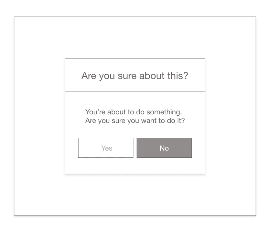
Our eyes are attracted to the heaviest object in the screen. Also, those objects are usually placed in the right side and with brilliant colors so you feel attracted to click them.
In the picture above, if you follow your general instinct, you'd be cancelling the action you wish to do.
It should be like this instead:

Let's see another example.
Do you see something weird in the following image?

It seems there isn't any Logout button?
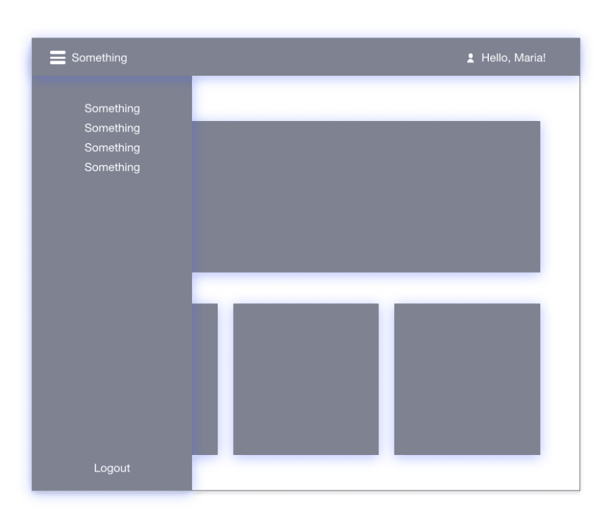
Oh-ho! There you are, inside of a side-menu!
You could think there isn't any problem esthetically, but it's not respecting the general visual education that we, as users, have.
Do you want another example?
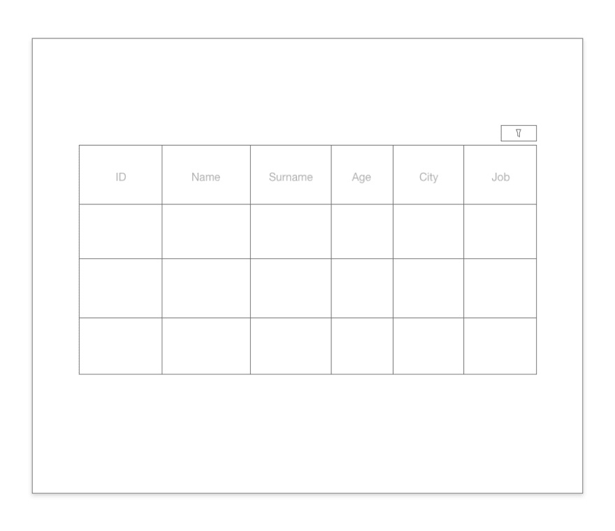
Let's see... Where are the filters...? OH! That's probably the icon in the right corner of the table (why not including a general search-bar as is the most usual component in a table?).
But, there's more...
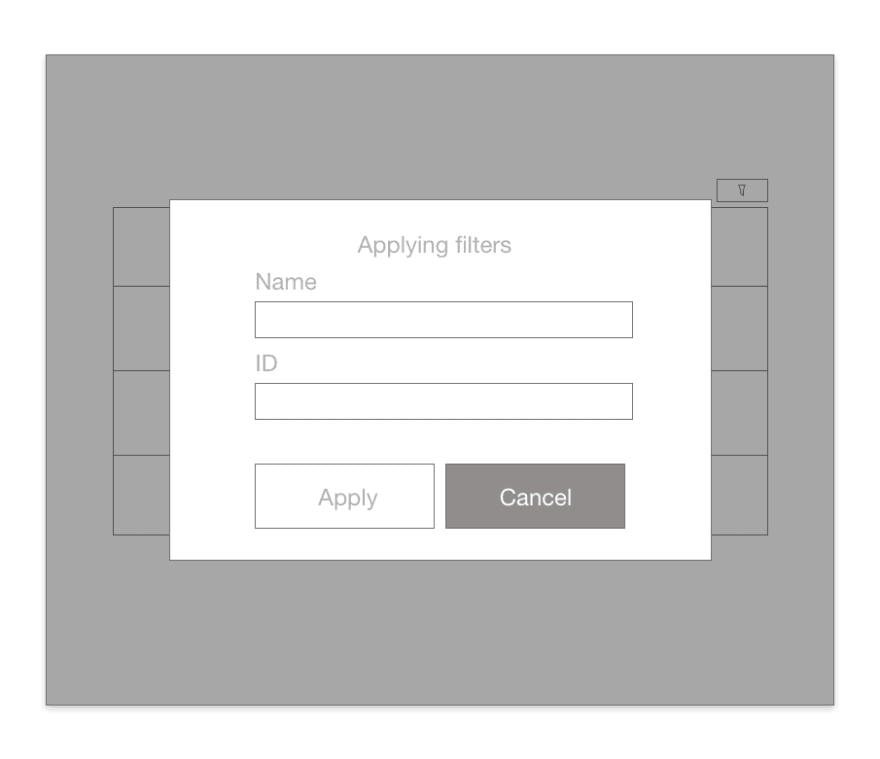
OH, NO! Why aren't filters applying...? Ah, I see, I clicked the wrong button.
All of these examples have a main thing in common: they don't respect users visual education.
What is that visual education you're talking about?
Vibrant colors, important options and add/accept/see/check actions, are normally placed at the right side of the screen. As you saw in the first example, if you don't respect that in your design, you'll probably make someone mad by cancelling what they want to do, or worse, loosing their progress.
We're always searching for the same navigation flow in every website we visit. Top menu usually keeps categories, login, logout, the logo...
As you saw in the second example, if you hide the logout button by placing it in an unknown place for the user such as a side-menu that it's not always visible, you'll be forcing the user to take an extra-step (opening the side-menu) to logout the page.
And there's nothing worse than taking extra-steps in a website.
You want another example? How do you feel when you click the logo of a website and it doesn't lead to the Home page of the website?
② Maintain a clear navigation (if possible)
Lots of mistakes are done when trying to figure out the screens of our product and how they relate to each other.
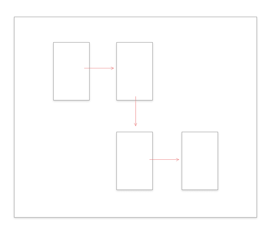
Don't create individual navigations as shown in the picture above. Our goal is that the user never (or almost never) uses the "back" button of the browser for many reasons, such as losing their data.
Have you ever had to 'go back' or clicked it accidentally and lost what you were writing/doing? Create "go back" buttons inside your design so developers can create some kind of function that makes a "safe copy" of what the user was doing.
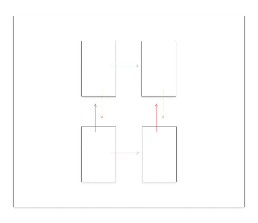
Every screen talks to each other. Navigation should be accessible from every screen of your product.
You won't be able to create communication between your designs? No problem:
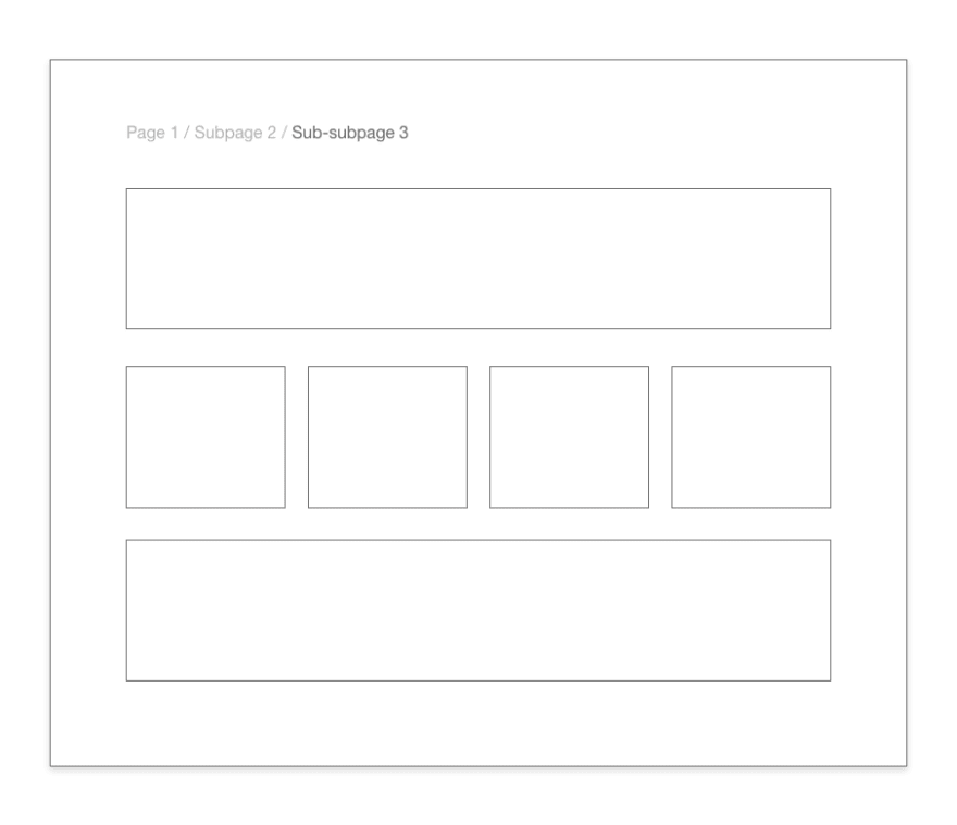
Breadcrumbs are and will always be there for you, but don't forget to tell the user where he/she is!
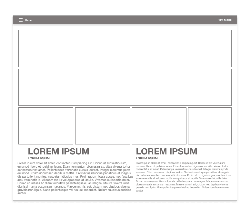
③ Show limited information per page
There's a lot of people thinking that they need to show the maximum of information that fits in the screen. Wrong.
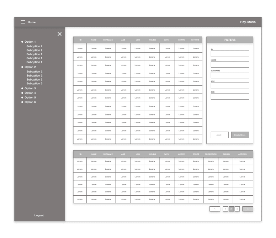

You see this? This is hell. We're humans, not machines. We can't just retain that much information, plus it feels like a visual chaos and not organized at all.
Make sure your users will find exactly what they're searching for in less than 3 seconds or you'll loose them.
④ Respect spacing
If you love your product, give it some space.
This is also related with showing limited information per screen. If you don't give any or not too much space to the elements inside your screens, you won't be able to define visual sections or divisions, the user probably won't be able to understand what he/she is seeing.
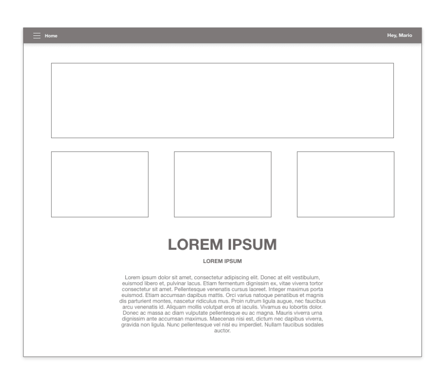
As shown above, choose carefully what you're showing and where do you put it. Learn to prioritize.
Believe it or not, creating a design is like preparing a story for the user. You must define the steps, make the user understand how the path is, where he/she's allowed to go and where it is forbidden, you're telling the story of your product, don't mess around with it.
⑤ Decide a visual language, use it everywhere
Normally we'll have some fixed components before building our product. That could be, a palette, icons, fonts... Have you ever found a project that changed styles from a screen to another? 👇
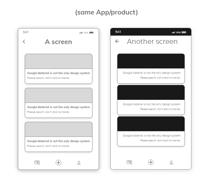
Well that's uncomfortable, for sure.
Once you decide the components that will be part of your product, use them in the same way, always, in every screen. Don't start changing suddenly the typography for the title from one design to another, or the spacing between components, where the text will be aligned... That will look weird and will break the visual language of your product.
In conclusion
So, why does accessibility and usability in Design matter? Because hell it does.
You're creating a product that will be consumed by someone else. That someone else could have disabilities, a slow computer, limited time to understand or find what they're searching... It is an exercise about empathy.
If after reading this you still think design is about shapes and colors please read it again.
You don't need to be an usability/accessibility jedi-ninja-rockstar, but having the basic knowledge won't hurt you.
These were my tips on how you can use usability and accessibility in your designs, I hope it comes handy!
See you around, happy coding💻!


Top comments (4)
Great article! Even the greatest features can be mediocre if usability is not considered on the front-end. I think the point about visual weight is important, I often see buttons with the same visual weight or even inconsistent left/right positions on the primary action that make using the app frustrating and unintuitive.
Indeed Ryan, the visual weight was the first thing I learned, it's the first visual impact we make in the user! Thank you so much for your opinion!
Great article overall, but I have to disagree with the 2nd example, that having a logout button hidden in the menu is wrong.
Logging out is not something users do regularly, so it doesn't need to be visible all the time.
And most users never even log out once they have logged in, they would just simply close the current tab where the page is opened.
So that button would just take valuable space from the navigation, especially on mobile view.
Hello, Kiss Patrik!
First of all thank you for your answer. I thought the same way before, until I faced some projects for some companies where everyone had to logout from every website/software before closing their computers. The reason is still unknown to me.
I'm well aware that's a common practice in some other areas, I put that example on purpose because it's a common error to think that "nobody ever logs out" until you find out that some are forced to do so.
I think it's because not everyone faced a project with this issue that many people think "it's not necessary"!