According to Techcrunch, nearly one in four people abandon applications after using them one time. One of the biggest reasons for users not coming back to your web app can be the lack of a user-friendly interface. It’s the representation part where an interface comes into play, and frontend development becomes paramount.
Every frontend developer wants to create multi-functioning, responsive, and aesthetic designs for their web apps. It seems easy on paper, but the execution requires a lot of effort, time, and repetitive writing of codes.
However, two developers at Twitter decided to create a framework that can offer pre-written pieces of code that offer responsive and multi-functional frontend design, also referred to as the Twitter Bootstrap.
Since its launch in 2011, Bootstrap has been quite popular among frontend developers, and there are many aspects of the framework that make it an attractive tool. So, here is everything that you need to know about Bootstrap!
What is Bootstrap?
Bootstrap is an open-source front-end CSS framework used to create responsive mobile-first websites and web apps. While the front-end framework template is primarily based on CSS, various HTML templates are available and support JavaScript components like jQuery. It has become the second popular UI development framework for its responsive design templates, frameworks, grids, and most importantly, multi-site compatibility.
Market Usage Statistics
Here are some exciting market usage statistics of Bootstrap:
- As of March 2021, approximately 3 million people have downloaded Bootstrap for web development.
- Till April 2021, Bootstrap is used by 22% of all websites amongst the JavaScript libraries.
- In terms of popularity and traffic, Bootstrap holds 2nd position with 14.8% of the market share.
Use Cases of Bootstrap
- You want to create a responsive mobile-first application.
- You want an advantage of ready-made styling components within your framework.
- You want to create consistent and compatible designs supported over multiple platforms and devices within a short period.
- You have a basic knowledge of HTML, CSS, and JS and want to learn a new framework.
- You are looking for a framework with easy customization and integration opportunities.
Popular Apps Built with Bootstrap
Vogue - The fashion magazine uses Bootstrap for its flat responsive website templates, making it compatible with all devices. It also uses Bootstrap’s 12 grid layout to fit in various content-based details within a single screen.
Apple Maps Connect - Apple uses MapKit JS for creating its interactive maps for multiple platforms. The Mapkit JS employs Bootstrap to build its user interface designs.
Lyft - The ride-sharing company utilized Bootstrap’s grid features along with the drop-down plugins for their website. The framework also helped in the website’s development within a short period.
Paypal - The online payment processing website uses Bootstrap’s Pricing Sliders to create the payment forms while checking out, adding cards, or paying bills through the site.
Whatsapp - The user interface of Web Whatsapp has been created using Bootstrap for better interactive features and facilities over the desktop application.
Etsy - The online eCommerce platform UI has been built using the component and utility classes that allowed the developers to use the grid system, listing card, and creative fonts.
Pros of Bootstrap
#1. Responsive design
When designing a responsive website or web application, the first thing that comes to our mind is compatibility with different screen sizes and devices. Bootstrap comes with a pre-built schema for different screens defined by a range of width sizes.
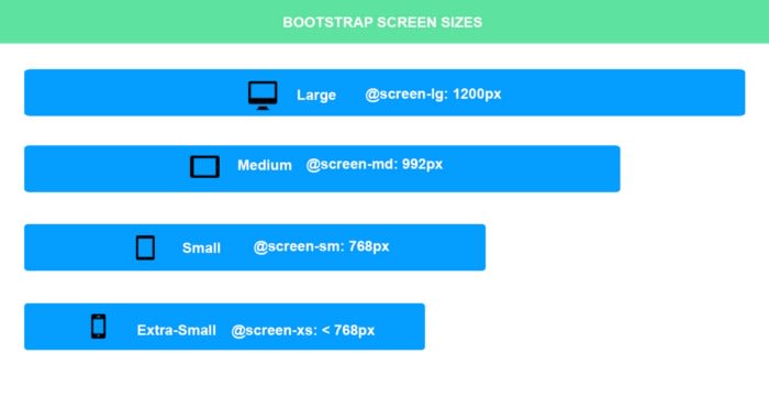
Image: @duncandevs
Another great advantage of the framework is the scalability of content as per screen size. Scaling relates to shrinking and changing the content as per screen size. You can add column sizes in the aspect ratio to help the content scale.
For example, you want two divisions or sections in an HTML document to appear in the 30 to 60% ratio for medium screens and 40 to 50% for small screens. You can add column sizes as per the screen type.
Here is an example of the column size addition in Bootstrap:
take up 30% the space on a medium screen but 60% on a small screen
take up 60% of screen on a medium screen but 50% on a small screen
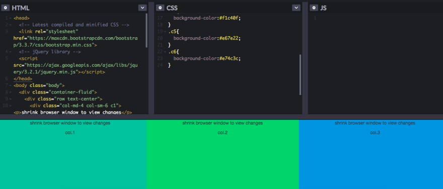
image: source
2. Time-saving
Bootstrap offers rapid development through pre-built templates that you can customize according to specific business needs. Apart from the templates, it provides all the components that you will need to write the web app’s front-end from scratch, including responsive typography, menus, reusable CSS, and Javascript libraries.
The frontend framework enables you to use task runners and preprocessors to save more time. Task runners reduce the time you need to recompile after a modification of the file. At the same time, preprocessors ensure that modifications in content format through hash commands are executed before the code is represented on the browser.
3. Styling Components
The frontend framework enables higher customizations for your web applications through several user templates, themes, and plugins and a grid system that are free and customizable as per project requirements. It is equipped with a responsive 12-column grid system based on the flex display property that allows complete customization of any content type with auto-scaling across screen sizes. With Bootstrap's grid system, you can use these 12 columns individually or group them to create wider columns and hide specific content as per device type.
4. Consistency and Compatibility
Consistency has been the core concept of Bootstrap. It focuses on creating a centralized code that ensures uniformity across platforms. Cross-browser compatibility of the framework is higher than many other frontend frameworks; whether you are using Chrome, Firefox, or even Microsoft Edge, the results are the same. The design layout remains uniform and consistent in terms of responsiveness, irrespective of screen size.
5. Substantial community support
Bootstrap is a free and open-source framework available on Github with significant community support contributing to its development. If you are stuck at any point during your web app development, you can easily ask expert developers on Boostrap's massive community for solutions.
Apart from the community support, the framework offers excellent documentation on the official website for you to start the development. Due to the open-source nature, you can get several UI components, tutorials, themes, plugins, and templates from its community for inspiration.
Signing Off
Using a front-end framework like Bootstrap will help you avoid losing time and effort whenever there is a need for a new app or theme. Packed with numerous state-of-the-art features, it is a worthy contender among other popular frameworks like React.
You can even discover a detailed comparison of Bootstrap vs. React to understand where these two stand in front-end development. However, which framework to choose always depends on the specific requirements of your project. So, if you are looking for a highly responsive, mobile-first front-end framework, Bootstrap is your best option!

Top comments (1)
Bootstrap is great in terms of time saving, i.e. quickly bootstrapping a project, but it's hardly the best for most projects. It's really dulled down UI design.
It helped bridge the gap between design & functionality for non design-focused devs, but it's a bad choice if you want creative control and there are other design frameworks that could work better depending on your project scope.
Depends if you want the framework to do the design for you, or if you just want it to assist you.