
Typography refers to the styling and arrangement of texts in order to improve readability and user experience. Texts are almost everywhere on a webpage. They could be the headings (<h1>-<h6>), the paragraphs (<p>), lists (<li>), and so on.
Text alignment
By default, the texts are left aligned, but you can change that by setting a text-align property. The property accepts four values, left, right, center, and justify.
p {
    text-align: left;
}

p {
    text-align: right;
}

p {
    text-align: center;
}

p {
    text-align: justify;
}

Notice that the last line of the paragraph is not justified. It is processed differently so that the last line does not look strange when it cannot fill the horizontal space. However, you can force it to be justified using the text-align-last property. It takes the same set of values as text-align.
p {
    text-align: justify;
    text-align-last: center;
}

Besides horizontal alignment, you can also specify how you wish the text to be aligned vertically. By default, all the texts are aligned to the baseline, as shown in the diagram below:

Some letters will go below the baseline, such as y and p in this diagram, but they are still considered as being aligned to the baseline.
You can change the default behavior by setting a vertical-align property. For instance, top will align the texts to the highest element in the line.
<p>AAA<span class="large">AAA</span><span class="small">aaa</span></p>
span {
    border: 1px red solid;
}

.large {
    font-size: large;
}

.small {
    font-size: small;
    vertical-align: top;
}
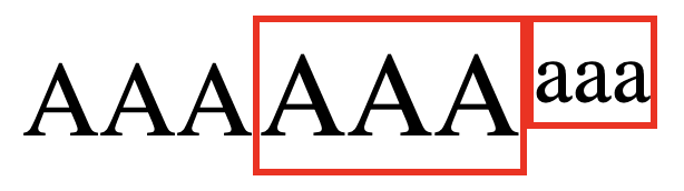
To make the effect more noticeable, I have changed the font size and added borders to each element. We will discuss how to do this later. As you can see, the upper border of .small is aligned with the upper borders of .large.
On the other hand, the text-top option will align the text with the highest letter in the parent element, which is <p> in this case.
.small {
    font-size: small;
    vertical-align: text-top;
}
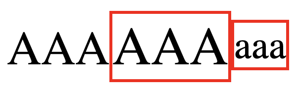
Notice that the .large element is ignored even though it is slightly higher because it is a sibling of .small, not the parent.
The bottom and text-bottom works similarly. bottom aligns the text to the lowest letter in the same line, and text-bottom aligns the text to the lowest letter in the parent element.

Lastly, the middle option aligns the text to the middle of the parent element, and the sub and super option each aligns the text to the subscript and superscript baseline of the parent text. You can test them in your own browser.
Text decoration
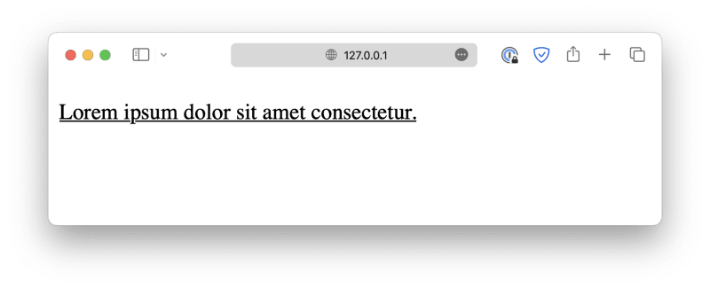
Text decorations are decorative lines you add to the plain text in order to make it stand out. For example, by setting the text-decoration-line property, you can underline the text like this:
<p>Lorem ipsum dolor sit amet consectetur.</p>
p {
    text-decoration-line: underline;
}
Other possible values include overline, which is a line displayed over the text.
p {
    text-decoration-line: overline;
}

Or line-through, which is a line displayed through the text.
p {
    text-decoration-line: line-through;
}

You can further customize the decorative line by setting a color using the text-decoration-color property.
p {
    text-decoration-line: underline;
    text-decoration-color: red;
}

Customize its thickness using the text-decoration-thickness property.
p {
    text-decoration-line: underline;
    text-decoration-color: red;
    text-decoration-thickness: 5px;
}

Or define a style, such as dotted, wavy, and so on, using the text-decoration-style property.
p {
    text-decoration-line: underline;
    text-decoration-color: red;
    text-decoration-style: wavy;
}

This seems like a lot of work for just a decorative line. Luckily, CSS offers a shortcut property, text-decoration, which allows you to define the type, style, thickness, and color simultaneously. It follows the syntax shown below:
text-decoration: <text-decoration-line> <text-decoration-style> <text-decoration-color> <text-decoration-thickness>
p {
  text-decoration: underline wavy red 2px;
}

However, please note that the text-decoration shorthand with multiple values is not yet supported with Safari. You must use the individual properties if your webpage needs to be compatible with the browser.
Text spacing
Similar to text alignment, we must discuss both horizontal and vertical directions when it comes to text spacing. Horizontal spacing refers to word spacing and letter spacing.
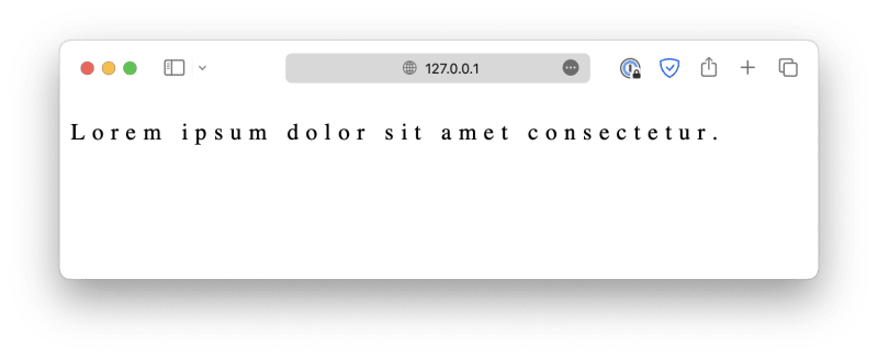
Word spacing can be customized using the property word-spacing.
<p>Lorem ipsum dolor sit amet consectetur.</p>
p {
    word-spacing: 10px;
}

In this example, the length is defined by px, which stands for pixels.
Letter spacing can be defined in a similar manner, using the letter-spacing property.
p {
    letter-spacing: 5px;
}
When it comes to vertical spacing, there is the line height (sometimes referred to as lead), which is the distance between two baselines.
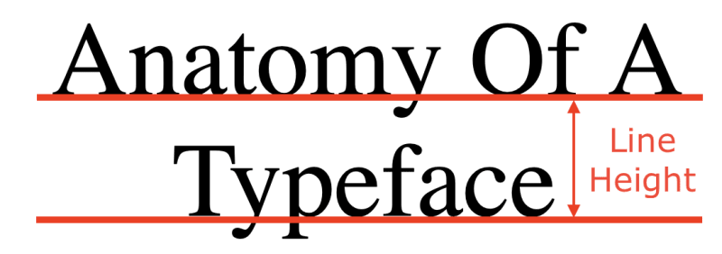
Line height can be specified using the property line-height.
p {
    line-height: 2em;
}

You can also control the indentation of the first line in a text block using the text-indent property.
p {
    text-indent: 50px;
}

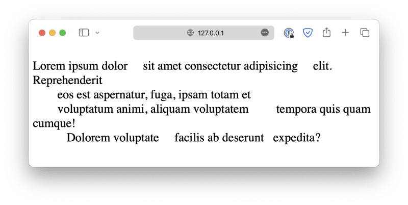
Lastly, as you know, your browser will automatically remove extra white spaces when rendering texts. It is possible to change that behavior by setting the white-space property.
When set to normal, the default condition, the browser will collapse all extra white spaces, and the text will wrap when necessary (automatically change to the next line when there is insufficient space). Line breaks are also considered white spaces.
<p>Lorem ipsum dolor     sit amet consectetur adipisicing     elit. Reprehenderit
    eos est aspernatur, fuga, ipsam totam et
    voluptatum animi, aliquam voluptatem         tempora quis quam    cumque!
       Dolorem voluptate     facilis ab deserunt   expedita?
</p>

When set to nowrap, the browser will not automatically wrap the texts.

When set to pre, all white spaces will be preserved, and texts will not wrap automatically.

When set to pre-wrap, all white spaces will be preserved, and texts will wrap automatically.
When set to pre-line, sequences of white spaces (multiple spaces, tabs) will collapse into one, but line breaks will be preserved, and texts will wrap automatically.

Using a font
Using the right font when creating a webpage can have a huge impact on the user experience. Using different fonts can create visual hierarchy, establish your own unique branding, improve esthetics and design, highlight key information, and more.
In CSS, we generally classify fonts into different categories based on their styles. The most common ones are:
- Serif fonts: These fonts have small decorative lines attached to the ends of the letters, also known as serifs. Some examples include Times New Roman, Georgia, and Garamond.

- Sans-serif fonts: These fonts do not have serifs. Some examples are Arial, Helvetica, and Calibri.

- Monospace fonts: All characters have the same width. Most commonly used in coding environments. Some examples include Courier New, Lucida Console, and so on.

- Handwritten fonts: Fonts that mimics handwritings. Such as Comic Sans MS. Also called cursive fonts.
- Display fonts: These fonts are attention-grabbing and often used for headings, titles, or logos. Examples include Impact, Lobster, and Bebas Neue. They are also called fantasy fonts.

You can use the font-family property to specify the font. For example:
<p>Lorem ipsum dolor . . .</p>

In most cases, your browser will use a serif font as the default. It may differ for your operating system, but that doesn't matter. You can change the default font like this:
p {
    font-family: Arial;
}
Here, we defined the font as Arial, a widely used sans-serif font available on almost all platforms.

You can also download fonts from the internet using tools such as Google Fonts, and then use it in your webpage. For example, after you've found and selected your desired fonts, follow the instructions to embed them into your webpage.
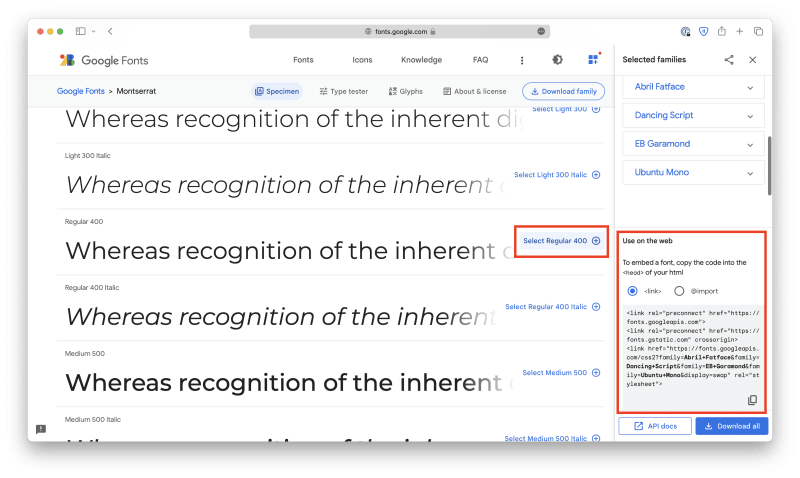
Either copy the <link> elements into the <head> section of your HTML document.
<!DOCTYPE html>
<html lang="en">

<head>
    <meta charset="UTF-8">
    <meta name="viewport" content="width=device-width, initial-scale=1.0">
    <title>Document</title>

    <link rel="stylesheet" href="style.css">

    <link rel="preconnect" href="https://fonts.googleapis.com">
    <link rel="preconnect" href="https://fonts.gstatic.com" crossorigin>
    <link
        href="https://fonts.googleapis.com/css2?family=Abril+Fatface&family=Dancing+Script&family=EB+Garamond&family=Montserrat&family=Ubuntu+Mono&display=swap"
        rel="stylesheet">
</head>

<body>
    . . .
</body>

</html>
Or copy the @import code to the beginning of your CSS file.
@import url('https://fonts.googleapis.com/css2?family=Abril+Fatface&family=Dancing+Script&family=EB+Garamond&family=Montserrat&family=Ubuntu+Mono&display=swap');

p {
    . . .
}
And then, you can use them like regular fonts. Notice that if the font name consists of multiple words, you must wrap it in quotes.
p {
    font-family: 'EB Garamond';
}
If, for some reason, the user's browser cannot download the fonts, it will simply use the default option. That could be problematic because all the texts will have the same font. As a result, it is best to have a fallback system so that even if your first option is not available, the browser will fall back to its closest relative.
You can create a fallback system by specifying multiple fonts with the font-family property, separated using commas:
p {
    font-family: 'EB Garamond', Cambria, Cochin, Georgia, Times, 'Times New Roman', serif;
}
The system should start with the font you like and end with common fonts that are available on most platforms (such as Times New Roman), as well as a generic font family.
Customizing font
In most cases, the font you choose comes in various styles, weights, and sizes. There are a few properties available in CSS that allow you to customize the fonts. For instance, you can change the font size using the font-size property:
p {
    font-size: 16px;
}

In this case, the font size is defined with px (pixels). In fact, there are many other more interesting units you can use, as shown in the list below:
-
cm: Centimeters. -
mm: Millimeters. -
in: Inches. -
px: Pixels. -
pt: Points,1ptequals1/72in. -
pc: Picas,1pcequals12pt.
There are also relative units. Their values are based on some other elements.
-
em: This is a relative unit, relative to the font size of the parent element. If not set, the default font size will be16px.2emis two times the current font size, which is32px. -
ex: Relative to the x-height of the current font. This is rarely used. -
ch: Relative to the width of the character0. The value may be different for different fonts. -
rem: Relative to the font size of the root element,<html>. This provides a consistent base size across the entire document, and as a result, this is the most commonly used unit for fonts. -
vw: Relative to 1% of the width of the viewport. Viewport is the visible area of the webpage, such as the browser window. -
vh: Relative to 1% of the height of the viewport. -
vmin: Relative to 1% of the smaller dimension (width or height) of the viewport. This ensures the element is at least visible on the screen. -
vmax: Relative to 1% of the larger dimension (width or height) of the viewport. -
%: Relative to the parent element.
Of course, these units can be used to define the sizes for any elements, and not just texts. We will dig deeper into this topic later with real-world examples.
Next, you can also define the weight (the thickness of the strokes) of the font using the font-weight property. The accepted values include lighter, normal, bold, bolder:
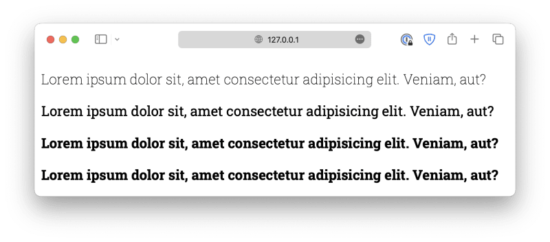
Or you can use numeric values 100, 200, to 900. 100 being the lightest, and 900 being the boldest. However, you should know that most fonts do not have this many variants. You must ensure the fonts you are using have the variants you need.

The font-style is used to define italic text. It can be either normal, italic, or oblique. Oblique is similar to italic but less supported, so it is rarely used.
p {
    font-style: italic;
}

Lastly, the font-variant property defines whether or not the text should be displayed in a small-caps form, where all lowercase letters are converted to uppercase but in a smaller form.
p {
    font-variant: small-caps;
}

Please visit www.thedevspace.io for the rest of this course.


Top comments (0)