
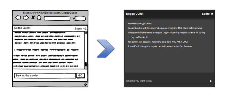
In this article we’ll take a user interface sketch and convert it into the visual structure of a new Angular application using Angular Material to quickly style and skin our new application.
Specifically, we’ll be making the main user interface on a text based adventure game project called “Doggo Quest”.
We’ll start with the user interface mockup that I created for my article on using event modeling for game design and we’ll end up with the visual structure and appearance of our application.
Angular & Angular Material
For those not familiar, Angular is a single page application (SPA) JavaScript framework used for designing complex but maintainable web applications. Angular is maintained by Google and uses TypeScript, dependency injection, npm, web pack, and other technologies from the start of every new project in order to equip new projects for success.
Angular Material is a library that provides Angular components to support Google’s Material style UI popularized by the Android and Chrome operating systems as well as Google’s online services.
Install Pre-Requisites
If this is your first time building an Angular application, there are a few things you’ll need to do before you can get started. I’ll cover the basics, but if you encounter something unexpected I recommend you check out Angular’s setup guide for more information.
While there are some fantastic editors for Angular applications (I recommend WebStorm or Visual Studio Code), everything I’m going to show you in this article you can do with a basic text editor like notepad and a command prompt.
First, you’ll need to install Node Package Manager (NPM) in order to install Angular’s command line tools. Because the instructions for this can vary by operating system, I recommend you go to the npm website and follow their instructions.
Once npm is installed, open a command line window and run this command from any folder: npm i -g @angular/cli
That tells npm to i nstall the package found at @angular/cli and to install it g lobally in npm’s shared packages directory for the entire machine.
You should see something like this:
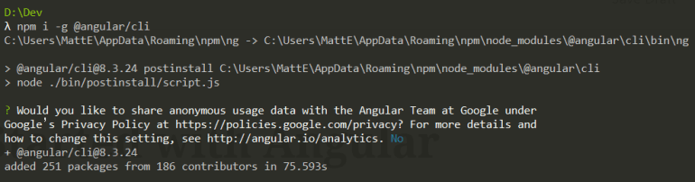
Once this completes, you are now set up with Angular’s Command Line Interface (CLI) and can use that for the remainder of this article.
Create and Run the Project
Now, let’s create our Angular application. Navigate to the folder that will hold the project folder we’re about to create and then use your command line to run: ng new project-name but replace project-name with the name of your project. I used doggo-quest for mine given the project I’m creating.
Angular will prompt you several times. I’ll walk you through each prompt as of Angular 8.3 at the time of this writing.
First, Angular asks if you want to use routing (navigation management) features. For my small single page application this is not needed and only adds size and complexity so I answered no.
Next, Angular will ask you which form of stylesheet technology you prefer to work with. This is entirely your preference as all of these are translated to CSS during the build process, but the examples in this article are all written using SCSS.
Once you’ve answered these questions, you’ll see Angular CLI generate a number of files:

Once complete, your new directory will be present and you can navigate into it via a command like cd doggo-quest (again, the name of your project).
If you list files in the directory you may notice that Angular CLI has automatically created a git repository in this directory and made an initial commit. This is just one example of Angular setting you up for good practices over time and helping you get a solid start on new projects.
You can launch the default project by telling Angular to serve up the application and open it in your web browser by running ng serve -o
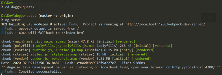
You should see something like this:

Replace the Default Content
Now that you’re up and running, let’s look at how we can customize this application.
First, lets go into the Src\Index.html page and replace its entire contents with Hello Doggo Quest and save the file. This will replace the application’s current view with placeholder text, and change the screen to something more manageable.
Unless you stopped the ng serve operation earlier, Angular should auto-refresh and render the changes you just made inside of the browser. This makes proofing changes much faster and increases the speed at which you can try new things.
Note: Sometimes when making code changes Angular can get hung up on code that does not yet compile or requires other files to be modified. If this happens, you may see errors in your console window and may need to hit Control + C to stop the server, then start it again via ng serve.
Translate a Mockup to Angular Components
Let’s take another look at the mockup we’ll be converting.

This is a pretty simple user interface but chopping it up into more manageable portions will lead to more maintainable code, so let’s look at how we can split this screen into components and sub-components.
For those unfamiliar, an Angular component is essentially a custom defined HTML tag that you can include in other places (including inside other components). Angular gives components views in the form of HTML, styling in the form of view-specific CSS (more on this later), and logic in the form of a TypeScript class definition for the view. Think of a component as a region of a page that can be reused as needed.
Here’s an annotated view of the mockup with its Angular components identified. Keep in mind that components can contain other components. The larger components are listed on the right side of the diagram with the more granular components listed on the left side.

The game’s components are:
-
App.Component– Main container for the application -
Header.Component– Contains the game title and high level game information, including the score -
Footer.Component– Holds the command entry component and the game over component -
StoryView.Component– Contains the game’s narrative. New entries will be added to the bottom -
CommandEntry.Component– Allows the player to enter in game commands and submit them -
GameOver.Component– Shown when the game has ended and allows the user to restart the game -
PlayerCommand.Component– Represents something the player typed into the engine at one point and is now part of the story -
StoryText.Component– An individual paragraph within the game’s narrative. Housed inside theStoryView.Component
Create Application Components
Okay, it’s time to start creating these components and working with them.
First, go back to the command line and stop the server if it is currently running by hitting Control + C.
Next we need to create our Angular components via the command line. While this may seem like an odd way to create components, it’s a very simple way of creating them and Angular creates multiple files in one command respecting your project’s settings.
To create the first component, we’ll run ng g c header. This tells Angular to g enerate a c omponent named header.component and creates a handful of files.
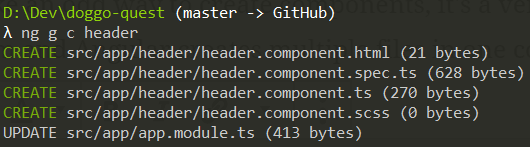
The .html file is the component’s user interface.
The .scss file is an empty style sheet for styles that can be defined that will only impact this component (unless you customize Angular’s CSS scoping behavior). I generally prefer to work with global styling, but everyone has different preferences.
The .ts file contains the component definition as well as any custom logic you may add later.
The spec.ts file is an auto-generated Jasmine test file. We won’t be talking about testing in this article, but later on in the series we’ll be discussing Angular testing in depth.
Go ahead now and generate the rest of the components listed above keeping in mind the following guidelines:
- Avoid upper case characters
- If you would normally use a space or an uppercase letter to distinguish between words, use a dash instead (e.g.
story-viewinstead ofStory VieworstoryView) - Do not include the word
component. Angular will append this automatically.
Customize the App Component
Once that’s done, modify app.component.html to have the following content:
<app-header></app-header>
<app-story-view></app-story-view>
<app-footer></app-footer>
These three tags use your application’s prefix (app by default) and reference components we just created to embed them into the generated view.
Run ng serve -o and you should see something like the following:
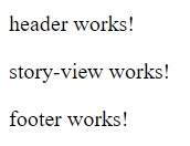
If you look at any of those components, you’ll see their HTML content is just “ works!”, so this is actually working exactly as we would expect it to.
Add Angular Material
Before we start structuring our content, let’s bring in Angular Material to help us style and structure the application visuals.
Stop the server if it is currently running and then run ng add @angular/material. This tells Angular to add in the dependencies needed via npm for Angular Material and save those dependencies appropriately.
Angular CLI will prompt you for a theme to use of the four default ones available. I plan on doing some customization, so I chose Custom, but feel free to select a default one if you’d like.
Next, Angular CLI will ask you about HammerJS and browser animations. I recommend you say yes to both as HammerJS will matter if you want to develop complex user interfaces for mobile and the animations will make everything just a little nicer.
Your experience should look something like this and complete after a few minutes:

Import Material Components
Now that we have Angular Material installed, we still need to tell Angular that we want to include it as something that can be injected into various components.
We do this by going into app.module.ts and adding in an import for each component we want to use at the top. In this article, I’ll be using 5 controls from Material so I’ll import those now:
import {MatCardModule} from '@angular/material/card';
import {MatInputModule} from '@angular/material/input';
import {MatButtonModule} from '@angular/material/button';
import {MatToolbarModule} from '@angular/material/toolbar';
import {MatIconModule} from '@angular/material/icon';
Next, scroll down to the imports list for the module definition and I’ll declare those things as things that the module imports:
  imports: [
    BrowserModule,
    BrowserAnimationsModule,
    MatInputModule,
    MatCardModule,
    MatButtonModule,
    MatToolbarModule,
    MatIconModule
  ],
This is one of my least favorite aspects of Angular but, thankfully, you do not have to do this too frequently once a project has reached momentum.
Customize Angular Material Styles
Material themes are just a combination of colors that get fed into some common functions, so customizing a theme isn’t too hard at all. In my case, I want a dark theme with blue and green accent colors.
Go into the Styles.scss file in your src directory and take a look and see what I mean.
In my case, I tweaked the colors named in the primary and accent color definitions to cyan and green respectively:
$doggo-quest-primary: mat-palette($mat-cyan);
$doggo-quest-accent: mat-palette($mat-green, A200, A100, A400);
I also changed the mat-light-theme function reference to mat-dark-theme.
That’s really all I had to do in order to get the high-level customization that I wanted.
Note: I did add some custom global styling classes to the bottom of this file that are needed to give the final appearance of the application. They’re not core to what we’re talking about here so I’m not going over them, but check out the file in full if you are curious.
Build the Header
Let’s start out simple by adding the title bar from the mockup.
Go into header.component.html and paste in the following code:
<mat-toolbar>
  <span>Doggo Quest</span>
  <span class="spacer"></span>
  <span>Score: {{Score}}</span>
</mat-toolbar>
Some things to point out here:
-
mat-toolbaruses Angular Material’s Toolbar component (note thematprefix from that component library) to render some custom content we provide it. - The
{{Score}}prefix tells Angular to bind that area of the user interface to the value of aScoreproperty on the component’s class
Next, let’s go into the component’s .ts file and make a few changes to support the changes in the view we just added.
First, add Input to the list of things we’re importing from Angular Core:
import {Component, Input, OnInit} from '@angular/core';
Next, define a new property inside the class as follows:
@Input()
public Score = 0;
The @Input() syntax tells Angular that when the component is being declared inside of another component, that component can pass in a value to Score if they choose.
For example, I could define <app-header Score=42 /> in another component and it would set the Score property appropriately.
When you run the application you should now see the title bar:

Conditional Display
Let’s build the footer component now and illustrate an Angular directive in the process.
In footer.component.html add the following HTML:
<app-command-entry *ngIf="!GameOver"></app-command-entry>
<app-game-over *ngIf="GameOver"></app-game-over>
Here we’re referencing two of our components, the command entry component where the player can type in a command to the game and the game over component where the game summary will be displayed.
Note the *ngIf syntax here. This is an Angular directive telling Angular to only emit these components if the condition in that clause is true. This is why we want the game over component to only show if GameOver is true and the command entry component to only show if GameOver is false (! indicates negation in JavaScript).
In this case we’re binding to GameOver inside of our component, which I just define as a constant false for this article:
  @Input()
  public GameOver = false;
Now if you run you should see “Command Entry Component Works!” instead of “Footer Works!”. That’s progress since the footer component is hosting the correct child component.
Forms and Input: Command Entry Component
We’ll detail the command entry component next.
While this component is fairly dumb for this article in that it doesn’t actually do anything with anything you type into it, Angular Material actually has some pretty awesome form controls.
Use the following HTML:
<mat-form-field class="command-area">
  <input matInput type="text" placeholder="What do you want to do?" autofocus autocomplete="off">
  <button mat-button matSuffix mat-icon-button aria-label="Submit">
    <mat-icon>send</mat-icon>
  </button>
</mat-form-field>
Okay, so a number of things here:
-
mat-form-fieldindicates a region that Angular Material will influence for styling purposes. Although there are multiple children, everything in and below this level is the text box. - You’ll notice a few Angular Material attributes on controls here:
matInput,mat-button,matSuffixandmat-icon-button. This is not uncommon for Angular Material in using to decorate existing HTML elements without using custom components everywhere. -
mat-iconrepresents a Google style icon that will be shown in the input box’s right edge. The contents of this element refers to a specific icon in the iconset. Take a look at the documentation for additional details. - We’re manipulating focus and autocompletion on the input control via attributes since this resulted in a better user experience.
Again, this control does very little right now, but you can interact with it and see the placeholder animation and theme working properly:

Cards, Events, and Properties
Now that we have Material in the application and working properly, we can refine our application’s main body to use it.
Go back into app.component.html and replace its HTML with this:
<div class="container full-height" >
  <app-header></app-header>

  <div (window:resize)="onResize()" [style.height.px]="ContentHeight">
    <mat-card class="full-height story-area">
      <mat-card-content #scrollMe class="full-height scroll-container">
        <app-story-view></app-story-view>
      </mat-card-content>
    </mat-card>
  </div>

  <app-footer class="footer"></app-footer>
</div>
A few notes here:
-
mat-cardand its related tags all refer to the Angular Material card component which is a very simple way of adding a polished visual structure to your application. -
(window:resize)="onResize()"is syntax that tells Angular to invoke anonResizemethod in this component whenever the window’sresizeevent fires. I use this event to adjust aContentHeightproperty. -
[style.height.px]="ContentHeight"tells Angular to maintain an inline style on that element that sets its height to the numeric value fromContentHeighton the control and that the value represents pixel values. -
#scrollMetells Angular to generate anid="scrollMe"on the element, but also allows Angular’s view engine to hook up that element to the code behind.
This is somewhat complex code and something I want to gloss over for an introductory article since this code is part of a system to auto-expand the card to fill the available height of the user interface, but I thought it might be beneficial to explain the syntax in this article.
Story and Player Command Text
The story and player command text nodes will show in the main visual area and are just controls that render content in the appropriate styling.
The story text component uses simple HTML with <p>{{Text}}</p> serving as its entire HTML template.
Similarly, the player command component uses a slightly more verbose template:
<code>
  <mat-icon inline="true">chevron_right</mat-icon>
  {{Text}}
</code>
This just adds an icon and preformatted text styling to the template.
Both controls rely on an entry in their class definition:
@Input()
public Text: string;
Neither one will render if you run the application because no component is including them yet. Let’s change that now.
Add Story Text
Going into story-view.component.html you can now customize the template to use the two components we just customized:
<app-story-text Text="Welcome to Doggo Quest!"></app-story-text>
<app-story-text Text="Doggo Quest is an Interactive Fiction game created by Matt Eland (@IntegerMan)"></app-story-text>
<app-story-text Text="This game is implemented in Angular / TypeScript using Angular Material for styling."></app-story-text>
<app-player-command Text="Say Hello World"></app-player-command>
<app-story-text Text="You cannot talk because - follow my logic here - YOU ARE A DOG!"></app-story-text>
<app-story-text Text="A small 'ruff' emerges from your mouth in protest to this fact, however."></app-story-text>
This is just placeholder text, but it’s enough to finish our user interface for now.
The Final Product
Now that everything is working properly, you can take a step back and look at the result of this article:
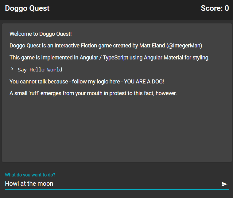
While this is certainly not a complex or even functional application, you can see how Angular let us quickly get started and Angular Material gave us the visual framework we needed to get up and running with minimal work on our end.
The full code is available on GitHub on the MockupToAngularMaterial tag.
The application is only beginning, so stay tuned for additional articles detailing how to make the rest of the application work properly, from click events and event handling to line rendering to text parsing and state management logic.
It’s going to be a lot of fun.
The post From Mockup to Angular Material appeared first on Kill All Defects.

Top comments (0)