On September 14th, In The Pocket signed the Digital Inclusion Charter to underline our commitment in fighting digital exclusion. In this post I'll explain how this can be applied to handling form submissions.
In the example, which can be found on GitHub, a user is able to fill in their name and email address, which will be validated in remix when submitting the form. There's two states of the form. The first one will occur if there are any validation errors and the second is a toast message which will appear and dissapear when the user has successfully submitted the form.
First up, want to see a demo?
Just head over to this StackBlitz app, click the "Open in New Window" in the header and enable VoiceOver.
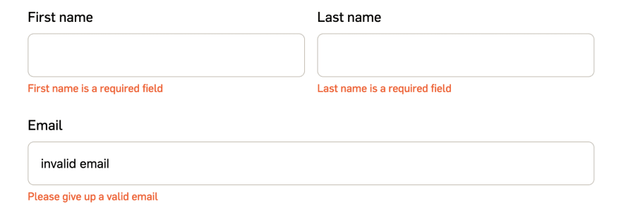
Native browser behaviour

Before I started coding specifically towards React/Remix, I first had a look at how native browser validation behaves. If we take a look at the screenshot above, we'll notice that browsers validate input fields one by one. Meaning that, if we have an error in a certain input field, that input field will be focused and an unstyled (and rather ugly) browser popover will be displayed with an error message.
This is important because when we want to create anything custom, we should take the native browser behaviour as a base for our validition. Users expect certain UI to be consistent, as it makes it easier for them to navigate a page.
Custom validation
Because we're always striving towards spectacular UI and UX, we decided to implement the following improvements towards this form:
- Validate the entire form when submitting the form.
- Show all validation errors in a styled error message underneath the input.
- When there are no validation errors, display a success message.
Validating the entire form is easily done thanks to Remix's action function and yup. All I had to do was create a function that validates our form data based on the validation schema and return each error. The specific code isn't present here because it would bloat the post, so again another incentive to have a look at the GitHub repo 😊.
To show the validation errors in a styled error message, we created a span element for each input element and bound our error messages. This leaves us with this beautiful validated form.
Accessibility
Now that we have a beautiful UI, thanks to custom validation, let's improve the UX by implementing the best features of native browser behaviour and make it accessible thanks to the use of some aria attributes.
After reading the Web Accessible Initiative tutorial regarding forms we are able to make our forms accessible by using the
following code:
const Index = () => {
  const { toastRef, showToast } = useToast();
  const actionData = useActionData();
  const { formRef } = useAccessibleForm({
    hasErrors: actionData?.hasErrors,
    errors: actionData?.errors,
    showToast,
  });

  return (
    <main>
      <Toast role="alert" aria-live="polite" />
      <Form method="post" aria-label="Personal information form" noValidate>
        <div className="form-group">
          <label htmlFor="first-name">First name</label>
          <input
            type="text"
            id="first-name"
            name="firstName"
            aria-required
            aria-describedby="first-name-error"
          />
          <span id="first-name-error" aria-hidden>
            {actionData?.errors?.firstName}
          </span>
        </div>
      </Form>
    </main>
  );
};
There are three things which help to make this form accessible.
First up, a toast component which has an alert role and and aria-live attribute. The alert role is used to communicate an important and usually time-sensitive message to the user. Seeing as form validation is quite important, this attribute fits perfectly! However, as the docs state, the alert role also causes aria-live to be set with the value "assertive", meaning it will interrupt the user's screenreader. In order to prevent this we set the aria-live attribute to "polite".
Second, when the form contains errors, the useAccessibleForm() hook will:
- generate all errors,
- create a human readable error message,
- call the
showToast()function with this error message.
Because the error messages are shown underneath the input fields, we don't have to show the toast. Thanks to the aria-live attribute however, the screenreader will still read this out.
Last, to bring everything together we're hiding the error message for the screenreader space. In order to add the relationship between the input field and the error message we can use the aria-describedby attribute, which will ensure the error message will be read out after the user navigates to the
input field.
As you can see: with little effort we were able to make the web a better place for people using a screenreader. There's plenty of other things we can do to improve accessibility and usually it comes down to our mindset. I hope this was useful and you'll probably see some more in the future!

Latest comments (1)
Thanks for sharing.